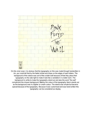
1. On this vinyl cover, it is obvious that the typography on this was made through handwritten in
ink, you could tell that by the faded stroke and drops on the edges of each letters. The
background of the sleeve was sort of like a toilet wall because of that they place their
typography on the side right to make it look like a vandalism in a toilet room. The
background is white to make the typography stand out and also the word “the wall”
compliment the chosen background. Making the colour of the typography black stands out
as the background was in a lighter or cream colour. The sleeve was simple but became
special because of the typography. Because it was customised and was hand written this
typography can be considered as display.
2. This vinyl cover is simple yet because of the typography, the sleeve became something
more than a cream background. The typography itself describes the word that was used.
The word “In” was constructed and made the “I” into an arrow going down which indicates
going in, same goes to the word “Out” it just that they made the arrow in letter “T” in the
direction of going out. They have also overlayed a picture of the artist on the letter “I” which
compliments the colour of the typography because the photo was desaturated. Making the
typography almost taking the whole space in the cover, it connotes that it was the main
subject as it is also in the center. The lack of something in the background made an
impression that there’s something missing. The other texts such as the name of the artist
above with different colour is also noticeable despite of its small size. The typography on the
top was also in italic which creates difference to the main text. This typography fall down
between sans serif and display category.
3. On this sleeve, the background was manipulated into a different hue and colour, the colour
of blue and pink dominates which help to indicate the audience the gender of the artist.
Because of the minimalistic choices of colours it gives the typography more attention. The
typography here was overlayed in a kind of texture which was also the same in the border of
the vinyl cover. With the textured text using overlay, it also complement the earth feel that
the background image wanted to portray with the mountain in it. The text also gives a
mysterious vibe on the artist in the image covering her eyes with the text. It is also not too
bold and not that seeking attention as it is also faded which doesn’t outshine the background
image. Notice also the small text on the lower right and use a geometrical or a sans serif
kind of typeface. The word “Badlands” taking the word “Lands” made it legible. The typeface
is in the sans serif category.