
Recommended
More Related Content
What's hot
What's hot (18)
Viewers also liked
Viewers also liked (19)
Similar to Presentation2 (1)
Similar to Presentation2 (1) (20)
More from dankyjosh
Recently uploaded
Recently uploaded (16)
Presentation2 (1)
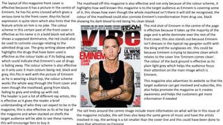
- 1. The layout of this magazine front cover is effective because it has a picture In the centre of Eminem, he has his arms crossed which gives a serious tone to the front cover. Also his facial expression is quite stern which also hints that the feature article on him is no joke. The colour scheme in this certain past of the front cover is effective as his name is in a bold block red which shows a supposed dominance, the red could also be used to connote courage relating to the admitted drug use. The grey writing above which highlights the drugs that have been used is effective as the colour looks as if its fading away which could indicate that Eminem's use of drugs is fading away. The colour scheme is also effective as it only uses 3 main colours being red, black and grey, this fits in well with the picture of Eminem as he is wearing a black top, the colour scheme works the whole way through the front cover and even though the masthead, going from black, fading to grey and ending up with red. The masthead off this magazine is also effective and not only because of the colour scheme, it highlights how well known this magazine is to the target audience as Eminem is covering some of it, this shows how even though the whole masthead isn’t there it will still be recognised, the colour of the masthead could also connote Eminem's transformation from drug use, black showing his dark blood to red being his clean blood. This magazine also advertises its website so that the target audience can get involved and subscribe, this also helps promote the magazine as it creates awareness and helps the customers get more information if needed The mid shot of Eminem in the centre of the page is effective because it takes up the majority of the page and is white dominate over the rest of the front cover, this also stands out because Eminem isn’t dresses in the typical rap gangster outfit with the bling and the sunglasses etc. this could be because Eminem is trying to become clean which relates to the cover line ‘Eminem comes clean’. The colour of the back ground is effective as its plain light grey which helps the audience focus their attention on the main image which is Eminem. The sell lines around the centre image include more information on what will be in this issue of the magazine includes, the sell lines also keep the same genre of music and have the artists involved in rap, the writing is a lot smaller than the cover line and this could have been done to The header is just a list of different rap artists, this is effective as it gives the reader a brief understanding of who they can expect to be in the magazine, this is also effective as its at he top of the magazine and when stacked on shelfs the target audience will be able to see these names, this will encourage fans to buy it.
- 2. In this front cover there are three main cover lines which are placed separately around the page, all three use a certain colour scheme of black and yellow which is effective as it stands out to the audience more than the other writing. The yellow outline of the writing clashes against the blue which makes the black stand out more. , the fact that they are placed in different parts is effective as it attracts the reader to look at different features on show. The colour scheme in this issue of the magazine is quite funk which relates well with vibe as they to are seen to be funky and unconventional. For example the masthead is baby blue and in bold lettering, which is instantly identifiable, similarly the sell lines around the picture are also easily identifiable as they stand out. The use of cover lines changes in this certain issue of vibe, there are a lot of changes in font, size and colour which is effective as it keeps the reader entertained. Also there is a certain emphasis on the words ‘swagger’ and ‘sex’ which are both highlighted own style. This links with Usher as his they are both features of his rap music. The main image of this front cover is off Usher who takes up most of the space and who is popular with most age groups due to his music, this is effective as it stands out and because he is well known the audience will be more interested to see what the magazine has to offer. Usher is represented in a typical rap manor by wearing the sunglasses, watch, ring and by having the hand gesture. This is effective as it links in with cover line ‘the king is back’ and peoples expectations of the rap genre. Vibe uses celebrities like this as they appeal to the target audience. Also like many other vibe covers, ushers head covers some the masthead again reinforcing how popular this magazine is. This type of shot is a mid shot and is effective because it shows the audience what they need see, the glasses make it hard to tell whether or not usher is looking directly at you. The background of this cover is of the scenery behind Usher but is blurred out, this is effective as it keeps the attention on Usher and the rest of the writing, this is also effective as it doesn't make the cover look to crowed. In the sell lines it tell the reader more about the magazine and what articles will be inside, it also mentions some of the top rap artists such as 50 cent, which will attract more people who are fans. The use of the website and the bottom under a cover line makes it more noticeable and that fact that its in that grey colour is effective as it blends in with ushers jacket. The header is also giving readers new updates on news stories which will encourage them to buy this issue of the magazine
- 3. The masthead (XXL) for this magazine is effective as the font is so bright and large, this is effective as it will immediately draw the attention of the target audience. The white on red colour scheme is also effective as the two opposite colours stand out against each other making the magazine clearly visible and eye catching to the target audience. The head line on this front cover matches the masthead by using the red colour. The red block and the artists name have also been used effectively as it stands out against the white back ground, the font and colour scheme in this addition on the ‘XXL’ magazine are simple and helps to make the font cover less crowded, however keeps the professionalism to the front cover. The fact that the masthead is covering the main image/artist shows that this magazine is less popular as oppose to other successful rap magazines such as ‘Vibe’ where the artist covers the masthead. On the other hand the design of the mast head is again simple highlighting how it doesn’t need to be fancy to be recognised. The main image of ‘French Montana’ is a mid-shot which goes will with the theme of rap as he is a well known rapper. This picture effective as it dominates the front cover but on the right hand side and not the centre. Just by looking at the main image the target audience will be able to establish the genre of this magazine. This main image is also effective as it reflects on the rap culture and the luxuries that come with it. The gold chain around Montana’s also suggest that he is wealthy as well as a hip hop rapper. This is effective because jewellery and flashy items are associated with rap and hip hop music. Montana’s body language suggests that he is praying which is effective as rappers are seen to be rude and arrogant. The ring on his hand also highlights how wealthy he is and shows how he is of a high significance/status. In the image he is wearing mostly black which effectively links in with the colour scheme of the cover line etc. The use of the hat is also effective in the main image as it keeps the focus on him and the text where as if he had a crazy hairstyle it would draw to much attention. The barcode , date and price on the front cover are also effective and the are quite large and can be seen easily, however the price isn’t that large in font which is effective as it doesn't draw to much attention. The cover lines are the names of the artists that will feature in that weeks addition of the magazine, the number of artists and who they are will appeal to the target audience as it will gain a certain interest. The names are highlighted in black which links well with the colour scheme, the use of white font is again effective as it clearly stands out and is easily visible. The circle at the top of the page is ‘first awards of XXL’, things like this on magazines are effective as it creates an interest for the target audience, this is also effective as it’s the ‘first’ which will also influence more people to see it.