The document summarizes the front covers of three different magazines - NME, featuring Billie Joe Armstrong of Green Day; The Fader featuring Eminem; and Kerrang! featuring Hayley Williams of Paramore. It analyzes the mastheads, color schemes, main images, and sell lines of each cover, noting how they follow or diverge from typical magazine conventions. The covers are designed to attract fans of the featured artists and relate to the genres of music represented in the magazines.
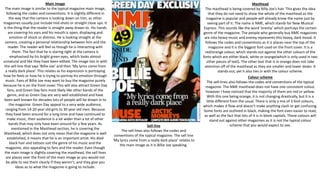
1. Masthead
The masthead is being covered by Billy-Joe’s hair. This gives the idea
that they do not need to show the whole of the masthead as the
magazine is popular and people will already know the name just by
seeing part of it. The name is NME, which stands for New Musical
Express. This sounds like the word ‘enemy’ which portrays the certain
genre of the magazine. The people who generally buy NME magazines
are into heavy music and enemy represents this heavy, dark mood. It
follows the codes and conventions as it is places near the top of the
magazine and it is the biggest font used on the front cover. It is a
red/orange colour, which stands out against the other colours of the
fonts which are either black, white or orange(which is only used in two
other pieces of text). The other text that is in orange does not take
attention off of the masthead as they are smaller and lower down. It
stands out, yet it also ties in with the colour scheme.
Sell-line
The sell-lines also follows the codes and
conventions of the typical magazine. The sell line
‘My lyrics come from a really dark place’ relates to
the main image as it Is Billie Joe speaking.
Main image
The main image is similar to the typical magazine main image,
following the codes and conventions. It is slightly different in
the way that the camera is looking down on him, as other
magazines usually just include mid-shots or straight close ups. It
is the thing that the reader is straight away drawn to. His hands
are covering his ears and his mouth is open, displaying and
emotion of shock or distress. He is looking straight at the
camera, creating a personal relationship between him and the
reader. The reader will feel as though he is interacting with
them. The fact that he is staring right at the camera is
emphasised by his bright green eyes, which looks almost
unnatural and like they have been edited. The image ties in with
the sell-line that says ‘Billie Joe’ and then ‘My lyrics come from
a really dark place’. This relates as his expression is portraying
how he feels or how he is trying to portray his emotion through
music. Fans of Billie Joe may want to buy the magazine purely
because he is on the front cover. This will also attract Green Day
fans, and Green Day fans most likely like other bands of the
genre, and as Green Day are very well established and have
been well known for decades lots of people will be drawn in to
the magazine. Green Day appeal to a very wide audience,
ranging from 14-20 year old girls to 30 year old men. Because
they have been around for a long time and have continued to
make music, their audience is a lot wider than a lot of other
bands that may only have been around for a few years. As
mentioned in the Masthead section, he is covering the
Masthead, which does not only mean that the magazine is well
established, it means that he is an important artist. His died
black hair and tattoos suit the genre of his music and the
magazine, also appealing to fans and the reader. Even though
the main image is slightly covering the masthead, the sell lines
are places over the front of the main image as you would not
be able to see them clearly if they weren’t, and they give you
ideas as to what the magazine is going to include.
Colour scheme
The sell-lines also follows the codes and conventions of the typical
magazine. The NME masthead does not have one consistent colour,
however I have noticed that the majority of them are red or yellow.
With this one being orange, it is not changing drastically, but it is a
little different from the usual. There is only a mix of 3 font colours,
which makes it flow and doesn’t make anything clash or get confusing.
Some fonts are outlined in black, making the font even easier to read,
as well as the fact that lots of it is in block capitals. These colours will
stand out against other magazines as it is not the typical colour
scheme that you would expect to see.
2. Main image
Eminem has a stern face and he is wearing a black tank top to
show off his tattoos. Usually, you would think he would be
standing like this to come across as intimidating, but it is just to
show off the tattoos and portray a certain vibe. His tattoos are a
large part of his life and they are also one of the main things his
fans recognise him by. The main image follows the main codes
and conventions of a typical magazine as it is a mid shot. You can
see his face close enough to see his expression but not so that it
is intimidating. The fact that he is crossing his arms does make
him come across as quite cold, but this also represents his certain
vibe and genre of music. He is wearing a necklace with a cross on
it, which proves he is proud of his religion and it could mean that
he is showing off the fact that he has overcome his battle with
drugs and wants to influence others who may be in the same
position. A lot of his music does relate to drugs, so his fans may
be associated with them so it may relate to them.
Eminem appeals to a very wide audience, ranging from teenagers
aged 12 to 18 to adults aged 19-30 of both genders. He has also
been around for quite a while and the fact that he is still around
proves that he is still popular, so he would be able to sell a
magazine well.
He is covering the masthead, proving that the magazine is well
known enough to have someone covering it and they will still
know the magazine. Although he is only covering a small part of
it, so the reader can still make out what it says.
Masthead
The masthead uses the gradient effect and it fades from black at the top to
red at the bottom. The connotations of black are darkness and mystery and
the connotations of red are power and danger. The power and danger could
represent Eminem’s dangerous drug-involved past and his power as he is
such a successful artist. The black also matches his top. Front cover
mastheads do not usually use the gradient effect, so this does not exactly
follow the codes and conventions of a typical magazine. The magazine is not
that mainstream, which could also be why the gradient tools is used as it is
different from other magazines.
Colour scheme
The main colours used in the front cover are red, black and
silver/grey. The background is a plain and simple grey colour, so
that the focus is not take off of the main image of Eminem and
the sell lines. The colour grey is very cool and relax, which really
contrasts with the dark and harsh colours of red and black, which
is mentioned in the masthead section. Eminem’s tattoos also suit
the colour scheme as they are black. They are a big part of the
front colour
3. Main image
The main image follows the basic codes and conventions
of the typical music magazine. It is a midshot and she is
level to the camera, making direct eye contact, connecting
with the audience. She is holding her arm up over her
head and slightly glaring at the camera, implying that she
is trying to look innocent or cute. The image ties in with
the sell line ‘Paramore, Hayley answers your questions’.
Hayley has a very different sort of outgoing style and her
very bright hair and bright yellow top bring a lot of
attention to the front cover. This also attracts fans of
Paramore and Hayley Williams and the fact that Kerrang is
a music magazine, it will mean that fans will want to read
it as Paramore were a rock band at the time this magazine
was out.
Masthead
The masthead is in bold white font, written in capitals over
the top of Hayley Williams’ face. The lines through the
writing make the masthead look rough and grungy,
suitable for the theme. Also the pronunciation of Kerrang
sounds like a rock magazine, it is also an onomatopoeic
word.
Sell Line
The 'poster special' box is a key selling point. This is
because teenagers that read this magazines fill their walls
with posters from each issue. Also each poster appeals to
fans of the rock genre.
The sell line ‘Hayley answers your questions’ gives the
audience the impression that they are involved with
Hayley, making them feel welcome.