SlideShare a Scribd company logo
1 of 25
Download to read offline
1/25
October 9, 2023
Tailwind Navbar: A Complete Guide for Stunning User Experience
purecode.ai/blogs/tailwind-navbar/
Victor Yakubu
Top MUI, Tailwind, React Components & Templates
Browse thousands of MUI, Tailwind, React components that are fully customizable and responsive.
Tailwind CSS is a highly customizable, low-level CSS framework that gives you all of the building blocks you need to build bespoke designs
without any annoying opinionated styles you have to fight to override. Unlike traditional CSS frameworks like Bootstrap, which come with
predefined components, Tailwind allows developers to construct their own unique design system by combining a series of small, reusable
classes.
You can use Tailwind CSS to build the navigation bar (navbar) component. Navbars are essential elements in web development because they
provide a roadmap to the content on a website. They improve the user experience by making navigation easier, allowing users to quickly find
the information they need.
This guide will walk you through creating a responsive navbar component with Tailwind CSS, covering the basics, code structure, responsive
design, and advanced features like adding dark mode and dropdown menus. By the end, the article will equip you to apply these concepts to
your projects and create a tailored, functional navbar.
Looking to speed up your UI development process? Purecode is the answer. Our AI-powered tool provides customized, ready-to-use
components, saving you valuable time and effort.
Let’s dive in
2/25
How do you make a Navigation bar using Tailwind CSS?
Creating a navigation bar with Tailwind CSS involves several steps, including setting up a Tailwind CSS project, creating a basic navbar, and
adding a dropdown menu.
Setting up a Tailwind CSS project
Before you can start building your navbar, you need to set up a Tailwind CSS project. This involves installing Tailwind CSS into your project
and configuring your template paths. You can install Tailwind CSS using a package manager such as npm or yarn.
Step 1: Create a folder and open it using your code editor.
Step 2: Initialize NPM in that folder.
npm init -y
and, Step 3: Install Tailwind CSS and create a tailwind.config.js file using the command below.
npm install -D tailwindcss npx tailwindcss init
In the tailwind.config.js add the paths to all of your template files.
/** @type {import('tailwindcss').Config} */
module.exports = {
content: ["./src/**/*.{html,js}"],
theme: {
extend: {},
},
plugins: [],
}
In your project folder, create a new folder called src.
Then, in the src folder, create a new file called input.css for your main CSS, and add the @tailwind directives for each of Tailwind’s layers to
your main CSS file
.
@tailwind base;
@tailwind components;
@tailwind utilities;
Start the Tailwind CLI build process by running the command below
npx tailwindcss -i ./src/input.css -o ./dist/output.css --watch
3/25
Proceed to create an index.html file inside the src folder.
Add your compiled CSS file (In the dist folder) to the <head> and start using Tailwind’s utility classes to style your content
<!doctype html>
<html>
<head>
<meta charset="UTF-8">
<meta name="viewport" content="width=device-width, initial-scale=1.0">
<link href="../dist/output.css" rel="stylesheet">
</head>
<body>
<h1 class="text-3xl font-bold underline">
Hello world!
</h1>
</body>
</html>
With this, you should have your Tailwind setup and you can proceed to write your code.
Creating a simple navbar with Tailwind CSS
In creating a navbar, it is best practice to use the nav element, after which you can populate it with the necessary items. Here is a simple
navbar with some menu items:
<nav class="flex justify-start">
<div class="hidden md:flex items-center space-x-1">
<a href="" class="py-4 px-2 text-green-500 border-b-4 border-green-500 font-semibold ">Home</a>
<a href=""
class="py-4 px-2 text-gray-500 font-semibold hover:text-green-500 transition duration-300">Services</a>
<a href=""
class="py-4 px-2 text-gray-500 font-semibold hover:text-green-500 transition duration-300">About</a>
<a href=""
class="py-4 px-2 text-gray-500 font-semibold hover:text-green-500 transition duration-300">Contact
Us</a>
</div>
</nav>
In this code, the parent nav bar element has a class “flex justify-start“. The flex class makes the navigation bar a flex container, allowing the
navbar to display its children in a row. The justify-start class aligns the children (in this case, the navigation links) to the start of the flex
container, pushing them to the left.
For the div element, a class of “hidden md:flex items-center space-x-1” was used, these classes style the wrapping <div> as follows:
hidden: This class hides the <div> by default, making it invisible on screens smaller than the medium (md) breakpoint.
md:flex: This class makes the <div> visible (displays it as a flex container) on screens equal to or larger than the medium (md)
breakpoint.
items-center: This class vertically centers the content inside the <div>, ensuring that the navigation links are vertically aligned.
space-x-1: This class adds horizontal spacing of 0.25rem (1/4th of the default spacing) between the child elements (navigation links).
For the anchor elements representing the navigation links, the class=”py-4 px-2 text-green-500 border-b-4 border-green-500 font-
semibold” was used. These are Tailwind CSS classes applied to each navigation link. They style the links as follows:
py-4: Adds vertical padding of 1rem (4 times the default spacing).
px-2: Adds horizontal padding of 0.5rem (2 times the default spacing).
text-green-500: Sets the text color to a shade of green (#10B981).
border-b-4 border-green-500: Adds a 4px thick green (#10B981) bottom border to the link, giving it an underline effect.
font-semibold: Makes the text bold (semibold).
This will create a simple navbar and it should look like this
4/25
Simple Navbar with TailwindCSS
5/25
6/25
How to add a dropdown menu in your Navigation bar
To create a responsive navigation bar with a dropdown menu in Tailwind CSS, you need to follow a few steps involving HTML, Tailwind CSS,
and JavaScript. Let’s break down the process.
Step 1: Create the HTML Structure
Here’s a simple structure for a navigation bar with a dropdown button
<nav class="bg-white shadow-lg">
<div class="max-w-6xl mx-auto px-4">
<div class="flex justify-between">
<div class="hidden md:flex items-center space-x-1">
<a href="" class="py-4 px-2 text-green-500 border-b-4 border-green-500 font-semibold ">Home</a>
<a href=""
class="py-4 px-2 text-gray-500 font-semibold hover:text-green-500 transition duration-300">Services</a>
<a href=""
class="py-4 px-2 text-gray-500 font-semibold hover:text-green-500 transition duration-300">About</a>
<div class="relative text-left dropdown">
<button class="py-4 px-2 text-gray-500 font-semibold hover:text-green-500 transition duration-300">
Contact Us
</button>
<ul class="hidden dropdown-menu absolute right-0 mt-2 w-48 bg-gray-800 rounded-md overflow-hidden z-
10">
<li href="#" class="block px-4 py-2 text-sm text-gray-200 hover:bg-gray-700">Link 1</li>
<li href="#" class="block px-4 py-2 text-sm text-gray-200 hover:bg-gray-700">Link 2</li>
<li href="#" class="block px-4 py-2 text-sm text-gray-200 hover:bg-gray-700">Link 3</li>
</ul>
</div>
</div>
</div>
</div>
</nav>
In this example, we have a navigation bar with three links: Home, About, and Contact. The dropdown button is labeled “Dropdown” and has
three links in its dropdown menu.
Step 2: Add JavaScript for Dropdown Toggle
<style>
.dropdown:focus-within .dropdown-menu {
/* @apply block; */
display: block;
}
</style
In the code above, when the element with the class dropdown-menu is clicked or focused on, it will set the display property of the selected
“.dropdown-menu” element to “block.” When an element’s display property is set to “block,” it means that the element is rendered as a block-
level element, taking up the full width of its parent container and stacking vertically. This makes the dropdown menu visible and takes up space
in the layout.
7/25
code navbar with dropdown (inline block format)
8/25
9/25
Aligning your Navbar content
In Tailwind CSS, you can use the justify-content property to align the content of your navbar. This property defines how the browser
distributes space between and around content items along the main axis of a flex container, and it’s very useful for aligning navbar items.
How do you align the navbar to the center in Tailwind?
To center the items in your navbar, you can use the justify-center class. Here is an example:
<div class="flex justify-center">
<div class="hidden md:flex items-center space-x-1">
<a href="" class="py-4 px-2 text-green-500 border-b-4 border-green-500 font-semibold ">Home</a>
<a href=""
class="py-4 px-2 text-gray-500 font-semibold hover:text-green-500 transition duration-300">Services</a>
<a href=""
class="py-4 px-2 text-gray-500 font-semibold hover:text-green-500 transition duration-300">About</a>
<a href=""
class="py-4 px-2 text-gray-500 font-semibold hover:text-green-500 transition duration-300">Contact
Us</a>
</div>
</div>
10/25
11/25
12/25
In this example, the justify-center class is used to center the navbar items. The flex class is used to set the display property of the navbar to
flex
How do you align the navbar to the right in Tailwind?
To align the items in your navbar to the right, you can use the justify-end class. Here is an example:
<div class="flex justify-end">
<div class="hidden md:flex items-center space-x-1">
<a href="" class="py-4 px-2 text-green-500 border-b-4 border-green-500 font-semibold ">Home</a>
<a href="" class="py-4 px-2 text-gray-500 font-semibold hover:text-green-500 transition duration-300">Services</a>
<a href="" class="py-4 px-2 text-gray-500 font-semibold hover:text-green-500 transition duration-300">About</a>
<a href="" class="py-4 px-2 text-gray-500 font-semibold hover:text-green-500 transition duration-300">Contact Us</a>
</div>
</div>
13/25
Align the navbar to the right in Tailwind
14/25
15/25
In this example, the justify-end class is used to align the navbar items to the right. There are other ways to justify your content using Tailwind
CSS, you can see other options from the documentation.
Customizing your Tailwind CSS Navbar
When creating a navigation bar with Tailwind CSS, there are multiple ways you can customize it to fit the needs of your website. Two popular
customizations include adding images (such as logos or icons) and adding a search input element for user convenience.
How to use images (SVG, Icons, etc.) in your NavBar
Images can be added to your navbar to enhance its visual appeal and functionality. For example, you can add a company logo to reinforce
your brand or use icons to represent different sections of your website.
To add an image, you can use the img HTML tag and apply Tailwind CSS classes to adjust its appearance. Here’s an example of how to add a
logo to your navbar
<div>
<a href="#" class="flex items-center py-4 px-2">
<img src="./logo.webp" alt="Logo" class="h-8 w-8 mr-2">
<span class="font-semibold text-gray-500 text-lg">PureCode</span>
</a>
</div>
In this example, an img tag is used to insert the logo image, and Tailwind CSS classes are used to adjust the size (h-8 w-8) and margin (mr-2)
of the image. The flex items-center classes are used to center the logo and text vertically within their container.
16/25
tailwind navbar with icon
17/25
18/25
How to add a search input to your Navbar
A search input can be a useful addition to your navbar, allowing users to quickly find the information they need. To add a search input, you can
use the input HTML tag and apply Tailwind CSS classes to style it. Here’s an example of how to add a search input to your navbar
<div class="mt-3">
<input placeholder="Search" class="appearance-none rounded-r rounded-l sm:rounded-l-none
border border-gray-400 border-b block pl-8 pr-6 py-2 w-full bg-white text-sm placeholder-gray-400 text-gray-700 focus:bg-white
focus:placeholder-gray-600 focus:text-gray-700 focus:outline-none" />
</div>
In this example, an input tag is used to create the search input, and Tailwind CSS classes are used to style it. The placeholder attribute is
used to display a hint to the user about what they should type in the input.
These examples illustrate some of the ways you can customize your navigation bar using Tailwind CSS. By combining HTML and Tailwind
CSS, you can create a navbar that is visually appealing, functional, and tailored to your specific needs.
19/25
tailwind navbar with search input
20/25
21/25
How to Create a Responsive Navigation Bar using Tailwind CSS
dropdown element with hamburger menu
Utilizing breakpoints and responsive classes in tailwind CSS
The code utilizes Tailwind CSS classes to create a responsive navigation bar. It uses responsive classes like lg:px-0, lg:hidden, and lg:text-
white to define different styles and behaviors based on screen size breakpoints.
22/25
These breakpoints are defined by the “lg” prefix, which targets screens larger than the “lg” breakpoint (usually desktop screens). For example,
lg:px-0 sets horizontal padding to 0 for screens larger than the “lg” breakpoint.
Adding a hamburger icon for mobile with Tailwind CSS
To create a hamburger icon for mobile navigation, the code uses an HTML input element with the class hidden. This input serves as a
checkbox input with the id “hamburger.”
Additionally, a label element is used with the class peer-checked:hamburger, which is conditionally applied when the “hamburger” input is
checked (i.e. when the mobile menu is active).
Inside the label, two horizontal bars are created using w-6 and h-0.5 classes with transitions. These bars form the hamburger icon when
displayed on smaller screens (hidden on larger screens).
Toggling the menu with Tailwind CSS
The code toggles the visibility of the mobile menu by changing the transform property using the –translate-y-full and peer-
checked:translate-y-0 classes. When the “hamburger” input is checked (i.e., the mobile menu is active), the mobile menu slides down into
view.
For larger screens, the menu remains static and is not affected by the translation transformation.
The navigation links inside the menu are styled differently for different screen sizes, with text-black for smaller screens and text-white for
larger screens, providing a smooth transition when the menu is toggled.
Here is the code for this below:
<div class="bg-blue-500">
<div class="flex justify-between items-center p-6 px-6 lg:px-0 container mx-auto">
<div class="text-lg font-bold uppercase text-white">PureCode</div>
<!-- Hamburger -->
<input class="peer hidden" type="checkbox" name="hamburger" id="hamburger" />
<label class="peer-checked:hamburger block relative cursor-pointer lg:hidden border-2 border-gray-300 peer-checked:border-2
peer-checked:border-white p-3 rounded-md transition-all" for="hamburger">
<div class="m-auto w-6 h-0.5 rounded bg-gray-300 transition-all duration-300"></div>
<div class="m-auto mt-2 w-6 h-0.5 rounded bg-gray-300 transition-all duration-300"></div>
</label>
<!-- Menu Navbar -->
<div class="-translate-y-full peer-checked:translate-y-0 lg:translate-y-0 inset-0 fixed lg:static pt-20 lg:pt-0 bg-white lg:bg-
transparent -z-10 lg:z-10 lg:h-auto lg:w-auto transition-all duration-300 ease-in-out">
<div class="bg-white shadow-md lg:bg-transparent lg:shadow-none py-10 lg:py-0 flex flex-col lg:items-center lg:flex-row px-6
space-y-4 lg:space-y-0 lg:space-x-12">
<a class="text-black lg:text-white hover:text-gray-300 transition-all" href="">Home</a>
<a class="text-black lg:text-white hover:text-gray-300 transition-all" href="">Services</a>
<a class="text-black lg:text-white hover:text-gray-300 transition-all" href="">About</a>
<a class="text-black lg:text-white hover:text-gray-300 transition-all" href="">Contact Us</a>
</div>
</div>
</div>
</div>
Implementing Dark and Light Mode in your Navigation bar using Tailwind CSS
23/25
navbar component with toggle mode
Tailwind CSS has built-in support for dark mode, which you can enable by adding the dark class to the root element of your application, or by
using media queries. Here’s how you can implement dark mode in the provided code.
Step 1: Enable Dark Mode in Tailwind CSS Configuration
First, you need to enable dark mode in your Tailwind CSS configuration file (tailwind.config.js). This is done by setting the darkMode option
to ‘class‘ or ‘media‘, depending on whether you want to use the dark class or media queries to control dark mode:
module.exports = {
darkMode: 'class', // or 'media'
// ...
}
24/25
Step 2: Define Dark Mode Classes
Next, you can add dark mode classes to your HTML. In Tailwind CSS, dark mode classes are prefixed with dark:. These classes will only take
effect when the dark class is present on a parent element, or when the prefers-color-scheme media feature matches dark (if you’re using
media queries to control dark mode).
Step 3: Enable Dark Mode
To enable dark mode, you’ll need to add a class to the HTML body element that indicates the user’s preference. You can use JavaScript to
toggle this class based on user input or preferences. In this case, let’s use a simple button to toggle dark mode on and off.
Here’s how you can implement dark mode in the provided code:
<div class="bg-blue-500 dark:bg-gray-900">
<div class="text-lg font-bold uppercase text-white dark:text-gray 300">PureCode</div>
<!-- ... rest of the code ... -->
<!-- Dark Mode Toggle Button -->
<button id="darkModeToggle" class="text-white dark:text-gray-300 justify-end">
Toggle Dark Mode
</button>
</div>
</div>
<script>
const darkModeToggle = document.getElementById('darkModeToggle');
const body = document.body;
darkModeToggle.addEventListener('click', () => {
// Toggle the 'dark' class on the body element
body.classList.toggle('dark');
});
</script>
In this code:
The parent <div> element has classes bg-blue-500 and dark:bg-gray-900, which define the background color for light and dark modes,
respectively.
A “Toggle Dark Mode” button is added, and a JavaScript event listener is used to toggle the dark class on the body element when the
button is clicked.
Now, when the user clicks the “Toggle Dark Mode” button, the background and text color of the page will switch between the light and dark
mode styles defined in the classes. You can extend this approach to customize other elements in your navigation bar for dark mode as
needed.
Wrapping Up with Tailwind Navbar
Throughout this guide, we’ve explored various aspects of creating and customizing a navigation bar using Tailwind CSS. We’ve seen how to
structure the HTML for a basic navigation bar and how to add additional features like a dropdown menu. Additionally, you know how to make
the navbar responsive to different screen sizes now.
We’ve also discussed how to add images, such as logos or icons, to the navbar and how to include a search input for user convenience.
Finally, we learned how to implement dark mode using Tailwind CSS, which can enhance the user experience by providing a visually
comfortable interface in low-light conditions.
Moreover, we’ve seen how to use Tailwind’s responsive classes and breakpoints to adjust the layout and visibility of the navigation bar
elements, and how to add a hamburger icon for mobile layouts. We’ve also touched on how to toggle the visibility of the navigation menu using
JavaScript, which is a common requirement for mobile-friendly designs.
In conclusion, Tailwind CSS offers a powerful and flexible approach to building navigation bars. By leveraging its utility-first classes and
responsive design features, you can create attractive and functional navigation bars that work well across different devices and screen sizes.
With some creativity and experimentation, you can use Tailwind CSS to design navigation bars that perfectly suit your website’s needs and
enhance your users’ experience.
To learn more about Tailwind Navbar, you can go through these helpful resources
We’re launching soon!
25/25
Save time during development by generating thousands of responsive custom-styled HTML, CSS, Tailwind, and JS components with our AI
assistant. These components can also be customized to fit your brand identity. You can Sign Up now!
Victor Yakubu
More

More Related Content

Similar to Tailwind Navbar A Complete Guide for Stunning User Experience.pdf

2022 HTML5: The future is now
2022 HTML5: The future is now2022 HTML5: The future is now
2022 HTML5: The future is nowGonzalo Cordero
 
Get Started With Tailwind React and Create Beautiful Apps.pdf
Get Started With Tailwind React and Create Beautiful Apps.pdfGet Started With Tailwind React and Create Beautiful Apps.pdf
Get Started With Tailwind React and Create Beautiful Apps.pdfRonDosh
 
Bootstrap PPT by Mukesh
Bootstrap PPT by MukeshBootstrap PPT by Mukesh
Bootstrap PPT by MukeshMukesh Kumar
 
Stop reinventing the wheel: Build Responsive Websites Using Bootstrap
Stop reinventing the wheel: Build Responsive Websites Using BootstrapStop reinventing the wheel: Build Responsive Websites Using Bootstrap
Stop reinventing the wheel: Build Responsive Websites Using Bootstrapfreshlybakedpixels
 
GOTO Berlin - You can use CSS for that
GOTO Berlin - You can use CSS for thatGOTO Berlin - You can use CSS for that
GOTO Berlin - You can use CSS for thatRachel Andrew
 
Organize Your Website With Advanced CSS Tricks
Organize Your Website With Advanced CSS TricksOrganize Your Website With Advanced CSS Tricks
Organize Your Website With Advanced CSS TricksAndolasoft Inc
 
Confoo: You can use CSS for that!
Confoo: You can use CSS for that!Confoo: You can use CSS for that!
Confoo: You can use CSS for that!Rachel Andrew
 
The New CSS Layout - Dutch PHP Conference
The New CSS Layout - Dutch PHP ConferenceThe New CSS Layout - Dutch PHP Conference
The New CSS Layout - Dutch PHP ConferenceRachel Andrew
 
Lect-4-Responsive-Web-06032024-082044am.pptx
Lect-4-Responsive-Web-06032024-082044am.pptxLect-4-Responsive-Web-06032024-082044am.pptx
Lect-4-Responsive-Web-06032024-082044am.pptxzainm7032
 
How to develop a CSS Framework
How to develop a CSS FrameworkHow to develop a CSS Framework
How to develop a CSS FrameworkOlivier Besson
 
Dynamic User Interfaces for Desktop and Mobile
Dynamic User Interfaces for Desktop and MobileDynamic User Interfaces for Desktop and Mobile
Dynamic User Interfaces for Desktop and Mobilepeychevi
 
The New UI - Staying Strong with Flexbox, SASS, and {{Mustache.js}}
The New UI - Staying Strong with Flexbox, SASS, and {{Mustache.js}}The New UI - Staying Strong with Flexbox, SASS, and {{Mustache.js}}
The New UI - Staying Strong with Flexbox, SASS, and {{Mustache.js}}Eric Carlisle
 
Explore the Tailwind Hidden Utility for Great Design Control - Blogs
Explore the Tailwind Hidden Utility for Great Design Control - BlogsExplore the Tailwind Hidden Utility for Great Design Control - Blogs
Explore the Tailwind Hidden Utility for Great Design Control - BlogsRonDosh
 
CSS Frameworks
CSS FrameworksCSS Frameworks
CSS FrameworksMike Crabb
 

Similar to Tailwind Navbar A Complete Guide for Stunning User Experience.pdf (20)

2022 HTML5: The future is now
2022 HTML5: The future is now2022 HTML5: The future is now
2022 HTML5: The future is now
 
Get Started With Tailwind React and Create Beautiful Apps.pdf
Get Started With Tailwind React and Create Beautiful Apps.pdfGet Started With Tailwind React and Create Beautiful Apps.pdf
Get Started With Tailwind React and Create Beautiful Apps.pdf
 
Bootstrap PPT by Mukesh
Bootstrap PPT by MukeshBootstrap PPT by Mukesh
Bootstrap PPT by Mukesh
 
Stop reinventing the wheel: Build Responsive Websites Using Bootstrap
Stop reinventing the wheel: Build Responsive Websites Using BootstrapStop reinventing the wheel: Build Responsive Websites Using Bootstrap
Stop reinventing the wheel: Build Responsive Websites Using Bootstrap
 
Fewd week2 slides
Fewd week2 slidesFewd week2 slides
Fewd week2 slides
 
GOTO Berlin - You can use CSS for that
GOTO Berlin - You can use CSS for thatGOTO Berlin - You can use CSS for that
GOTO Berlin - You can use CSS for that
 
Organize Your Website With Advanced CSS Tricks
Organize Your Website With Advanced CSS TricksOrganize Your Website With Advanced CSS Tricks
Organize Your Website With Advanced CSS Tricks
 
Confoo: You can use CSS for that!
Confoo: You can use CSS for that!Confoo: You can use CSS for that!
Confoo: You can use CSS for that!
 
Next-level CSS
Next-level CSSNext-level CSS
Next-level CSS
 
Html5
Html5Html5
Html5
 
The New CSS Layout - Dutch PHP Conference
The New CSS Layout - Dutch PHP ConferenceThe New CSS Layout - Dutch PHP Conference
The New CSS Layout - Dutch PHP Conference
 
html5_css3
html5_css3html5_css3
html5_css3
 
Lect-4-Responsive-Web-06032024-082044am.pptx
Lect-4-Responsive-Web-06032024-082044am.pptxLect-4-Responsive-Web-06032024-082044am.pptx
Lect-4-Responsive-Web-06032024-082044am.pptx
 
Css framework
Css frameworkCss framework
Css framework
 
How to develop a CSS Framework
How to develop a CSS FrameworkHow to develop a CSS Framework
How to develop a CSS Framework
 
Css framework
Css frameworkCss framework
Css framework
 
Dynamic User Interfaces for Desktop and Mobile
Dynamic User Interfaces for Desktop and MobileDynamic User Interfaces for Desktop and Mobile
Dynamic User Interfaces for Desktop and Mobile
 
The New UI - Staying Strong with Flexbox, SASS, and {{Mustache.js}}
The New UI - Staying Strong with Flexbox, SASS, and {{Mustache.js}}The New UI - Staying Strong with Flexbox, SASS, and {{Mustache.js}}
The New UI - Staying Strong with Flexbox, SASS, and {{Mustache.js}}
 
Explore the Tailwind Hidden Utility for Great Design Control - Blogs
Explore the Tailwind Hidden Utility for Great Design Control - BlogsExplore the Tailwind Hidden Utility for Great Design Control - Blogs
Explore the Tailwind Hidden Utility for Great Design Control - Blogs
 
CSS Frameworks
CSS FrameworksCSS Frameworks
CSS Frameworks
 

More from RonDosh

TailwindCSS Empty State - (Pure Code AI)
TailwindCSS Empty State - (Pure Code AI)TailwindCSS Empty State - (Pure Code AI)
TailwindCSS Empty State - (Pure Code AI)RonDosh
 
How to Use Material UI Tooltip Component Like a Pro
How to Use Material UI Tooltip Component Like a ProHow to Use Material UI Tooltip Component Like a Pro
How to Use Material UI Tooltip Component Like a ProRonDosh
 
How to Use Tailwind Config to Customize Theme Styles
How to Use Tailwind Config to Customize Theme StylesHow to Use Tailwind Config to Customize Theme Styles
How to Use Tailwind Config to Customize Theme StylesRonDosh
 
Tailwind Animation: How to Make Eye-Catching Websites
Tailwind Animation: How to Make Eye-Catching WebsitesTailwind Animation: How to Make Eye-Catching Websites
Tailwind Animation: How to Make Eye-Catching WebsitesRonDosh
 
How to Implement a Navigation MUI Drawer in Your React App
How to Implement a Navigation MUI Drawer in Your React AppHow to Implement a Navigation MUI Drawer in Your React App
How to Implement a Navigation MUI Drawer in Your React AppRonDosh
 
A Guide to Creating a Great Custom Tailwind Sidebar
A Guide to Creating a Great Custom Tailwind SidebarA Guide to Creating a Great Custom Tailwind Sidebar
A Guide to Creating a Great Custom Tailwind SidebarRonDosh
 
Creating a Great Navigation Bar with MUI AppBar Component - Blogs
Creating a Great Navigation Bar with MUI AppBar Component - BlogsCreating a Great Navigation Bar with MUI AppBar Component - Blogs
Creating a Great Navigation Bar with MUI AppBar Component - BlogsRonDosh
 
Use Tailwind Select for Easy and Reliable Dropdowns - Blogs
Use Tailwind Select for Easy and Reliable Dropdowns - BlogsUse Tailwind Select for Easy and Reliable Dropdowns - Blogs
Use Tailwind Select for Easy and Reliable Dropdowns - BlogsRonDosh
 
Using Tailwind Shadow: An Easy Guide to Custom Shadows - Blogs
Using Tailwind Shadow: An Easy Guide to Custom Shadows - BlogsUsing Tailwind Shadow: An Easy Guide to Custom Shadows - Blogs
Using Tailwind Shadow: An Easy Guide to Custom Shadows - BlogsRonDosh
 
Top 20+ React Website Templates: Free and Premium Themes - Blogs
Top 20+ React Website Templates: Free and Premium Themes - BlogsTop 20+ React Website Templates: Free and Premium Themes - Blogs
Top 20+ React Website Templates: Free and Premium Themes - BlogsRonDosh
 
CSS Disable Button - How to Disable Buttons Using CSS - Blogs
CSS Disable Button - How to Disable Buttons Using CSS - BlogsCSS Disable Button - How to Disable Buttons Using CSS - Blogs
CSS Disable Button - How to Disable Buttons Using CSS - BlogsRonDosh
 
Make the Most of the MUI Dialog Component in React.pdf
Make the Most of the MUI Dialog Component in React.pdfMake the Most of the MUI Dialog Component in React.pdf
Make the Most of the MUI Dialog Component in React.pdfRonDosh
 
Tailwind Templates How to Find the Perfect Template.pdf
Tailwind Templates How to Find the Perfect Template.pdfTailwind Templates How to Find the Perfect Template.pdf
Tailwind Templates How to Find the Perfect Template.pdfRonDosh
 
Create Stunning Tailwind Gradient Text Easily.pdf
Create Stunning Tailwind Gradient Text Easily.pdfCreate Stunning Tailwind Gradient Text Easily.pdf
Create Stunning Tailwind Gradient Text Easily.pdfRonDosh
 
Unlock the Power of MUI Colors How to Create Color Palettes.pdf
Unlock the Power of MUI Colors How to Create Color Palettes.pdfUnlock the Power of MUI Colors How to Create Color Palettes.pdf
Unlock the Power of MUI Colors How to Create Color Palettes.pdfRonDosh
 
Unlock the Power of Mui Breakpoints and Make Great Projects.pdf
Unlock the Power of Mui Breakpoints and Make Great Projects.pdfUnlock the Power of Mui Breakpoints and Make Great Projects.pdf
Unlock the Power of Mui Breakpoints and Make Great Projects.pdfRonDosh
 
How to Create Sleek MUI Chip Components.pdf
How to Create Sleek MUI Chip Components.pdfHow to Create Sleek MUI Chip Components.pdf
How to Create Sleek MUI Chip Components.pdfRonDosh
 
MUI Modal Make Your Web Application More Powerful.pdf
MUI Modal Make Your Web Application More Powerful.pdfMUI Modal Make Your Web Application More Powerful.pdf
MUI Modal Make Your Web Application More Powerful.pdfRonDosh
 
Tailwind Background Color Unlocking its Full Potential.pdf
Tailwind Background Color Unlocking its Full Potential.pdfTailwind Background Color Unlocking its Full Potential.pdf
Tailwind Background Color Unlocking its Full Potential.pdfRonDosh
 
Using Tailwind Background Image Add Beautiful Images Easily.pdf
Using Tailwind Background Image Add Beautiful Images Easily.pdfUsing Tailwind Background Image Add Beautiful Images Easily.pdf
Using Tailwind Background Image Add Beautiful Images Easily.pdfRonDosh
 

More from RonDosh (20)

TailwindCSS Empty State - (Pure Code AI)
TailwindCSS Empty State - (Pure Code AI)TailwindCSS Empty State - (Pure Code AI)
TailwindCSS Empty State - (Pure Code AI)
 
How to Use Material UI Tooltip Component Like a Pro
How to Use Material UI Tooltip Component Like a ProHow to Use Material UI Tooltip Component Like a Pro
How to Use Material UI Tooltip Component Like a Pro
 
How to Use Tailwind Config to Customize Theme Styles
How to Use Tailwind Config to Customize Theme StylesHow to Use Tailwind Config to Customize Theme Styles
How to Use Tailwind Config to Customize Theme Styles
 
Tailwind Animation: How to Make Eye-Catching Websites
Tailwind Animation: How to Make Eye-Catching WebsitesTailwind Animation: How to Make Eye-Catching Websites
Tailwind Animation: How to Make Eye-Catching Websites
 
How to Implement a Navigation MUI Drawer in Your React App
How to Implement a Navigation MUI Drawer in Your React AppHow to Implement a Navigation MUI Drawer in Your React App
How to Implement a Navigation MUI Drawer in Your React App
 
A Guide to Creating a Great Custom Tailwind Sidebar
A Guide to Creating a Great Custom Tailwind SidebarA Guide to Creating a Great Custom Tailwind Sidebar
A Guide to Creating a Great Custom Tailwind Sidebar
 
Creating a Great Navigation Bar with MUI AppBar Component - Blogs
Creating a Great Navigation Bar with MUI AppBar Component - BlogsCreating a Great Navigation Bar with MUI AppBar Component - Blogs
Creating a Great Navigation Bar with MUI AppBar Component - Blogs
 
Use Tailwind Select for Easy and Reliable Dropdowns - Blogs
Use Tailwind Select for Easy and Reliable Dropdowns - BlogsUse Tailwind Select for Easy and Reliable Dropdowns - Blogs
Use Tailwind Select for Easy and Reliable Dropdowns - Blogs
 
Using Tailwind Shadow: An Easy Guide to Custom Shadows - Blogs
Using Tailwind Shadow: An Easy Guide to Custom Shadows - BlogsUsing Tailwind Shadow: An Easy Guide to Custom Shadows - Blogs
Using Tailwind Shadow: An Easy Guide to Custom Shadows - Blogs
 
Top 20+ React Website Templates: Free and Premium Themes - Blogs
Top 20+ React Website Templates: Free and Premium Themes - BlogsTop 20+ React Website Templates: Free and Premium Themes - Blogs
Top 20+ React Website Templates: Free and Premium Themes - Blogs
 
CSS Disable Button - How to Disable Buttons Using CSS - Blogs
CSS Disable Button - How to Disable Buttons Using CSS - BlogsCSS Disable Button - How to Disable Buttons Using CSS - Blogs
CSS Disable Button - How to Disable Buttons Using CSS - Blogs
 
Make the Most of the MUI Dialog Component in React.pdf
Make the Most of the MUI Dialog Component in React.pdfMake the Most of the MUI Dialog Component in React.pdf
Make the Most of the MUI Dialog Component in React.pdf
 
Tailwind Templates How to Find the Perfect Template.pdf
Tailwind Templates How to Find the Perfect Template.pdfTailwind Templates How to Find the Perfect Template.pdf
Tailwind Templates How to Find the Perfect Template.pdf
 
Create Stunning Tailwind Gradient Text Easily.pdf
Create Stunning Tailwind Gradient Text Easily.pdfCreate Stunning Tailwind Gradient Text Easily.pdf
Create Stunning Tailwind Gradient Text Easily.pdf
 
Unlock the Power of MUI Colors How to Create Color Palettes.pdf
Unlock the Power of MUI Colors How to Create Color Palettes.pdfUnlock the Power of MUI Colors How to Create Color Palettes.pdf
Unlock the Power of MUI Colors How to Create Color Palettes.pdf
 
Unlock the Power of Mui Breakpoints and Make Great Projects.pdf
Unlock the Power of Mui Breakpoints and Make Great Projects.pdfUnlock the Power of Mui Breakpoints and Make Great Projects.pdf
Unlock the Power of Mui Breakpoints and Make Great Projects.pdf
 
How to Create Sleek MUI Chip Components.pdf
How to Create Sleek MUI Chip Components.pdfHow to Create Sleek MUI Chip Components.pdf
How to Create Sleek MUI Chip Components.pdf
 
MUI Modal Make Your Web Application More Powerful.pdf
MUI Modal Make Your Web Application More Powerful.pdfMUI Modal Make Your Web Application More Powerful.pdf
MUI Modal Make Your Web Application More Powerful.pdf
 
Tailwind Background Color Unlocking its Full Potential.pdf
Tailwind Background Color Unlocking its Full Potential.pdfTailwind Background Color Unlocking its Full Potential.pdf
Tailwind Background Color Unlocking its Full Potential.pdf
 
Using Tailwind Background Image Add Beautiful Images Easily.pdf
Using Tailwind Background Image Add Beautiful Images Easily.pdfUsing Tailwind Background Image Add Beautiful Images Easily.pdf
Using Tailwind Background Image Add Beautiful Images Easily.pdf
 

Recently uploaded

Progress Report - Oracle Database Analyst Summit
Progress  Report - Oracle Database Analyst SummitProgress  Report - Oracle Database Analyst Summit
Progress Report - Oracle Database Analyst SummitHolger Mueller
 
BEST Call Girls In Old Faridabad ✨ 9773824855 ✨ Escorts Service In Delhi Ncr,
BEST Call Girls In Old Faridabad ✨ 9773824855 ✨ Escorts Service In Delhi Ncr,BEST Call Girls In Old Faridabad ✨ 9773824855 ✨ Escorts Service In Delhi Ncr,
BEST Call Girls In Old Faridabad ✨ 9773824855 ✨ Escorts Service In Delhi Ncr,noida100girls
 
/:Call Girls In Indirapuram Ghaziabad ➥9990211544 Independent Best Escorts In...
/:Call Girls In Indirapuram Ghaziabad ➥9990211544 Independent Best Escorts In.../:Call Girls In Indirapuram Ghaziabad ➥9990211544 Independent Best Escorts In...
/:Call Girls In Indirapuram Ghaziabad ➥9990211544 Independent Best Escorts In...lizamodels9
 
Marketing Management Business Plan_My Sweet Creations
Marketing Management Business Plan_My Sweet CreationsMarketing Management Business Plan_My Sweet Creations
Marketing Management Business Plan_My Sweet Creationsnakalysalcedo61
 
rishikeshgirls.in- Rishikesh call girl.pdf
rishikeshgirls.in- Rishikesh call girl.pdfrishikeshgirls.in- Rishikesh call girl.pdf
rishikeshgirls.in- Rishikesh call girl.pdfmuskan1121w
 
Call Girls in Mehrauli Delhi 💯Call Us 🔝8264348440🔝
Call Girls in Mehrauli Delhi 💯Call Us 🔝8264348440🔝Call Girls in Mehrauli Delhi 💯Call Us 🔝8264348440🔝
Call Girls in Mehrauli Delhi 💯Call Us 🔝8264348440🔝soniya singh
 
VIP Call Girl Jamshedpur Aashi 8250192130 Independent Escort Service Jamshedpur
VIP Call Girl Jamshedpur Aashi 8250192130 Independent Escort Service JamshedpurVIP Call Girl Jamshedpur Aashi 8250192130 Independent Escort Service Jamshedpur
VIP Call Girl Jamshedpur Aashi 8250192130 Independent Escort Service JamshedpurSuhani Kapoor
 
Keppel Ltd. 1Q 2024 Business Update Presentation Slides
Keppel Ltd. 1Q 2024 Business Update  Presentation SlidesKeppel Ltd. 1Q 2024 Business Update  Presentation Slides
Keppel Ltd. 1Q 2024 Business Update Presentation SlidesKeppelCorporation
 
Call Girls In Connaught Place Delhi ❤️88604**77959_Russian 100% Genuine Escor...
Call Girls In Connaught Place Delhi ❤️88604**77959_Russian 100% Genuine Escor...Call Girls In Connaught Place Delhi ❤️88604**77959_Russian 100% Genuine Escor...
Call Girls In Connaught Place Delhi ❤️88604**77959_Russian 100% Genuine Escor...lizamodels9
 
Catalogue ONG NUOC PPR DE NHAT .pdf
Catalogue ONG NUOC PPR DE NHAT      .pdfCatalogue ONG NUOC PPR DE NHAT      .pdf
Catalogue ONG NUOC PPR DE NHAT .pdfOrient Homes
 
Banana Powder Manufacturing Plant Project Report 2024 Edition.pptx
Banana Powder Manufacturing Plant Project Report 2024 Edition.pptxBanana Powder Manufacturing Plant Project Report 2024 Edition.pptx
Banana Powder Manufacturing Plant Project Report 2024 Edition.pptxgeorgebrinton95
 
GD Birla and his contribution in management
GD Birla and his contribution in managementGD Birla and his contribution in management
GD Birla and his contribution in managementchhavia330
 
Vip Female Escorts Noida 9711199171 Greater Noida Escorts Service
Vip Female Escorts Noida 9711199171 Greater Noida Escorts ServiceVip Female Escorts Noida 9711199171 Greater Noida Escorts Service
Vip Female Escorts Noida 9711199171 Greater Noida Escorts Serviceankitnayak356677
 
Pitch Deck Teardown: NOQX's $200k Pre-seed deck
Pitch Deck Teardown: NOQX's $200k Pre-seed deckPitch Deck Teardown: NOQX's $200k Pre-seed deck
Pitch Deck Teardown: NOQX's $200k Pre-seed deckHajeJanKamps
 
2024 Numerator Consumer Study of Cannabis Usage
2024 Numerator Consumer Study of Cannabis Usage2024 Numerator Consumer Study of Cannabis Usage
2024 Numerator Consumer Study of Cannabis UsageNeil Kimberley
 
Call Girls In Sikandarpur Gurgaon ❤️8860477959_Russian 100% Genuine Escorts I...
Call Girls In Sikandarpur Gurgaon ❤️8860477959_Russian 100% Genuine Escorts I...Call Girls In Sikandarpur Gurgaon ❤️8860477959_Russian 100% Genuine Escorts I...
Call Girls In Sikandarpur Gurgaon ❤️8860477959_Russian 100% Genuine Escorts I...lizamodels9
 
/:Call Girls In Jaypee Siddharth - 5 Star Hotel New Delhi ➥9990211544 Top Esc...
/:Call Girls In Jaypee Siddharth - 5 Star Hotel New Delhi ➥9990211544 Top Esc.../:Call Girls In Jaypee Siddharth - 5 Star Hotel New Delhi ➥9990211544 Top Esc...
/:Call Girls In Jaypee Siddharth - 5 Star Hotel New Delhi ➥9990211544 Top Esc...lizamodels9
 
Regression analysis: Simple Linear Regression Multiple Linear Regression
Regression analysis:  Simple Linear Regression Multiple Linear RegressionRegression analysis:  Simple Linear Regression Multiple Linear Regression
Regression analysis: Simple Linear Regression Multiple Linear RegressionRavindra Nath Shukla
 
Grateful 7 speech thanking everyone that has helped.pdf
Grateful 7 speech thanking everyone that has helped.pdfGrateful 7 speech thanking everyone that has helped.pdf
Grateful 7 speech thanking everyone that has helped.pdfPaul Menig
 

Recently uploaded (20)

Progress Report - Oracle Database Analyst Summit
Progress  Report - Oracle Database Analyst SummitProgress  Report - Oracle Database Analyst Summit
Progress Report - Oracle Database Analyst Summit
 
BEST Call Girls In Old Faridabad ✨ 9773824855 ✨ Escorts Service In Delhi Ncr,
BEST Call Girls In Old Faridabad ✨ 9773824855 ✨ Escorts Service In Delhi Ncr,BEST Call Girls In Old Faridabad ✨ 9773824855 ✨ Escorts Service In Delhi Ncr,
BEST Call Girls In Old Faridabad ✨ 9773824855 ✨ Escorts Service In Delhi Ncr,
 
/:Call Girls In Indirapuram Ghaziabad ➥9990211544 Independent Best Escorts In...
/:Call Girls In Indirapuram Ghaziabad ➥9990211544 Independent Best Escorts In.../:Call Girls In Indirapuram Ghaziabad ➥9990211544 Independent Best Escorts In...
/:Call Girls In Indirapuram Ghaziabad ➥9990211544 Independent Best Escorts In...
 
Marketing Management Business Plan_My Sweet Creations
Marketing Management Business Plan_My Sweet CreationsMarketing Management Business Plan_My Sweet Creations
Marketing Management Business Plan_My Sweet Creations
 
rishikeshgirls.in- Rishikesh call girl.pdf
rishikeshgirls.in- Rishikesh call girl.pdfrishikeshgirls.in- Rishikesh call girl.pdf
rishikeshgirls.in- Rishikesh call girl.pdf
 
Call Girls in Mehrauli Delhi 💯Call Us 🔝8264348440🔝
Call Girls in Mehrauli Delhi 💯Call Us 🔝8264348440🔝Call Girls in Mehrauli Delhi 💯Call Us 🔝8264348440🔝
Call Girls in Mehrauli Delhi 💯Call Us 🔝8264348440🔝
 
VIP Call Girl Jamshedpur Aashi 8250192130 Independent Escort Service Jamshedpur
VIP Call Girl Jamshedpur Aashi 8250192130 Independent Escort Service JamshedpurVIP Call Girl Jamshedpur Aashi 8250192130 Independent Escort Service Jamshedpur
VIP Call Girl Jamshedpur Aashi 8250192130 Independent Escort Service Jamshedpur
 
Keppel Ltd. 1Q 2024 Business Update Presentation Slides
Keppel Ltd. 1Q 2024 Business Update  Presentation SlidesKeppel Ltd. 1Q 2024 Business Update  Presentation Slides
Keppel Ltd. 1Q 2024 Business Update Presentation Slides
 
KestrelPro Flyer Japan IT Week 2024 (English)
KestrelPro Flyer Japan IT Week 2024 (English)KestrelPro Flyer Japan IT Week 2024 (English)
KestrelPro Flyer Japan IT Week 2024 (English)
 
Call Girls In Connaught Place Delhi ❤️88604**77959_Russian 100% Genuine Escor...
Call Girls In Connaught Place Delhi ❤️88604**77959_Russian 100% Genuine Escor...Call Girls In Connaught Place Delhi ❤️88604**77959_Russian 100% Genuine Escor...
Call Girls In Connaught Place Delhi ❤️88604**77959_Russian 100% Genuine Escor...
 
Catalogue ONG NUOC PPR DE NHAT .pdf
Catalogue ONG NUOC PPR DE NHAT      .pdfCatalogue ONG NUOC PPR DE NHAT      .pdf
Catalogue ONG NUOC PPR DE NHAT .pdf
 
Banana Powder Manufacturing Plant Project Report 2024 Edition.pptx
Banana Powder Manufacturing Plant Project Report 2024 Edition.pptxBanana Powder Manufacturing Plant Project Report 2024 Edition.pptx
Banana Powder Manufacturing Plant Project Report 2024 Edition.pptx
 
GD Birla and his contribution in management
GD Birla and his contribution in managementGD Birla and his contribution in management
GD Birla and his contribution in management
 
Vip Female Escorts Noida 9711199171 Greater Noida Escorts Service
Vip Female Escorts Noida 9711199171 Greater Noida Escorts ServiceVip Female Escorts Noida 9711199171 Greater Noida Escorts Service
Vip Female Escorts Noida 9711199171 Greater Noida Escorts Service
 
Pitch Deck Teardown: NOQX's $200k Pre-seed deck
Pitch Deck Teardown: NOQX's $200k Pre-seed deckPitch Deck Teardown: NOQX's $200k Pre-seed deck
Pitch Deck Teardown: NOQX's $200k Pre-seed deck
 
2024 Numerator Consumer Study of Cannabis Usage
2024 Numerator Consumer Study of Cannabis Usage2024 Numerator Consumer Study of Cannabis Usage
2024 Numerator Consumer Study of Cannabis Usage
 
Call Girls In Sikandarpur Gurgaon ❤️8860477959_Russian 100% Genuine Escorts I...
Call Girls In Sikandarpur Gurgaon ❤️8860477959_Russian 100% Genuine Escorts I...Call Girls In Sikandarpur Gurgaon ❤️8860477959_Russian 100% Genuine Escorts I...
Call Girls In Sikandarpur Gurgaon ❤️8860477959_Russian 100% Genuine Escorts I...
 
/:Call Girls In Jaypee Siddharth - 5 Star Hotel New Delhi ➥9990211544 Top Esc...
/:Call Girls In Jaypee Siddharth - 5 Star Hotel New Delhi ➥9990211544 Top Esc.../:Call Girls In Jaypee Siddharth - 5 Star Hotel New Delhi ➥9990211544 Top Esc...
/:Call Girls In Jaypee Siddharth - 5 Star Hotel New Delhi ➥9990211544 Top Esc...
 
Regression analysis: Simple Linear Regression Multiple Linear Regression
Regression analysis:  Simple Linear Regression Multiple Linear RegressionRegression analysis:  Simple Linear Regression Multiple Linear Regression
Regression analysis: Simple Linear Regression Multiple Linear Regression
 
Grateful 7 speech thanking everyone that has helped.pdf
Grateful 7 speech thanking everyone that has helped.pdfGrateful 7 speech thanking everyone that has helped.pdf
Grateful 7 speech thanking everyone that has helped.pdf
 

Tailwind Navbar A Complete Guide for Stunning User Experience.pdf

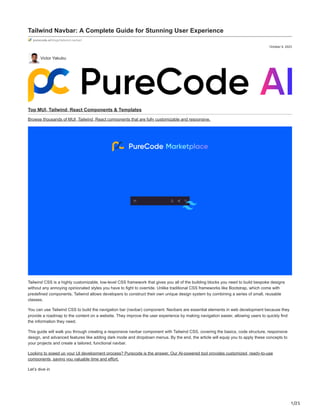
  • 1. 1/25 October 9, 2023 Tailwind Navbar: A Complete Guide for Stunning User Experience purecode.ai/blogs/tailwind-navbar/ Victor Yakubu Top MUI, Tailwind, React Components & Templates Browse thousands of MUI, Tailwind, React components that are fully customizable and responsive. Tailwind CSS is a highly customizable, low-level CSS framework that gives you all of the building blocks you need to build bespoke designs without any annoying opinionated styles you have to fight to override. Unlike traditional CSS frameworks like Bootstrap, which come with predefined components, Tailwind allows developers to construct their own unique design system by combining a series of small, reusable classes. You can use Tailwind CSS to build the navigation bar (navbar) component. Navbars are essential elements in web development because they provide a roadmap to the content on a website. They improve the user experience by making navigation easier, allowing users to quickly find the information they need. This guide will walk you through creating a responsive navbar component with Tailwind CSS, covering the basics, code structure, responsive design, and advanced features like adding dark mode and dropdown menus. By the end, the article will equip you to apply these concepts to your projects and create a tailored, functional navbar. Looking to speed up your UI development process? Purecode is the answer. Our AI-powered tool provides customized, ready-to-use components, saving you valuable time and effort. Let’s dive in
  • 2. 2/25 How do you make a Navigation bar using Tailwind CSS? Creating a navigation bar with Tailwind CSS involves several steps, including setting up a Tailwind CSS project, creating a basic navbar, and adding a dropdown menu. Setting up a Tailwind CSS project Before you can start building your navbar, you need to set up a Tailwind CSS project. This involves installing Tailwind CSS into your project and configuring your template paths. You can install Tailwind CSS using a package manager such as npm or yarn. Step 1: Create a folder and open it using your code editor. Step 2: Initialize NPM in that folder. npm init -y and, Step 3: Install Tailwind CSS and create a tailwind.config.js file using the command below. npm install -D tailwindcss npx tailwindcss init In the tailwind.config.js add the paths to all of your template files. /** @type {import('tailwindcss').Config} */ module.exports = { content: ["./src/**/*.{html,js}"], theme: { extend: {}, }, plugins: [], } In your project folder, create a new folder called src. Then, in the src folder, create a new file called input.css for your main CSS, and add the @tailwind directives for each of Tailwind’s layers to your main CSS file . @tailwind base; @tailwind components; @tailwind utilities; Start the Tailwind CLI build process by running the command below npx tailwindcss -i ./src/input.css -o ./dist/output.css --watch
  • 3. 3/25 Proceed to create an index.html file inside the src folder. Add your compiled CSS file (In the dist folder) to the <head> and start using Tailwind’s utility classes to style your content <!doctype html> <html> <head> <meta charset="UTF-8"> <meta name="viewport" content="width=device-width, initial-scale=1.0"> <link href="../dist/output.css" rel="stylesheet"> </head> <body> <h1 class="text-3xl font-bold underline"> Hello world! </h1> </body> </html> With this, you should have your Tailwind setup and you can proceed to write your code. Creating a simple navbar with Tailwind CSS In creating a navbar, it is best practice to use the nav element, after which you can populate it with the necessary items. Here is a simple navbar with some menu items: <nav class="flex justify-start"> <div class="hidden md:flex items-center space-x-1"> <a href="" class="py-4 px-2 text-green-500 border-b-4 border-green-500 font-semibold ">Home</a> <a href="" class="py-4 px-2 text-gray-500 font-semibold hover:text-green-500 transition duration-300">Services</a> <a href="" class="py-4 px-2 text-gray-500 font-semibold hover:text-green-500 transition duration-300">About</a> <a href="" class="py-4 px-2 text-gray-500 font-semibold hover:text-green-500 transition duration-300">Contact Us</a> </div> </nav> In this code, the parent nav bar element has a class “flex justify-start“. The flex class makes the navigation bar a flex container, allowing the navbar to display its children in a row. The justify-start class aligns the children (in this case, the navigation links) to the start of the flex container, pushing them to the left. For the div element, a class of “hidden md:flex items-center space-x-1” was used, these classes style the wrapping <div> as follows: hidden: This class hides the <div> by default, making it invisible on screens smaller than the medium (md) breakpoint. md:flex: This class makes the <div> visible (displays it as a flex container) on screens equal to or larger than the medium (md) breakpoint. items-center: This class vertically centers the content inside the <div>, ensuring that the navigation links are vertically aligned. space-x-1: This class adds horizontal spacing of 0.25rem (1/4th of the default spacing) between the child elements (navigation links). For the anchor elements representing the navigation links, the class=”py-4 px-2 text-green-500 border-b-4 border-green-500 font- semibold” was used. These are Tailwind CSS classes applied to each navigation link. They style the links as follows: py-4: Adds vertical padding of 1rem (4 times the default spacing). px-2: Adds horizontal padding of 0.5rem (2 times the default spacing). text-green-500: Sets the text color to a shade of green (#10B981). border-b-4 border-green-500: Adds a 4px thick green (#10B981) bottom border to the link, giving it an underline effect. font-semibold: Makes the text bold (semibold). This will create a simple navbar and it should look like this
  • 6. 6/25 How to add a dropdown menu in your Navigation bar To create a responsive navigation bar with a dropdown menu in Tailwind CSS, you need to follow a few steps involving HTML, Tailwind CSS, and JavaScript. Let’s break down the process. Step 1: Create the HTML Structure Here’s a simple structure for a navigation bar with a dropdown button <nav class="bg-white shadow-lg"> <div class="max-w-6xl mx-auto px-4"> <div class="flex justify-between"> <div class="hidden md:flex items-center space-x-1"> <a href="" class="py-4 px-2 text-green-500 border-b-4 border-green-500 font-semibold ">Home</a> <a href="" class="py-4 px-2 text-gray-500 font-semibold hover:text-green-500 transition duration-300">Services</a> <a href="" class="py-4 px-2 text-gray-500 font-semibold hover:text-green-500 transition duration-300">About</a> <div class="relative text-left dropdown"> <button class="py-4 px-2 text-gray-500 font-semibold hover:text-green-500 transition duration-300"> Contact Us </button> <ul class="hidden dropdown-menu absolute right-0 mt-2 w-48 bg-gray-800 rounded-md overflow-hidden z- 10"> <li href="#" class="block px-4 py-2 text-sm text-gray-200 hover:bg-gray-700">Link 1</li> <li href="#" class="block px-4 py-2 text-sm text-gray-200 hover:bg-gray-700">Link 2</li> <li href="#" class="block px-4 py-2 text-sm text-gray-200 hover:bg-gray-700">Link 3</li> </ul> </div> </div> </div> </div> </nav> In this example, we have a navigation bar with three links: Home, About, and Contact. The dropdown button is labeled “Dropdown” and has three links in its dropdown menu. Step 2: Add JavaScript for Dropdown Toggle <style> .dropdown:focus-within .dropdown-menu { /* @apply block; */ display: block; } </style In the code above, when the element with the class dropdown-menu is clicked or focused on, it will set the display property of the selected “.dropdown-menu” element to “block.” When an element’s display property is set to “block,” it means that the element is rendered as a block- level element, taking up the full width of its parent container and stacking vertically. This makes the dropdown menu visible and takes up space in the layout.
  • 7. 7/25 code navbar with dropdown (inline block format)
  • 9. 9/25 Aligning your Navbar content In Tailwind CSS, you can use the justify-content property to align the content of your navbar. This property defines how the browser distributes space between and around content items along the main axis of a flex container, and it’s very useful for aligning navbar items. How do you align the navbar to the center in Tailwind? To center the items in your navbar, you can use the justify-center class. Here is an example: <div class="flex justify-center"> <div class="hidden md:flex items-center space-x-1"> <a href="" class="py-4 px-2 text-green-500 border-b-4 border-green-500 font-semibold ">Home</a> <a href="" class="py-4 px-2 text-gray-500 font-semibold hover:text-green-500 transition duration-300">Services</a> <a href="" class="py-4 px-2 text-gray-500 font-semibold hover:text-green-500 transition duration-300">About</a> <a href="" class="py-4 px-2 text-gray-500 font-semibold hover:text-green-500 transition duration-300">Contact Us</a> </div> </div>
  • 10. 10/25
  • 11. 11/25
  • 12. 12/25 In this example, the justify-center class is used to center the navbar items. The flex class is used to set the display property of the navbar to flex How do you align the navbar to the right in Tailwind? To align the items in your navbar to the right, you can use the justify-end class. Here is an example: <div class="flex justify-end"> <div class="hidden md:flex items-center space-x-1"> <a href="" class="py-4 px-2 text-green-500 border-b-4 border-green-500 font-semibold ">Home</a> <a href="" class="py-4 px-2 text-gray-500 font-semibold hover:text-green-500 transition duration-300">Services</a> <a href="" class="py-4 px-2 text-gray-500 font-semibold hover:text-green-500 transition duration-300">About</a> <a href="" class="py-4 px-2 text-gray-500 font-semibold hover:text-green-500 transition duration-300">Contact Us</a> </div> </div>
  • 13. 13/25 Align the navbar to the right in Tailwind
  • 14. 14/25
  • 15. 15/25 In this example, the justify-end class is used to align the navbar items to the right. There are other ways to justify your content using Tailwind CSS, you can see other options from the documentation. Customizing your Tailwind CSS Navbar When creating a navigation bar with Tailwind CSS, there are multiple ways you can customize it to fit the needs of your website. Two popular customizations include adding images (such as logos or icons) and adding a search input element for user convenience. How to use images (SVG, Icons, etc.) in your NavBar Images can be added to your navbar to enhance its visual appeal and functionality. For example, you can add a company logo to reinforce your brand or use icons to represent different sections of your website. To add an image, you can use the img HTML tag and apply Tailwind CSS classes to adjust its appearance. Here’s an example of how to add a logo to your navbar <div> <a href="#" class="flex items-center py-4 px-2"> <img src="./logo.webp" alt="Logo" class="h-8 w-8 mr-2"> <span class="font-semibold text-gray-500 text-lg">PureCode</span> </a> </div> In this example, an img tag is used to insert the logo image, and Tailwind CSS classes are used to adjust the size (h-8 w-8) and margin (mr-2) of the image. The flex items-center classes are used to center the logo and text vertically within their container.
  • 17. 17/25
  • 18. 18/25 How to add a search input to your Navbar A search input can be a useful addition to your navbar, allowing users to quickly find the information they need. To add a search input, you can use the input HTML tag and apply Tailwind CSS classes to style it. Here’s an example of how to add a search input to your navbar <div class="mt-3"> <input placeholder="Search" class="appearance-none rounded-r rounded-l sm:rounded-l-none border border-gray-400 border-b block pl-8 pr-6 py-2 w-full bg-white text-sm placeholder-gray-400 text-gray-700 focus:bg-white focus:placeholder-gray-600 focus:text-gray-700 focus:outline-none" /> </div> In this example, an input tag is used to create the search input, and Tailwind CSS classes are used to style it. The placeholder attribute is used to display a hint to the user about what they should type in the input. These examples illustrate some of the ways you can customize your navigation bar using Tailwind CSS. By combining HTML and Tailwind CSS, you can create a navbar that is visually appealing, functional, and tailored to your specific needs.
  • 20. 20/25
  • 21. 21/25 How to Create a Responsive Navigation Bar using Tailwind CSS dropdown element with hamburger menu Utilizing breakpoints and responsive classes in tailwind CSS The code utilizes Tailwind CSS classes to create a responsive navigation bar. It uses responsive classes like lg:px-0, lg:hidden, and lg:text- white to define different styles and behaviors based on screen size breakpoints.
  • 22. 22/25 These breakpoints are defined by the “lg” prefix, which targets screens larger than the “lg” breakpoint (usually desktop screens). For example, lg:px-0 sets horizontal padding to 0 for screens larger than the “lg” breakpoint. Adding a hamburger icon for mobile with Tailwind CSS To create a hamburger icon for mobile navigation, the code uses an HTML input element with the class hidden. This input serves as a checkbox input with the id “hamburger.” Additionally, a label element is used with the class peer-checked:hamburger, which is conditionally applied when the “hamburger” input is checked (i.e. when the mobile menu is active). Inside the label, two horizontal bars are created using w-6 and h-0.5 classes with transitions. These bars form the hamburger icon when displayed on smaller screens (hidden on larger screens). Toggling the menu with Tailwind CSS The code toggles the visibility of the mobile menu by changing the transform property using the –translate-y-full and peer- checked:translate-y-0 classes. When the “hamburger” input is checked (i.e., the mobile menu is active), the mobile menu slides down into view. For larger screens, the menu remains static and is not affected by the translation transformation. The navigation links inside the menu are styled differently for different screen sizes, with text-black for smaller screens and text-white for larger screens, providing a smooth transition when the menu is toggled. Here is the code for this below: <div class="bg-blue-500"> <div class="flex justify-between items-center p-6 px-6 lg:px-0 container mx-auto"> <div class="text-lg font-bold uppercase text-white">PureCode</div> <!-- Hamburger --> <input class="peer hidden" type="checkbox" name="hamburger" id="hamburger" /> <label class="peer-checked:hamburger block relative cursor-pointer lg:hidden border-2 border-gray-300 peer-checked:border-2 peer-checked:border-white p-3 rounded-md transition-all" for="hamburger"> <div class="m-auto w-6 h-0.5 rounded bg-gray-300 transition-all duration-300"></div> <div class="m-auto mt-2 w-6 h-0.5 rounded bg-gray-300 transition-all duration-300"></div> </label> <!-- Menu Navbar --> <div class="-translate-y-full peer-checked:translate-y-0 lg:translate-y-0 inset-0 fixed lg:static pt-20 lg:pt-0 bg-white lg:bg- transparent -z-10 lg:z-10 lg:h-auto lg:w-auto transition-all duration-300 ease-in-out"> <div class="bg-white shadow-md lg:bg-transparent lg:shadow-none py-10 lg:py-0 flex flex-col lg:items-center lg:flex-row px-6 space-y-4 lg:space-y-0 lg:space-x-12"> <a class="text-black lg:text-white hover:text-gray-300 transition-all" href="">Home</a> <a class="text-black lg:text-white hover:text-gray-300 transition-all" href="">Services</a> <a class="text-black lg:text-white hover:text-gray-300 transition-all" href="">About</a> <a class="text-black lg:text-white hover:text-gray-300 transition-all" href="">Contact Us</a> </div> </div> </div> </div> Implementing Dark and Light Mode in your Navigation bar using Tailwind CSS
  • 23. 23/25 navbar component with toggle mode Tailwind CSS has built-in support for dark mode, which you can enable by adding the dark class to the root element of your application, or by using media queries. Here’s how you can implement dark mode in the provided code. Step 1: Enable Dark Mode in Tailwind CSS Configuration First, you need to enable dark mode in your Tailwind CSS configuration file (tailwind.config.js). This is done by setting the darkMode option to ‘class‘ or ‘media‘, depending on whether you want to use the dark class or media queries to control dark mode: module.exports = { darkMode: 'class', // or 'media' // ... }
  • 24. 24/25 Step 2: Define Dark Mode Classes Next, you can add dark mode classes to your HTML. In Tailwind CSS, dark mode classes are prefixed with dark:. These classes will only take effect when the dark class is present on a parent element, or when the prefers-color-scheme media feature matches dark (if you’re using media queries to control dark mode). Step 3: Enable Dark Mode To enable dark mode, you’ll need to add a class to the HTML body element that indicates the user’s preference. You can use JavaScript to toggle this class based on user input or preferences. In this case, let’s use a simple button to toggle dark mode on and off. Here’s how you can implement dark mode in the provided code: <div class="bg-blue-500 dark:bg-gray-900"> <div class="text-lg font-bold uppercase text-white dark:text-gray 300">PureCode</div> <!-- ... rest of the code ... --> <!-- Dark Mode Toggle Button --> <button id="darkModeToggle" class="text-white dark:text-gray-300 justify-end"> Toggle Dark Mode </button> </div> </div> <script> const darkModeToggle = document.getElementById('darkModeToggle'); const body = document.body; darkModeToggle.addEventListener('click', () => { // Toggle the 'dark' class on the body element body.classList.toggle('dark'); }); </script> In this code: The parent <div> element has classes bg-blue-500 and dark:bg-gray-900, which define the background color for light and dark modes, respectively. A “Toggle Dark Mode” button is added, and a JavaScript event listener is used to toggle the dark class on the body element when the button is clicked. Now, when the user clicks the “Toggle Dark Mode” button, the background and text color of the page will switch between the light and dark mode styles defined in the classes. You can extend this approach to customize other elements in your navigation bar for dark mode as needed. Wrapping Up with Tailwind Navbar Throughout this guide, we’ve explored various aspects of creating and customizing a navigation bar using Tailwind CSS. We’ve seen how to structure the HTML for a basic navigation bar and how to add additional features like a dropdown menu. Additionally, you know how to make the navbar responsive to different screen sizes now. We’ve also discussed how to add images, such as logos or icons, to the navbar and how to include a search input for user convenience. Finally, we learned how to implement dark mode using Tailwind CSS, which can enhance the user experience by providing a visually comfortable interface in low-light conditions. Moreover, we’ve seen how to use Tailwind’s responsive classes and breakpoints to adjust the layout and visibility of the navigation bar elements, and how to add a hamburger icon for mobile layouts. We’ve also touched on how to toggle the visibility of the navigation menu using JavaScript, which is a common requirement for mobile-friendly designs. In conclusion, Tailwind CSS offers a powerful and flexible approach to building navigation bars. By leveraging its utility-first classes and responsive design features, you can create attractive and functional navigation bars that work well across different devices and screen sizes. With some creativity and experimentation, you can use Tailwind CSS to design navigation bars that perfectly suit your website’s needs and enhance your users’ experience. To learn more about Tailwind Navbar, you can go through these helpful resources We’re launching soon!
  • 25. 25/25 Save time during development by generating thousands of responsive custom-styled HTML, CSS, Tailwind, and JS components with our AI assistant. These components can also be customized to fit your brand identity. You can Sign Up now! Victor Yakubu More