Downloaded 107 times


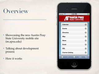

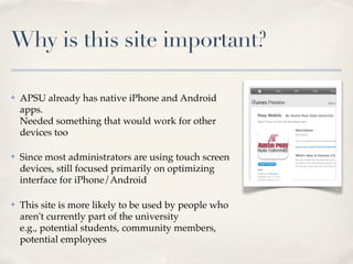
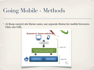
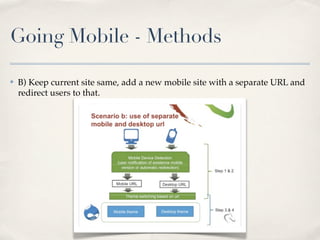
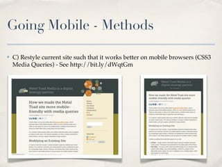
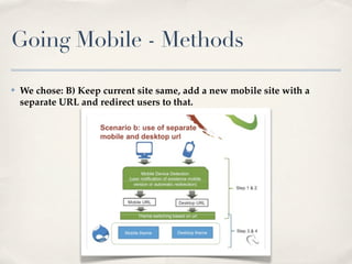
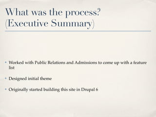
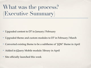
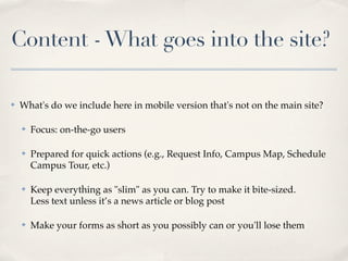

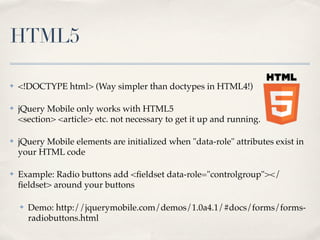
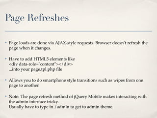
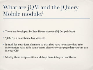
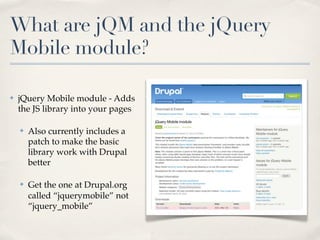
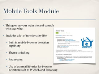
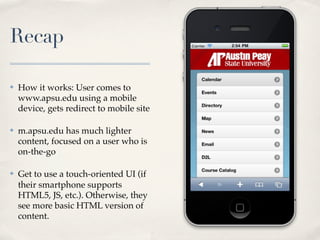
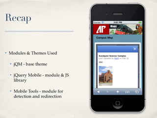
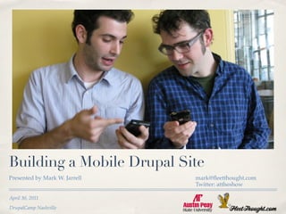

Mark Jarrell presented on building a mobile Drupal site for Austin Peay State University. He discussed evaluating different methods for developing a mobile site, choosing to use a separate mobile URL and redirect users. The process involved designing a theme, upgrading content to Drupal 7, and adding the jQuery Mobile module to optimize the interface for touchscreens. Key elements were lightweight content focused on quick actions, and utilizing HTML5 and jQuery Mobile features to improve the mobile experience.


