Download as PDF, PPTX
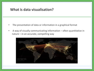
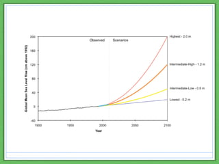
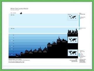
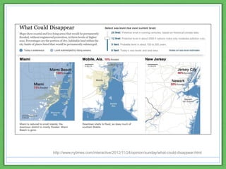
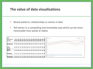
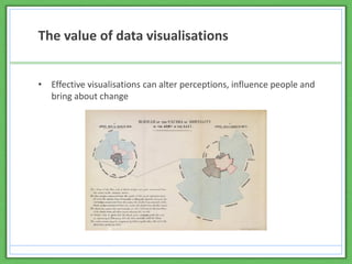

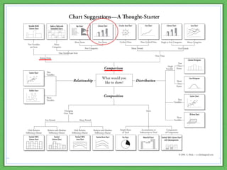
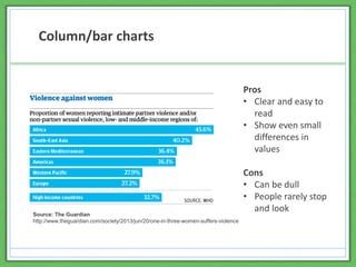
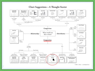
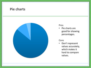
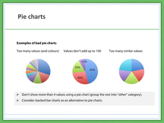
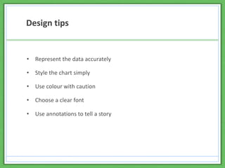
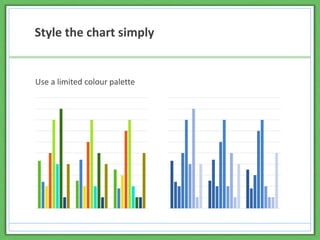
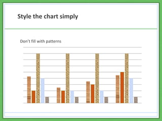
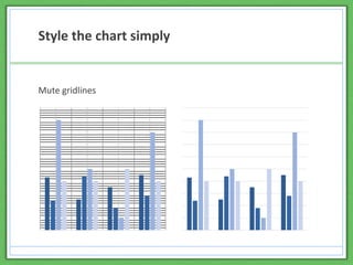
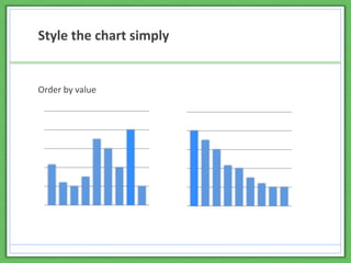
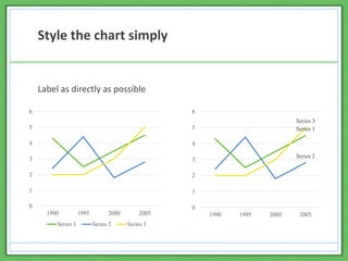
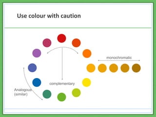
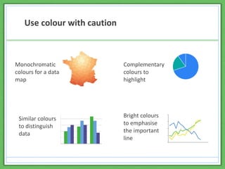
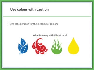
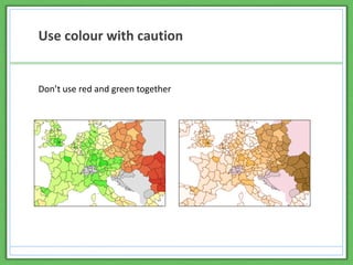
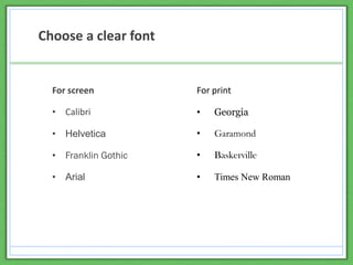
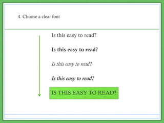
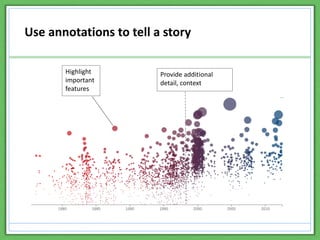


1) The document discusses data visualization and provides tips for effective data visualization design. It introduces different types of charts like column charts, pie charts, bubble charts and their pros and cons. 2) Design tips include representing data accurately, using simple styles, employing color cautiously, choosing clear fonts, and using annotations to tell a story. 3) Online visualization tools like Infogram are also presented. The resource aims to demonstrate the value of data visualization for research communication and uptake.