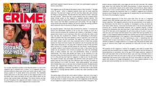
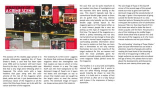
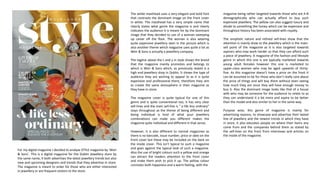
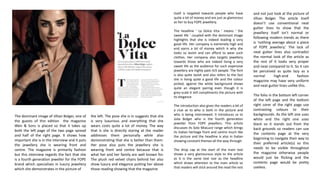
The document analyzes and summarizes two magazines - Crime Monthly, a true crime magazine, and Weir & Sons STYLE magazine, a luxury fashion magazine. It discusses the target audiences, purposes, and design elements of each magazine cover and selected inside pages. While the magazines have different genres and styles, they both adhere to some conventions of their types. Crime Monthly has a busy layout typical of children's magazines, while Weir & Sons STYLE magazine presents an elegant, refined style for a wealthy audience. Reading digital magazines can be less accessible and tiresome compared to print.
Students, digital devices and success - Andreas Schleicher - 27 May 2024..pptxEduSkills OECD
Andreas Schleicher presents at the OECD webinar ‘Digital devices in schools: detrimental distraction or secret to success?’ on 27 May 2024. The presentation was based on findings from PISA 2022 results and the webinar helped launch the PISA in Focus ‘Managing screen time: How to protect and equip students against distraction’ https://www.oecd-ilibrary.org/education/managing-screen-time_7c225af4-en and the OECD Education Policy Perspective ‘Students, digital devices and success’ can be found here - https://oe.cd/il/5yV
Ethnobotany and Ethnopharmacology:
Ethnobotany in herbal drug evaluation,
Impact of Ethnobotany in traditional medicine,
New development in herbals,
Bio-prospecting tools for drug discovery,
Role of Ethnopharmacology in drug evaluation,
Reverse Pharmacology.
Welcome to TechSoup New Member Orientation and Q&A (May 2024).pdfTechSoup
In this webinar you will learn how your organization can access TechSoup's wide variety of product discount and donation programs. From hardware to software, we'll give you a tour of the tools available to help your nonprofit with productivity, collaboration, financial management, donor tracking, security, and more.
The French Revolution, which began in 1789, was a period of radical social and political upheaval in France. It marked the decline of absolute monarchies, the rise of secular and democratic republics, and the eventual rise of Napoleon Bonaparte. This revolutionary period is crucial in understanding the transition from feudalism to modernity in Europe.
For more information, visit-www.vavaclasses.com
This is a presentation by Dada Robert in a Your Skill Boost masterclass organised by the Excellence Foundation for South Sudan (EFSS) on Saturday, the 25th and Sunday, the 26th of May 2024.
He discussed the concept of quality improvement, emphasizing its applicability to various aspects of life, including personal, project, and program improvements. He defined quality as doing the right thing at the right time in the right way to achieve the best possible results and discussed the concept of the "gap" between what we know and what we do, and how this gap represents the areas we need to improve. He explained the scientific approach to quality improvement, which involves systematic performance analysis, testing and learning, and implementing change ideas. He also highlighted the importance of client focus and a team approach to quality improvement.
The Roman Empire A Historical Colossus.pdfkaushalkr1407
The Roman Empire, a vast and enduring power, stands as one of history's most remarkable civilizations, leaving an indelible imprint on the world. It emerged from the Roman Republic, transitioning into an imperial powerhouse under the leadership of Augustus Caesar in 27 BCE. This transformation marked the beginning of an era defined by unprecedented territorial expansion, architectural marvels, and profound cultural influence.
The empire's roots lie in the city of Rome, founded, according to legend, by Romulus in 753 BCE. Over centuries, Rome evolved from a small settlement to a formidable republic, characterized by a complex political system with elected officials and checks on power. However, internal strife, class conflicts, and military ambitions paved the way for the end of the Republic. Julius Caesar’s dictatorship and subsequent assassination in 44 BCE created a power vacuum, leading to a civil war. Octavian, later Augustus, emerged victorious, heralding the Roman Empire’s birth.
Under Augustus, the empire experienced the Pax Romana, a 200-year period of relative peace and stability. Augustus reformed the military, established efficient administrative systems, and initiated grand construction projects. The empire's borders expanded, encompassing territories from Britain to Egypt and from Spain to the Euphrates. Roman legions, renowned for their discipline and engineering prowess, secured and maintained these vast territories, building roads, fortifications, and cities that facilitated control and integration.
The Roman Empire’s society was hierarchical, with a rigid class system. At the top were the patricians, wealthy elites who held significant political power. Below them were the plebeians, free citizens with limited political influence, and the vast numbers of slaves who formed the backbone of the economy. The family unit was central, governed by the paterfamilias, the male head who held absolute authority.
Culturally, the Romans were eclectic, absorbing and adapting elements from the civilizations they encountered, particularly the Greeks. Roman art, literature, and philosophy reflected this synthesis, creating a rich cultural tapestry. Latin, the Roman language, became the lingua franca of the Western world, influencing numerous modern languages.
Roman architecture and engineering achievements were monumental. They perfected the arch, vault, and dome, constructing enduring structures like the Colosseum, Pantheon, and aqueducts. These engineering marvels not only showcased Roman ingenuity but also served practical purposes, from public entertainment to water supply.
Palestine last event orientationfvgnh .pptxRaedMohamed3
An EFL lesson about the current events in Palestine. It is intended to be for intermediate students who wish to increase their listening skills through a short lesson in power point.
Read| The latest issue of The Challenger is here! We are thrilled to announce that our school paper has qualified for the NATIONAL SCHOOLS PRESS CONFERENCE (NSPC) 2024. Thank you for your unwavering support and trust. Dive into the stories that made us stand out!
Operation “Blue Star” is the only event in the history of Independent India where the state went into war with its own people. Even after about 40 years it is not clear if it was culmination of states anger over people of the region, a political game of power or start of dictatorial chapter in the democratic setup.
The people of Punjab felt alienated from main stream due to denial of their just demands during a long democratic struggle since independence. As it happen all over the word, it led to militant struggle with great loss of lives of military, police and civilian personnel. Killing of Indira Gandhi and massacre of innocent Sikhs in Delhi and other India cities was also associated with this movement.
1. specifically targeted towards women as it looks into psychological analysis of
famous serial killers.
The magazine also as the plug at the bottom states it also includes a “ 16-page
crime TV guide ” which is targeted towards those who do enjoy watching
television. The dominant image is of Fred and Rose West who were famous
for killing 12 young women. The fact that the main sell-line is that ” Rose was
the real monster ” shows that she is more powerful than her husband which
shows female power as the magazine is targeted towards women. The
dominant image also shows both of them looking very guilty which represents
their crimes and Fred West’s eventual guilt and suicide. The sub image of
Louise Porton who killed her children, the picture shows her looking confident
which shows her lack of remorse for killing her daughters.
By using the caption “ The escort who murdered her children “ it removes the
human and identifiable qualities of her as she isn’t classed as much of a
human anymore because she murdered two children in cold blood. It makes
people want to pick it up to read about who she is and what her name is and
how and why she murdered her children. The withholding of information
makes it evident that they want people to read on and pick it up to find out
what awful crimes she has committed. The tagline ‘ the darkest crimes and
evil minds’ makes it seem a lot more important and as if they have actually
looked into those evil mind. It gives the audience a bit of inclusivity that they
might enjoy being part of. The plug that is layered on top of Fred and Rose
West’s picture is in a bright red that stands out, the phrase ‘ world exclusive’
in capitals makes it more obvious and stand out more. It also shows that the
reader can be involved in the minority of people who have the knowledge
about it which employs the uses and gratifications theory of personal
relationships. This means that people will read it to be involved in on the
discussion about the world exclusive which a lot of people want to do in order
to fit in they will buy and read the magazine in hope to join the discussion.
The skyline includes two sub-images and sell-lines show pull quotes of the
articles they are from which will most definitely catch the eyes of readers or
those looking at it on a shelf. The quote ‘ black widow gangster’ was actually
what initially drew me in as she was seen as feared and quite threatening also
the fact she ‘ slapped Myra Hindley in the face’ could be seen that she was
quite tough, slapping a notorious murderer in the face but it also shows
that she is a strong woman which is what the main premise of the
magazine is.
The yellow plug in the top left corner about it being a ‘ new true crime mag’ it
shows a bit of an informal tone as ‘mag’ is quite slang and short for magazine.
It will also draw in readers of previous true crime magazines as the following
of such magazines is quite strong and it has an avid fan base in the genre. The
bottom banner includes both a sub image and sell line and a barcode. The subtext
talks about the truth behind the Netflix documentary, it shows exclusivity since
Netflix is a subscription based service which shows documentaries about subjects
such as this it is for a certain audience. With the magazine cover itself being quite
cluttered it may give the impression that it is a children's magazine but it provides
escapism and a change from the average day for people who can put themselves in
the shoes of an investigative reporter.
The cluttered appearance of this front cover hails from the fact it is targeted
towards those with possibly quite busy lives as a form of escapism to a world of
being a detective. This magazine primarily is for the entertainment of its readers to
put themselves into the shoes of a reporter or investigator as they can learn the
truth about rather famous crimes that are known both in the UK and world-wide. It
primarily has a female dominated audience and is targeted towards a female
audience for housewives who lead busy lives or have children to look after for their
time off to read each article separately. As each story exists on its own it is easy to
read one case, put it down and think about it for a while then pick up another once
ready. It is also targeted towards working class mothers who are particularly from D
to B grade demographically as the magazine is fairly affordable and in a reasonable
genre that a lot of people may find interesting as crime is something that we
normally want to learn more about as humans. This magazine uses natural human
interest to appeal to a larger audience in a compact way that would be easier than
having to research every single case separately for those who do have very little
time.
The purpose of this magazine is mainly for strugglers, who want to escape their
possibly dull and mundane lives to explore interesting themes and live fantasies of
being detectives or journalists. Due to the age of the target audience, majority of
them will have been alive at the time of these cases and may remember them, it
will also take them back into their past so they can sort of forget about whatever is
happening in the present just to make their life much more easier to cope with. The
layout also alludes to its target demographic as if it was targeted towards A or B
groups who would probably use a lot more of a simple layout.
For my task I decided to analyse Crime Monthly which is a true crime
magazine that is released once a month. It is a magazine meant to
educate audiences about past crimes and recent ones as well, it also
shows a guide on TV shows about crime and books. The masthead
stands alone and is in the main colours of the magazine which is red
and white. Red, white and black are the main colours which are all
colours that connote death and danger. The colour scheme can also
be seen throughout the magazine and makes it stand out on a shelf.
Crime Monthly is a true crime magazine that is known to be
2. The purpose of this double page spread is to
provide information regarding the of Tupac
Shakur’s death, a case that has been open
since 1996 and his murderer still hasn’t been
found to this day. It is an extremely public case
that had a very large press following when it
happened. The article starts with a large
headline that goes along with the color
scheme of the rest of the magazine which
black, white and red. It just demonstrates the
continuous nature of the magazine as all the
colors that they have chosen are to do with the
nature and them of the magazine.
The ’anatomy of a crime scene ‘ suggests
the theme that continues throughout the
magazine about the investigative role
that readers can take on which is Crime
Monthly’s mission in a way. The page
itself uses the main background as the
dominant image of Tupac’s car it layers
red boxes and sub-images on top to
ensure that readers eyes are caught by
the bright colors to read the various
points. The dominant image of Tupac's
car shows various points that relate to
the case that can be quite important to
put readers into shoes of investigators and
the reporters who were looking at the
case. This doesn’t typically look like a
conventional double page spread as there
are no gutter lines. This may interest
people who only typically see the normal
double page spread layout as the
magazine genre isn't that typical either so
it could interest people like e who are
picking up this type of magazine for the
first time. The layout of the magazine as a
whole is pretty interesting and not very
normal which can be strange to those who
are used to normal layout magazines .The
sub-heading provides information about
the case to readers so that they can learn
abut it themselves to not only interest
themselves but since the majority of the
target audience for this are women and
since the most profitable genre for
women is actually mystery and detective a
crime magazine makes perfect sense for
the magazine.
The headline is in a very bold and brightly
colored font it suggests that it wants to
stick out while flicking through people
would instantly be drawn to read this
article. It is bold and in a matter of fact
kind of font as after all it is fully factual
and it gives it the impression of being a
statement.
The sub-image of Tupac in the top left
corner of the second page of the spread
stands out most as goes over both the
dominant image and the outside border of
the page. It gives it the impression of going
outside the border because it is a very
important picture. Showing the victim of the
crime gives the audience a bit of clarification
because if like me, they have heard of him
but never seen what he looks like then it
clears up quite a lot for them. The picture is
also of him holding up his middle finger,
which shows what kind of person he is and
the nature of the magazine as it is for more
mature audiences and not just children.
The sub-heading ‘ shooting of Tupac Shakur ‘
gives not just information but can draw in
attention, majority of people who will be
reading this have heard of the shooting at
the time of it happening in 1996 as the
target audience are women who are above
the age of thirty. This allows them to learn
about the developments and discoveries
found out over twenty-three years ago.
3. The white masthead uses a very elegant and bold font
that contrasts the dominant image on the front cover
in white. The masthead has a very simple name that
clearly states what genre the magazine is and clearly
indicates the audience it is meant for by the dominant
image that they decided to use of a woman sweeping
up caviar off the floor. The woman is also wearing
quite expensive jewellery seen in the picture which is
also another theme which magazine uses quite a lot as
Weir & Sons is actually a jewellery company.
The tagline above the t and y in style shows the brand
that the magazine mainly promotes and belongs to
which is Weir & Sons which, as previously stated is a
high end jewellery shop in Dublin. It shows the type of
audience they are wishing to appeal to as it is quite
expensive and professional there, therefore they aim
to create the same atmosphere in their magazine as
they have in-store.
The magazine cover is quite typical for one of this
genre and is quite conventional too, it has very clear
sell-lines and the main sell-line is “ a life less ordinary”
stays throughout as the theme of being different and
being individual is kind of what your jewellery
combinations can make you different makes the
magazine quite individual and different in that sense.
However, it is also different to normal magazines as
there is no barcode, issue number, price or date on the
front cover but these may be included on the back on
the inside cover. This isn’t typical to such a magazine
and goes against the typical look of such a magazine.
Also the use of bright colours such a yellow and orange
can attract the readers attention to the front cover
and make them wish to pick it up. The yellow colour
connotes both happiness and a warm feeling, with the
magazine being rather targeted towards those who are A-B
demographically who can actually afford to buy such
expensive jewellery. The yellow can also suggest luxury and
allude to something like honey which can be expensive and
throughout history has been associated with royalty.
The simplistic nature and refined sell-lines show that the
attention is mainly draw to the jewellery which is the main-
sell point of the magazine as it is also targeted towards
aspirers who may work harder so that they can afford such
a piece of jewellery. A magazine of the fashion and lifestyle
genre in which this one is are typically marketed towards
young adult females however this one is marketed to
upper-class women who may be aged upwards of thirty-
five. As this magazine doesn’t have a price on the front it
can be assumed to be for those who don’t really care about
the price of things and will buy them without even seeing
how much they are since they will have enough money to
buy it. Also the dominant image looks like that of a house
wife who may be someone for the audience to relate to as
they can understand it a bit more and aspire to be better
than the model and also similar to her in the same way.
Purpose wise, this genre of magazine is mainly for
advertising reasons, to showcase and advertise their lasted
line of jewellery and the newest trends in which they have
in store, it also educates people on where their items any
come from and the companies behind them as stated by
the sell-lines on the front from interviews and articles on
the inside of the magazine.
For my digital magazine I decided to analyse STYLE magazine by ‘Weir
& Sons’. This is a digital magazine for the Dublin Jewellery store by
the same name, it both advertises the latest jewellery trends but also
new and upcoming designers and trends that they advertise in store.
The magazine is meant to order for those who are either interested
in jewellery or are frequent visitors to the store.
4. The dominant image of Jillian Bolger, one of
the guests of this edition the magazine
Weir & Sons is placed so that it takes up
both the left page of the two page spread
and half of the right page. It shows how
important she is in the interview and it puts
the jewellery she is wearing front and
centre. The magazine is primarily fashion
but this interview regards the fact that she
is a fourth generation jeweller for the FOPE
brand which specialises in luxury jewellery
which she demonstrates in the picture of
the left. The pose she is in suggests that she
is very luxurious and everything that she
wears costs quite a lot of money. The way
that is she is directly staring at the reader
addresses them personally while also
demonstrating that she is better than them.
Her pose also puts the jewellery she is
wearing front and centre because that is
what her and her family are well known for.
The plush red velvet chairs behind her also
show luxury and elegance putting her above
those reading showing that the magazine
itself is targeted towards people who have
quite a lot of money and are just as glamorous
as her to buy FOPE jewellery.
The headline ‘ La Dolce Vita ‘ means ‘ the
sweet life ‘ coupled with the dominant image
highlights that she is indeed leading a very
good life. Her company is extremely high and
end earns a lot of money which is why she
looks so lavish and can afford to wear such
clothes. Her company also targets jewellery
towards those who are indeed living a very
sweet life as the audience for such expensive
jewellery are highly paid rich people. The font
is also quite lavish and also refers to the fact
she is living quite a good life and the colour
picked, against the white background shows
quite an elegant pairing even though it is
grey-scale it still compliments the picture with
its elegance.
The introduction also gives the readers a bit of
a clue as to who is both in the picture and
who is being interviewed. It introduces us to
Julia Bolger who is the fourth generation
jeweller from FOPE jewellers. This article
discusses its Solo MiaLuce range which brings
its Italian heritage front and centre much like
the picture and the headline is also in Italian
showing constant themes all the way through.
The drop cap at the start of the main text
shows a very glamourous style to the article
as it is the same text size as the headline
which draws attention to the main article so
that readers will stick around the read the rest
and not just look at the picture of
Jillian Bolger. The article itself
doesn’t use conventional neat
gutter lines to show that the
jewellery itself isn’t normal or
following modern trends as there
is ‘nothing average about a piece
of FOPE jewellery.’ The lack of
neat gutter lines also contradict
the normal look of the article as
the rest of it looks very proper
and neat compared to it. So it can
be perceived as quite lazy as a
normal high-end fashion
magazine may have very uniform
and neat gutter lines unlike this.
The folio in the bottom left corner
of the left page and the bottom
right corer of the right page use
contrasting colours to their
backgrounds. As the left one uses
white and the right one uses
black so it stands out from the
back grounds so readers can use
the contents page at the very
beginning to navigate their way to
their preferred article(s) so this
needs to be visible throughout
the magazine otherwise people
would just be flicking and the
contents page would be pretty
useless.
5. In the end after looking at both crime monthly and Weir & Sons STYLE magazine it shows that even though they are both of different genres, they both stick to some
conventional traits of their genres. For example, Weir & Sons STYLE magazine shows a very elegant and refined magazine for a wealthier audience as it is for those who visit the
jewellery store in Dublin in which it hails from. While Crime Monthly has quite a busy set up which is common to children's magazines not adult true crime, but it shows just
how full of information it is which can be extremely useful to show on a front cover. Crime Monthly uses very bold colour schemes but mostly just red, white and black because
those colours can relate back to old film noir.
A noticeable disadvantage for digital is both accessibility and reading them, online a lot of free-to-access digital magazines are either fan-made, not professional ones or are of
cost, even when having to pay for them, having to zoom in on each little bit of text can be extremely tiring and tedious for readers who may just opt to pick up a print copy
instead if it means they save time for the same quality and money. A lot of people also like having a hard copy in their hands, which you don’t get with digital, though some
places provide monthly subscriptions were you can get an unlimited amount of magazines free other offer monthly subscriptions for certain magazines which cost a lot more
than those websites which offer a range of magazines for a monthly subscription charge. Another disadvantage is that digital may be quite hard to access as you are required to
both have internet and internet, which some people don’t, elderly people like to go out and buy magazines as it gets them out the house which makes it more practical for
them. However it can also be helpful, for those who want to go paperless it is definitely the eco-friendly option and for those with children who may be too busy to make us a
magazine daily, having an online subscription means they can check it while they are out an about or when they have any free time.
A disadvantage for print is that for those who are quite busy and struggle to get out it is pretty much inaccessible for them as it may not be available online, meaning that if
someone does have children and leads quite a busy life they can’t catch up on their favourite magazine or elderly people who struggle to get out a lot. Also hard copies can get
lost and damaged quite easily so having a digital version can benefit those who do have busy lives with kids who may spill something on a newly bought magazine or when they
accidentally leave it on the bus. Another disadvantage is the fact that print isn’t very eco-friendly and with the rising crisis of de-forestation a lot of people are choosing to move
to paperless options too save the environment. However an advantage would be that it is very easy to access and that only a minority cannot get access to print, it can also be
cheaper for those buying it in the long run as they can choose which ones to buy as they might not want every week like an online subscription would give you.
Technical considerations also need to factor into this for magazine distribution as print will cost a lot more than updating a website weekly and both the cost of the materials,
machines and the staff to operate and distribute the magazines will be a lot more than digital as the materials, machines and those distributing it will not need to be employed,
just a group of people who staff the website and keep the servers running smoothly. Colours and paper sizes will also need to be considered as it can take up a lot more ink for
certain fonts or font colours on A4 or even A5 depending on what it is printed on as it may look different once transferred from print to digital.
Conclusion.