Download as PDF, PPTX


![<paper-input floatinglabel
label="Type only numbers... (floating)"
validate="^[0-9]*$"
error="Input is not a number!">
</paper-input>](https://image.slidesharecdn.com/io2014unlockthenexteraofuidesignwithpolymer-140628173200-phpapp01/75/Unlock-the-next-era-of-UI-design-with-Polymer-43-2048.jpg)


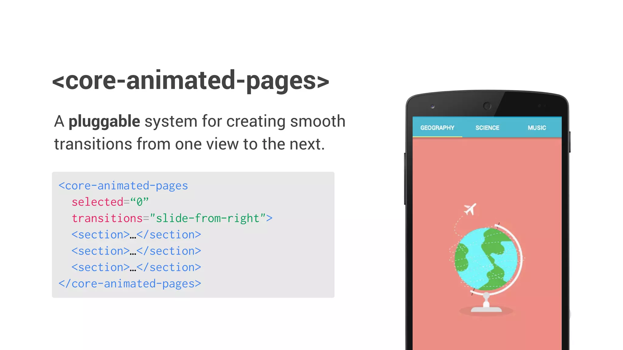
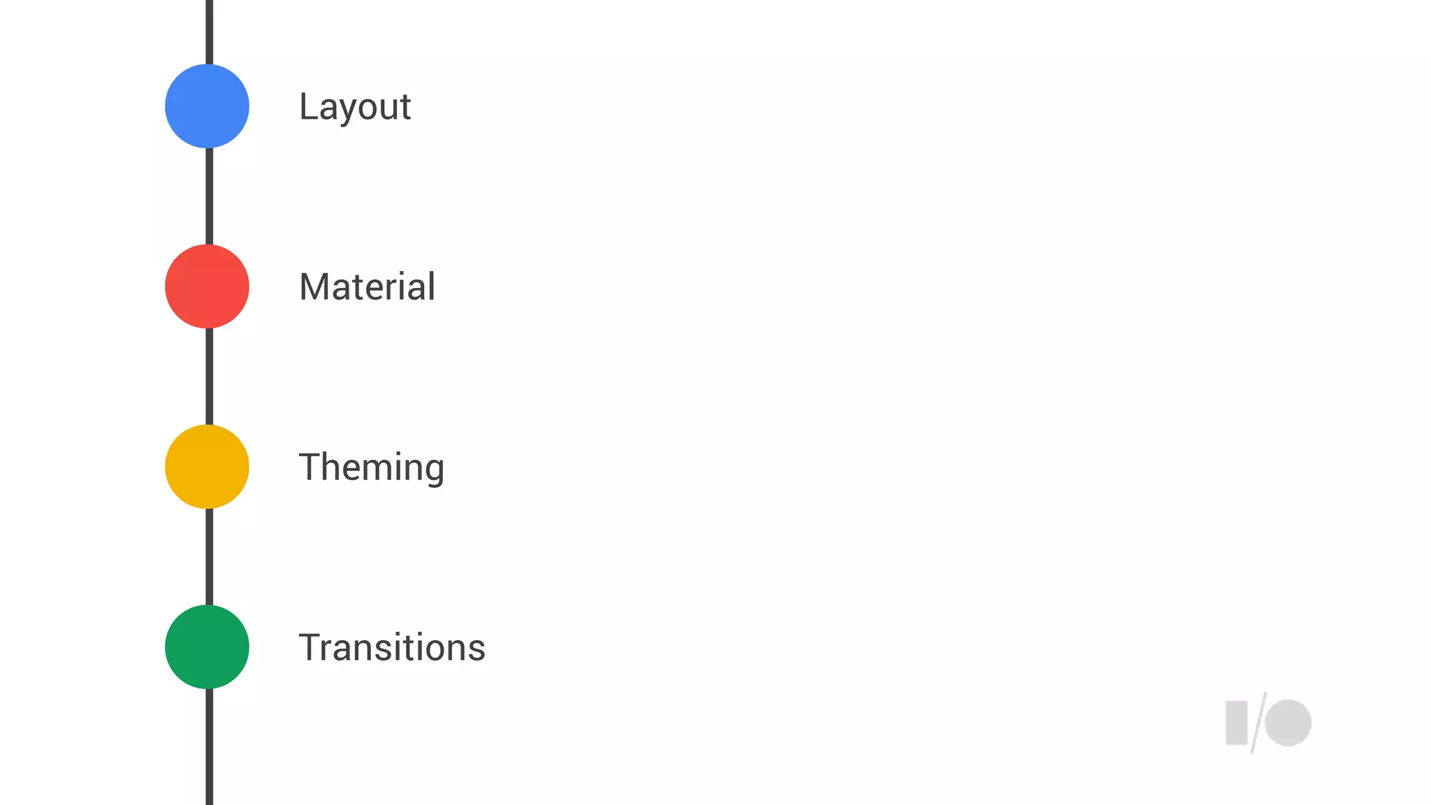
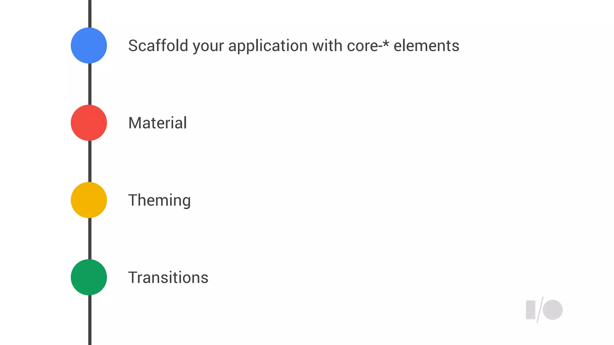


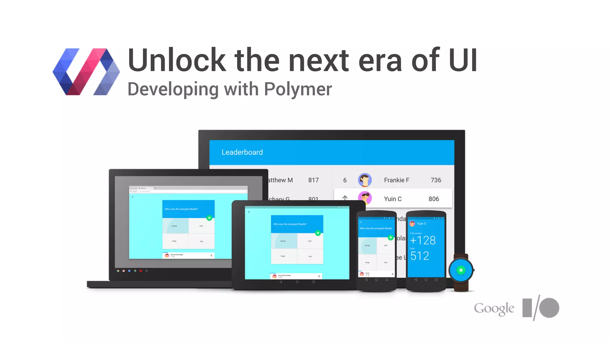
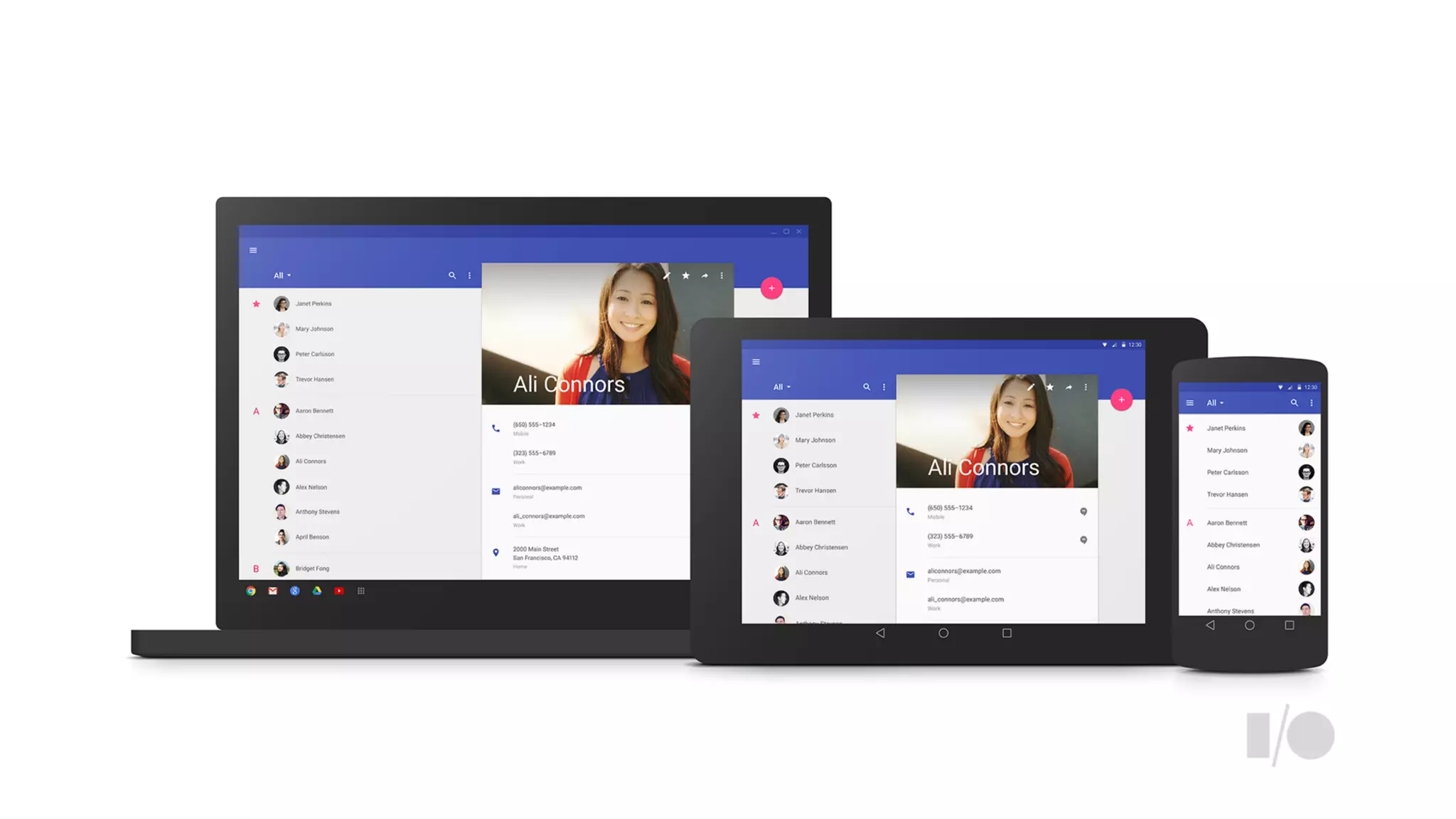
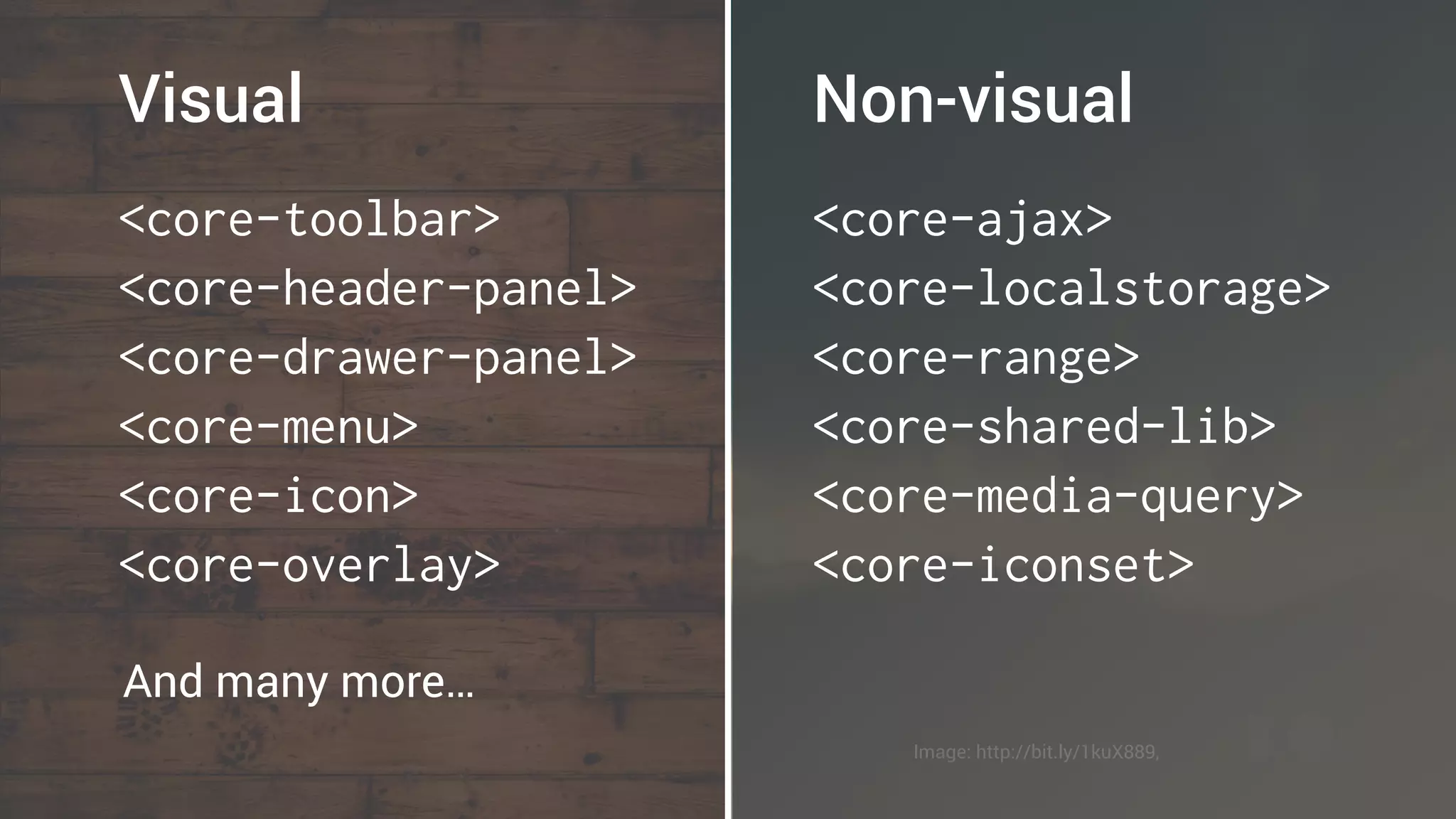
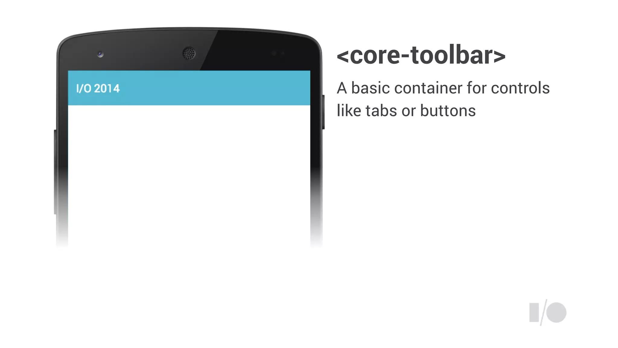
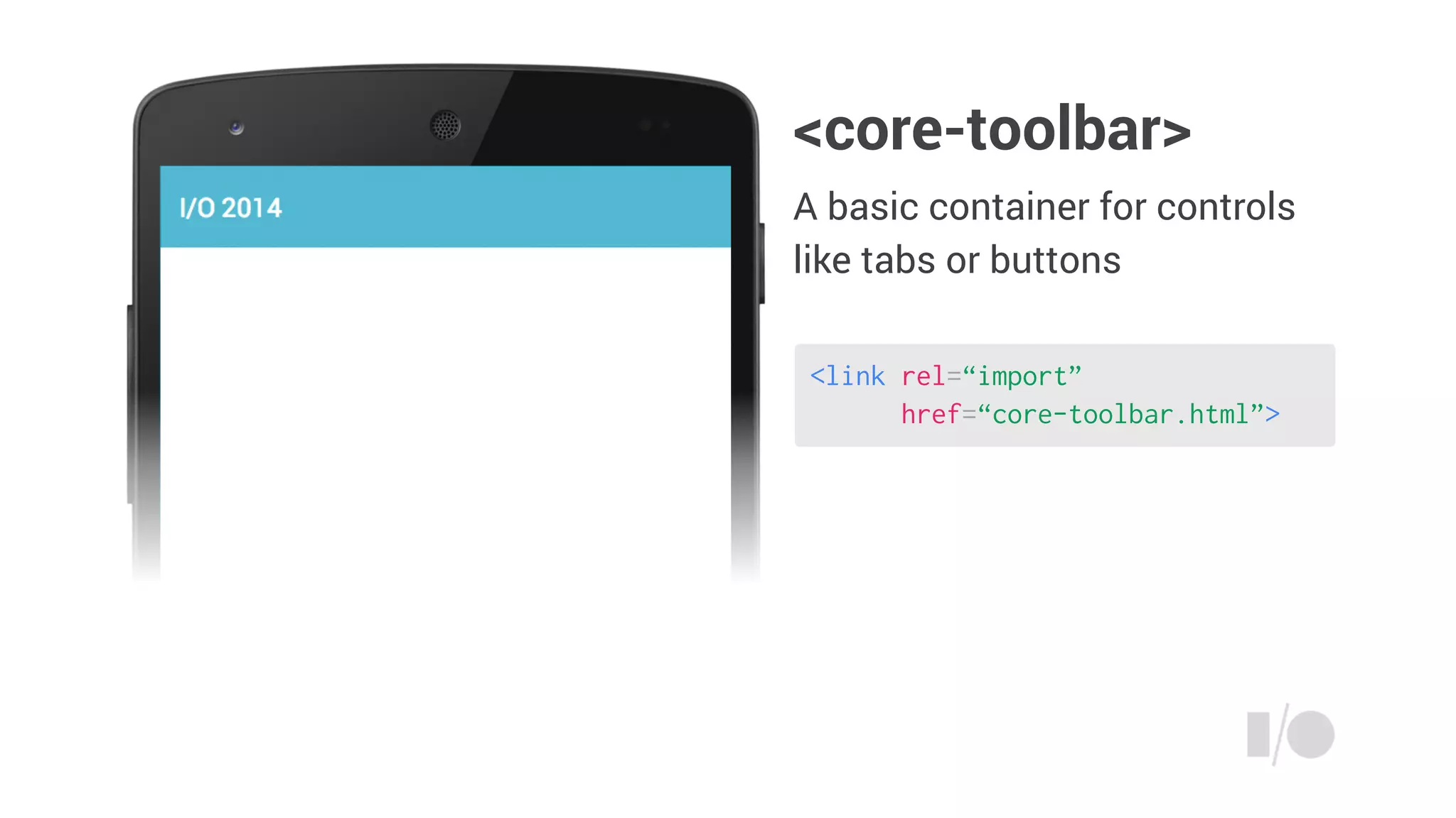
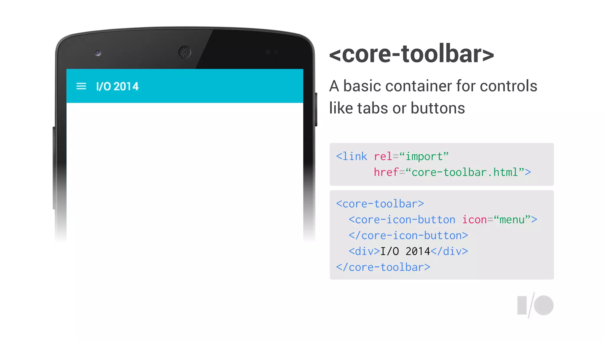
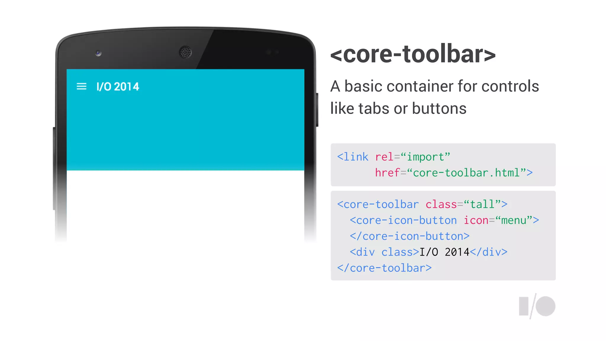
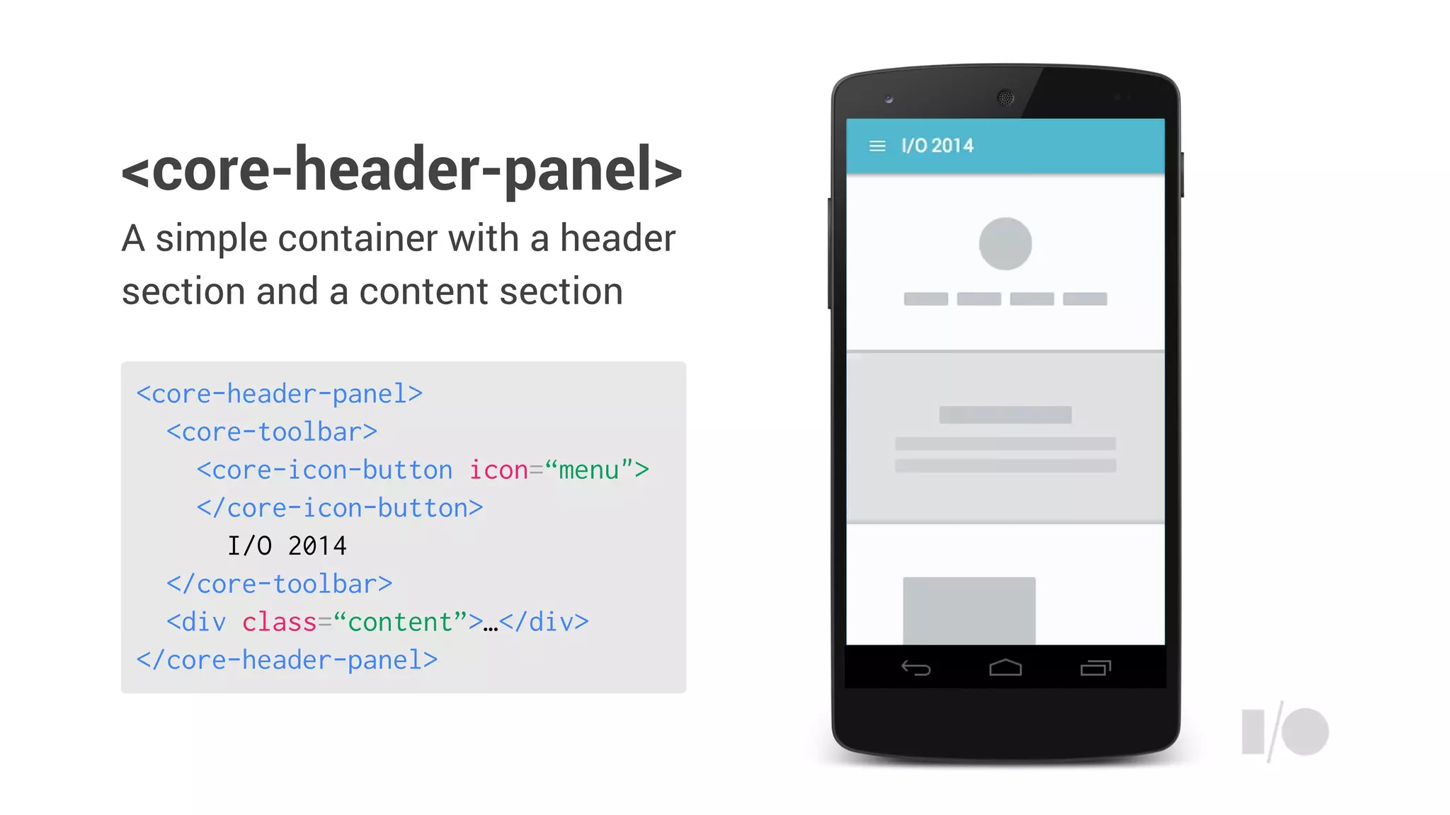
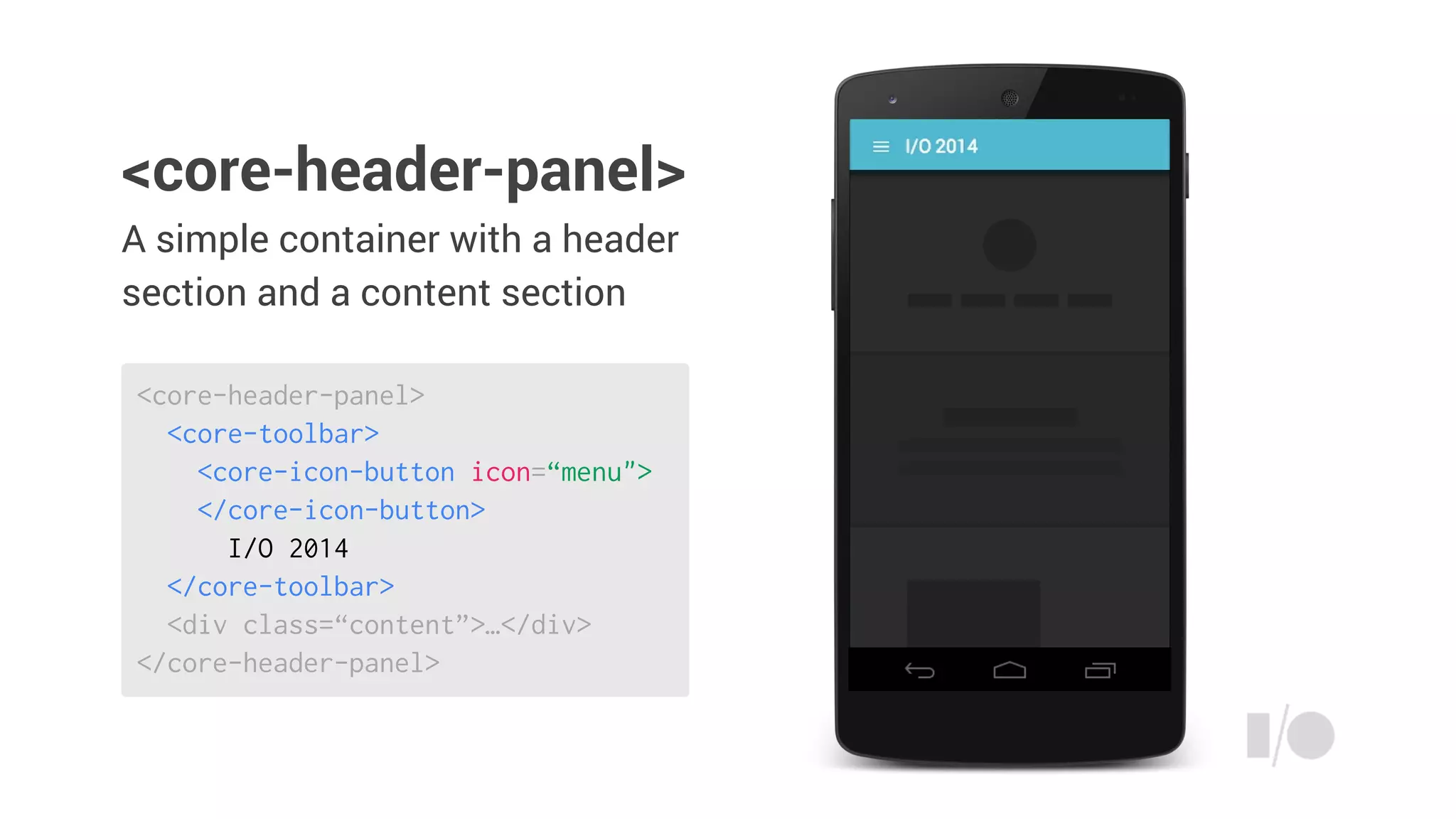
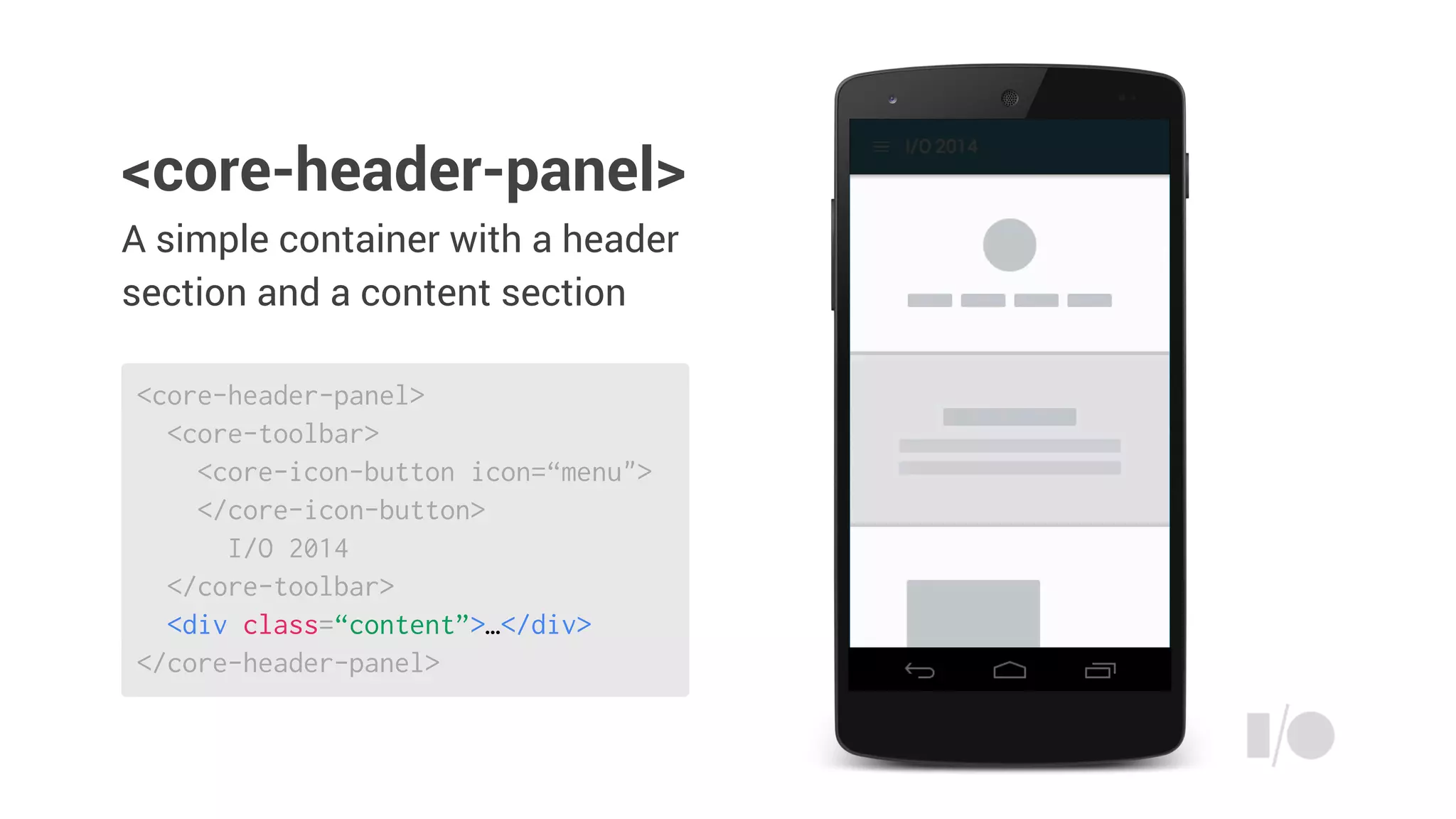
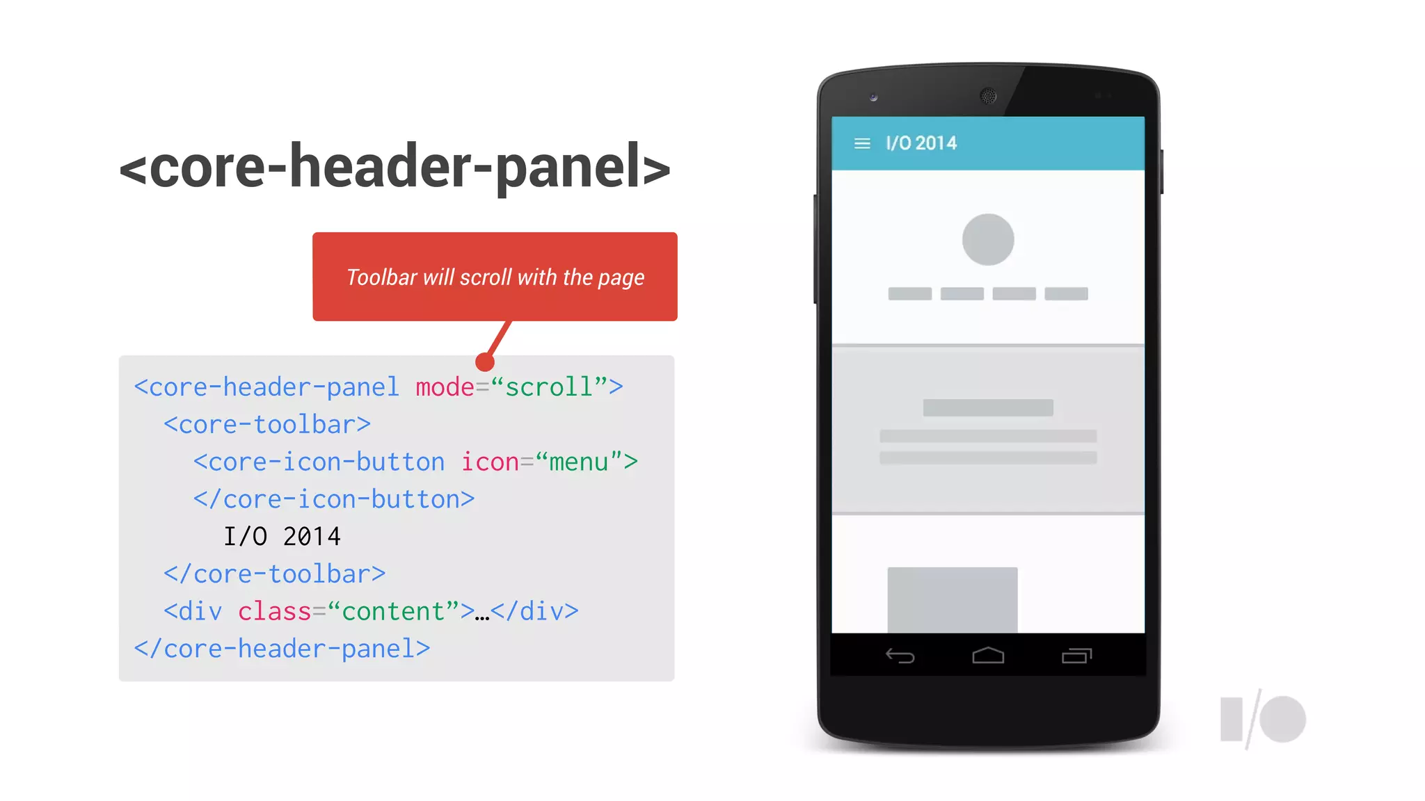
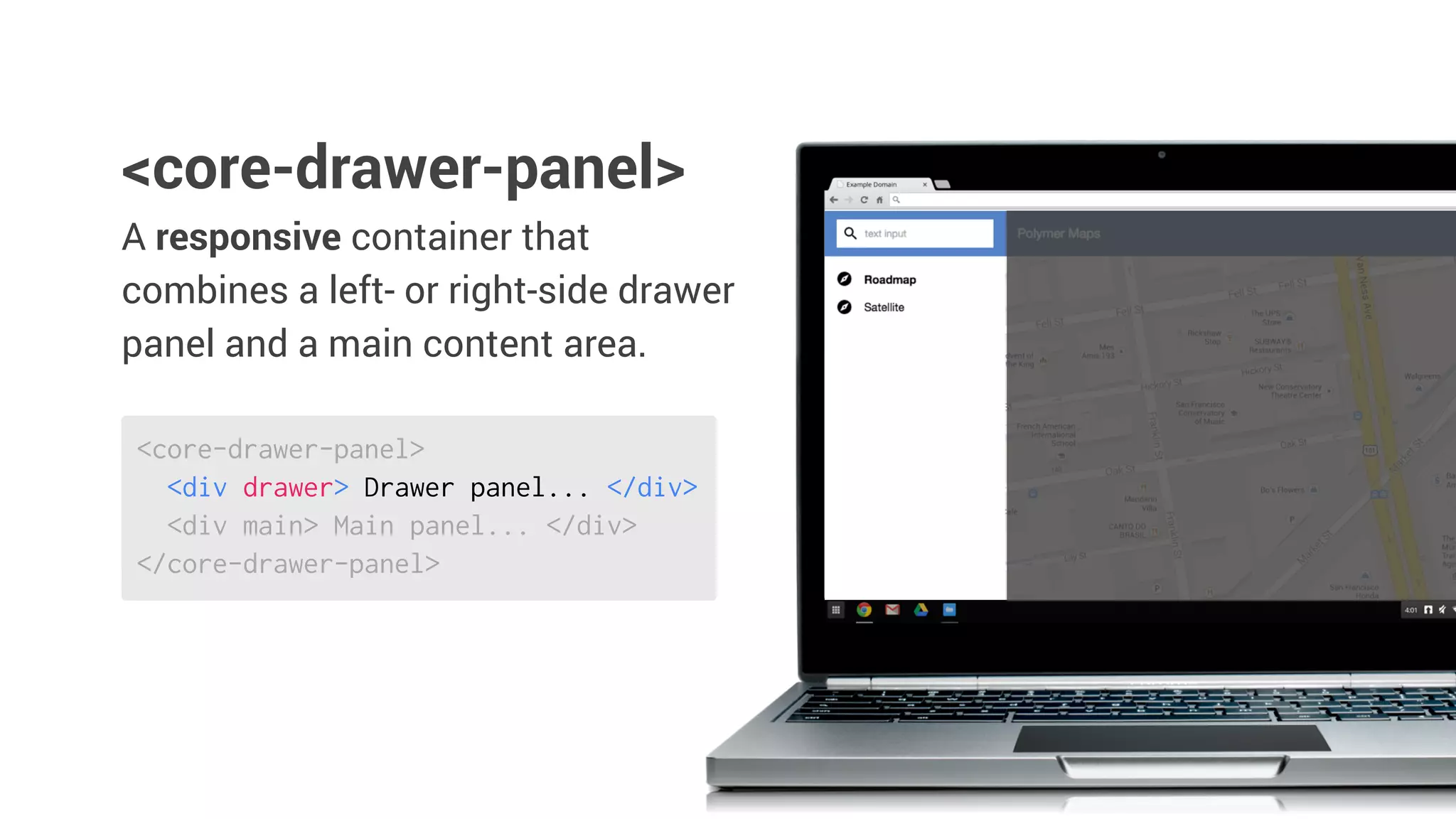
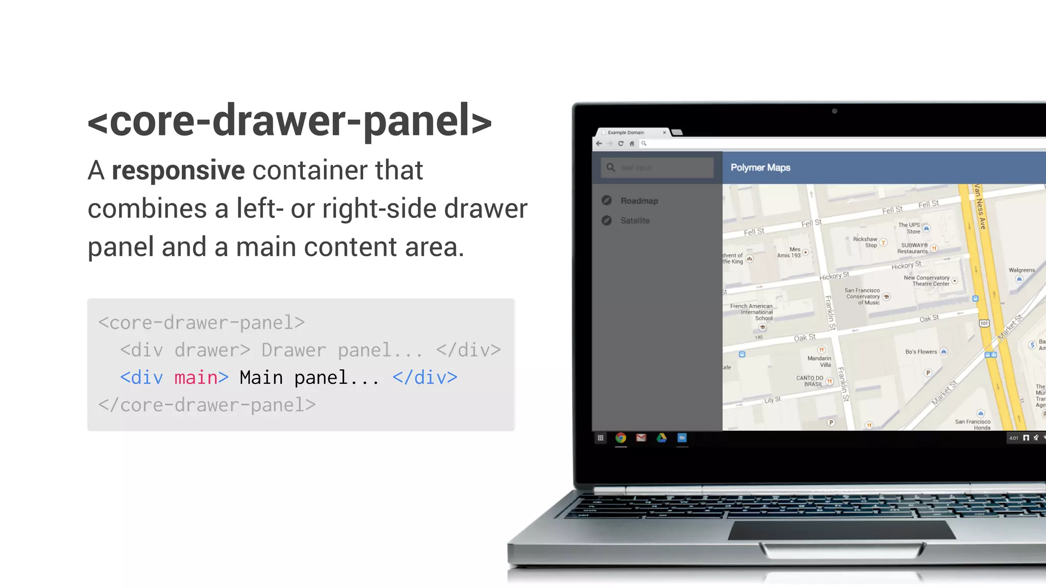
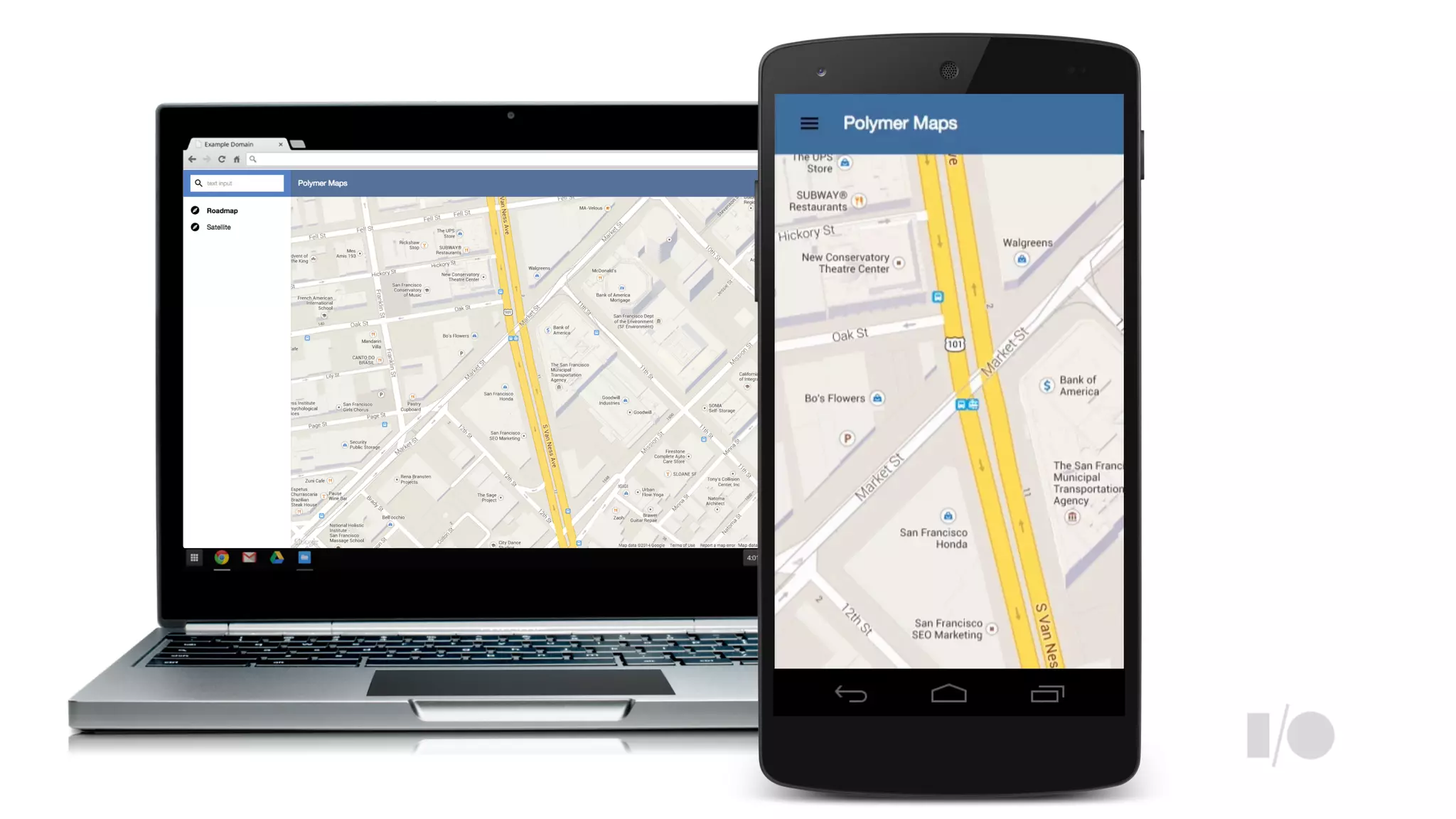
The document outlines the capabilities and components available in the Polymer library for UI development, including core and paper elements that facilitate responsive layouts, material design themes, and transitions. It provides examples of various UI components like toolbars, header panels, and interactive controls that can be used to create modern web applications. Additionally, it emphasizes the importance of theming and the ability to define styles and layouts declaratively.