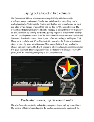
Download to read offline


This document is a step-by-step guide on using Flexbox for creating a responsive website layout. It outlines the process from wireframing design elements for different devices to implementing HTML and CSS for a functional layout with mobile-first design principles. The guide emphasizes the use of Flexbox for effective layout on desktops, tablets, and mobile devices, while also providing resources and contact information for further assistance.


![Getting Started with Apache Spark: Big Data Made Simple [Free Meetup]](https://cdn.slidesharecdn.com/ss_thumbnails/apachesparkgettingstarted-260203175547-8361bcc3-thumbnail.jpg?width=640&height=640&fit=bounds)


