My Media Studies
Evaluation
BY CHRISTOPHER OSINAIKE
In what ways does your magazine use,
develop or challenge forms and
conventions of real magazines?
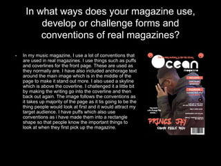
• In my music magazine, I use a lot of conventions that
are used in real magazines. I use things such as puffs
and coverlines for the front page. These are used as
they normally are. I have also included anchorage text
around the main image which is in the middle of the
page to make it stand out more. I also used a skyline
which is above the coverline. I challenged it a little bit
by making the writing go into the coverline and then
back out again. The image follows the conventions as
it takes up majority of the page as it tis going to be the
thing people would look at first and it would attract my
target audience. I have puffs which also use
conventions as i have made them into a rectangle
shape so that people know the important things to
look at when they first pick up the magazine.
In what ways does your magazine use,
develop or challenge forms and
conventions of real magazines?
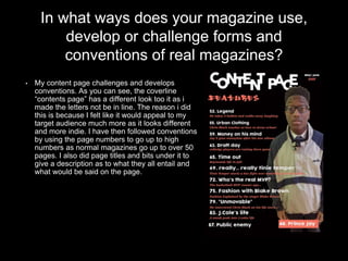
• My content page challenges and develops
conventions. As you can see, the coverline
“contents page” has a different look too it as i
made the letters not be in line. The reason i did
this is because I felt like it would appeal to my
target audience much more as it looks different
and more indie. I have then followed conventions
by using the page numbers to go up to high
numbers as normal magazines go up to over 50
pages. I also did page titles and bits under it to
give a description as to what they all entail and
what would be said on the page.
In what ways does your magazine use,
develop or challenge forms and
conventions of real magazines?
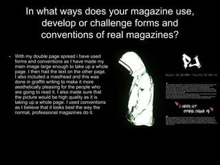
• With my double page spread i have used
forms and conventions as I have made my
main image large enough to take up a whole
page. I then had the text on the other page.
I also included a masthead and this was
done in graffiti writing to make it more
aesthetically pleasing for the people who
are going to read it. I also made sure that
the picture would be high quality as it is
taking up a whole page. I used conventions
as I believe that it looks best the way the
normal, professional magazines do it.
How does your magazine represent
particular social groups?
• I believe my magazine represents particular social groups by the fonts the
mastheads, the coverlines and subtitles share and also the type of language I
included. I made it so that the magazine is more laid back and easy to read for
my target audience. There are 5 audiences that my magazine could be written to.
These are:
1. Group A: The highest class who are like lawyers and bankers who
prefer to look at current affairs.
2. Group B: Such as Teachers/ Doctors who are fairly wealthy and can
purchase branded items.
3. Group C: These are people who have jobs like; plumbers, electricians
and nurses. They like to keep up with social media
4. Group D: People who live off low paid jobs and shop at cheap shops
5. Group E: These are the unemployed people, students or pensioners
who catch up on media through free things
How does your magazine represent
particular social groups?
• I think my magazine goes more to group E as it includes students
and that it my target audience. My magazine has a lot of gossip in it
and uses informal language do it wont be suitable for groups A to
C. Then the fact that the fonts are more urban narrows it more to
the students who find it more appealing then the older people.
• I made it suitable enough for all groups to be able to purchase it
and understand what is going on in the magazine
What kind of media institution might
distribute your magazine and why?
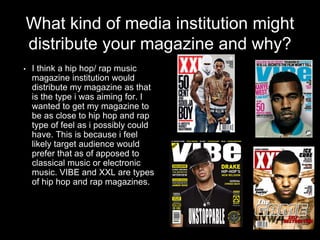
• I think a hip hop/ rap music
magazine institution would
distribute my magazine as that
is the type i was aiming for. I
wanted to get my magazine to
be as close to hip hop and rap
type of feel as i possibly could
have. This is because i feel
likely target audience would
prefer that as of apposed to
classical music or electronic
music. VIBE and XXL are types
of hip hop and rap magazines.
who would be the audience
for your magazine?
• The audience for my magazine would most likely be males form the
age 16-21. I chose this age range as I feel like i can relate to this
age group and i could voice my own opinion. This will make my
planning be more reliable because I also think like a 16-21 year
old. The colour scheme I chose was based on my questionnaire
and also personal. I think that it is aesthetically pleasing and it
would look cool and appealing to my audience. The images I took
also correspond to my target audience as i tried to make it as cool
and inviting as I could. I think the thing that attracts my target
audience the most is the urban text fonts that i tried to use. This is
because I thinks it looks cool and my audience will want to read
more as it looks better.
How did you attract/ address
your audience?
• I attracted my audience first with a colour scheme that I thought
looks best as the dark colours allows the important text which is in
light colours to stand out more and look really cool.
• I also used photos to make it attract the audience. For example, in
my double page spread, the model for my main image is wearing a
reflective jacket which makes it look really cool and I think my
target audience would enjoy it.
• finally I think the thing that attracts my target audience the most is
the urban text fonts that i tried to use. This is because I thinks it
looks cool and my audience will want to read more as it looks
better.
what have you learnt about the
technologies from the process of
constructing your magazine?
• For my magazine I used many different technologies to reach the
final product. For example, I used computer hardware(which is
digital technology) to use Photoshop as the software to edit, add
pictures and piece all of my magazine together. I was able to use
photoshop much more easier and more efficiently then i was before
and this can help me at a later date. I used a dark room and my
phone camera for my double page spread image. With this, I was
able to understand what to use when in a dark room and how to
fully utilise my phones functions to get the best possible quality
photo I could. I also learnt that there are more than just one way to
print off the magazine.
looking at your preliminary task- what do
you feel you have learnt in the progression
from it to the full product?
• From the preliminary task, I have learnt to make sure that I have my target
audience in mind whenever I am creating something or writing something
as it is going to be sold to them so they need to be as happy and content
with my product as can make them to be. I have also learnt that using
more conventions and more higher quality pictures make the finished
product look much more better then if you didn’t.
• For my contents page, I learnt that I need to include many more page
numbers and page titles to make it look like a real magazine. I also need to
add better quality images to make it more authentic and make the overall
look and feel of the content page better.
• I think that the cover page and the content page both guided me to make a
good double page spread. I needed to add all of the improvements that i
mentioned from my contents page and front cover into my double page
spread to make it look as cool and as urban as I could so that my audience
would enjoy it and buy it.

Media studies evaluation

  • 1.
    My Media Studies Evaluation BYCHRISTOPHER OSINAIKE
  • 2.
    In what waysdoes your magazine use, develop or challenge forms and conventions of real magazines? • In my music magazine, I use a lot of conventions that are used in real magazines. I use things such as puffs and coverlines for the front page. These are used as they normally are. I have also included anchorage text around the main image which is in the middle of the page to make it stand out more. I also used a skyline which is above the coverline. I challenged it a little bit by making the writing go into the coverline and then back out again. The image follows the conventions as it takes up majority of the page as it tis going to be the thing people would look at first and it would attract my target audience. I have puffs which also use conventions as i have made them into a rectangle shape so that people know the important things to look at when they first pick up the magazine.
  • 3.
    In what waysdoes your magazine use, develop or challenge forms and conventions of real magazines? • My content page challenges and develops conventions. As you can see, the coverline “contents page” has a different look too it as i made the letters not be in line. The reason i did this is because I felt like it would appeal to my target audience much more as it looks different and more indie. I have then followed conventions by using the page numbers to go up to high numbers as normal magazines go up to over 50 pages. I also did page titles and bits under it to give a description as to what they all entail and what would be said on the page.
  • 4.
    In what waysdoes your magazine use, develop or challenge forms and conventions of real magazines? • With my double page spread i have used forms and conventions as I have made my main image large enough to take up a whole page. I then had the text on the other page. I also included a masthead and this was done in graffiti writing to make it more aesthetically pleasing for the people who are going to read it. I also made sure that the picture would be high quality as it is taking up a whole page. I used conventions as I believe that it looks best the way the normal, professional magazines do it.
  • 5.
    How does yourmagazine represent particular social groups? • I believe my magazine represents particular social groups by the fonts the mastheads, the coverlines and subtitles share and also the type of language I included. I made it so that the magazine is more laid back and easy to read for my target audience. There are 5 audiences that my magazine could be written to. These are: 1. Group A: The highest class who are like lawyers and bankers who prefer to look at current affairs. 2. Group B: Such as Teachers/ Doctors who are fairly wealthy and can purchase branded items. 3. Group C: These are people who have jobs like; plumbers, electricians and nurses. They like to keep up with social media 4. Group D: People who live off low paid jobs and shop at cheap shops 5. Group E: These are the unemployed people, students or pensioners who catch up on media through free things
  • 6.
    How does yourmagazine represent particular social groups? • I think my magazine goes more to group E as it includes students and that it my target audience. My magazine has a lot of gossip in it and uses informal language do it wont be suitable for groups A to C. Then the fact that the fonts are more urban narrows it more to the students who find it more appealing then the older people. • I made it suitable enough for all groups to be able to purchase it and understand what is going on in the magazine
  • 7.
    What kind ofmedia institution might distribute your magazine and why? • I think a hip hop/ rap music magazine institution would distribute my magazine as that is the type i was aiming for. I wanted to get my magazine to be as close to hip hop and rap type of feel as i possibly could have. This is because i feel likely target audience would prefer that as of apposed to classical music or electronic music. VIBE and XXL are types of hip hop and rap magazines.
  • 8.
    who would bethe audience for your magazine? • The audience for my magazine would most likely be males form the age 16-21. I chose this age range as I feel like i can relate to this age group and i could voice my own opinion. This will make my planning be more reliable because I also think like a 16-21 year old. The colour scheme I chose was based on my questionnaire and also personal. I think that it is aesthetically pleasing and it would look cool and appealing to my audience. The images I took also correspond to my target audience as i tried to make it as cool and inviting as I could. I think the thing that attracts my target audience the most is the urban text fonts that i tried to use. This is because I thinks it looks cool and my audience will want to read more as it looks better.
  • 9.
    How did youattract/ address your audience? • I attracted my audience first with a colour scheme that I thought looks best as the dark colours allows the important text which is in light colours to stand out more and look really cool. • I also used photos to make it attract the audience. For example, in my double page spread, the model for my main image is wearing a reflective jacket which makes it look really cool and I think my target audience would enjoy it. • finally I think the thing that attracts my target audience the most is the urban text fonts that i tried to use. This is because I thinks it looks cool and my audience will want to read more as it looks better.
  • 10.
    what have youlearnt about the technologies from the process of constructing your magazine? • For my magazine I used many different technologies to reach the final product. For example, I used computer hardware(which is digital technology) to use Photoshop as the software to edit, add pictures and piece all of my magazine together. I was able to use photoshop much more easier and more efficiently then i was before and this can help me at a later date. I used a dark room and my phone camera for my double page spread image. With this, I was able to understand what to use when in a dark room and how to fully utilise my phones functions to get the best possible quality photo I could. I also learnt that there are more than just one way to print off the magazine.
  • 11.
    looking at yourpreliminary task- what do you feel you have learnt in the progression from it to the full product? • From the preliminary task, I have learnt to make sure that I have my target audience in mind whenever I am creating something or writing something as it is going to be sold to them so they need to be as happy and content with my product as can make them to be. I have also learnt that using more conventions and more higher quality pictures make the finished product look much more better then if you didn’t. • For my contents page, I learnt that I need to include many more page numbers and page titles to make it look like a real magazine. I also need to add better quality images to make it more authentic and make the overall look and feel of the content page better. • I think that the cover page and the content page both guided me to make a good double page spread. I needed to add all of the improvements that i mentioned from my contents page and front cover into my double page spread to make it look as cool and as urban as I could so that my audience would enjoy it and buy it.