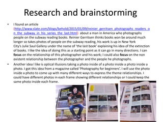
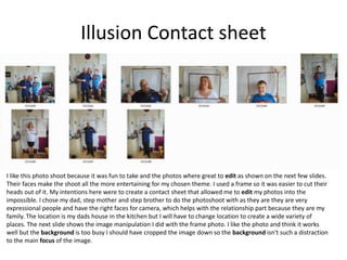
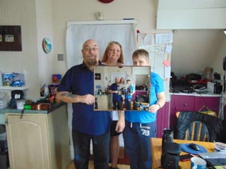
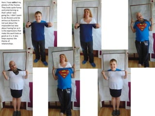
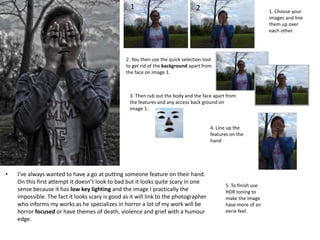
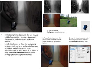
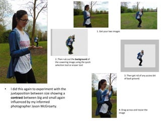
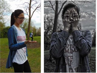
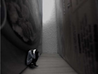
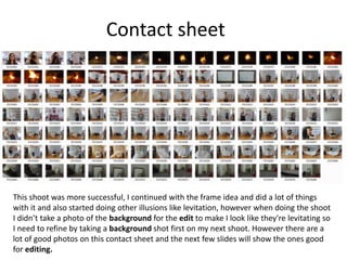
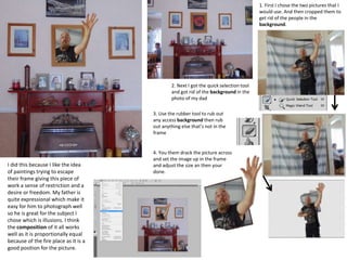
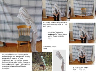
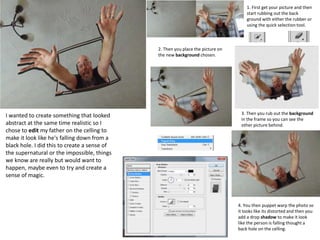
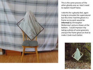
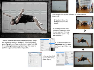
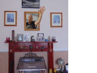
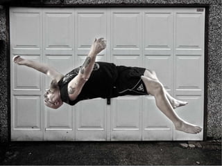
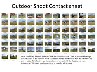
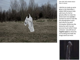
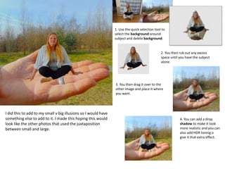
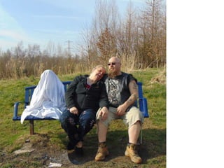
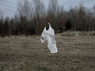
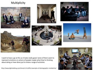
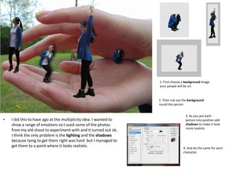
This document contains research and brainstorming for a photography project on the theme of relationships. Some of the ideas explored include photographing people reading on the subway to capture disappearing relationships with books, and creating optical illusions through multiple frames within photos. The document also shares examples of illusionist photographers' work for inspiration, and proposes taking photos of family engaged in illusion-style photo shoots to represent different relationships. Contact sheets from two photo shoots using frames are included, with annotations on refining the shoots. Experiments with cyanotype and editing photos to look like impossible scenarios like people in unusual locations are also detailed.
2. Relationships
People
Pets
Emotion/
mood
Life
Connection
Contrasts
Food
Obsession
Juxtaposition
Colour
VS e.g. good vs evil
Black
and
white
Odd
relationships
e.g. a snake
and a little girl
Love
Love
Fun
Walking
Treats
Family
Friends
Interaction
Holding
Paw and
hand
Linking
Chains
Padlock and
keys
Daily life
Home life
Queuing
in shops
Walking
the dog
Driving
Career/
education
Family
dinners
House
work
Sleep
Fish
and
chips
Curry and
rice
Tea and
scones/
crumpets
/ biscuits
Hobbies
TV/Film
Books
OTP’S
Sports
Fears/
Phobias
Happy
Sad
Day
and
night
Family
Dark
times
Happy
vs Sad
Patting
Illusions
3. Research and brainstorming
• I found an article
(http://www.slate.com/blogs/behold/2015/01/09/reinier_gerritsen_photographs_readers_o
n_the_subway_in_his_series_the_last.html) about a man in America who photographs
people on the subway reading books. Reinier Gerritsen thinks books won be around much
longer so takes photos of people on the subway reading, his work is up in New York
City’s Julie Saul Gallery under the name of ‘the last book’ explaining his idea of the extinction
of books. I like the idea of doing this as a starting point as it can go in many directions. I can
focus on the relationship of this photographer and his work; I could also focus on the non
existent relationship between the photographer and the people he photographs.
• Another idea l like is optical illusions taking a photo inside of a photo inside a photo inside a
photo. I got this idea from a magazine called ‘Photography for beginners’. I will use the photo
inside a photo to come up with many different ways to express the theme relationships. I
could have different photos in each frame showing different relationships or I could keep the
same photo inside each frame.
7. Jack Young
• I found this image on the internet looking for
inspiration for my work. I find the image really
good, it is something I want to do but maybe
differently each time so I won’t be repeating
myself. The composition of it all is quite
effective as it is just in the middle with negative
space around it allowing viewers to focus on
the image rather than any distracting back
grounds. The person who did this most likely
just edited the same photo inside the frame
each time. The main colour of this pieces is a
beige colour which gives the piece a nice and
relaxing feel. The colours are quite soft as well
and the fact the woman is wearing a similar
colour cardigan it makes the viewers work
harder as their eyes have to adjust to see the
image which make the image an illusion in two
ways. The image is high key lighting which
adds to he soft colours because there is no
shadow on the background making the image
that much more of a challenge to see.
8. Unknown artist
• I also found this image on the internet and found
it really interesting because it is in my chosen
topic for this theme. I want to have ago at doing
this but I would have to either wait till it rains or
put water on the floor, it will probably look best
when it rains. I like how the image is black and
white as it evokes emotion in the viewers as the
image could be representing a lost memory or
the death of some children or the death of loved
ones. Although the image is black and white
there is high key lighting in the back ground
which helps highlights the shadows of the
people and could maybe suggest how when
things get dark there will always be a patch of
light. The image could also represent the ghosts
of a loved one, I think the negative space with
shadows adds to that theme of loss in the photo
as you usually associative this style of photo with
loss despite the fact it is a illusion piece. The fact
all four are lined up in a row adds a bit of
symmetry to the piece making the image look
quite balanced and equal on each side.
9. Illusion Contact sheet
I like this photo shoot because it was fun to take and the photos where great to edit as shown on the next few slides.
Their faces make the shoot all the more entertaining for my chosen theme. I used a frame so it was easier to cut their
heads out of it. My intentions here were to create a contact sheet that allowed me to edit my photos into the
impossible. I chose my dad, step mother and step brother to do the photoshoot with as they are they are very
expressional people and have the right faces for camera, which helps with the relationship part because they are my
family. The location is my dads house in the kitchen but I will have to change location to create a wide variety of
places. The next slide shows the image manipulation I did with the frame photo. I like the photo and think it works
well but the background is too busy I should have cropped the image down so the background isn't such a distraction
to the main focus of the image.
10.
11. Here I have edited my
photos of the frames.
They looks quite funny
and entertaining as
that’s what I was
going for; I didn’t want
to do illusions and be
serious as illusions is
not just about the
impossible but also
about having fun as it
is the expressions that
make the work look as
good as it is. It also
helps express the
theme of
relationships.
12. Contact sheet
This second contact sheet was as strong as the first as I use my family at my dads house to take the photos however I
live with my mother and photos are harder to take here especially since no one is available . This shoot didn’t go as
planned especially with the box because I was trying to make it look my friends were escaping the frame but it didn’t
work out well however I do want to continue with the frame idea as I could do a lot with that idea. This shoot was so
unorganised as well as the photos weren't taken on the same day or location, some were at my mothers house and
the others were the next day in college using the photography studio with soft box lighting. I will use this contact
sheet to motivate me to refine my work for the next shoot.
13.
14. Experimentation: cyanotype
1. First we made the
image chose Black and
white on Photoshop
and then we invert it
2. Next print the
picture onto acetate
3. And then use the blue chemical solution made of
ammonium iron (III) citrate, water, potassium,
hexacyanoferrate to paint the back of some paper
could be A4 or A3. Then you dry it with a hair dryer.
4. Once dry you place the
acetate over the blue
paper and put it in the UV
bed for 2 minutes.
5. You then rinse the paper in water and once the
ink had all cleared away, it is done.
6. However you can
also use the
purple/brown dye or
bleach/yellow dye to
give the image a
different look like I
have done left.
I participated in a cyanotype workshop with a visiting
artist Freya, this would be a good way to present my
work
15.
16. Christopher McKenney
• Christopher McKenney is a conceptual
photographer who specializes in horror and
surrealist photography.
• Christopher's work I find amazing his
surrealism is something I want to achieve
when I come to edit my illusion photos as I
want them to look as good as his. The four
photos I have chosen to use on here as
examples are my favourite of his work they
just look real despite that being their
purpose It creates such a ghostly
atmosphere. He seems to use old objects in
his work like the frame piece where he uses
an old looking frame with an old chair and
the sheets used for the ghostly images were
probably stained to make them look old or
unused which gives the work that eerie feel
as it creates images of an old abandoned
house with aged furniture.
• Christopher's work will defiantly inform my
work. http://www.christophermckenney.com/
17. Jason McGroarty
• Jason is a surrealist photographer.
• Jason’s work looks incredible. It seems he
uses glasses and mugs the most. I like his
idea of associating the drink with the place
by putting the city on top of the mug. The
fact he does this make him a ‘stereotyper’
which I find is the best kind of photography
there is as it generates different ideas and
thoughts from his audience. The four images
I chose I found were my favourite out of his
work so far. I especially like the top right
hand one because it looks like the swan is in
a miniature lake which is what he was going
for but it looks remarkable and it seems like
something I could have a go at.
• I find his work very creative and I would like
to have a go at it in the next shoot I do, so his
will work will inform mine.
http://www.exposureguide.com/interviews/an-interview-with-surreal-
photographer-jason-mcgroarty/
18. New shoot
I think this shoot didn’t work as well as the first one because it wasn’t as comical as my other one because
my father and step mother and step brother are quite expressional making the photos more comedic and
less serious where as this shoot seems more serious because I have changed the person because of the
unavailability of my father.
19. • I’ve always wanted to have a go at putting someone feature on their hand.
On this first attempt it doesn’t look to bad but it looks quite scary in one
sense because it has low key lighting and the image I practically the
impossible. The fact it looks scary is good as it will link to the photographer
who informs my works as he specializes in horror a lot of my work will be
horror focused or have themes of death, violence and grief with a humour
edge.
1. Choose your
images and line
them up over
each other.
2. You then use the quick selection tool
to get rid of the background apart from
the face on image 1.
1 2
3. Then rub out the body and the face apart from
the features and any access back ground on
image 1.
4. Line up the
features on the
hand
5. To finish use
HDR toning to
make the image
have more of an
eerie feel.
20. • In the top right hand corner is the two images
I did before realizing I needed a shadow on
the person to make the image look more
realistic.
• I made this illusion to show the juxtaposing
between small and large and also to have a go
at my informed photographer James
McGroarty style of work with a bit of horror or
deep surrealism informed from the other
photographer Christopher McKenney.
1. First rub out the
background round the person
2. Drag the crouched person onto
the back ground photo and add a
drop shadow for a realistic effect
3. Place wherever you want the
person and to finish off use HDR
toning to make the picture look
better.
21. • I did this again to experiment with the
juxtaposition between size showing a
contrast between big and small again
influenced by my informed
photographer Jason McGroarty.
1. Get your two images
2. Then rub out the background of
the cowering image using the quick
selection tool or eraser tool
3. Then get rid of any access bit
of back ground.
4. Drag across and resize the
image
22.
23.
24. Contact sheet
This shoot was more successful, I continued with the frame idea and did a lot of things
with it and also started doing other illusions like levitation, however when doing the shoot
I didn’t take a photo of the background for the edit to make I look like they're levitating so
I need to refine by taking a background shot first on my next shoot. However there are a
lot of good photos on this contact sheet and the next few slides will show the ones good
for editing.
25. 1. First I chose the two pictures that I
would use. And then cropped them to
get rid of the people in the
background.
2. Next I got the quick selection tool
and got rid of the background in the
photo of my dad
3. Use the rubber tool to rub out
any access background then rub
out anything else that’s not in the
frame
4. You them drack the picture across
and set the image up in the frame
and adjust the size an then your
done.
I did this because I like the idea
of paintings trying to escape
their frame giving this piece of
work a sense of restriction and a
desire or freedom. My father is
quite expressional which make it
easy for him to photograph well
so he is great for the subject I
chose which is illusions. I think
the composition of it all works
well as it is proportionally equal
because of the fire place as it is a
good position for the picture.
26. 1. First you get your two images and
then put one over the other so it can
be in place.
2. Then you rub out the
background of the top photo
leaving the person on the
chair.
3. Then you rub out the
body of the person.
4. And then you are
done
My aim with this was to create a ghostly
effect making it look like a ghost is floating
above he chair, creating an eerie
supernatural feel. I got the idea from an
illusionist photographer named Christopher
McKenney because his work seems almost
impossible so I wanted to achieve the
impossible.
27. 1. First get your picture and then
start rubbing out the back
ground with either the rubber or
using the quick selection tool.
2. Then you place the picture on
the new background chosen.
3. Then you rub out the background
in the frame so you can see the
other picture behind.
4. You then puppet warp the photo so
it looks like its distorted and then you
add a drop shadow to make it look
like the person is falling thought a
back hole on the celling.
I wanted to create something that looked
abstract at the same time realistic so I
chose to edit my father on the celling to
make it look like he's falling down from a
black hole. I did this to create a sense of
the supernatural or the impossible, things
we know are really but would want to
happen, maybe even to try and create a
sense of magic.
28. This is the same process of the
other ghostly one so I don’t need
to explain myself twice.
I did this for a ghostly feel, again
trying to simulate the supernatural
but this time I had the ghost in a
frame so my work would be
informed by Christopher
McKenney’s picture shown at the
bottom. I could improve it by
taking a photo of some greenery
and put the frame ghost on that to
make it look much better.
29. 1. You get your two pictures and place the subject over the
background.
2. You then rub out the
background behind the
subject
3. You are practically done
now but to make some small
tweaks you move the body
into place and rotate it any
way you want it.
4. You then straighten the
background with the warp
tool and crop with the crop
tool
5. You can then finish
by using HDR toning
to add effects.
I did this because I wanted to try levitation ever since I
saw a previous students work and I thought it looked
good. Trying it myself was harder than it looks but I did
it. I was trying to create a surreal image that explores
both the supernatural and the impossible.
30.
31.
32. Outdoor Shoot Contact sheet
Here I refined my previous shoot and took the location outside. I tried to do different things
than what I did in the previous shoot. I think this shoot is much better than the other one not
only because of the location but this one is more comical with the illusions and more
expressional. This shoot also has potential pictures for a final piece.
33.
34. 1. First get your two
images together.
2. The rub out the background around
the subjects in the photo and rub out
the legs of the ghost.
3. Then to finish you can do HDR
toning but I didn’t use it on this
image.
First of all I did this to create a ghostly feel and second of all I did this to create meaning, a meaning of life and death maybe even
a juxtaposition between the two. The image is meant to show the loss of a child showing the heartbroken couple and the ghost of
their dead child. It is a depressing subject but it was something I came up with and express for the my mother experienced as a
young adult. Despite the grief meaning behind it the faces of my family are humorous making the photos light hearted so they
wont be taken to seriously.
35. Here I have put Five pictures together and rearranged their opacity to make a series of ghosts
on this photo. I was trying to create a disappearing feel with multiple meanings like a memory
that is fading away or somebody who feel like they are inviable and are starting to disappear
hypothetically. It could also symbolize a ghost going away now that it has done its job on
earth.
36. (See slide 18 for details about
how it is done)
I did this to create an eerie
ghost in the field effect. I
added HDR toning to help
add more of a horror
ghostly effect to make the
photo look more surreal. I
wanted my work to look like
the photographers work
that informs my work
Christopher McKenney like
below but with my own
personal touch which I have
achieved. I also left lots of
negative space to show the
surrounding and make the
image stand out more.
37. I did this to add to my small v big illusions so I would have
something else to add to it. I made this hoping this would
look like the other photos that used the juxtaposition
between small and large.
1. Use the quick selection tool to
select the background around
subject and delete background.
2. You then rub out any excess
space until you have the subject
alone.
3. You then drag it over to the
other image and place it where
you want.
4. You can add a drop
shadow to make it look
more realistic and you can
also add HDR toning o
give it that extra effect.
38. • I did this to evoke emotion in anyone who would see this. I
tried to make a convincing scene of the ghost of a loved one
who has passed away and their memory still lives inside the
mind of the one alive. I wanted to do something like the
artist Christopher McKenney who has a meaning behind all
his photos especially since some of the themes he has like
death and magic and horror are so graphic with in his
photos, I wanted to create something that had meaning like
his work does. The low key lighting was used to generate
quite a gritty effect to it emphasis the sadness and
seriousness of the picture. However there is still a light
hearted feel about it as we know its not serious because my
fathers face is still quite comical as you can tell its an act.
1. First get your images
up and then crop the
images down to where
you want them.
2. Next get your ghost
image and using the
quick selection tool get
rid of the background
around the ghost.
3. Deselect the image and then
rub out any unnecessary bits of
background around the ghost.
4. Then drag the ghost image on
to the background and place
where you want it.
5 . You can then change the size of the ghost
by using free transformation or Ctrl + T. Or
you can warp the ghost by going onto edit
and clicking puppet warp.
6 . Warp the ghost to how you like it
and then to finish off add HDR toning
to add that gritty effect
39. • This image was done in a similar way to
the previous slide. See previous slide on
how to make this. (No warp on this
image thought)
• Here I wanted to also create a sense of
meaning be hind the picture the
photographer Christopher McKenney.
The meaning behind this image is ‘don’t
mess with the dead’. Taking a trick out of
McKenney’s horror photos I wanted to
create a sinister feel to this image as it
shows viewers not to deceive the dead as
they see all. Originally I waned this to be
the devil but I couldn’t find any red
sheets so I went with a ghostly effect.
Like the previous slide I added HDR
toning to make the image look more
gritty with the meaning behind it.
Despite the serious meaning behind it
the faces of my family are quite humours
making the photos light hearted and not
taken to seriously.
40. 1.First drag the ghost onto the
background.
2. Then rub out the bottom
part of the ghost
3. Then place and press ctrl + t
or go on to free transform to
resize the ghost and add a drop
shadow for a realistic effect.
4. One done to finish off that
ghostly effect add HDR toning.
I did this to make a
ghostly effect of a ghost
rising from its grave
trying to create an
element of the
supernatural and
emphasising peoples fear
of the paranormal
evoking emotion within
viewers.
41.
42.
43. Reflect and progress
• When starting the exam unit I was worried about what to do because instantly with the theme relationships you assume its about
love but love could be expressed in different ways such as a love for a pet or family member or partner which I found difficult to do
because I’m not affectionate. So after discussing ideas in a group finding out the many different relationships (see mind map) I could
choose from. I chose to do books as my starting point because its there is no affection just the relationship between the book and the
person and I found an article about a photographer who take photos of strangers on the subway (see slide 3) I was keen on this idea, I
even took photos when I went to London on a Film trip but reading a magazine article in class about how to do an illusion (a picture
inside a picture inside a picture etc.) and I decided I wanted to try that, so doing my first shoot I was happy with what I produced and
then later edited (slide 8-10) however when doing this I pondered how this would link to relationships but then I realised I use my
father, step mother and step brother in the photos which is family which is essentially relationships.
• The first photo shoot was one of the best photo shoots so far because it was so simple and I didn’t need to develop it to make it
better because it’s the first photo shoot, I tried to refine it on the second shoot but that wasn’t so successful but the third shoot was
which refined the work and developed it into something more evolved thus bringing in the photographer who informed my work.
• Finding artists for this subject of illusions was tough because not many professional photographers did this so searching for
photographers many of the images that came up were amateur photographers however I did find this one photographer named
Christopher McKenney (slide 15) who does surrealism and horror photos, I find his work amazing and his work has informed my
work. There was also another photographer called Jason McGroarty who experiments with size and a section of his work shows him
putting buildings on top of drinks in mugs matching the beverage to the place of origin or stereotype I would like to have ago at his
work.
• The cyanotype workshop was something create and fun to do, it is an idea to present a final piece of work for this unit but I'm not
sure if I will use it because of the type of photographs I took. My chosen subject for the theme is more editing than anything else so
doing this wouldn’t really suit. However it was fun and I learned something new. The images I used were from my first photoshoot as
the faces of my family are quite expressional and immature which makes the photos entertaining, that one turned out well and I did
another one on textured paper which also turned out well but I prefer the first one because the original is usually the best.
• My work has changed over the photoshoots I have done. They have change in location and in quality because I have got a tripod. At
the moment I am trying to edit all my photos because I have so many and will most likely need to take more after I have done editing
the ones I have. Most of them are repeating and I would like to take my work further by doing something different on the next
photoshoot but I just have to figure out what.
45. • I did this to have ago at the multiplicity idea. I wanted to
show a range of emotions so I used some of the photos
from my old shoot to experiment with and it turned out ok.
I think the only problem is the lighting and the shadows
because tying to get them right was hard but I managed to
get them to a point where it looks realistic.
2. Then rub out the background
round the person
1. First choose a background image
your people will be on.
3. As you put each
person into position add
shadows to make it look
more realistic
4. And do the same for each
character.
46. • (See slide 43 one on how to make this)
• This top piece is good but its too small because I
had to put the images all behind one main image,
I basically filled the negative space. On the other
one however it is more spacious because I can
put more photos in because the image is
spacious and doesn’t have a central image in it. I
did these images to create a multiplicity image
like the previous one but with my family instead.
A lot of these multiplicity images
use the photos to show emotions
or what people want to do but I
think mine just shows; one a
collection of photos from my
photoshoot and two; just absurd
and supernatural things that
happen at the park with an added
supernatural element. I wont use
this as a final piece but it was and
idea.
47.
48. Evaluation
• When I first heard that the theme would be relationships I panicked because I though of love and marriage which is a subject I am not comfortable with so when I head
relationships could be between objects and interaction between objects or people etc. I was happy because I could explore the theme into more detail and choose
something I am comfortable with to photograph. On slide 2 I break down the theme and state what things I could do in this theme.
• At the start of this I initially wanted to work wit people and books like said photographer Reinier Gerritsen on slide three who takes photos of random people reading
on the train. I really liked the Idea and even took some photos of my friends reading on the train when we went to London because I wanted to photograph the
relationship between people and books but that idea bored me after going to London but when I returned I found a page in a magazine called ‘Photography for
Beginners’ and it was how to create a picture Inside a picture Illusion and that’s when I realised I wanted to have ago at that, I wanted to have a go at creating the
impossible. I collected bunch of images for a mood board (slide 5&6) about illusions and found a photographer called Jack young (slide 7) who also did a similar thing
with the continuous images inside a frame. I also did another mind map of what I could do with this new subject of Illusions and also found (Slide four) where I also
have two artist who do illusions which are Brigit Riley and Escher who do more optical illusions whereas what I do is more surrealism.
• My first photoshoot (slide 9) was quite successful despite only having 9 images they were all I needed to edit my images into illusions (slide 10&11). After editing my
continuous image inside a frame edit it was then I realised that the background was to distracting in it as I forgot to crop the background. However I left it as it is
because I learned from that mistake and I have learned to look at the background and see if it needs cropping or know what to put in the background. When doing this
shoot I had no idea what to photograph besides the frame illusion idea, hence only having nine photos on that first shoot. However I did come up with an idea to use
the frame cleverly and use it to put different head onto different bodies making my work quite quirky and humours especially with the faces of my family.
• When doing the cyanotype workshop I learnt a lot about dying the colour of the paper with UV lighting printing the pictures onto the paper and how it all works using
different chemicals. I must say I like the idea of doing this for presenting my final piece. However I think my final pieces look great on their own. The pieces I did on the
cyanotype workshop actually looked good as I used photos from my first shoot with my family pulling funny faces and they worked out well when they were printed.
• After my second shoot didn’t work because it was hard to take photos of my dad when I'm only there every other weekend so taking a few photos of mother and
friends at college weren’t as good. I then found two artists who specialise in surrealism and illusions so I wanted to have ago at what they do. I then refined my shoot
by taking photos of my friend in the park by my mothers house and editing them but the photos I took of her weren’t as good as the ones with my family because they
weren't as funny as the first shoot. So I refined my shoot again by taking some photos of my dad and family at my dads house and due to weather circumstances they
were taken inside and the shoot was quite successful as well. I edited them and came out with some good edits the only problem with these edits were the fact the
sheet in the background was chequered and it was hard to replicate that for the background. To refine that shoot I had to move location somewhere easier to
photograph. I went to dog park near my dads house and took another photoshoot there which I think was the best shoot out of all my shoots because of the funny and
goofy faces my family pulls making this whole theme very enjoyable.
• I think since unit one and this unit I have broadened my knowledge of Photoshop especially in this unit because of all the edits I had to do so I had to learn new things
and try those new things to get my edit just right to make it look the impossible so my knowledge of Photoshop has defiantly evolved. I think since unit one I have
changed my way of doing things especially with photoshoots. This time I took more time to think about what photos I need to take and where I want them and what
positions do I put people in. I actually haven't used any of the camera setting since unit one because this particular subject of illusions doesn’t need to use shutter
speed or aperture for my photoshoots because they weren’t needed in this subject. However this theme was a challenge because I didn’t need to do as much editing
in the last unit where as in this unit it was more refined edits as I had to concentrate on getting the edits right.
• I just stuck with my illusions Idea but near the end of this unit I found an illusion call Multiplicity where its one person taken in different positions and are place in one
photo usually used to show emotion or what could happen. Because I couldn’t get a new shoot for this newly found research when I had a go at it I had to use past
photos and some worked quite well I liked the one with my friend showing a range of moods and emotions on the hand but I really like the park one showing different
things going on. I was only going to use photos from the park shoot but then I incorporated an image from my previous shoot that I didn’t managed to get edited.
• I think my final pieces were quite successful. I chosen four image from my work that were the most successful which was my dad floating in front of the garage, my
dad trapped in a frame, my dad as a ghost and the park bench phot of my step brother as the ghost. I think these were the most successful not just because of how I
edited it but because of the humour and light heartedness of the images, despite their serious meanings or supernatural essences the faces, actions and positions my
family did in these photos just made the shoot all the more fun to do; not only that, these photos clearly define what relationships is to me and that would be my
family.