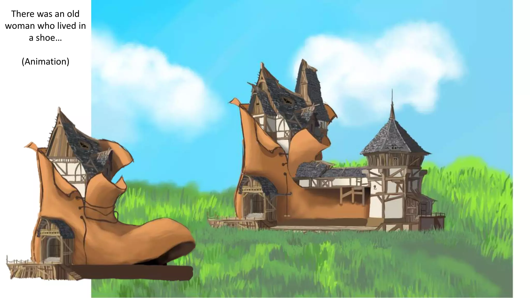
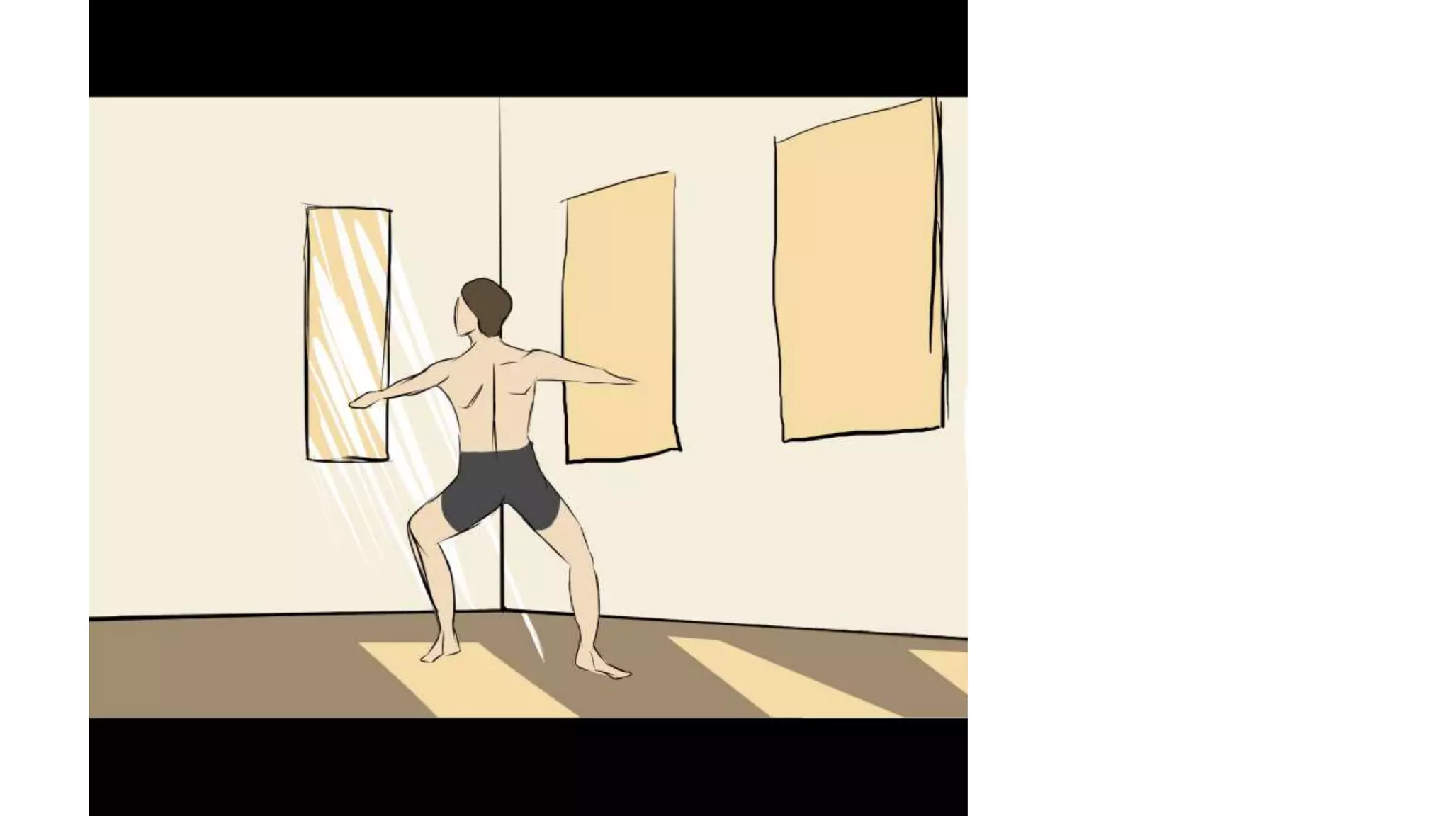
Feedback:
There was an old
woman who lived in
a shoe…
(Animation)
orange and blue
pen is what I plan
to animate.
B
A
1:
Questions:
1. A or B
I prefer the art style of b as the harder edges give a more cartoon and friendly feel to the area, however I would mix the
two styles as the rays of light hitting the floor do look a bit sporadic so making the edges softer may solve this. However
if you aren't going for a friendly look and are instead looking for a slightly more real aesthetic A is definitely better.
2. What do you think of my design style? is it suitable for this task?
I like your design style and think it works really well for creating the fantasy aesthetic your task is going, the only thing I
would change is some of the characters, especially the person in the door on slide 5 as she looks quite flat and not very
detailed compared to the rest of the scene.
3. If this was your work what would you add or improve about the art work?
I would probably improve the colour scheme by making it a bit brighter, especially if it is targeted at a young audience
as this can be very dull in areas as there isn't a wide range of colours that you have used.
4. How could I make the animation most effective?
I would make the animation most successful by keeping it simple and understandable, as that makes the story clear and
non confusing. However I would still aim to have some excitement in the animation so that people viewing it don’t lose
interest.
2:
Questions:
1. A or B
A, looks much more realistic
2. What do you think of my design style? is it suitable for this task?
I think an obviously cartoon style is a good idea for animation, however for text you could make it look more realistic,
instead of cartoon-like as well, as this will create some diversity and make the text stand out more over the cartoon imagery.
3. If this was your work what would you add or improve about the art work?
include more details in the rooms for example. such as names, images on the books on the bookshelf or more ornaments
in the rooms
4. How could I make the animation most effective?
by making sure it is not stuttering or lagging, so it looks like it runs smoothly, as otherwise it looks very unprofessional and
unfinished.
3:
Questions:
1. A or B
a because b looks really off, like more solid than light.
2. What do you think of my design style? is it suitable for this task?
that kind of design style is mostly used for story based games where it shows of lot of art style and even more story
development. and assuming that’s what you are trying to do I would say that its very good then
3. If this was your work what would you add or improve about the art work?
honestly the work is very well don’t not sure I could get at this level of detail. I can say that maybe making the images and
people less sharp would make it look better because they look a little to sharp I feel
4. How could I make the animation most effective?
sampling your own audio may make it more detailed if you weren't already planning it because it ads more detail on it
covering every type of audio from breathing to walking and etc.. second to last image with the guy posing, you should change
the light to match A because I feel like the image is also to solid for light going through the window
feedback summery:
I find this feedback helpful and agree with most of it. I agree with the improvements they say but I’m
not sure if I am going to be able to change my work to fit with them. for example the first suggested
changing to a brighter colour scheme but I can’t re colour every scene I've done so far. The second
said I could add more detail to the images such as images on the books or more ornaments in the
rooms. I would like to do this and if I have time I will but I want to focus on getting each scene done
before I start adding any more details. especially if they are not directly linked to the story's.
Another improvement that was mentioned was on slide five the woman in the image looked a little
flat compared to her surroundings which is a good point and has reminded me to make sure to keep
my colours and shades consistent through out.
Some of the feed back I don’t really understand for example feedback 3 said they felt my imaged
were too sharp. I’m not entirely sure what they mean how to change this. Also in the second
feedback page they were talking about text and making the text more realistic which I am not sure
what text they are talking about. I don’t think I showed any text.
The animation feedback were basic things which I was already considering such as keeping it simple
and understandable and making it smooth so it doesn't lag. But it was still good to hear others
opinions and views on what they think will be a good animation.
One issue is I don’t think people realised that page 6 was a video I think they just thought it was an
image. This is my fault as to me it is obvious it’s a video and I just assumed people would figure it out
but I know now it isn't obvious at all. It would have been nice to see how people felt about it and the
sketchy design of the character and It is a shame that they didn’t.

Peer Feedback (Production)

  • 1.
  • 2.
    There was anold woman who lived in a shoe… (Animation)
  • 5.
    orange and blue penis what I plan to animate.
  • 7.
  • 8.
    1: Questions: 1. A orB I prefer the art style of b as the harder edges give a more cartoon and friendly feel to the area, however I would mix the two styles as the rays of light hitting the floor do look a bit sporadic so making the edges softer may solve this. However if you aren't going for a friendly look and are instead looking for a slightly more real aesthetic A is definitely better. 2. What do you think of my design style? is it suitable for this task? I like your design style and think it works really well for creating the fantasy aesthetic your task is going, the only thing I would change is some of the characters, especially the person in the door on slide 5 as she looks quite flat and not very detailed compared to the rest of the scene. 3. If this was your work what would you add or improve about the art work? I would probably improve the colour scheme by making it a bit brighter, especially if it is targeted at a young audience as this can be very dull in areas as there isn't a wide range of colours that you have used. 4. How could I make the animation most effective? I would make the animation most successful by keeping it simple and understandable, as that makes the story clear and non confusing. However I would still aim to have some excitement in the animation so that people viewing it don’t lose interest.
  • 9.
    2: Questions: 1. A orB A, looks much more realistic 2. What do you think of my design style? is it suitable for this task? I think an obviously cartoon style is a good idea for animation, however for text you could make it look more realistic, instead of cartoon-like as well, as this will create some diversity and make the text stand out more over the cartoon imagery. 3. If this was your work what would you add or improve about the art work? include more details in the rooms for example. such as names, images on the books on the bookshelf or more ornaments in the rooms 4. How could I make the animation most effective? by making sure it is not stuttering or lagging, so it looks like it runs smoothly, as otherwise it looks very unprofessional and unfinished.
  • 10.
    3: Questions: 1. A orB a because b looks really off, like more solid than light. 2. What do you think of my design style? is it suitable for this task? that kind of design style is mostly used for story based games where it shows of lot of art style and even more story development. and assuming that’s what you are trying to do I would say that its very good then 3. If this was your work what would you add or improve about the art work? honestly the work is very well don’t not sure I could get at this level of detail. I can say that maybe making the images and people less sharp would make it look better because they look a little to sharp I feel 4. How could I make the animation most effective? sampling your own audio may make it more detailed if you weren't already planning it because it ads more detail on it covering every type of audio from breathing to walking and etc.. second to last image with the guy posing, you should change the light to match A because I feel like the image is also to solid for light going through the window
  • 11.
    feedback summery: I findthis feedback helpful and agree with most of it. I agree with the improvements they say but I’m not sure if I am going to be able to change my work to fit with them. for example the first suggested changing to a brighter colour scheme but I can’t re colour every scene I've done so far. The second said I could add more detail to the images such as images on the books or more ornaments in the rooms. I would like to do this and if I have time I will but I want to focus on getting each scene done before I start adding any more details. especially if they are not directly linked to the story's. Another improvement that was mentioned was on slide five the woman in the image looked a little flat compared to her surroundings which is a good point and has reminded me to make sure to keep my colours and shades consistent through out. Some of the feed back I don’t really understand for example feedback 3 said they felt my imaged were too sharp. I’m not entirely sure what they mean how to change this. Also in the second feedback page they were talking about text and making the text more realistic which I am not sure what text they are talking about. I don’t think I showed any text. The animation feedback were basic things which I was already considering such as keeping it simple and understandable and making it smooth so it doesn't lag. But it was still good to hear others opinions and views on what they think will be a good animation. One issue is I don’t think people realised that page 6 was a video I think they just thought it was an image. This is my fault as to me it is obvious it’s a video and I just assumed people would figure it out but I know now it isn't obvious at all. It would have been nice to see how people felt about it and the sketchy design of the character and It is a shame that they didn’t.