
Recommended
More Related Content
What's hot
What's hot (20)
Similar to Analysis of Dear John film trailer and poster
Similar to Analysis of Dear John film trailer and poster (20)
More from amydedman1
More from amydedman1 (20)
Recently uploaded
Recently uploaded (20)
Analysis of Dear John film trailer and poster
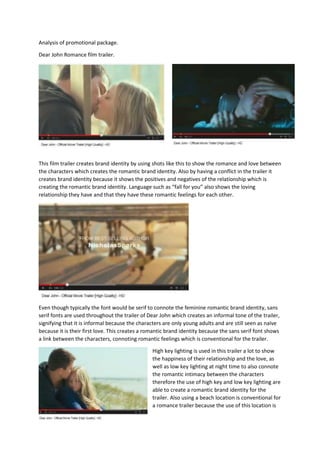
- 1. Analysis of promotional package. Dear John Romance film trailer. This film trailer creates brand identity by using shots like this to show the romance and love between the characters which creates the romantic brand identity. Also by having a conflict in the trailer it creates brand identity because it shows the positives and negatives of the relationship which is creating the romantic brand identity. Language such as “fall for you” also shows the loving relationship they have and that they have these romantic feelings for each other. Even though typically the font would be serif to connote the feminine romantic brand identity, sans serif fonts are used throughout the trailer of Dear John which creates an informal tone of the trailer, signifying that it is informal because the characters are only young adults and are still seen as naïve because it is their first love. This creates a romantic brand identity because the sans serif font shows a link between the characters, connoting romantic feelings which is conventional for the trailer. High key lighting is used in this trailer a lot to show the happiness of their relationship and the love, as well as low key lighting at night time to also connote the romantic intimacy between the characters therefore the use of high key and low key lighting are able to create a romantic brand identity for the trailer. Also using a beach location is conventional for a romance trailer because the use of this location is
- 2. useful due to the fact they are quite isolated and have only each other’s company which is typical as they have these feelings for each other. This also creates a romantic brand identity because the beach has positive connotations and the setting can also be seen as quite romantic. This trailer varies the colours but there is a consistent use of warm colours which is connoting love and passion, this forms a passionate and romantic brand identity because these colours signify love. Also there is a lot of blue used in this trailer, signifying calmness for the two characters and a calm loving relationship. However, when there is a conflict dark colours such as black and grey are used, connoting the sadness that the characters are feeling which is conventional for a romance trailer to have the mixed emotions that the characters are feeling. Also having the characters show affection towards each other is useful for this trailer because it shows the audience the intimacy between the characters and the love they have for each other. Also the use of each character being upset and hurt contributes towards the conventional and successful trailer because most romance films have the negative parts of the relationship which keeps the attention of the audience. This poster is very conventional for the film genre and creates a romantic brand identity mainly due to the image of the poster because the couple are showing affection and holding each other which is showing the love and intimacy between the characters. The font of this poster is very colloquial because it is sans serif which is generally showing the youth and their young love as the young adults are usually seen as Having the background of the poster being quite pale and blue signifies the calmness and health meaning that they are young and they can be seen as naïve, causing problems in their relationship. This is
- 3. + The lighting of this poster is conventional because the high key lighting connotes happiness and that the relationship between the two characters is romantic. Also the setting of a beach is seen as romantic for the characters which is conventional because the location is usually a nice place to be, such as the beach to highlight their romance. The image used is conventional for a romance trailer because the male and female characters are showing affection to show the intimacy and romance in the relationship. Also it shows the main characters in the film to give the audience and idea, which is what the main purpose of the trailer is too. The trailer appeals to the target audience which is usually female teenagers or young adults because it shows romantic scenes and a couple being romantic. Also the ‘Dear John’ trailer appeals to the target audience because of the stereotypical characters and the conventional location makes the trailer look more stereotypical which appeals to the audience. The poster appeals to the audience because it shows who the main characters are and gives the audience an idea of what the film is about. Also this appeals to the audience because the use of mise-en-scene and the use of image shows the stereotypical romantic relationship between the two characters. The trailer and the poster are linked because they both give an insight to the actual film and show the conventional romance between the characters. Also the mise-en-scene is similar in the trailer and the poster because it is showing the characters and their relationship positively, however in the trailer the use of low key lighting is useful when there is conflict between the characters.