Download to read offline

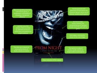
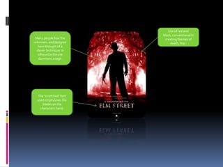
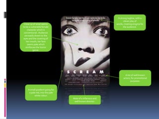
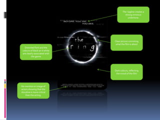

The film poster uses common horror genre conventions like a distressed female character, blue tint, and lack of major actor names. Elements like the red titles and tagline carrying themes of death, and the silhouette drawing the viewer's eye effectively target the intended teenage audience. Dark colors and a close-up central image create a mood that matches the horror genre and provides clear information about the film's release and director.


