Download to read offline
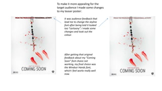

The document discusses changes made to a teaser poster based on feedback received. Feedback led to changing the font from "Coming Soon" to "Windsor Hands", removing color from the skyline font as it looked too "cartoony", and repositioning various elements as the original design was "too crowded". Additional changes included brightening the page by adding a yellow color and repositioning the masthead from the middle to improve attention on other elements based on feedback.


![7. evaluation [recovered]](https://cdn.slidesharecdn.com/ss_thumbnails/7-171213161650-thumbnail.jpg?width=640&height=640&fit=bounds)


