Download to read offline
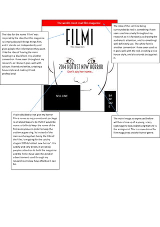

The document discusses design choices for a film magazine called "Filmi" and promotional materials for a horror film. It recommends using red text around the sell line to draw attention, as well as white text that contrasts nicely. Black text for main headings is also a convention. The magazine cover will feature a close-up of a scared girl's face to represent the antagonist, in line with horror genre conventions. Rather than include the film's name, the promotional materials will use the catchy slogan "2014's hottest new horror" to generate interest without revealing details.