Tips to make reading from the computer screen easier
Chances are that you now spend more time reading text from your computer's monitor than before and also that you are reading more text on screen than what you read on paper. This trend makes it important that you make reading on screen a more comfortable experience, and this post offers some tips on how to do that.
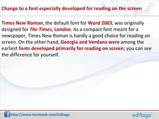
Times New Roman , the default font for  Word 2003 , was originally designed for   The Times , London . As a compact font meant for a newspaper, Times New Roman is hardly a good choice for reading on screen. On the other hand,  Georgia and Verdana were  among the earliest  fonts developed primarily for reading on screen ; you can see the difference for yourself. Change to a font especially developed for reading on the screen
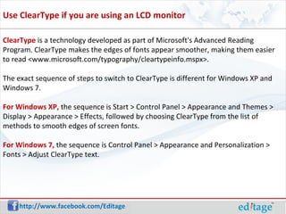
ClearType  is a technology developed as part of Microsoft's Advanced Reading Program. ClearType makes the edges of fonts appear smoother, making them easier to read <www.microsoft.com/typography/cleartypeinfo.mspx>.  The exact sequence of steps to switch to ClearType is different for Windows XP and Windows 7. For Windows XP,  the sequence is Start > Control Panel > Appearance and Themes > Display > Appearance > Effects, followed by choosing ClearType from the list of methods to smooth edges of screen fonts. For Windows 7,  the sequence is Control Panel > Appearance and Personalization > Fonts > Adjust ClearType text. Use ClearType if you are using an LCD monitor
Reading from screen allows you to make the text comfortably large: zoom in for an enlarged view, sit back, and read in comfort. Zoom in to make the text larger and read from a distance
Connect with us on: http://www.facebook.com/Editage http://www.twitter.com/Editage http://www.linkedin.com/company/cactus-communications Connect http://blog.editage.com

Tips to make reading from the computer screen easier

  • 1.
    Tips to makereading from the computer screen easier
  • 2.
    Chances are thatyou now spend more time reading text from your computer's monitor than before and also that you are reading more text on screen than what you read on paper. This trend makes it important that you make reading on screen a more comfortable experience, and this post offers some tips on how to do that.
  • 3.
    Times New Roman, the default font for Word 2003 , was originally designed for   The Times , London . As a compact font meant for a newspaper, Times New Roman is hardly a good choice for reading on screen. On the other hand, Georgia and Verdana were among the earliest fonts developed primarily for reading on screen ; you can see the difference for yourself. Change to a font especially developed for reading on the screen
  • 4.
    ClearType isa technology developed as part of Microsoft's Advanced Reading Program. ClearType makes the edges of fonts appear smoother, making them easier to read <www.microsoft.com/typography/cleartypeinfo.mspx>. The exact sequence of steps to switch to ClearType is different for Windows XP and Windows 7. For Windows XP, the sequence is Start > Control Panel > Appearance and Themes > Display > Appearance > Effects, followed by choosing ClearType from the list of methods to smooth edges of screen fonts. For Windows 7, the sequence is Control Panel > Appearance and Personalization > Fonts > Adjust ClearType text. Use ClearType if you are using an LCD monitor
  • 5.
    Reading from screenallows you to make the text comfortably large: zoom in for an enlarged view, sit back, and read in comfort. Zoom in to make the text larger and read from a distance
  • 6.
    Connect with uson: http://www.facebook.com/Editage http://www.twitter.com/Editage http://www.linkedin.com/company/cactus-communications Connect http://blog.editage.com