
Download to read offline

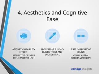
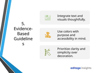
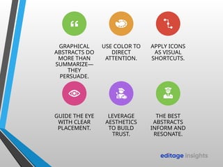
Graphical abstracts are now standard in many journals and preprints. They give readers a snapshot of your research and can make the difference between someone engaging with your work—or scrolling past. But not all graphical abstracts are created equal. Some resonate instantly, while others confuse or overwhelm. The difference often comes down to psychology—how our brains respond to color, icons, and placement. Let’s explore the science behind designing graphical abstracts that inform and persuade.


