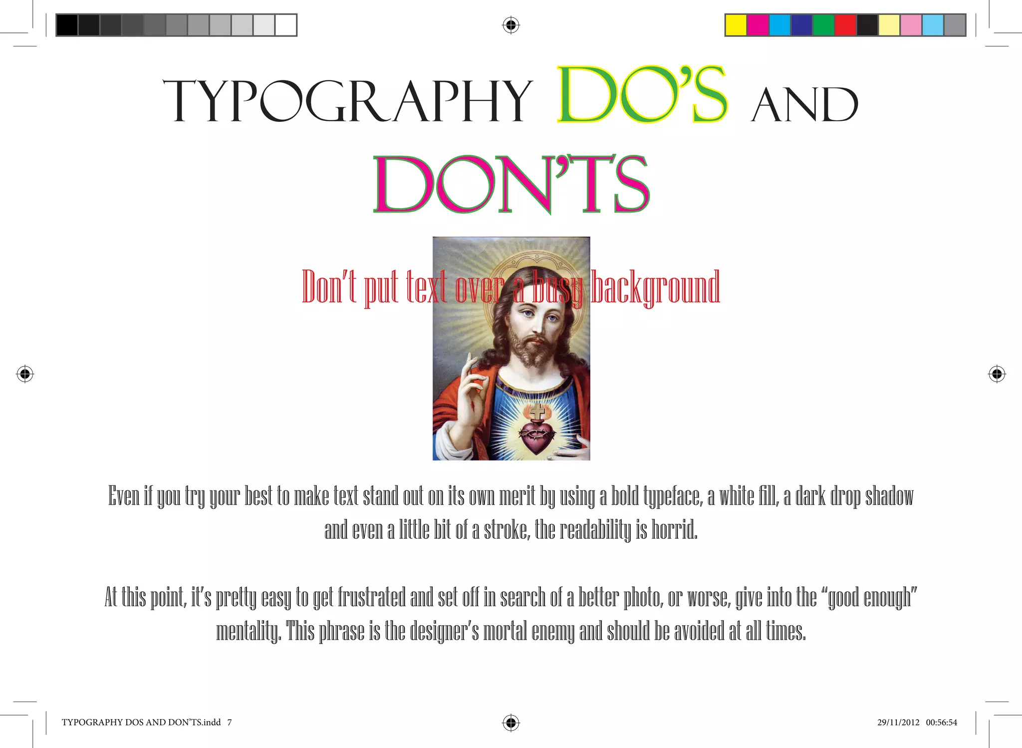
The document provides several dos and don'ts for typography. It recommends manually kerning important text rather than relying solely on automatic kerning. It advises against letting Photoshop kern text and suggests choosing fonts that fit the tone and audience. The document also stresses the importance of consistency, simplicity, and avoiding busy backgrounds or hard-to-read fonts.
