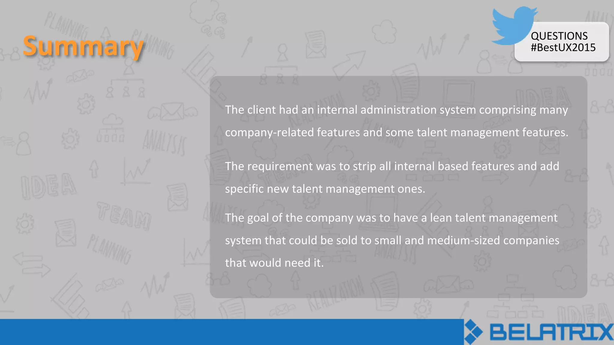
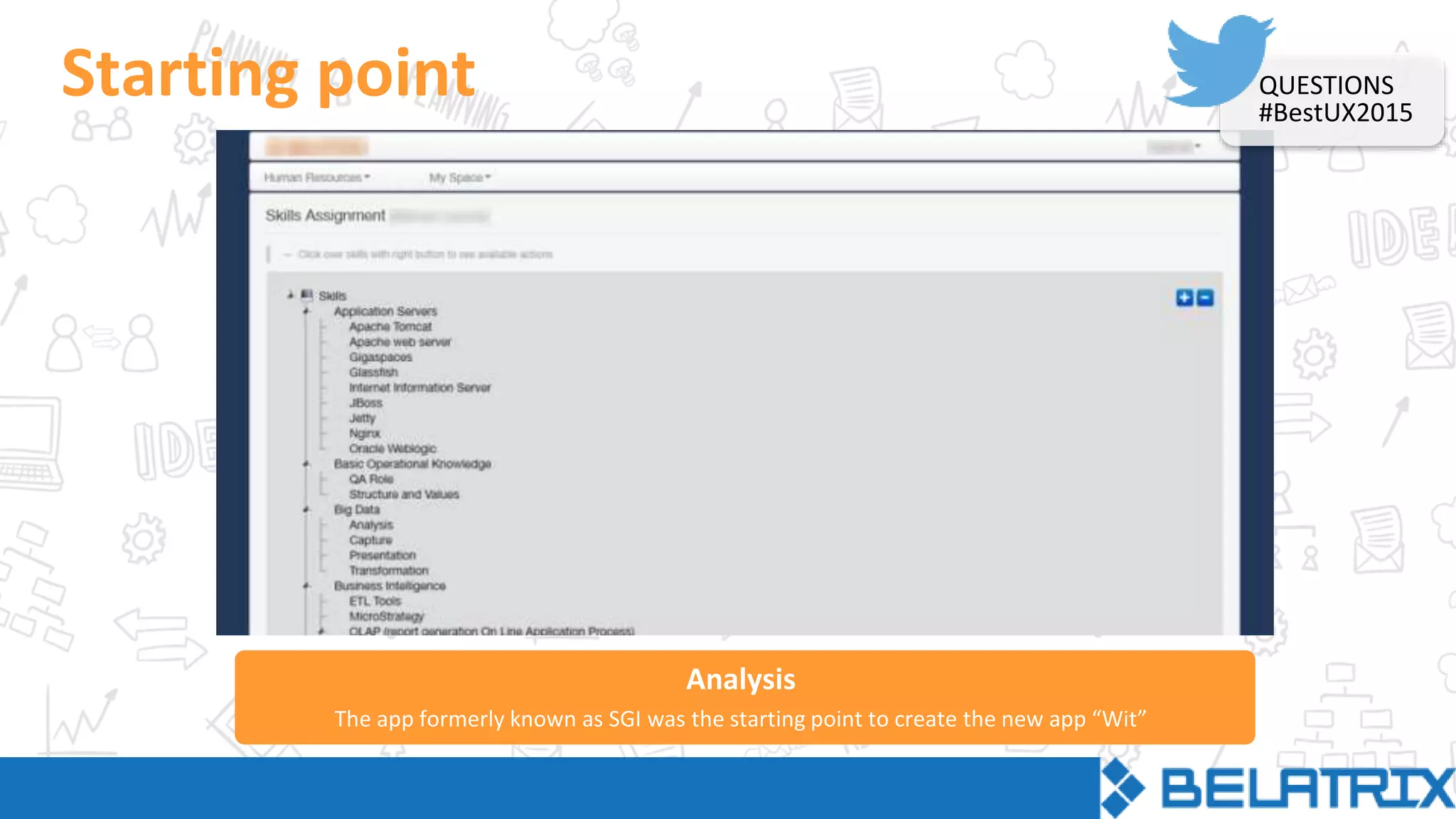
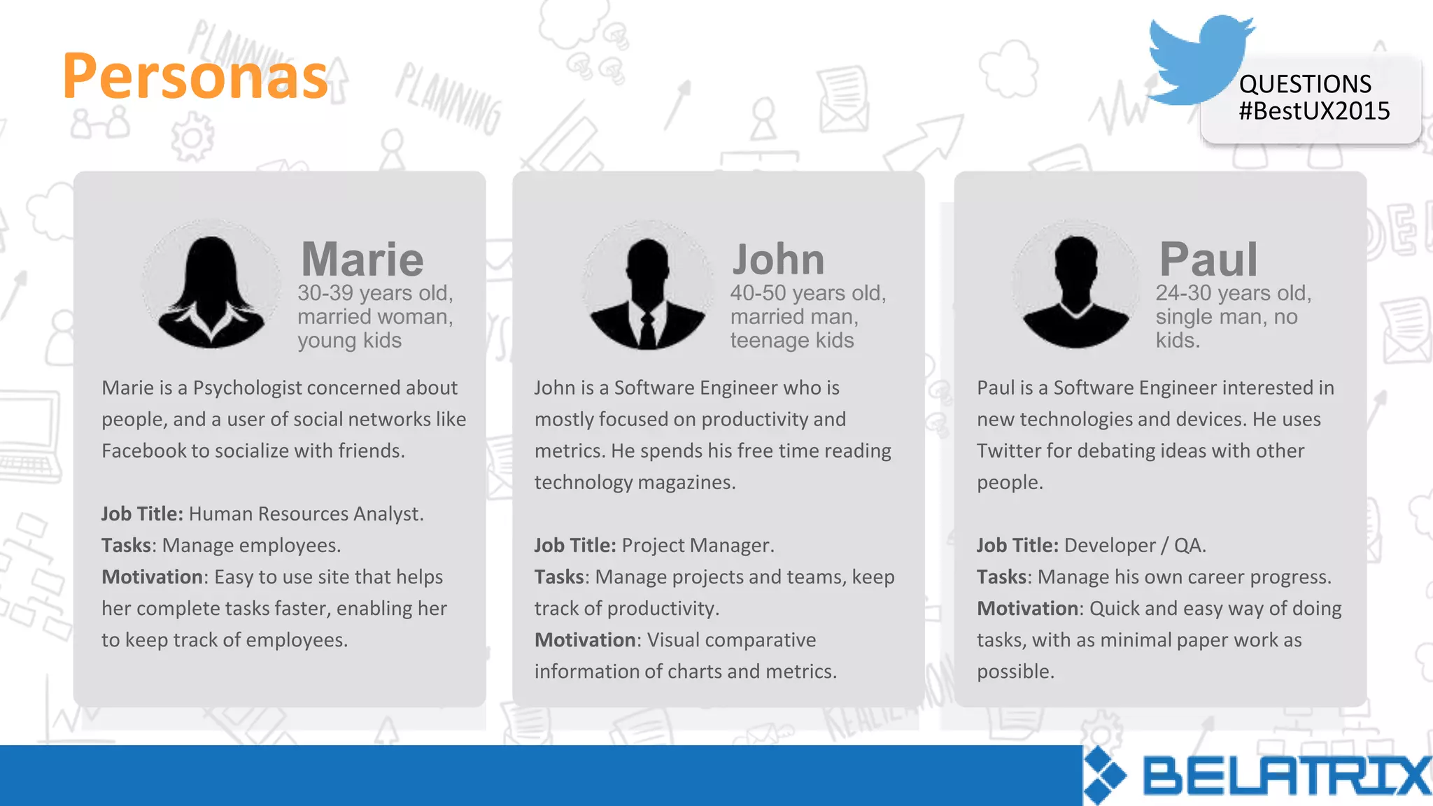
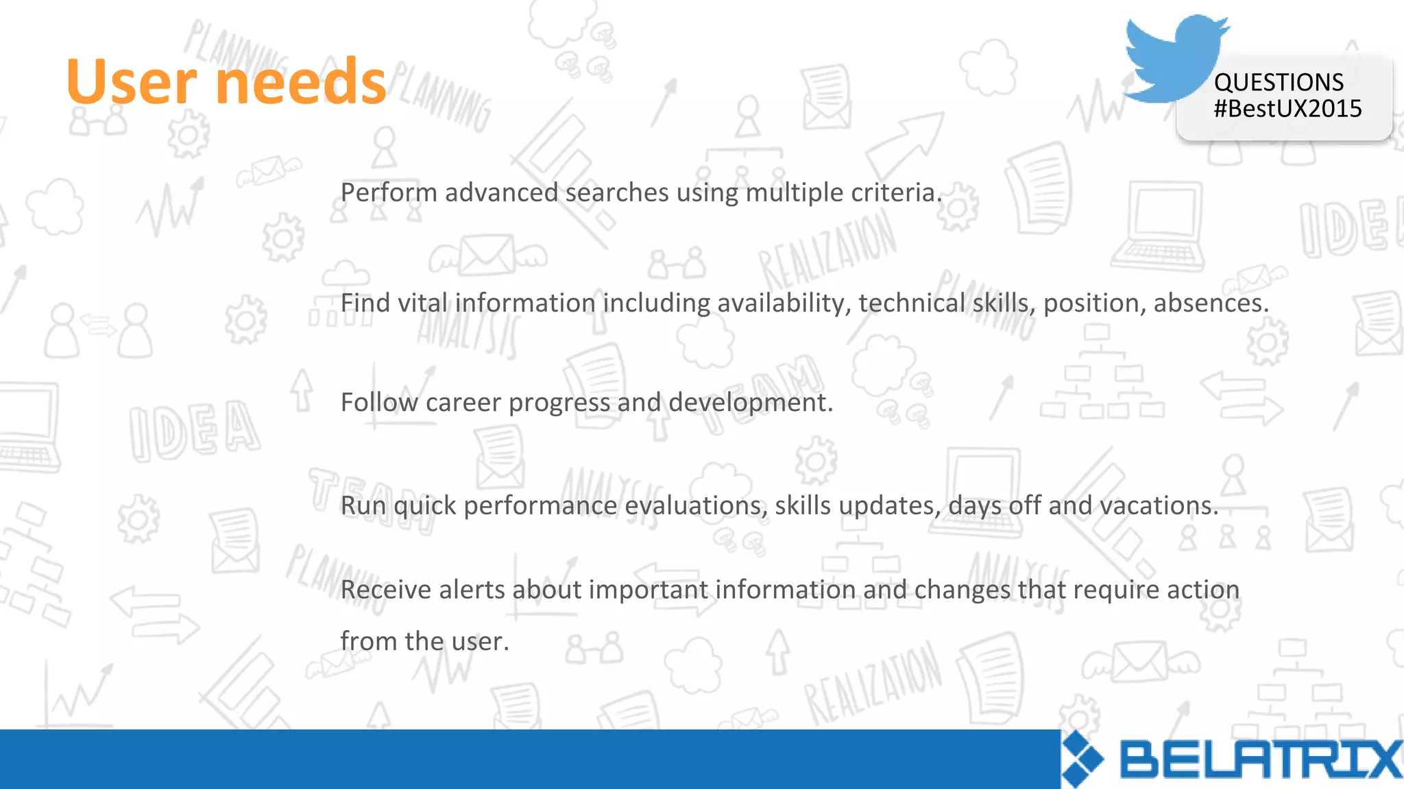
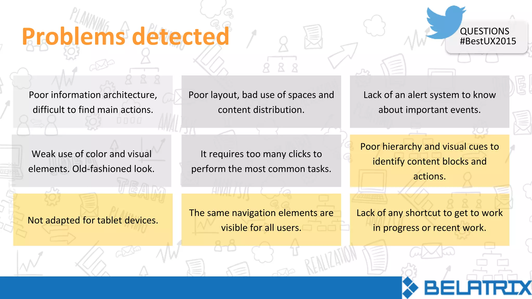
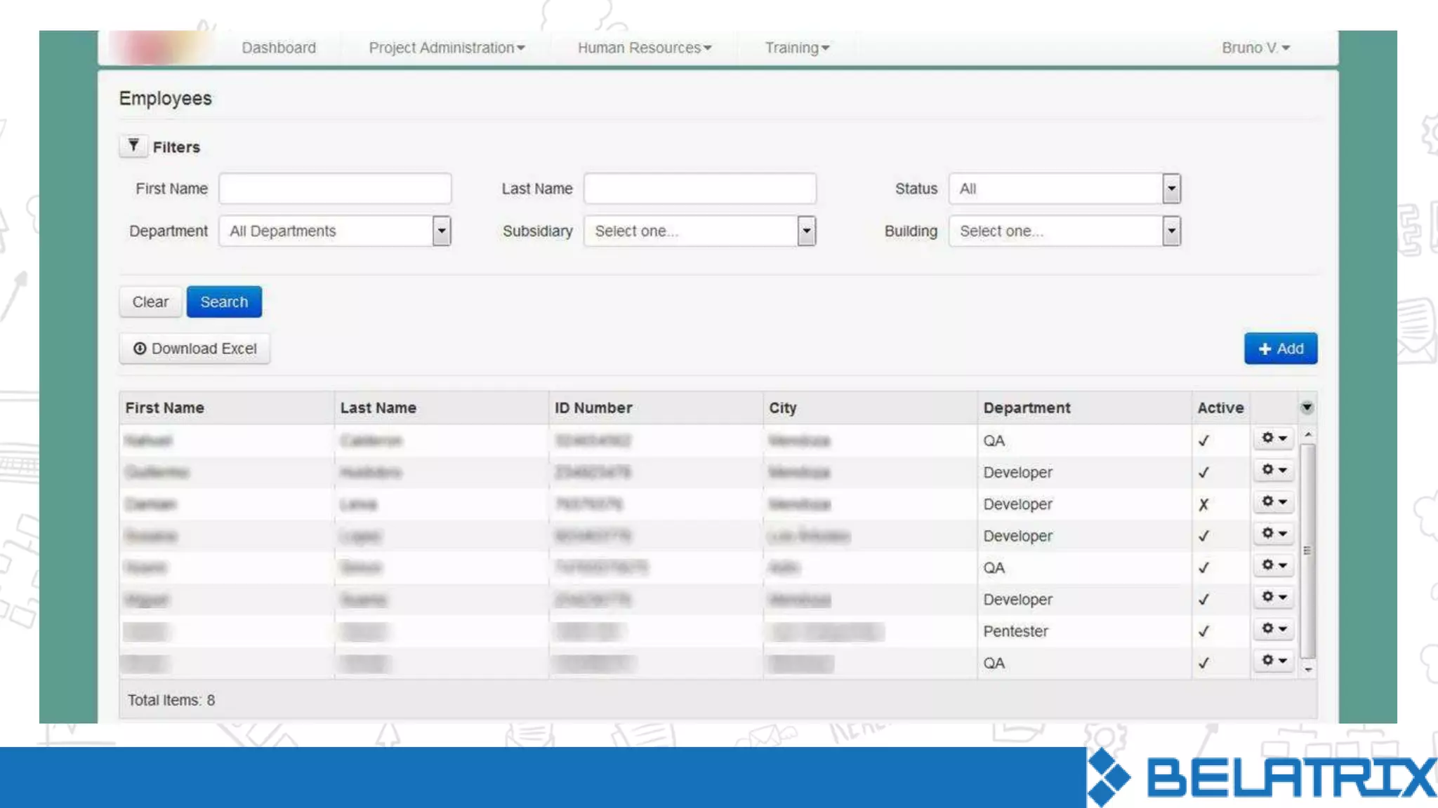
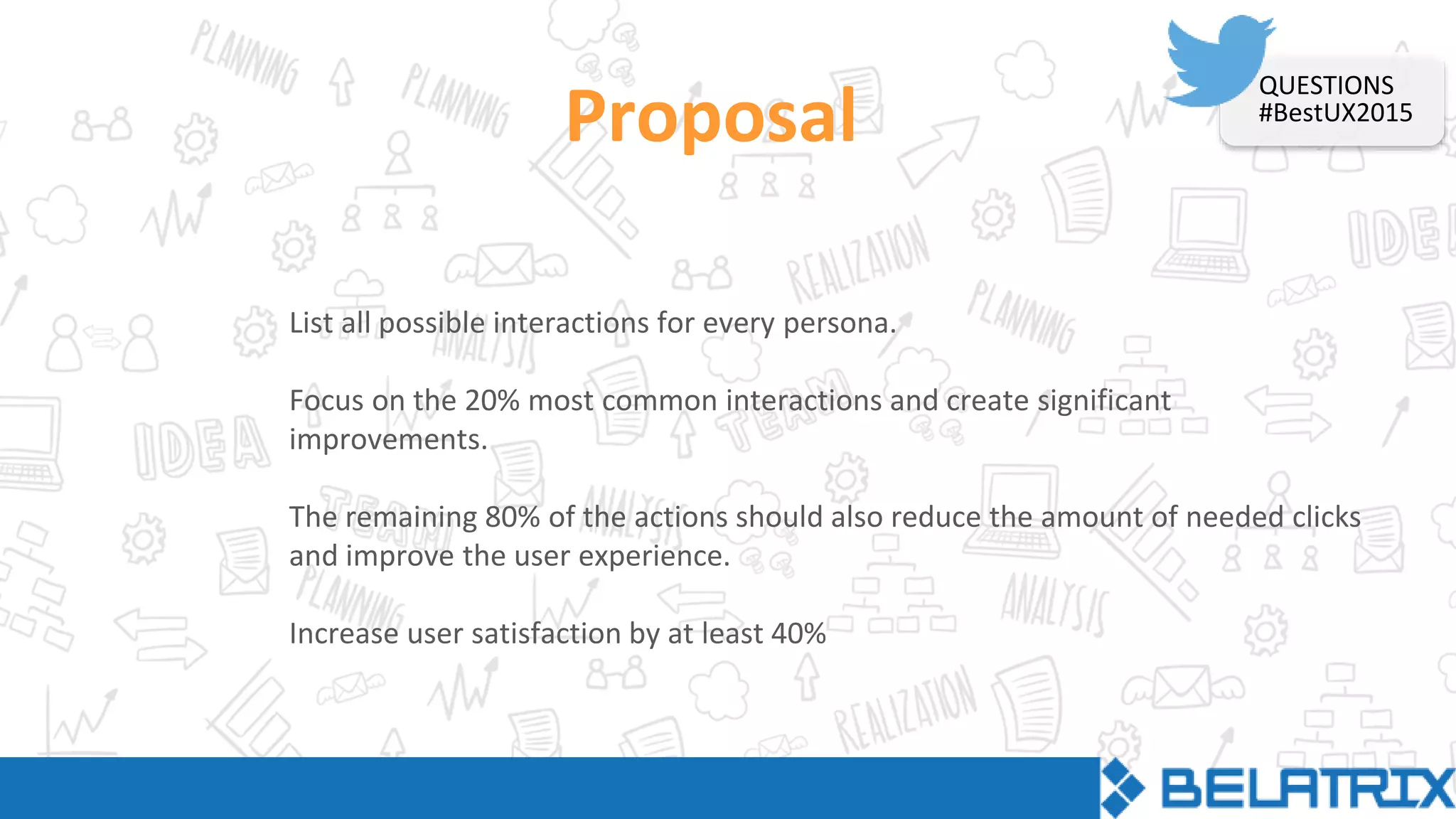
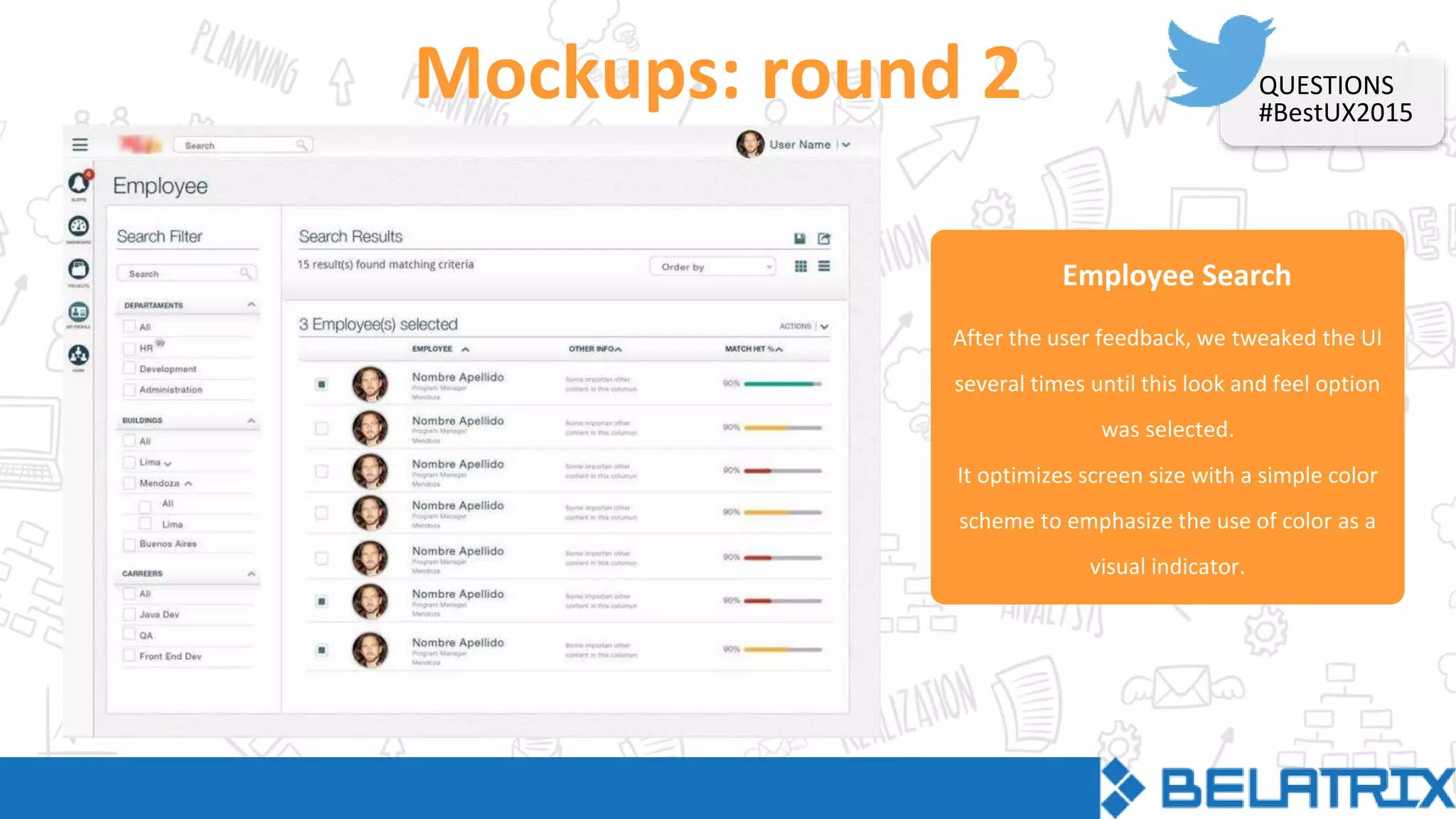
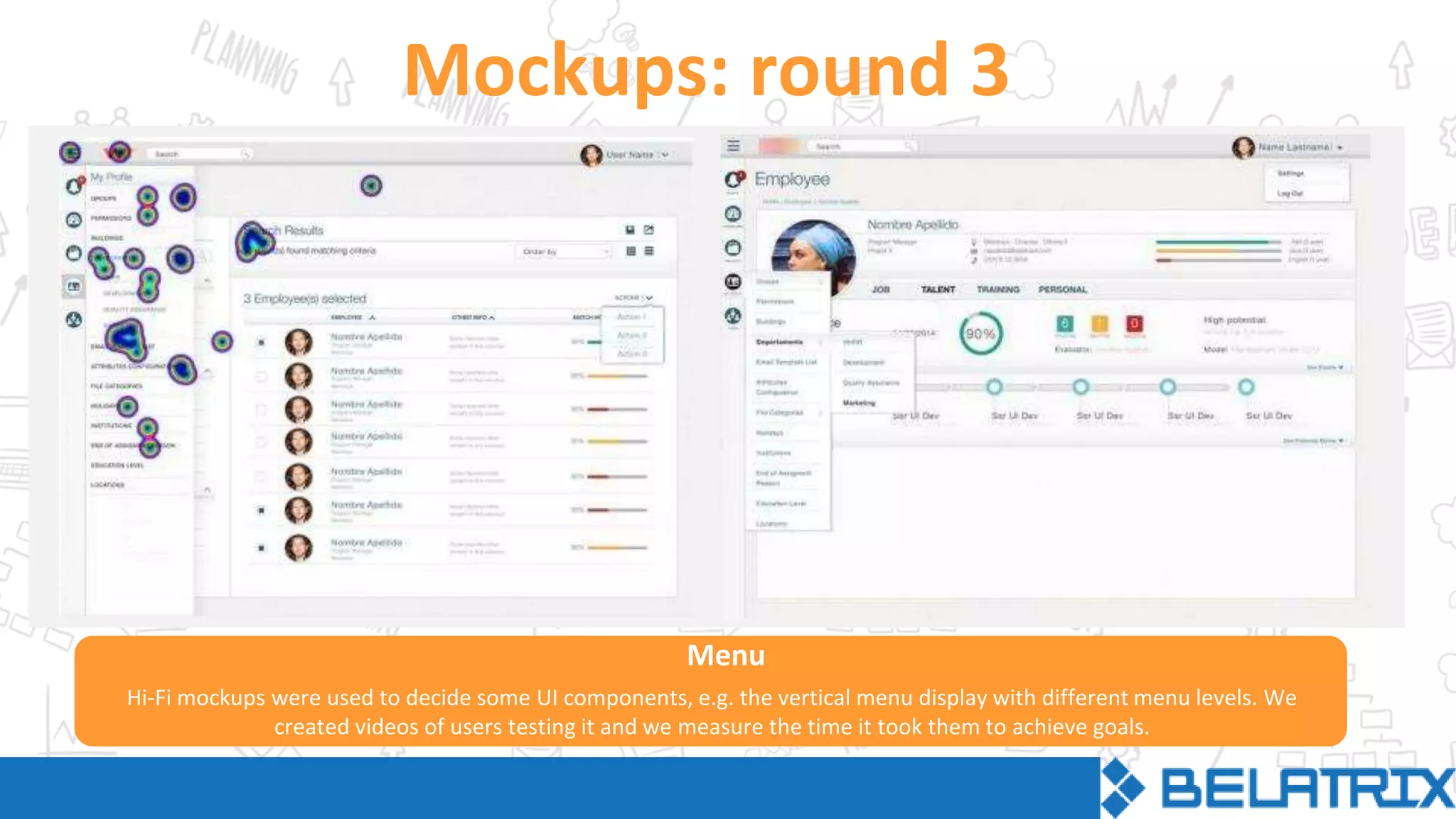
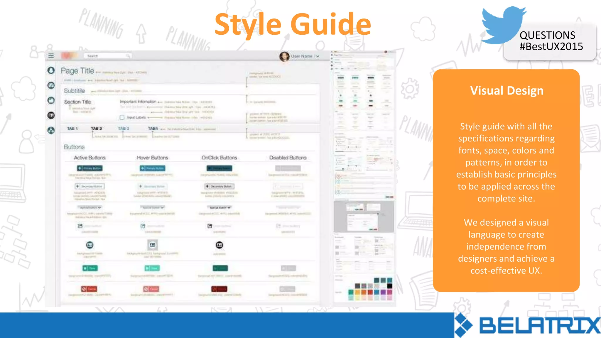
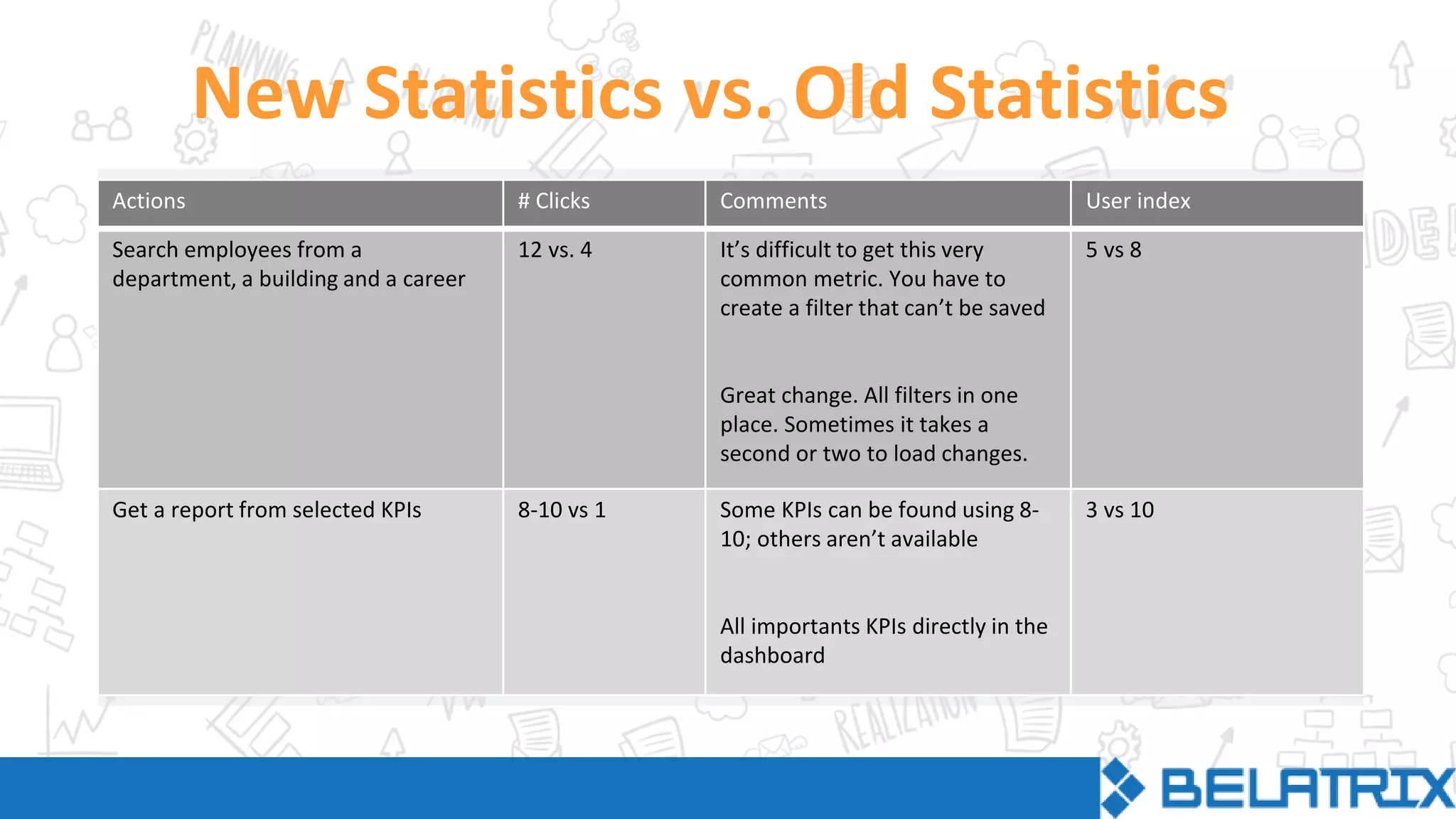
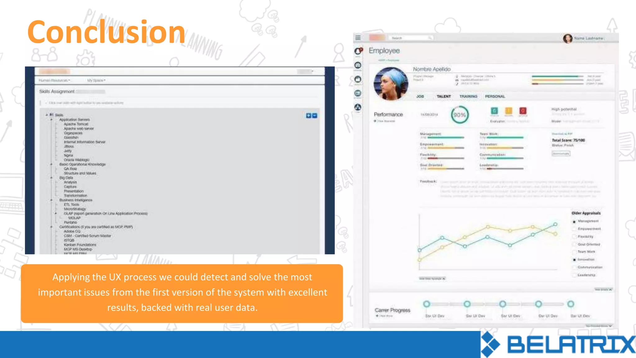
WEBINAR
August 27th
1pm PDT|4pm EDT
Barbara Lipinski
UX Designer
Bruno Viches
Senior Web Developer &
Product Manager
Charles Green
Marketing Analyst
Clothing design
First design schools had the
approach “one solution fits all”
Graphic design
Product design
Industry growth forced
the unified design to split
into different disciplines
QUESTIONS
#BestUX2015
QUESTIONS
#BestUX2015
In the human-computer interaction, the physical
space in the screen has created a dialog between
the user and the design.
Donald Norman
“User experience” encompasses all
aspects of the end-user’s interaction
with the company, its services, and
its products.
QUESTIONS
#BestUX2015
UX addreses how a person feels about using a system
What, when, where, why and how someone uses the
product
UX takes into account business goals, includes the user
needs at every step of the product cycle
Multidisciplinary techniques are involved
QUESTIONS
#BestUX2015
UXDesign behind the
visual interface trying
to meet business
goals with user goals
+
A good user experience has a positive effect on how users feel about a site or product.
This will impact sales and conversions.
Business Goals
User Goals
User Interface
Technology
USER
EXPERIENCE
UX Elements QUESTIONS
#BestUX2015
UX PROCESS
UXSurface
Visual design
Skeleton
Interface &
navigation
design
Structure
Interaction
design +
Information
architecrure
Scope
Functional
specs,
Content
requirements
Strategy
User needs +
Product
objectives
This is a schematic way to break down the basic steps for
developing UX in a coherent framework.
These 5 steps go from abstract to concrete and each of
them has specific tasks.
QUESTIONS
#BestUX2015
Case Study
WIT
Summary
The client had an internal administration system comprising many
company-related features and some talent management features.
The requirement was to strip all internal based features and add
specific new talent management ones.
The goal of the company was to have a lean talent management
system that could be sold to small and medium-sized companies
that would need it.
QUESTIONS
#BestUX2015
Analysis
Starting point
The app formerly known as SGI was the starting point to create the new app “Wit”
QUESTIONS
#BestUX2015
Personas
Marie is a Psychologist concerned about
people, and a user of social networks like
Facebook to socialize with friends.
Job Title: Human Resources Analyst.
Tasks: Manage employees.
Motivation: Easy to use site that helps
her complete tasks faster, enabling her
to keep track of employees.
30-39 years old,
married woman,
young kids
Marie
John is a Software Engineer who is
mostly focused on productivity and
metrics. He spends his free time reading
technology magazines.
Job Title: Project Manager.
Tasks: Manage projects and teams, keep
track of productivity.
Motivation: Visual comparative
information of charts and metrics.
40-50 years old,
married man,
teenage kids
John
Paul is a Software Engineer interested in
new technologies and devices. He uses
Twitter for debating ideas with other
people.
Job Title: Developer / QA.
Tasks: Manage his own career progress.
Motivation: Quick and easy way of doing
tasks, with as minimal paper work as
possible.
24-30 years old,
single man, no
kids.
Paul
QUESTIONS
#BestUX2015
User needs
Perform advanced searches using multiple criteria.
Find vital information including availability, technical skills, position, absences.
Follow career progress and development.
Run quick performance evaluations, skills updates, days off and vacations.
Receive alerts about important information and changes that require action
from the user.
QUESTIONS
#BestUX2015
STRUCTURE
Problems detected
Poor information architecture,
difficult to find main actions.
It requires too many clicks to
perform the most common tasks.
Lack of any shortcut to get to work
in progress or recent work.
Lack of an alert system to know
about important events.
Poor hierarchy and visual cues to
identify content blocks and
actions.
Poor layout, bad use of spaces and
content distribution.
Not adapted for tablet devices.
Weak use of color and visual
elements. Old-fashioned look.
The same navigation elements are
visible for all users.
QUESTIONS
#BestUX2015
Proposal
List all possible interactions for every persona.
Focus on the 20% most common interactions and create significant
improvements.
The remaining 80% of the actions should also reduce the amount of needed clicks
and improve the user experience.
Increase user satisfaction by at least 40%
QUESTIONS
#BestUX2015
STRUCTURE
Statistics (some of the 20% most common interactions)
Common Actions # Clicks Comments
User satisf.
index
Search employees from a
department, a building and a
career
12
It’s difficult to get this very common metric. You
have to create a filter that can’t be saved
5
Get a report from selected
KPIs
8-10
Some KPIs can be received using 8-10; others are
not available
3
Learn about the last
performance appraisal of an
employee and jump to his/her
career progress
9
The information is not integrated in one place
and the flow is not employee centric
3
STRUCTURE
Employee Search
Wireframes
Employee filtering by multiple criteria is
one of the main tasks.
The solution was a fixed and visible filter
column, instant update, and a list of
columns with contextualized information.
This makes it easier for the user to
visualize the differences between them.
QUESTIONS
#BestUX2015
Employee Search
Wireframes
The wireframes were designed
emphasizing the content, minimizing
and hiding the less important elements.
The progressive disclosure pattern was
useful to show important information
about the employee with the possibility
of viewing more details if necessary.
QUESTIONS
#BestUX2015
Visual Design Options
Mockups: round 1
Two possible look and feel options to apply to the wireframes, both focused on clean design, clear hierarchies and
avoiding heavy visual treatments and effects. Tested with real users.
Employee Search
Mockups: round 2
After the user feedback, we tweaked the UI
several times until this look and feel option
was selected.
It optimizes screen size with a simple color
scheme to emphasize the use of color as a
visual indicator.
QUESTIONS
#BestUX2015
Mockups: round 3
Hi-Fi mockups were used to decide some UI components, e.g. the vertical menu display with different menu levels. We
created videos of users testing it and we measure the time it took them to achieve goals.
Menu
Visual Design
Style Guide
Style guide with all the
specifications regarding
fonts, space, colors and
patterns, in order to
establish basic principles
to be applied across the
complete site.
We designed a visual
language to create
independence from
designers and achieve a
cost-effective UX.
QUESTIONS
#BestUX2015
New Statistics vs. Old Statistics
Actions # Clicks Comments User index
Search employees from a
department, a building and a career
12 vs. 4 It’s difficult to get this very
common metric. You have to
create a filter that can’t be saved
Great change. All filters in one
place. Sometimes it takes a
second or two to load changes.
5 vs 8
Get a report from selected KPIs 8-10 vs 1 Some KPIs can be found using 8-
10; others aren’t available
All importants KPIs directly in the
dashboard
3 vs 10
Conclusion
Applying the UX process we could detect and solve the most
important issues from the first version of the system with excellent
results, backed with real user data.
Barbara Lipinski
blipinski@belatrixsf.com
Bruno Viches
bvilches@belatrixsf.com
Charles Green
cgreen@belatrixsf.com
QUESTIONS
#BestUX2015
Belatrix Software
@BelatrixSF
Belatrix Software
Belatrix Software Factory

The UX Process Behind Compelling User Experiences

  • 1.
  • 2.
    Barbara Lipinski UX Designer BrunoViches Senior Web Developer & Product Manager Charles Green Marketing Analyst
  • 3.
    Clothing design First designschools had the approach “one solution fits all” Graphic design Product design Industry growth forced the unified design to split into different disciplines QUESTIONS #BestUX2015
  • 4.
    QUESTIONS #BestUX2015 In the human-computerinteraction, the physical space in the screen has created a dialog between the user and the design.
  • 5.
    Donald Norman “User experience”encompasses all aspects of the end-user’s interaction with the company, its services, and its products. QUESTIONS #BestUX2015
  • 6.
    UX addreses howa person feels about using a system What, when, where, why and how someone uses the product UX takes into account business goals, includes the user needs at every step of the product cycle Multidisciplinary techniques are involved QUESTIONS #BestUX2015
  • 7.
    UXDesign behind the visualinterface trying to meet business goals with user goals + A good user experience has a positive effect on how users feel about a site or product. This will impact sales and conversions. Business Goals User Goals User Interface Technology USER EXPERIENCE
  • 8.
  • 9.
    UX PROCESS UXSurface Visual design Skeleton Interface& navigation design Structure Interaction design + Information architecrure Scope Functional specs, Content requirements Strategy User needs + Product objectives This is a schematic way to break down the basic steps for developing UX in a coherent framework. These 5 steps go from abstract to concrete and each of them has specific tasks. QUESTIONS #BestUX2015
  • 10.
  • 11.
    Summary The client hadan internal administration system comprising many company-related features and some talent management features. The requirement was to strip all internal based features and add specific new talent management ones. The goal of the company was to have a lean talent management system that could be sold to small and medium-sized companies that would need it. QUESTIONS #BestUX2015
  • 12.
    Analysis Starting point The appformerly known as SGI was the starting point to create the new app “Wit” QUESTIONS #BestUX2015
  • 13.
    Personas Marie is aPsychologist concerned about people, and a user of social networks like Facebook to socialize with friends. Job Title: Human Resources Analyst. Tasks: Manage employees. Motivation: Easy to use site that helps her complete tasks faster, enabling her to keep track of employees. 30-39 years old, married woman, young kids Marie John is a Software Engineer who is mostly focused on productivity and metrics. He spends his free time reading technology magazines. Job Title: Project Manager. Tasks: Manage projects and teams, keep track of productivity. Motivation: Visual comparative information of charts and metrics. 40-50 years old, married man, teenage kids John Paul is a Software Engineer interested in new technologies and devices. He uses Twitter for debating ideas with other people. Job Title: Developer / QA. Tasks: Manage his own career progress. Motivation: Quick and easy way of doing tasks, with as minimal paper work as possible. 24-30 years old, single man, no kids. Paul QUESTIONS #BestUX2015
  • 14.
    User needs Perform advancedsearches using multiple criteria. Find vital information including availability, technical skills, position, absences. Follow career progress and development. Run quick performance evaluations, skills updates, days off and vacations. Receive alerts about important information and changes that require action from the user. QUESTIONS #BestUX2015
  • 15.
    STRUCTURE Problems detected Poor informationarchitecture, difficult to find main actions. It requires too many clicks to perform the most common tasks. Lack of any shortcut to get to work in progress or recent work. Lack of an alert system to know about important events. Poor hierarchy and visual cues to identify content blocks and actions. Poor layout, bad use of spaces and content distribution. Not adapted for tablet devices. Weak use of color and visual elements. Old-fashioned look. The same navigation elements are visible for all users. QUESTIONS #BestUX2015
  • 17.
    Proposal List all possibleinteractions for every persona. Focus on the 20% most common interactions and create significant improvements. The remaining 80% of the actions should also reduce the amount of needed clicks and improve the user experience. Increase user satisfaction by at least 40% QUESTIONS #BestUX2015
  • 18.
    STRUCTURE Statistics (some ofthe 20% most common interactions) Common Actions # Clicks Comments User satisf. index Search employees from a department, a building and a career 12 It’s difficult to get this very common metric. You have to create a filter that can’t be saved 5 Get a report from selected KPIs 8-10 Some KPIs can be received using 8-10; others are not available 3 Learn about the last performance appraisal of an employee and jump to his/her career progress 9 The information is not integrated in one place and the flow is not employee centric 3
  • 19.
    STRUCTURE Employee Search Wireframes Employee filteringby multiple criteria is one of the main tasks. The solution was a fixed and visible filter column, instant update, and a list of columns with contextualized information. This makes it easier for the user to visualize the differences between them. QUESTIONS #BestUX2015
  • 20.
    Employee Search Wireframes The wireframeswere designed emphasizing the content, minimizing and hiding the less important elements. The progressive disclosure pattern was useful to show important information about the employee with the possibility of viewing more details if necessary. QUESTIONS #BestUX2015
  • 21.
    Visual Design Options Mockups:round 1 Two possible look and feel options to apply to the wireframes, both focused on clean design, clear hierarchies and avoiding heavy visual treatments and effects. Tested with real users.
  • 22.
    Employee Search Mockups: round2 After the user feedback, we tweaked the UI several times until this look and feel option was selected. It optimizes screen size with a simple color scheme to emphasize the use of color as a visual indicator. QUESTIONS #BestUX2015
  • 23.
    Mockups: round 3 Hi-Fimockups were used to decide some UI components, e.g. the vertical menu display with different menu levels. We created videos of users testing it and we measure the time it took them to achieve goals. Menu
  • 24.
    Visual Design Style Guide Styleguide with all the specifications regarding fonts, space, colors and patterns, in order to establish basic principles to be applied across the complete site. We designed a visual language to create independence from designers and achieve a cost-effective UX. QUESTIONS #BestUX2015
  • 25.
    New Statistics vs.Old Statistics Actions # Clicks Comments User index Search employees from a department, a building and a career 12 vs. 4 It’s difficult to get this very common metric. You have to create a filter that can’t be saved Great change. All filters in one place. Sometimes it takes a second or two to load changes. 5 vs 8 Get a report from selected KPIs 8-10 vs 1 Some KPIs can be found using 8- 10; others aren’t available All importants KPIs directly in the dashboard 3 vs 10
  • 26.
    Conclusion Applying the UXprocess we could detect and solve the most important issues from the first version of the system with excellent results, backed with real user data.
  • 27.
  • 28.