Download as PDF, PPTX
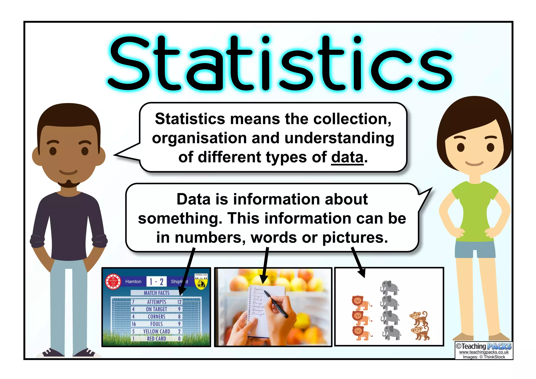


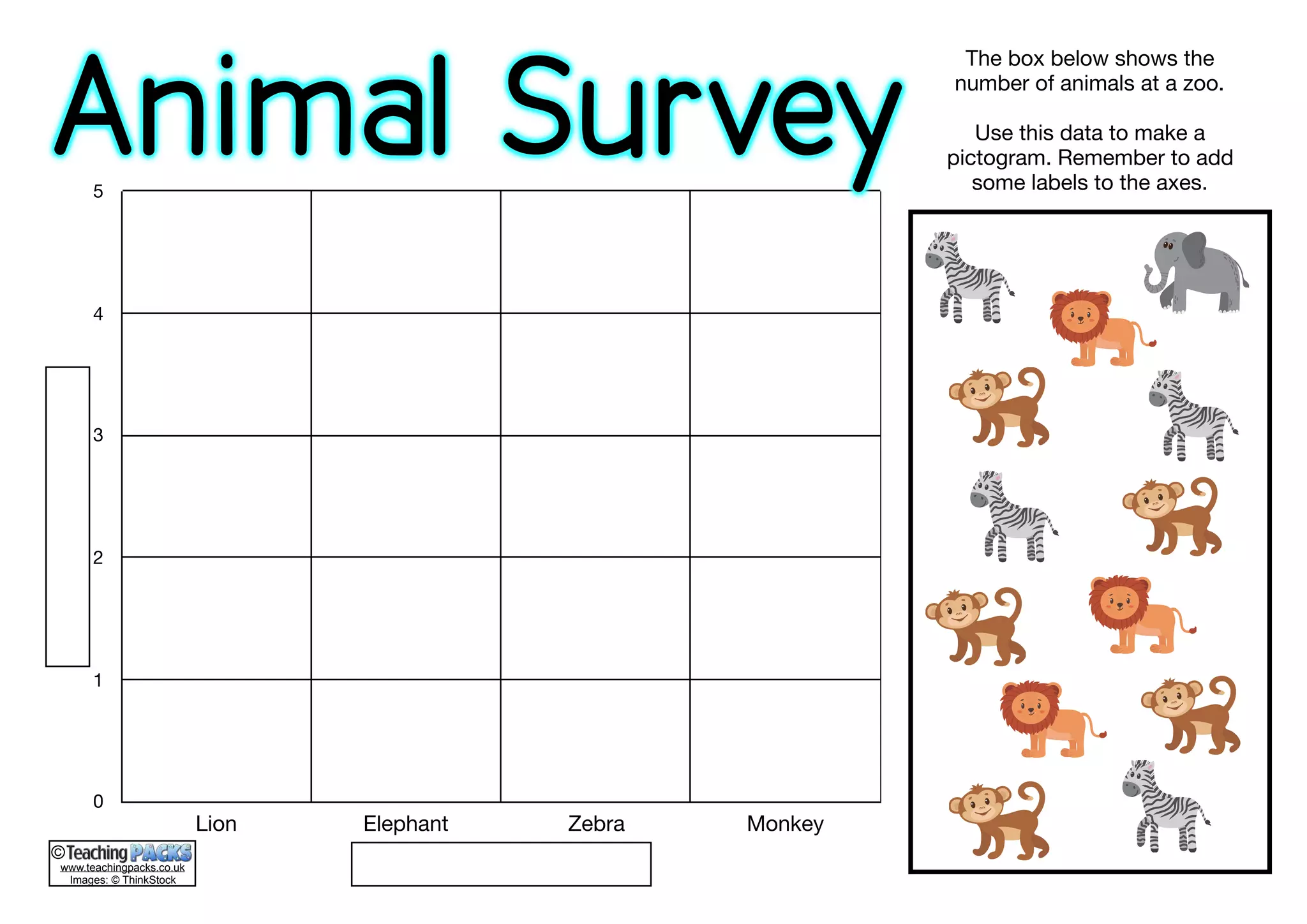


The document provides an overview of various methods for collecting and displaying data, including pie charts, pictograms, and Venn diagrams. It explains how to interpret data through examples such as favorite fruits, animals, and podcast downloads. Additionally, it describes statistical concepts like averages and includes practical exercises for understanding the material.