Download as PPSX, PPTX

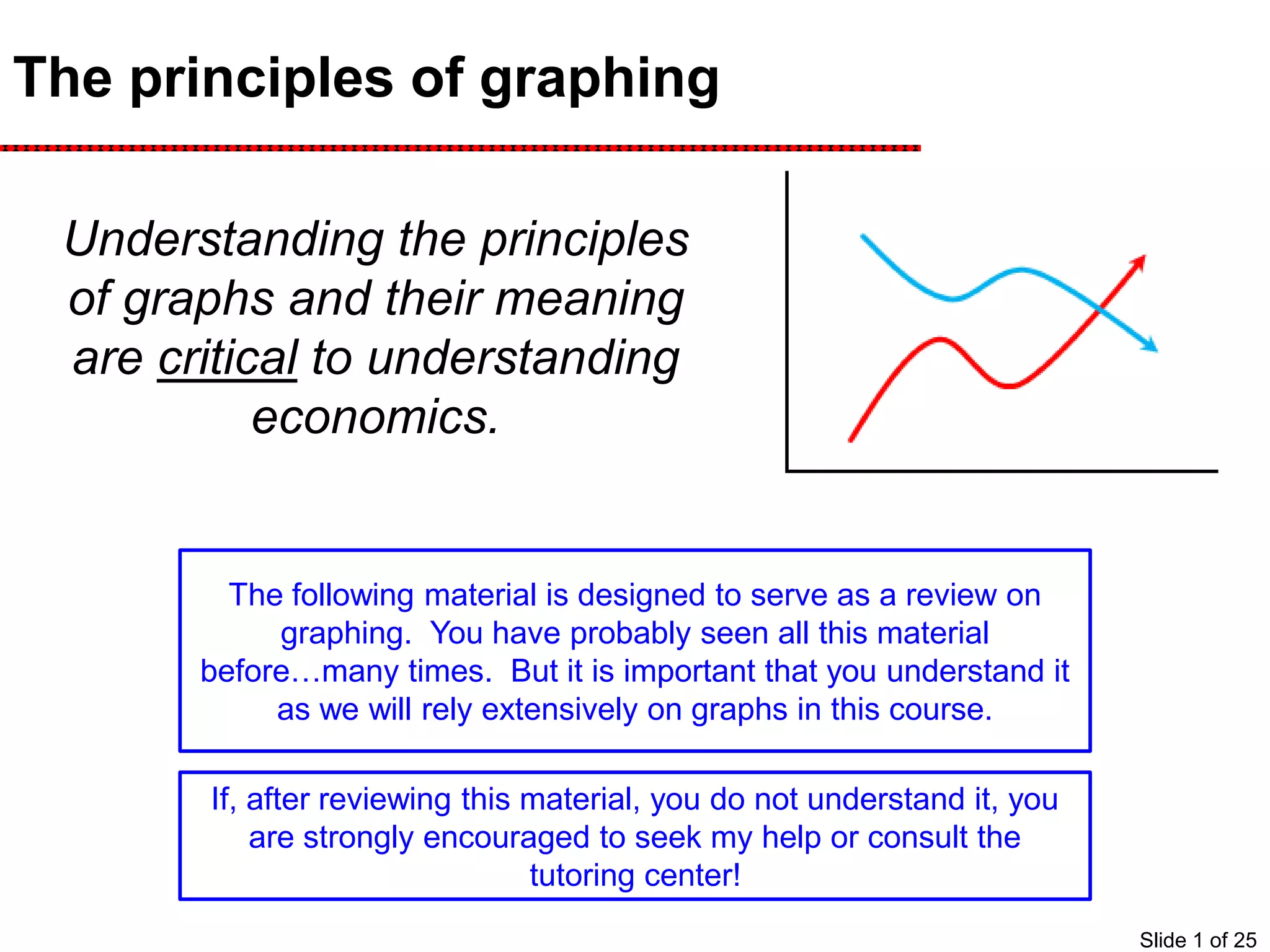

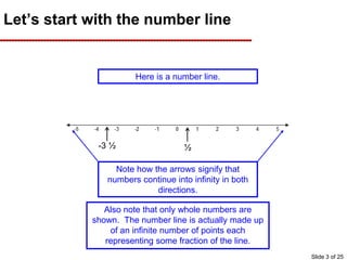
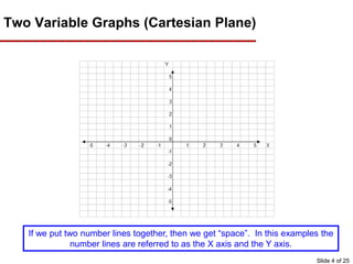
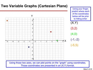
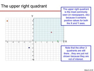
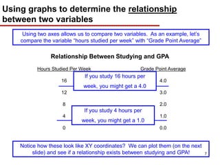
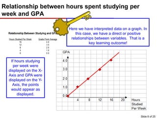
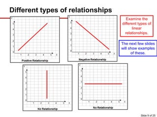
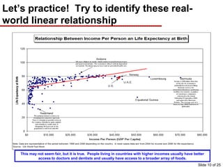
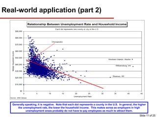
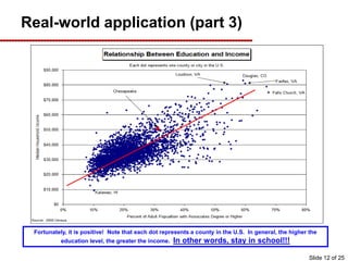
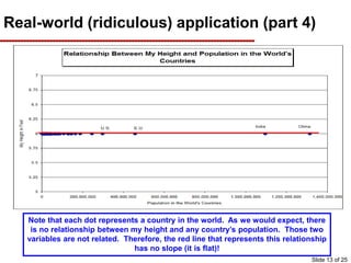
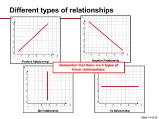

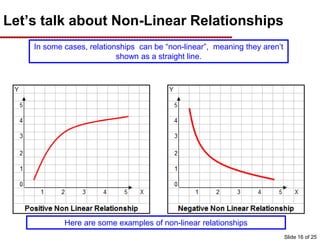
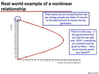
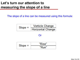
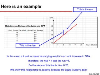
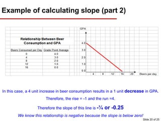
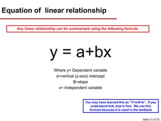
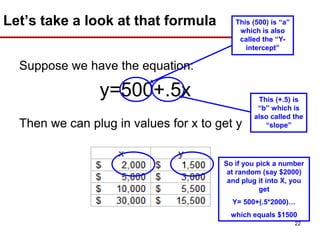
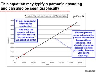
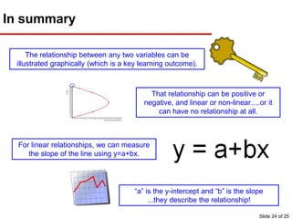
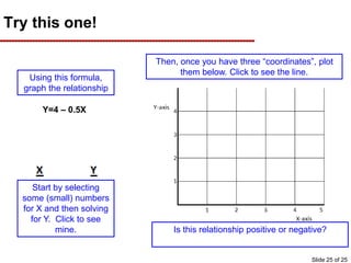

This document provides an overview of graphing principles and their application in economics. It begins with an introduction explaining the importance of understanding graphs. It then presents a series of slides explaining key graphing concepts like the Cartesian plane, linear relationships between variables, measuring slope, and using the equation y=mx+b to represent linear relationships algebraically. Examples are given for positive, negative, and no relationships between real-world variables like income and life expectancy. Non-linear relationships are also briefly discussed. The document emphasizes that understanding graphs is critical for success in economics courses.