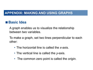
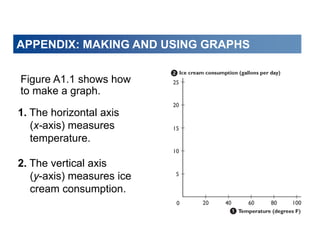
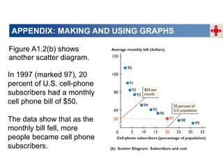
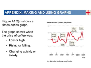
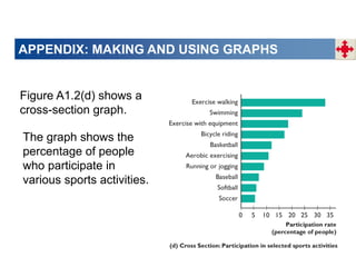
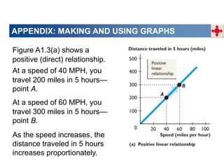
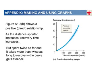
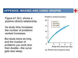
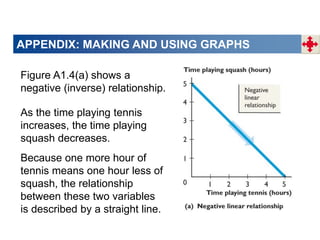
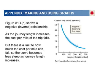
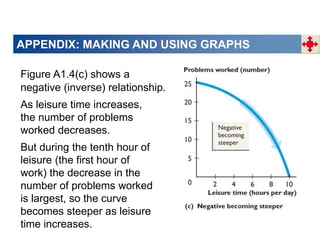
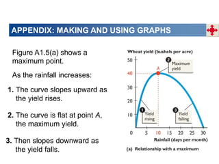
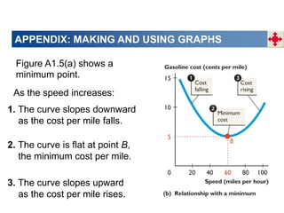
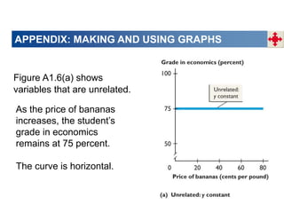
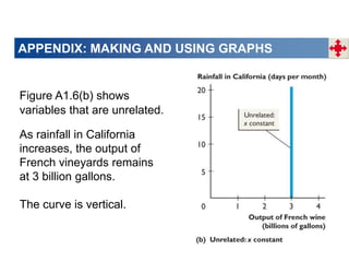
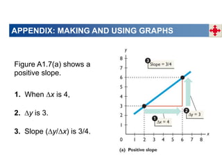
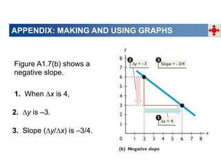
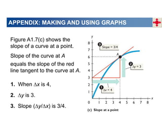
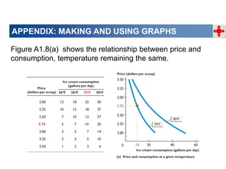
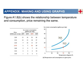
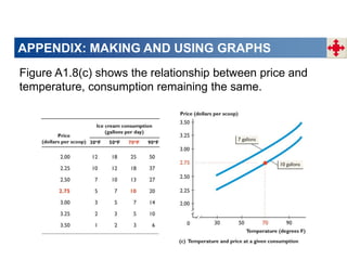
© 2011 Pearson Education
Getting Started 1
When you have completed your study of this
appendix, you will be able to
1 Interpret a scatter diagram, a time-series graph, and a
cross-section graph.
2 Interpret the graphs used in economic models.
3 Define and calculate slope.
4 Graph relationships among more than two variables.
APPENDIX CHECKLIST
Basic Idea
A graph enables us to visualize the relationship
between two variables.
To make a graph, set two lines perpendicular to each
other:
• The horizontal line is called the x-axis.
• The vertical line is called the y-axis.
• The common zero point is called the origin.
APPENDIX: MAKING AND USING GRAPHS
Figure A1.1 shows how
to make a graph.
1. The horizontal axis
(x-axis) measures
temperature.
2. The vertical axis
(y-axis) measures ice
cream consumption.
APPENDIX: MAKING AND USING GRAPHS
3. Point A shows that when
the temperature is 40
degrees, ice cream
consumption is only 5
gallons a day.
4. Point B shows that when
the temperature is 80
degrees, ice cream
consumption jumps to 20
gallons a day.
APPENDIX: MAKING AND USING GRAPHS
Interpreting Data Graphs
Scatter diagram is a graph of the value of one
variable against the value of another variable.
Time-series graph is a graph that measures time on
the x-axis and the variable or variables in which we are
interested on the y-axis.
APPENDIX: MAKING AND USING GRAPHS
Trend is a general tendency for the value of a variable
to rise or fall.
Cross-section graph is a graph that shows the
values of an economic variable for different groups in a
population at a point in time.
APPENDIX: MAKING AND USING GRAPHS
Figure A1.2(a) shows a
scatter diagram.
The data for 1999 to
2009 show that as
income increases,
expenditure increases.
In 2004 (marked 04),
income per person was
$28,990 and
expenditure per person
was $27,400.
APPENDIX: MAKING AND USING GRAPHS
Figure A1.2(b) shows
another scatter diagram.
The data show that as the
monthly bill fell, more
people became cell phone
subscribers.
In 1997 (marked 97), 20
percent of U.S. cell-phone
subscribers had a monthly
cell phone bill of $50.
APPENDIX: MAKING AND USING GRAPHS
Figure A1.2(c) shows a
times-series graph.
• Low or high.
• Rising or falling.
• Changing quickly or
slowly.
The graph shows when
the price of coffee was:
APPENDIX: MAKING AND USING GRAPHS
Figure A1.2(d) shows a
cross-section graph.
The graph shows the
percentage of people
who participate in
various sports activities.
APPENDIX: MAKING AND USING GRAPHS
Interpreting Graphs Used in Economic
Models
Positive relationship or direct relationship is a
relationship between two variables that move in the
same direction.
Linear relationship is a relationship that graphs as a
straight line.
APPENDIX: MAKING AND USING GRAPHS
Figure A1.3(a) shows a
positive (direct) relationship.
As the speed increases, the
distance traveled in 5 hours
increases proportionately.
At a speed of 40 MPH, you
travel 200 miles in 5 hours—
point A.
At a speed of 60 MPH, you
travel 300 miles in 5 hours—
point B.
APPENDIX: MAKING AND USING GRAPHS
Figure A1.3(b) shows a
positive (direct) relationship.
As the distance sprinted
increases, recovery time
increases.
But sprint twice as far and
it takes more than twice as
long to recover—the curve
gets steeper.
APPENDIX: MAKING AND USING GRAPHS
Figure A1.3(c) shows a
positive (direct) relationship.
As study time increases,
the number of problems
worked increases.
But study twice as long
and the number of
problems you work less
than double—the curve
gets less steep.
APPENDIX: MAKING AND USING GRAPHS
Negative relationship or inverse relationship is a
relationship between two variables that move in
opposite directions.
APPENDIX: MAKING AND USING GRAPHS
Figure A1.4(a) shows a
negative (inverse) relationship.
As the time playing tennis
increases, the time playing
squash decreases.
Because one more hour of
tennis means one hour less of
squash, the relationship
between these two variables
is described by a straight line.
APPENDIX: MAKING AND USING GRAPHS
Figure A1.4(b) shows a
negative (inverse) relationship.
As the journey length increases,
the cost per mile of the trip falls.
But there is a limit to how
much the cost per mile can
fall, so the curve becomes
less steep as journey length
increases.
APPENDIX: MAKING AND USING GRAPHS
Figure A1.4(c) shows a
negative (inverse) relationship.
As leisure time increases,
the number of problems
worked decreases.
But during the tenth hour of
leisure (the first hour of
work) the decrease in the
number of problems worked
is largest, so the curve
becomes steeper as leisure
time increases.
APPENDIX: MAKING AND USING GRAPHS
Figure A1.5(a) shows a
maximum point.
1. The curve slopes upward as
the yield rises.
2. The curve is flat at point A,
the maximum yield.
3. Then slopes downward as
the yield falls.
As the rainfall increases:
APPENDIX: MAKING AND USING GRAPHS
Figure A1.5(a) shows a
minimum point.
1. The curve slopes downward
as the cost per mile falls.
2. The curve is flat at point B,
the minimum cost per mile.
3. The curve slopes upward
as the cost per mile rises.
As the speed increases:
APPENDIX: MAKING AND USING GRAPHS
Figure A1.6(a) shows
variables that are unrelated.
As the price of bananas
increases, the student’s
grade in economics
remains at 75 percent.
The curve is horizontal.
APPENDIX: MAKING AND USING GRAPHS
Figure A1.6(b) shows
variables that are unrelated.
As rainfall in California
increases, the output of
French vineyards remains
at 3 billion gallons.
The curve is vertical.
APPENDIX: MAKING AND USING GRAPHS
The Slope of a Relationship
Slope equals the change in the value of the variable
measured on the y-axis divided by the change the value
of the variable measured on the x-axis.
Slope = y ÷ x.
APPENDIX: MAKING AND USING GRAPHS
Figure A1.7(a) shows a
positive slope.
1. When ∆x is 4,
2. ∆y is 3.
3. Slope (∆y/∆x) is 3/4.
APPENDIX: MAKING AND USING GRAPHS
Figure A1.7(b) shows a
negative slope.
1. When ∆x is 4,
2. ∆y is –3.
3. Slope (∆y/∆x) is –3/4.
APPENDIX: MAKING AND USING GRAPHS
Figure A1.7(c) shows the
slope of a curve at a point.
1. When ∆x is 4,
2. ∆y is 3.
3. Slope (∆y/∆x) is 3/4.
Slope of the curve at A
equals the slope of the red
line tangent to the curve at A.
APPENDIX: MAKING AND USING GRAPHS
Relationships Among More Than Two
Variables
To graph a relationship that involves more than two
variables, we use the ceteris paribus assumption.
Ceteris Paribus
“other things remaining the same.”
Figure A1.8 shows the relationships between ice cream
consumed, the temperature, and the price of ice cream.
APPENDIX: MAKING AND USING GRAPHS
Figure A1.8(a) shows the relationship between price and
consumption, temperature remaining the same.
APPENDIX: MAKING AND USING GRAPHS
Figure A1.8(b) shows the relationship between temperature
and consumption, price remaining the same.
APPENDIX: MAKING AND USING GRAPHS
Figure A1.8(c) shows the relationship between price and
temperature, consumption remaining the same.

ch01apxlecture.ppt

  • 1.
    © 2011 PearsonEducation
  • 2.
    © 2011 PearsonEducation Getting Started 1 When you have completed your study of this appendix, you will be able to 1 Interpret a scatter diagram, a time-series graph, and a cross-section graph. 2 Interpret the graphs used in economic models. 3 Define and calculate slope. 4 Graph relationships among more than two variables. APPENDIX CHECKLIST
  • 3.
    Basic Idea A graphenables us to visualize the relationship between two variables. To make a graph, set two lines perpendicular to each other: • The horizontal line is called the x-axis. • The vertical line is called the y-axis. • The common zero point is called the origin. APPENDIX: MAKING AND USING GRAPHS
  • 4.
    APPENDIX: MAKING ANDUSING GRAPHS Figure A1.1 shows how to make a graph. 1. The horizontal axis (x-axis) measures temperature. 2. The vertical axis (y-axis) measures ice cream consumption.
  • 5.
    APPENDIX: MAKING ANDUSING GRAPHS 3. Point A shows that when the temperature is 40 degrees, ice cream consumption is only 5 gallons a day. 4. Point B shows that when the temperature is 80 degrees, ice cream consumption jumps to 20 gallons a day.
  • 6.
    APPENDIX: MAKING ANDUSING GRAPHS Interpreting Data Graphs Scatter diagram is a graph of the value of one variable against the value of another variable. Time-series graph is a graph that measures time on the x-axis and the variable or variables in which we are interested on the y-axis.
  • 7.
    APPENDIX: MAKING ANDUSING GRAPHS Trend is a general tendency for the value of a variable to rise or fall. Cross-section graph is a graph that shows the values of an economic variable for different groups in a population at a point in time.
  • 8.
    APPENDIX: MAKING ANDUSING GRAPHS Figure A1.2(a) shows a scatter diagram. The data for 1999 to 2009 show that as income increases, expenditure increases. In 2004 (marked 04), income per person was $28,990 and expenditure per person was $27,400.
  • 9.
    APPENDIX: MAKING ANDUSING GRAPHS Figure A1.2(b) shows another scatter diagram. The data show that as the monthly bill fell, more people became cell phone subscribers. In 1997 (marked 97), 20 percent of U.S. cell-phone subscribers had a monthly cell phone bill of $50.
  • 10.
    APPENDIX: MAKING ANDUSING GRAPHS Figure A1.2(c) shows a times-series graph. • Low or high. • Rising or falling. • Changing quickly or slowly. The graph shows when the price of coffee was:
  • 11.
    APPENDIX: MAKING ANDUSING GRAPHS Figure A1.2(d) shows a cross-section graph. The graph shows the percentage of people who participate in various sports activities.
  • 12.
    APPENDIX: MAKING ANDUSING GRAPHS Interpreting Graphs Used in Economic Models Positive relationship or direct relationship is a relationship between two variables that move in the same direction. Linear relationship is a relationship that graphs as a straight line.
  • 13.
    APPENDIX: MAKING ANDUSING GRAPHS Figure A1.3(a) shows a positive (direct) relationship. As the speed increases, the distance traveled in 5 hours increases proportionately. At a speed of 40 MPH, you travel 200 miles in 5 hours— point A. At a speed of 60 MPH, you travel 300 miles in 5 hours— point B.
  • 14.
    APPENDIX: MAKING ANDUSING GRAPHS Figure A1.3(b) shows a positive (direct) relationship. As the distance sprinted increases, recovery time increases. But sprint twice as far and it takes more than twice as long to recover—the curve gets steeper.
  • 15.
    APPENDIX: MAKING ANDUSING GRAPHS Figure A1.3(c) shows a positive (direct) relationship. As study time increases, the number of problems worked increases. But study twice as long and the number of problems you work less than double—the curve gets less steep.
  • 16.
    APPENDIX: MAKING ANDUSING GRAPHS Negative relationship or inverse relationship is a relationship between two variables that move in opposite directions.
  • 17.
    APPENDIX: MAKING ANDUSING GRAPHS Figure A1.4(a) shows a negative (inverse) relationship. As the time playing tennis increases, the time playing squash decreases. Because one more hour of tennis means one hour less of squash, the relationship between these two variables is described by a straight line.
  • 18.
    APPENDIX: MAKING ANDUSING GRAPHS Figure A1.4(b) shows a negative (inverse) relationship. As the journey length increases, the cost per mile of the trip falls. But there is a limit to how much the cost per mile can fall, so the curve becomes less steep as journey length increases.
  • 19.
    APPENDIX: MAKING ANDUSING GRAPHS Figure A1.4(c) shows a negative (inverse) relationship. As leisure time increases, the number of problems worked decreases. But during the tenth hour of leisure (the first hour of work) the decrease in the number of problems worked is largest, so the curve becomes steeper as leisure time increases.
  • 20.
    APPENDIX: MAKING ANDUSING GRAPHS Figure A1.5(a) shows a maximum point. 1. The curve slopes upward as the yield rises. 2. The curve is flat at point A, the maximum yield. 3. Then slopes downward as the yield falls. As the rainfall increases:
  • 21.
    APPENDIX: MAKING ANDUSING GRAPHS Figure A1.5(a) shows a minimum point. 1. The curve slopes downward as the cost per mile falls. 2. The curve is flat at point B, the minimum cost per mile. 3. The curve slopes upward as the cost per mile rises. As the speed increases:
  • 22.
    APPENDIX: MAKING ANDUSING GRAPHS Figure A1.6(a) shows variables that are unrelated. As the price of bananas increases, the student’s grade in economics remains at 75 percent. The curve is horizontal.
  • 23.
    APPENDIX: MAKING ANDUSING GRAPHS Figure A1.6(b) shows variables that are unrelated. As rainfall in California increases, the output of French vineyards remains at 3 billion gallons. The curve is vertical.
  • 24.
    APPENDIX: MAKING ANDUSING GRAPHS The Slope of a Relationship Slope equals the change in the value of the variable measured on the y-axis divided by the change the value of the variable measured on the x-axis. Slope = y ÷ x.
  • 25.
    APPENDIX: MAKING ANDUSING GRAPHS Figure A1.7(a) shows a positive slope. 1. When ∆x is 4, 2. ∆y is 3. 3. Slope (∆y/∆x) is 3/4.
  • 26.
    APPENDIX: MAKING ANDUSING GRAPHS Figure A1.7(b) shows a negative slope. 1. When ∆x is 4, 2. ∆y is –3. 3. Slope (∆y/∆x) is –3/4.
  • 27.
    APPENDIX: MAKING ANDUSING GRAPHS Figure A1.7(c) shows the slope of a curve at a point. 1. When ∆x is 4, 2. ∆y is 3. 3. Slope (∆y/∆x) is 3/4. Slope of the curve at A equals the slope of the red line tangent to the curve at A.
  • 28.
    APPENDIX: MAKING ANDUSING GRAPHS Relationships Among More Than Two Variables To graph a relationship that involves more than two variables, we use the ceteris paribus assumption. Ceteris Paribus “other things remaining the same.” Figure A1.8 shows the relationships between ice cream consumed, the temperature, and the price of ice cream.
  • 29.
    APPENDIX: MAKING ANDUSING GRAPHS Figure A1.8(a) shows the relationship between price and consumption, temperature remaining the same.
  • 30.
    APPENDIX: MAKING ANDUSING GRAPHS Figure A1.8(b) shows the relationship between temperature and consumption, price remaining the same.
  • 31.
    APPENDIX: MAKING ANDUSING GRAPHS Figure A1.8(c) shows the relationship between price and temperature, consumption remaining the same.