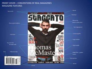
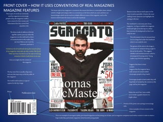
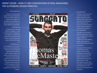
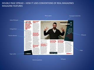
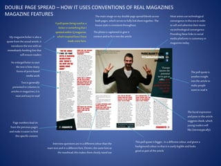
The ways in which my
magazine use, challenge, and
develop the conventions of
real magazines
Buzzwords
Direct mode of address
Cover lines
Keycover line
& modelcredit
Price
Banner
Masthead
Official info
(Issueno, date, price)
Keyimage gesture
Contentsignifier
Large numbers
Pageexample
Badge/flash– graphic
feature
Posterpreview
banner
website
Publicationdate
FRONT COVER – CONVENTIONS OF REAL MAGAZINES
MAGAZINE FEATURES
These typesof wordsarecommonly
used by magazinestoencourage
people tobuy the magazine.It offers
morecontent fortheir money and
informationthat theycannot find
anywhere else
Gives aninsight intothe content of
the magazine
The key coverline isusually a bigname,
and uses thismain story asthe key sellerof
the magazine
The modelcreditworksasa type of
captionforthe key image.
Price
Suggeststhat there ismore
content
Encourages people tolook inside,they will
hopefully be hooked by the content on the
page and buy the magazine
Makes the word‘free’ more visible
asit isinsidea graphic feature in a
brightcolour
Previewofthe posterusessynergy toencourage
sales
Gives examplesofmore content in the
magazine
Thisisan exampleof convergent media,print-basedmagazines arebecoming out-of-date,and somagazine companiesneed online content in ordertoretain a
large readership, particularlymagazinesaimedtowardsyoung people.
Publicationdate
The directmode of addressin the key
signifiercatchesyour eye whenthe
magazineison the shelfand isa form
ofcommunication to the reader; they
aremore likelytosee it and, by
extension, purchase it
Bannersensure thatasmuch space on the
cover isused as possible,it framesthe cover
making itmore attractiveand highlightsthe
synergy in the text
The mastheadisa necessarypart ofany
magazine, it isbigtoestablishthe magazine
brand and rightacrossthe top in a colour
thatcontraststhe background sothat itcan
easilybeseen
Thisinformationiskeyforany purchase,
so isin a large fontunder the masthead
where it can easilybe seen
The gesture of the artistin the image is
reminiscentof someone being caught in
the act by the police. Thissuggests
rebellionand mischievousness,which is
stereotypicalof young artists.Young
readersmay findthisappealing
Suggeststhat the magazine has a
wide amount ofcontent which
encourages people tobuy/read it
FRONT COVER – HOW IT USES CONVENTIONS OF REAL MAGAZINES
MAGAZINE FEATURES The house style ofmymagazine isconsistent;thismeansthat there isa noticeable colour scheme
(whichisbrightand unique), there isa consistencytothe fontswhich are used, and there are
layoutdesigns which can beused on multipledifferent issuesofthe magazine, such asthe
banners which framethe issue as wellas the masthead.
I looked at a lotof mastheadsduring the research phase
ofmy magazine, manytake up only a corner, likeQand
NME, butI have decided touse the style of mixmag
insteadas I thinkit looksbetterinmycase.
Primaryopticalarea
Weakfallowarea
Strong fallowarea
Terminalarea
Readinggravity
Thisarea iswherethereading
gravityofthemagazine begins,and
sothemain thingitcontainsisthe
mastheadofmy magazine.Itis
generallyimportanttokeepthisin
theprimaryopticalareasothatitis
fullyestablishedandeasilylegible.
Thisquartercontains thesecond
partofthemastheadandkey
signifier,alongsidetheprimary
opticalarea ofthemagazine.Italso
hasthekey,officialinformation
whichis importantforthe
consumer. Thisincludestheissue
number,thedateofpublication,
andthepriceofthemagazine.
Themajorityofthecoverlinesare
sectoredinthispartofthe
magazine.Thisiswherethe
readinggravitynaturallyfalls,so
talks aboutwhatisinsideofthe
magazine.Likewise,thereisa
previewofthefreeposterinside
rightinthecorner, which
encouragestheconsumertobuy
themagazine withthethoughtthat
theyare gettingmorefortheir
money.Thisisan importantareaof
mymagazine.
Theweakfallowareacontainsthe
keycoverlineandthemodelcredit,
whichcaptionthekeyimageand
tellthereaderaboutthemain
articleinsidethemagazine.This
sectioncanoftengounnoticed,soI
havemadeitcontainthislarge
pieceoftextsothatitisn’twasted.
Italsocontainsthebarcodewhich
isimportanttohaveonthefront
coverofthemagazineforthesale,
butnotnecessarilyimportant
enoughtobeina strongarea ofthe
magazine.
Europeanreadersarenaturally
inclinedtoreadpagesinacertain
way,followingthe‘readinggravity’.
Mymagazine usesthisbyhaving
thetitleat thetop,andinformation
incolumnsacrossbothsidesofthe
page,concludingintheterminal
area.
Keyimage/signifier
Theimageusesa directmodeof
addresstohookthereaderintothe
issue.The“caught intheact”gesture
suggestsrebellionand
mischievousnesswhichwillattract
youngerreadersas theyare
stereotypicallyrebelliousthemselves
FRONT COVER – HOW IT USES CONVENTIONS OF REAL MAGAZINES
THE GUTENBERG DESIGN PRINCIPLE
CONTENTS PAGE – HOW IT USES CONVENTIONS OF REAL MAGAZINES
MAGAZINE FEATURES
Pagetitle
Twitterlink
Pullquotecaption
Photo
Subscriptioninformation
Editorial
Pagenumber
Pagenumber photocaption
Photo
Pullquote/photocaption
Contentnumbers
Flash
Subtitle
Label:Cover Story
Website
Content
CONTENTS PAGE – HOW IT USES CONVENTIONS OF REAL MAGAZINES
MAGAZINE FEATURES
Thisfollowsthe house style ofthe
front cover, and tellsthe reader
thatthisisthe contents page
Readersin thisgeneration willknow thatthe ‘@’
symbolsignifiesa Twitterlink,which willappeal
especiallyto young readers
The photo iscaptionedwith a pull
quote taken fromthe inside,thisis
used tohook the reader’s interest
and make themreadthe restofthe
article
Thisphoto linkstothe page
number in itscorner, which
advertisesthe content ofthe page
Magazinesoften offer subscription
dealsto people who buy their
magazines; thisoffersthem a
subscription which isimportantas
it ensuresa regularreadershipof
the magazine.
Allmagazineshave an editorialin them,
and a lotput these on the contents
page. This isa message fromthe editor,
tellingthe readerabout the content
inside.
Each page isnumbered sothe readercan
keep a trackof what page theyare on and
can followthecontents list.This isan
extremely importantfeature. Also,the
magazine name isrepeated withit tomake
it more aestheticallypleasing
Thisphoto istaken fromone ofmy
photoshoots, linkingto one ofthe
articlesinthe magazine and
encouraging people toread it
The photo captionadvertisesthe content
and attractspeople toread it
Each page ofcontent isgiven a page
number asinall magazines, and this
goes up to120 asit isdesigned tobe a
monthly magazine soneeds a lotof
content.
Thisflashencourages the readerto
lookat thisarticle,and makesit
seemimportantwhere it may be
otherwiseignored.
Thispart of the content formedia is
labelled‘cover story’so thatthe reader
knows where toturn toinorder tofind
the main articlewhichisadvertisedon
the front cover, mostmagazines use
someform of label forthe cover article.
Printbased magazinesaregoing out ofdate
with the eraof Web 2.0, soit isimportantto
includelinkstoonline information.Also,
thisencourages a readership ofyounger
people.
The subtitlesshow the reader
where to findcertaintypesof
content, includingfeatures,articles
createdby experts, and reviewsof
existingmusic.
The photo iscaptionedwith the page
number sothe readerknows what article
the photo linksto
Colours and typographiesused around the
page followthe same house style asthose
used on the double page spread and on the
front cover.
Gives a titleforthe content and a
shortexplanation
DOUBLE PAGE SPREAD – HOW IT USES CONVENTIONS OF REAL MAGAZINES
MAGAZINE FEATURES
Pullquote
Image
Pagenumber
Masthead
Keysignifier
Photocredit
DOUBLE PAGE SPREAD I – HOW IT USES CONVENTIONS OF REAL MAGAZINES
MAGAZINE FEATURES
Thisisa quotefrom the
articleonthe next page
which can be usedto hook
the readerinto exploring
the article.It usesstrong
andinformallanguageto
hookthetarget reader–
youngadults.
Thisisanotherimage
from thesame
photoshootof my artist,
which highlightshis
significancein thisarticle.
Thedoublepage spread
runsover two pages, so
therearetwo page
numbers.Like onthe
contentspage, the
mastheadisalsorepeated
to make thesecorners
lookmore attractiveand
to establishthebrand.
Thisintroducesthe article,
puttingit asit is.The same
font asthemastheadonthe
front cover is usedagainas
part of thehousestyleof my
magazine
Thekey image onthispage hasbeeneditedusing
photoshopsothat thebackground hasbeenremoved
but theartistandthe shadowremain,allowingfull
emphasisto be given to his gesturecodes.
Realmagazinesuse
photosfrom various
differentphotographers
andhave to give them
credit for thephoto.I
have donethishere,
althoughallof the photos
aremy own.
Introductorydoublepage spreadsarenotalwaysusedbeforekey articles,butdo helpgrab attentionforkey pagesinside.Thisis
a techniquethatI spottedin Qmagazine, notablyin thosethatI analysedduringmy market researchof doublepagespreads,
andis somethingthat I thought my magazinecouldbenefitfrom.
DOUBLE PAGE SPREAD – HOW IT USES CONVENTIONS OF REAL MAGAZINES
MAGAZINE FEATURES
Kicker/Pullquote
Enlargedletter
Text (in columns)
Pagenumber
Interviewquestions
Pullquote
Photocaption Convergentmedialinks
Pullquote
Image
DOUBLE PAGE SPREAD – HOW IT USES CONVENTIONS OF REAL MAGAZINES
MAGAZINE FEATURES
My magazinekicker is alsoa
quotefrom the actualarticle, it
introducesthetext with an
immediatelyhooking linethat
will ensurereaders
An enlargedletterto start
the text ishow many
forms of print-based
mediawork
Text isgenerally
presentedincolumnsin
articlesin magazines,it is
neatandeasyto read
Pagenumbersleadon
from thepreviouspages
andmake it easierto find
thisspecificcontent
Interviewquestionsareina differentcolourthanthe
main text andin a differentfont, Dimitri, the samefontas
the masthead,thismakesthem clearlystandout
Thispullquoteisbigger, in a differentcolour, andgiven a
backgroundcolour sothat it iseasilylegibleandlooks
good aspart of thearticle
Thephotois captionedto give it
context andto fit it intothe article
Mostartistsusetechnological
convergencein thisera in order
to sellandadvertisetheirmusic
via technologicalconvergence.
Providingtheselinksto social
mediaplatformsiscustomaryin
magazinestoday.
Thepull quoteis
anotherinsight
intothe articleto
make people
want to readit
Thefacialexpression
andposein thisarticle
suggestscheek, which
youngreaderswill
like (stereotypically).
A pull quotebeing usedas a
kicker is somethingthat I
spottedwithinQ magazine,
which inspiredhowI have
mademine here.
Themain image onmy doublepagespreadbleedsacross
bothpages, which servesto fullylinkthem together.The
housestyleis consistentthroughout.

Magazine features

  • 1.
    The ways inwhich my magazine use, challenge, and develop the conventions of real magazines
  • 2.
    Buzzwords Direct mode ofaddress Cover lines Keycover line & modelcredit Price Banner Masthead Official info (Issueno, date, price) Keyimage gesture Contentsignifier Large numbers Pageexample Badge/flash– graphic feature Posterpreview banner website Publicationdate FRONT COVER – CONVENTIONS OF REAL MAGAZINES MAGAZINE FEATURES
  • 3.
    These typesof wordsarecommonly usedby magazinestoencourage people tobuy the magazine.It offers morecontent fortheir money and informationthat theycannot find anywhere else Gives aninsight intothe content of the magazine The key coverline isusually a bigname, and uses thismain story asthe key sellerof the magazine The modelcreditworksasa type of captionforthe key image. Price Suggeststhat there ismore content Encourages people tolook inside,they will hopefully be hooked by the content on the page and buy the magazine Makes the word‘free’ more visible asit isinsidea graphic feature in a brightcolour Previewofthe posterusessynergy toencourage sales Gives examplesofmore content in the magazine Thisisan exampleof convergent media,print-basedmagazines arebecoming out-of-date,and somagazine companiesneed online content in ordertoretain a large readership, particularlymagazinesaimedtowardsyoung people. Publicationdate The directmode of addressin the key signifiercatchesyour eye whenthe magazineison the shelfand isa form ofcommunication to the reader; they aremore likelytosee it and, by extension, purchase it Bannersensure thatasmuch space on the cover isused as possible,it framesthe cover making itmore attractiveand highlightsthe synergy in the text The mastheadisa necessarypart ofany magazine, it isbigtoestablishthe magazine brand and rightacrossthe top in a colour thatcontraststhe background sothat itcan easilybeseen Thisinformationiskeyforany purchase, so isin a large fontunder the masthead where it can easilybe seen The gesture of the artistin the image is reminiscentof someone being caught in the act by the police. Thissuggests rebellionand mischievousness,which is stereotypicalof young artists.Young readersmay findthisappealing Suggeststhat the magazine has a wide amount ofcontent which encourages people tobuy/read it FRONT COVER – HOW IT USES CONVENTIONS OF REAL MAGAZINES MAGAZINE FEATURES The house style ofmymagazine isconsistent;thismeansthat there isa noticeable colour scheme (whichisbrightand unique), there isa consistencytothe fontswhich are used, and there are layoutdesigns which can beused on multipledifferent issuesofthe magazine, such asthe banners which framethe issue as wellas the masthead. I looked at a lotof mastheadsduring the research phase ofmy magazine, manytake up only a corner, likeQand NME, butI have decided touse the style of mixmag insteadas I thinkit looksbetterinmycase.
  • 4.
    Primaryopticalarea Weakfallowarea Strong fallowarea Terminalarea Readinggravity Thisarea iswherethereading gravityofthemagazinebegins,and sothemain thingitcontainsisthe mastheadofmy magazine.Itis generallyimportanttokeepthisin theprimaryopticalareasothatitis fullyestablishedandeasilylegible. Thisquartercontains thesecond partofthemastheadandkey signifier,alongsidetheprimary opticalarea ofthemagazine.Italso hasthekey,officialinformation whichis importantforthe consumer. Thisincludestheissue number,thedateofpublication, andthepriceofthemagazine. Themajorityofthecoverlinesare sectoredinthispartofthe magazine.Thisiswherethe readinggravitynaturallyfalls,so talks aboutwhatisinsideofthe magazine.Likewise,thereisa previewofthefreeposterinside rightinthecorner, which encouragestheconsumertobuy themagazine withthethoughtthat theyare gettingmorefortheir money.Thisisan importantareaof mymagazine. Theweakfallowareacontainsthe keycoverlineandthemodelcredit, whichcaptionthekeyimageand tellthereaderaboutthemain articleinsidethemagazine.This sectioncanoftengounnoticed,soI havemadeitcontainthislarge pieceoftextsothatitisn’twasted. Italsocontainsthebarcodewhich isimportanttohaveonthefront coverofthemagazineforthesale, butnotnecessarilyimportant enoughtobeina strongarea ofthe magazine. Europeanreadersarenaturally inclinedtoreadpagesinacertain way,followingthe‘readinggravity’. Mymagazine usesthisbyhaving thetitleat thetop,andinformation incolumnsacrossbothsidesofthe page,concludingintheterminal area. Keyimage/signifier Theimageusesa directmodeof addresstohookthereaderintothe issue.The“caught intheact”gesture suggestsrebellionand mischievousnesswhichwillattract youngerreadersas theyare stereotypicallyrebelliousthemselves FRONT COVER – HOW IT USES CONVENTIONS OF REAL MAGAZINES THE GUTENBERG DESIGN PRINCIPLE
  • 5.
    CONTENTS PAGE –HOW IT USES CONVENTIONS OF REAL MAGAZINES MAGAZINE FEATURES Pagetitle Twitterlink Pullquotecaption Photo Subscriptioninformation Editorial Pagenumber Pagenumber photocaption Photo Pullquote/photocaption Contentnumbers Flash Subtitle Label:Cover Story Website Content
  • 6.
    CONTENTS PAGE –HOW IT USES CONVENTIONS OF REAL MAGAZINES MAGAZINE FEATURES Thisfollowsthe house style ofthe front cover, and tellsthe reader thatthisisthe contents page Readersin thisgeneration willknow thatthe ‘@’ symbolsignifiesa Twitterlink,which willappeal especiallyto young readers The photo iscaptionedwith a pull quote taken fromthe inside,thisis used tohook the reader’s interest and make themreadthe restofthe article Thisphoto linkstothe page number in itscorner, which advertisesthe content ofthe page Magazinesoften offer subscription dealsto people who buy their magazines; thisoffersthem a subscription which isimportantas it ensuresa regularreadershipof the magazine. Allmagazineshave an editorialin them, and a lotput these on the contents page. This isa message fromthe editor, tellingthe readerabout the content inside. Each page isnumbered sothe readercan keep a trackof what page theyare on and can followthecontents list.This isan extremely importantfeature. Also,the magazine name isrepeated withit tomake it more aestheticallypleasing Thisphoto istaken fromone ofmy photoshoots, linkingto one ofthe articlesinthe magazine and encouraging people toread it The photo captionadvertisesthe content and attractspeople toread it Each page ofcontent isgiven a page number asinall magazines, and this goes up to120 asit isdesigned tobe a monthly magazine soneeds a lotof content. Thisflashencourages the readerto lookat thisarticle,and makesit seemimportantwhere it may be otherwiseignored. Thispart of the content formedia is labelled‘cover story’so thatthe reader knows where toturn toinorder tofind the main articlewhichisadvertisedon the front cover, mostmagazines use someform of label forthe cover article. Printbased magazinesaregoing out ofdate with the eraof Web 2.0, soit isimportantto includelinkstoonline information.Also, thisencourages a readership ofyounger people. The subtitlesshow the reader where to findcertaintypesof content, includingfeatures,articles createdby experts, and reviewsof existingmusic. The photo iscaptionedwith the page number sothe readerknows what article the photo linksto Colours and typographiesused around the page followthe same house style asthose used on the double page spread and on the front cover. Gives a titleforthe content and a shortexplanation
  • 7.
    DOUBLE PAGE SPREAD– HOW IT USES CONVENTIONS OF REAL MAGAZINES MAGAZINE FEATURES Pullquote Image Pagenumber Masthead Keysignifier Photocredit
  • 8.
    DOUBLE PAGE SPREADI – HOW IT USES CONVENTIONS OF REAL MAGAZINES MAGAZINE FEATURES Thisisa quotefrom the articleonthe next page which can be usedto hook the readerinto exploring the article.It usesstrong andinformallanguageto hookthetarget reader– youngadults. Thisisanotherimage from thesame photoshootof my artist, which highlightshis significancein thisarticle. Thedoublepage spread runsover two pages, so therearetwo page numbers.Like onthe contentspage, the mastheadisalsorepeated to make thesecorners lookmore attractiveand to establishthebrand. Thisintroducesthe article, puttingit asit is.The same font asthemastheadonthe front cover is usedagainas part of thehousestyleof my magazine Thekey image onthispage hasbeeneditedusing photoshopsothat thebackground hasbeenremoved but theartistandthe shadowremain,allowingfull emphasisto be given to his gesturecodes. Realmagazinesuse photosfrom various differentphotographers andhave to give them credit for thephoto.I have donethishere, althoughallof the photos aremy own. Introductorydoublepage spreadsarenotalwaysusedbeforekey articles,butdo helpgrab attentionforkey pagesinside.Thisis a techniquethatI spottedin Qmagazine, notablyin thosethatI analysedduringmy market researchof doublepagespreads, andis somethingthat I thought my magazinecouldbenefitfrom.
  • 9.
    DOUBLE PAGE SPREAD– HOW IT USES CONVENTIONS OF REAL MAGAZINES MAGAZINE FEATURES Kicker/Pullquote Enlargedletter Text (in columns) Pagenumber Interviewquestions Pullquote Photocaption Convergentmedialinks Pullquote Image
  • 10.
    DOUBLE PAGE SPREAD– HOW IT USES CONVENTIONS OF REAL MAGAZINES MAGAZINE FEATURES My magazinekicker is alsoa quotefrom the actualarticle, it introducesthetext with an immediatelyhooking linethat will ensurereaders An enlargedletterto start the text ishow many forms of print-based mediawork Text isgenerally presentedincolumnsin articlesin magazines,it is neatandeasyto read Pagenumbersleadon from thepreviouspages andmake it easierto find thisspecificcontent Interviewquestionsareina differentcolourthanthe main text andin a differentfont, Dimitri, the samefontas the masthead,thismakesthem clearlystandout Thispullquoteisbigger, in a differentcolour, andgiven a backgroundcolour sothat it iseasilylegibleandlooks good aspart of thearticle Thephotois captionedto give it context andto fit it intothe article Mostartistsusetechnological convergencein thisera in order to sellandadvertisetheirmusic via technologicalconvergence. Providingtheselinksto social mediaplatformsiscustomaryin magazinestoday. Thepull quoteis anotherinsight intothe articleto make people want to readit Thefacialexpression andposein thisarticle suggestscheek, which youngreaderswill like (stereotypically). A pull quotebeing usedas a kicker is somethingthat I spottedwithinQ magazine, which inspiredhowI have mademine here. Themain image onmy doublepagespreadbleedsacross bothpages, which servesto fullylinkthem together.The housestyleis consistentthroughout.