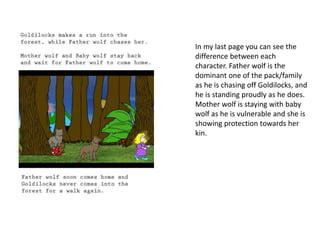
Graphic Narrative 
Evaluation
Use this template to help you evaluate your project. 
You should give specific details about your work. 
You should provide both written and visual examples to explain your project. 
You should find areas to praise in your work. Be specific about why you think they are 
good or why you are proud of them. 
You should also find areas that could be improved. Look for areas that you could make 
better if you went back to them. Be specific about what you would improve. 
Add additional slides as you need to. Don’t be restricted by what is here. 
Any blank slides should be deleted before submission.
Does your final product reflect your 
original intentions? 
My final product did reflect on how I originally 
wanted my product to be like. It was finished with the 
same idea I had created during my planning, but I had 
to add minor adjustments to make the story more 
suitable for my target audience, as well as make the 
story work too. 
On my original storyboards I had created a minor 
version of my story on strip-generator, which allowed 
me to see how my story would look if I had created it. I 
looked into the techniques I used to create it and 
looked for things which may need to be changed. As of 
this I managed to find the minor adjustments I needed 
to make but also I managed to keep the product and 
storyline to my original intentions.
One piece of work from 
my strip – generator 
creation. As you can see I 
have the 3 hammocks 
separated on to 2 
different pages. I made a 
minor adjustment so in 
my project they are all 
bunched together in the 
garden on one page. 
These adjustments were 
made to make a better 
effect in the story and to 
create a much better 
visual image.
How well have you constructed your 
images? 
I have used many different techniques to create my images in 
Photoshop. I have used a range of techniques during this time, but I 
main aspect I used was rotoscoping. Rotoscoping allowed me to 
take a picture, draw over the top of different parts of them and 
change them. This creates a cartoon-like effect for my objects used, 
but keeps the realistic look on them. 
Some of my images were better constructed than others, for 
instance, my main character Goldilocks; I had to change her as I had 
one source image to work from which I could not make major 
changes to it to create her look for the next scenes. As a result of 
this, I managed to find multiple source images of a Goldilocks 
replacement, and she had different animation in each image. This 
allowed me to create a much more effective image to help when 
building up the visualisation of my scenes.
As you can see on the left, these are the images I used for goldilocks in my 
different scenes. They are constructed very well and work with the visuals in 
the scenes. As on the right, this was a single source image, which would take to 
much time and also create major difficulties when trying to edit her and make 
her be in different poses for the different scenes.
How well have you used text to anchor 
your images 
I have used a sustainable method to anchor my images and entangle them 
with text which suits and fits around the scene. On my digital flat plans I came up 
with 2 different methods of adding text to my pages, which would compliment the 
images. 
My first idea was an original classic design where the image is in between 
the top and middle of the page, and the text then follows at the bottom of the 
page. I thought that this idea is too original, and sometimes can be plain & boring. 
I decided to check a new method which I thought you could space the text evenly 
out around the image. The image would stay in the middle of the page and the 
text would surround the image from the top and the bottom. 
As of this design, it changed how you would look at the scene. I undertook 
this decision and it turned out for the best. It compliments my images very well 
and anchors them down, allowing readers to have a visual perspective of what is 
happening as well as reading what it happening. I could improve by chopping 
down some of the text as in some of my pages the text is in a block paragraph. As 
of this, it may cause difficulty for younger readers to read all of the text by 
themselves if they are reading the book alone.
As you can see on the left, some of my pages have a lot of text around the image which can 
create some sort of difficulties for younger children. A prime example of comparison would 
be the Gruffalo written by Julia Donaldson as she wraps her text around the image, which is 
different. Although she he some big chunks of text, they work with the image as it is 
entangled within the image.
Is your product suitable for your 
audience? 
In my proposal, I wanted to create my book for a target 
audience of children between the ages of 5-8. This was the fact that 
the book is quite long, and with a plot twist, some of the content in 
the book could be found a little bit scary. I also was targeting a 
multi-gender audience, so both male and female. I have changed 
the 3 bears to wolves, so it would drag the book to appeal more to 
the male side of things, but as my Goldilocks character has been 
changed and in different poses for the scenes, this will balance the 
differences out as it will appeal to more females. 
I would say that my product is suitable for my target audience 
as I have tried to keep it close to the original storyline, but I have 
also tried to make the characters help create an appeal to the 
audience which will cause more sales with both sides of gender, but 
will also allow for my target age group to obtain the book.
Audience 
I am targeting an audience of both children & adults. I need my 
book to appeal to both groups to generate more popularity for 
my book. The ages I will focus on are between ages 5-8, so 
children can read the book with an adult or with help from the 
adult. The location my book will be aimed at is around the 
world, as the original story is a popular fairy tale in the English 
language. I will also focus on trying to create a rhythm for the 
book, to keep it at a nice pace. 
As shown, this chunk of text is from proposal stating what I wanted to 
achieve when targeting my audience. I have managed to achieve most 
objectives set in my audience, but although I may not be able to say, I 
may have not achieved some of the objects such as having the book as a 
world wide selling book.
What do you like/dislike about the 
techniques you have used? 
I like the techniques I used with my images such as rotoscoping. 
While rotoscoping, you have to cut around a part of the original image, 
and then you can change that area with different ways such as; Colour 
Overlay, Stroke and Gradient Overlay. There are many more, but I used 
Colour Overlay and Stroke on every image I rotoscoped over. 
As I used rotoscoping, I managed overtime to use different tools 
which helped with the process. I would usually of used the polygonal lasso 
tool, which allows me to cut around the image, but then I started to use 
the magic wand tool, which you can just click an area, and it cuts around 
the image as best it can, speeding up my rotoscoping process. I also used 
another tool called the clone stamp for when I had to add an extra back 
leg to a wolf. This allowed me to copy certain areas from the original wolf 
and apply them in a different location. 
Something I disliked about the rotoscoping technique I used was the 
fact that when I was using the polygonal lasso tool, it would take a long 
time to rotoscope around an image. Once I learned to use the magic wand 
tool it was not so bad, but I managed to lose a lot of time when I was 
creating my characters.
This is the wolf I had to use the 
clone stamp on to create the 
back legs. I also had to add the 
tail, but as you can tell, I cloned 
the legs as they have no details 
for the fur like the head and 
front of the wolf does. This 
creates contrast and doesn’t 
really get noticed when the 
wolf is in a smaller image, but 
up close you can tell it has been 
changed.
What do you like/dislike about how 
your final product looks? 
I like about my final product that each page works 
together, images all link and there is a nice contrast with 
colours. I also like how my book has a suitable text and 
image amounts for young children who are going to read 
the book. 
Something I dislike about my final product are small 
things, so I dislike how my final product is longer than I had 
hoped. Originally it was supposed to have around 10 pages, 
but instead, now it has 15, which could make the reader get 
bored from reading as it could start to get repetitive. I also 
dislike how in my final product as whole, the images can be 
quite bright and involve vibrant colours which can make a 
massive impact on the audience reading it in case this 
problem affects their eyes.
Why did you include the content you 
used? 
I included a lot of different content throughout my product. I added 
different images, colours and used different effects in my project. The 
images I used were mainly rotoscoped over but some of them like skyline 
were used with a certain coloured shape and then it was used with an 
effect called overlay where the 2 images merge, creating a nice skyline 
effect. 
I used colours which reflected most real life colours for that item, 
such as the trees, trunk is brown, leaves are green. When Goldilocks 
acquired her outfit I decided to make it have colours which a girl may 
use/like, so that is why purple was the main colour based for her. 
I also used different fonts at first to try find the one which suited my 
project first, and I came across as nice font which was actually a serif font, 
so I used it. This would help for young readers be able to lead from one 
letter to another with ease. 
All of the content I used was to create details, add special effects 
which could bring the reader into the book and think it was them actually 
being there as well as the thought of helping them when they are trying to 
read it.
This image is my first page of my 
childrens book. As you can see, I 
have decided to use specific colours 
to create a forest, the leaves, grass. I 
have also used different textures to 
create the skylight and the grass 
effect. And with Goldilocks, I have 
tried to replicate colours which may 
be favoured by girls as Goldilocks is 
a girl.
What signs, symbols or codes have your used in your work? 
I have many different signs, symbols and codes in my work. 
One which is shown throughout the whole book is Goldilocks. She has 
blonde hair, which obviously is shown by her name. Blonde hair 
represents youth, beauty and innocence. These are some of the 
symbols which are shown through her hair, and they continue 
throughout. The time of day also shows different signs, for instance, 
Goldilocks finds a hut in a forest when it is starting to get late. Being 
alone in a forest when its dark is dangerous and scary, so these are 
the signs emitted from this scenario. 
I also have included some images when in the house, there is 
a toy car in the living room, and there is a trampoline in the garden. 
This shows signs of a child present and living in the household which 
can create tension. There is also kitchen cupboards in the kitchen 
which show that the household is a middle class home. When 
zooming in on Goldilocks in the house scenes, it symbolises the fact 
the we are focusing on the important parts of the story. 
The last thing is the wolves. When we first see them, 
they are standing tall and buff, with their young one in 
between the parents. This symbolises the parents are 
protective, they are proud to be wolves and they are 
like a normal wolf family. At the end the wolves are 
split up, but the baby and the mother wolf stay 
together, which shows signs of motherhood and 
caring for their own. The father disperses to chase 
Goldilocks away which again, is showing protection 
within the family.
What representations can be found in 
your work? 
Men, women and children alike are not exactly shown in my 
product. They are referenced in the book into animals as well as 
Goldilocks being a child who is a female. There is no representation 
for any of my characters which are in the book. 
There is a massive lack of variety for my characters that any 
representations which are shown are made by the audience, as 
they can see the different things each characters shows. For 
example, Father wolf shows pride of the wolf pack as he is the 
strong one and alpha male. Mother wolf shows love and protection 
towards her kin. And baby wolf shows properties of a child, like 
being vulnerable and throws tantrums when his things are broken. 
This creates a diverse viewpoint throughout my whole work as 
everyone has different viewpoints so they might agree and disagree 
with other people’s representation ideas.
In my last page you can see the 
difference between each 
character. Father wolf is the 
dominant one of the pack/family 
as he is chasing off Goldilocks, and 
he is standing proudly as he does. 
Mother wolf is staying with baby 
wolf as he is vulnerable and she is 
showing protection towards her 
kin.
What style have you employed in your 
products? 
• Discuss influences/ existing products 
• What visual style does your work have and why did you choose it? 
For my product, I have gone with different styles to most books. I have 
anchored my images in the middle of the page, with text complimenting the 
images at top and bottom of the page. An example of my image placement would 
be from the book ‘The Tickle Book’ by Ian Whybrow & Axel Scheffler. In Whybrow’s 
book, his images have mass detail on what items are placed in the scene, like the 
fence. It contains details of a wood texture in the fence panels, while the house 
has a single block colour, so it doesn’t steal the effect from other objects. I have 
done the same effect style for my images, keeping them busy and plenty to look at 
for my audience. 
When coming to the text, I have placed the text above and below my image. 
This helps the reader be able to read a little about what is going on, then see what 
is actually happening, and then is carried on. I had got my design from Julia 
Donaldson, as she does the same style in her books, text at the top left and 
bottom right of the pages, with images in the middle. This is a good technique 
which helps young people learn to read from left to right but also allows them to 
get some visual idea of what is happening in the story/scene as well as reading 
about it.
The top left image shows my image 
decisions as I have copied the style of 
adding certain textures to create a 
better scene, as well as keeping some 
images plain to create a contrast within 
the images and scene. 
The bottom left image shows how I 
have got inspiration for my text based 
ideas, this has allowed me to continue 
this effect into my book and create a 
style where the children read about 
the scene first, then see what is 
happening, then read what else 
happens or the consequences of what 
is happening.
What were the strengths and weaknesses 
of the pre-production and planning 
When I was in pre-production for my product, I had to create some 
research to help with my book, which the planning and a lot of research 
helped me. I managed to develop a small file which contained children’s 
book research, which contained information about some children books, 
the amount of pages they used, size of pages, what kind of images they 
used (illustrations, drawings, Photoshop). This research allowed me to get 
an idea of what I wanted to use to create my product with, and it allowed 
me to have more of an understanding when in production of my product. 
I also had to manage my time very well as I was creating a children’s 
book to a professional standard in only 2 weeks. I created a timescale plan 
to stick to, in order to manage my time well and allow me to complete my 
product within the time specified. An example would be that after my first 
session I wanted to have started my 2nd page before the next day, and 
then me 2nd and 3rd session, I wanted to have completed just over 3 pages. 
I managed to stick to this timescale and complete my product earlier than 
expected. This allowed for more time to make adjustments and polish it 
off to a better standard.
In this example, it shows my time 
management scale on what I wanted 
to have done by my 1st, 2nd & 3rd 
session. As stated, you can see I was 
using my time wisely to not only 
complete my pages for my product, 
but to also go back, check them and 
make sure they work together nicely, 
and calculate my actual time used to 
change and create these pages.
Historical and cultural context 
My work is different to what other variations of Goldilocks & 
the Three Bears that were created in the past. Some of them will 
have been simple and just cartoon versions. Some versions will be 
like mine and have had a plot twist of some sort. An example I have 
is one variation is a cartoon version which is drawn by S. Harris. In 
this version goldilocks is comparing air conditioning to cool herself 
down. 
This is similar to my product as it has a slight change within the 
original storyline, and as it involves different objects for Goldilocks 
to test/use/break. This product is currently out for public use, and 
there are many more which are out there too. There will be current 
products which have been released which can be in the same 
context of mine, but will be different depending on what items they 
change and use.
This is the example I have referred 
to in my answer. As seen, in this 
variation, Goldilocks is testing 
different air conditioning units to 
find which one is ‘just right’. This is 
similar to my variation as she is 
using something which is not in the 
original story, but it is a slight 
change. Also, this product was 
released before mine, so it is 
currently a past product compared 
to mine.

Digital Graphics Evaluation Pro Forma

  • 1.
  • 2.
    Use this templateto help you evaluate your project. You should give specific details about your work. You should provide both written and visual examples to explain your project. You should find areas to praise in your work. Be specific about why you think they are good or why you are proud of them. You should also find areas that could be improved. Look for areas that you could make better if you went back to them. Be specific about what you would improve. Add additional slides as you need to. Don’t be restricted by what is here. Any blank slides should be deleted before submission.
  • 3.
    Does your finalproduct reflect your original intentions? My final product did reflect on how I originally wanted my product to be like. It was finished with the same idea I had created during my planning, but I had to add minor adjustments to make the story more suitable for my target audience, as well as make the story work too. On my original storyboards I had created a minor version of my story on strip-generator, which allowed me to see how my story would look if I had created it. I looked into the techniques I used to create it and looked for things which may need to be changed. As of this I managed to find the minor adjustments I needed to make but also I managed to keep the product and storyline to my original intentions.
  • 4.
    One piece ofwork from my strip – generator creation. As you can see I have the 3 hammocks separated on to 2 different pages. I made a minor adjustment so in my project they are all bunched together in the garden on one page. These adjustments were made to make a better effect in the story and to create a much better visual image.
  • 5.
    How well haveyou constructed your images? I have used many different techniques to create my images in Photoshop. I have used a range of techniques during this time, but I main aspect I used was rotoscoping. Rotoscoping allowed me to take a picture, draw over the top of different parts of them and change them. This creates a cartoon-like effect for my objects used, but keeps the realistic look on them. Some of my images were better constructed than others, for instance, my main character Goldilocks; I had to change her as I had one source image to work from which I could not make major changes to it to create her look for the next scenes. As a result of this, I managed to find multiple source images of a Goldilocks replacement, and she had different animation in each image. This allowed me to create a much more effective image to help when building up the visualisation of my scenes.
  • 6.
    As you cansee on the left, these are the images I used for goldilocks in my different scenes. They are constructed very well and work with the visuals in the scenes. As on the right, this was a single source image, which would take to much time and also create major difficulties when trying to edit her and make her be in different poses for the different scenes.
  • 7.
    How well haveyou used text to anchor your images I have used a sustainable method to anchor my images and entangle them with text which suits and fits around the scene. On my digital flat plans I came up with 2 different methods of adding text to my pages, which would compliment the images. My first idea was an original classic design where the image is in between the top and middle of the page, and the text then follows at the bottom of the page. I thought that this idea is too original, and sometimes can be plain & boring. I decided to check a new method which I thought you could space the text evenly out around the image. The image would stay in the middle of the page and the text would surround the image from the top and the bottom. As of this design, it changed how you would look at the scene. I undertook this decision and it turned out for the best. It compliments my images very well and anchors them down, allowing readers to have a visual perspective of what is happening as well as reading what it happening. I could improve by chopping down some of the text as in some of my pages the text is in a block paragraph. As of this, it may cause difficulty for younger readers to read all of the text by themselves if they are reading the book alone.
  • 8.
    As you cansee on the left, some of my pages have a lot of text around the image which can create some sort of difficulties for younger children. A prime example of comparison would be the Gruffalo written by Julia Donaldson as she wraps her text around the image, which is different. Although she he some big chunks of text, they work with the image as it is entangled within the image.
  • 9.
    Is your productsuitable for your audience? In my proposal, I wanted to create my book for a target audience of children between the ages of 5-8. This was the fact that the book is quite long, and with a plot twist, some of the content in the book could be found a little bit scary. I also was targeting a multi-gender audience, so both male and female. I have changed the 3 bears to wolves, so it would drag the book to appeal more to the male side of things, but as my Goldilocks character has been changed and in different poses for the scenes, this will balance the differences out as it will appeal to more females. I would say that my product is suitable for my target audience as I have tried to keep it close to the original storyline, but I have also tried to make the characters help create an appeal to the audience which will cause more sales with both sides of gender, but will also allow for my target age group to obtain the book.
  • 10.
    Audience I amtargeting an audience of both children & adults. I need my book to appeal to both groups to generate more popularity for my book. The ages I will focus on are between ages 5-8, so children can read the book with an adult or with help from the adult. The location my book will be aimed at is around the world, as the original story is a popular fairy tale in the English language. I will also focus on trying to create a rhythm for the book, to keep it at a nice pace. As shown, this chunk of text is from proposal stating what I wanted to achieve when targeting my audience. I have managed to achieve most objectives set in my audience, but although I may not be able to say, I may have not achieved some of the objects such as having the book as a world wide selling book.
  • 11.
    What do youlike/dislike about the techniques you have used? I like the techniques I used with my images such as rotoscoping. While rotoscoping, you have to cut around a part of the original image, and then you can change that area with different ways such as; Colour Overlay, Stroke and Gradient Overlay. There are many more, but I used Colour Overlay and Stroke on every image I rotoscoped over. As I used rotoscoping, I managed overtime to use different tools which helped with the process. I would usually of used the polygonal lasso tool, which allows me to cut around the image, but then I started to use the magic wand tool, which you can just click an area, and it cuts around the image as best it can, speeding up my rotoscoping process. I also used another tool called the clone stamp for when I had to add an extra back leg to a wolf. This allowed me to copy certain areas from the original wolf and apply them in a different location. Something I disliked about the rotoscoping technique I used was the fact that when I was using the polygonal lasso tool, it would take a long time to rotoscope around an image. Once I learned to use the magic wand tool it was not so bad, but I managed to lose a lot of time when I was creating my characters.
  • 12.
    This is thewolf I had to use the clone stamp on to create the back legs. I also had to add the tail, but as you can tell, I cloned the legs as they have no details for the fur like the head and front of the wolf does. This creates contrast and doesn’t really get noticed when the wolf is in a smaller image, but up close you can tell it has been changed.
  • 13.
    What do youlike/dislike about how your final product looks? I like about my final product that each page works together, images all link and there is a nice contrast with colours. I also like how my book has a suitable text and image amounts for young children who are going to read the book. Something I dislike about my final product are small things, so I dislike how my final product is longer than I had hoped. Originally it was supposed to have around 10 pages, but instead, now it has 15, which could make the reader get bored from reading as it could start to get repetitive. I also dislike how in my final product as whole, the images can be quite bright and involve vibrant colours which can make a massive impact on the audience reading it in case this problem affects their eyes.
  • 14.
    Why did youinclude the content you used? I included a lot of different content throughout my product. I added different images, colours and used different effects in my project. The images I used were mainly rotoscoped over but some of them like skyline were used with a certain coloured shape and then it was used with an effect called overlay where the 2 images merge, creating a nice skyline effect. I used colours which reflected most real life colours for that item, such as the trees, trunk is brown, leaves are green. When Goldilocks acquired her outfit I decided to make it have colours which a girl may use/like, so that is why purple was the main colour based for her. I also used different fonts at first to try find the one which suited my project first, and I came across as nice font which was actually a serif font, so I used it. This would help for young readers be able to lead from one letter to another with ease. All of the content I used was to create details, add special effects which could bring the reader into the book and think it was them actually being there as well as the thought of helping them when they are trying to read it.
  • 15.
    This image ismy first page of my childrens book. As you can see, I have decided to use specific colours to create a forest, the leaves, grass. I have also used different textures to create the skylight and the grass effect. And with Goldilocks, I have tried to replicate colours which may be favoured by girls as Goldilocks is a girl.
  • 16.
    What signs, symbolsor codes have your used in your work? I have many different signs, symbols and codes in my work. One which is shown throughout the whole book is Goldilocks. She has blonde hair, which obviously is shown by her name. Blonde hair represents youth, beauty and innocence. These are some of the symbols which are shown through her hair, and they continue throughout. The time of day also shows different signs, for instance, Goldilocks finds a hut in a forest when it is starting to get late. Being alone in a forest when its dark is dangerous and scary, so these are the signs emitted from this scenario. I also have included some images when in the house, there is a toy car in the living room, and there is a trampoline in the garden. This shows signs of a child present and living in the household which can create tension. There is also kitchen cupboards in the kitchen which show that the household is a middle class home. When zooming in on Goldilocks in the house scenes, it symbolises the fact the we are focusing on the important parts of the story. The last thing is the wolves. When we first see them, they are standing tall and buff, with their young one in between the parents. This symbolises the parents are protective, they are proud to be wolves and they are like a normal wolf family. At the end the wolves are split up, but the baby and the mother wolf stay together, which shows signs of motherhood and caring for their own. The father disperses to chase Goldilocks away which again, is showing protection within the family.
  • 17.
    What representations canbe found in your work? Men, women and children alike are not exactly shown in my product. They are referenced in the book into animals as well as Goldilocks being a child who is a female. There is no representation for any of my characters which are in the book. There is a massive lack of variety for my characters that any representations which are shown are made by the audience, as they can see the different things each characters shows. For example, Father wolf shows pride of the wolf pack as he is the strong one and alpha male. Mother wolf shows love and protection towards her kin. And baby wolf shows properties of a child, like being vulnerable and throws tantrums when his things are broken. This creates a diverse viewpoint throughout my whole work as everyone has different viewpoints so they might agree and disagree with other people’s representation ideas.
  • 18.
    In my lastpage you can see the difference between each character. Father wolf is the dominant one of the pack/family as he is chasing off Goldilocks, and he is standing proudly as he does. Mother wolf is staying with baby wolf as he is vulnerable and she is showing protection towards her kin.
  • 19.
    What style haveyou employed in your products? • Discuss influences/ existing products • What visual style does your work have and why did you choose it? For my product, I have gone with different styles to most books. I have anchored my images in the middle of the page, with text complimenting the images at top and bottom of the page. An example of my image placement would be from the book ‘The Tickle Book’ by Ian Whybrow & Axel Scheffler. In Whybrow’s book, his images have mass detail on what items are placed in the scene, like the fence. It contains details of a wood texture in the fence panels, while the house has a single block colour, so it doesn’t steal the effect from other objects. I have done the same effect style for my images, keeping them busy and plenty to look at for my audience. When coming to the text, I have placed the text above and below my image. This helps the reader be able to read a little about what is going on, then see what is actually happening, and then is carried on. I had got my design from Julia Donaldson, as she does the same style in her books, text at the top left and bottom right of the pages, with images in the middle. This is a good technique which helps young people learn to read from left to right but also allows them to get some visual idea of what is happening in the story/scene as well as reading about it.
  • 20.
    The top leftimage shows my image decisions as I have copied the style of adding certain textures to create a better scene, as well as keeping some images plain to create a contrast within the images and scene. The bottom left image shows how I have got inspiration for my text based ideas, this has allowed me to continue this effect into my book and create a style where the children read about the scene first, then see what is happening, then read what else happens or the consequences of what is happening.
  • 21.
    What were thestrengths and weaknesses of the pre-production and planning When I was in pre-production for my product, I had to create some research to help with my book, which the planning and a lot of research helped me. I managed to develop a small file which contained children’s book research, which contained information about some children books, the amount of pages they used, size of pages, what kind of images they used (illustrations, drawings, Photoshop). This research allowed me to get an idea of what I wanted to use to create my product with, and it allowed me to have more of an understanding when in production of my product. I also had to manage my time very well as I was creating a children’s book to a professional standard in only 2 weeks. I created a timescale plan to stick to, in order to manage my time well and allow me to complete my product within the time specified. An example would be that after my first session I wanted to have started my 2nd page before the next day, and then me 2nd and 3rd session, I wanted to have completed just over 3 pages. I managed to stick to this timescale and complete my product earlier than expected. This allowed for more time to make adjustments and polish it off to a better standard.
  • 22.
    In this example,it shows my time management scale on what I wanted to have done by my 1st, 2nd & 3rd session. As stated, you can see I was using my time wisely to not only complete my pages for my product, but to also go back, check them and make sure they work together nicely, and calculate my actual time used to change and create these pages.
  • 23.
    Historical and culturalcontext My work is different to what other variations of Goldilocks & the Three Bears that were created in the past. Some of them will have been simple and just cartoon versions. Some versions will be like mine and have had a plot twist of some sort. An example I have is one variation is a cartoon version which is drawn by S. Harris. In this version goldilocks is comparing air conditioning to cool herself down. This is similar to my product as it has a slight change within the original storyline, and as it involves different objects for Goldilocks to test/use/break. This product is currently out for public use, and there are many more which are out there too. There will be current products which have been released which can be in the same context of mine, but will be different depending on what items they change and use.
  • 24.
    This is theexample I have referred to in my answer. As seen, in this variation, Goldilocks is testing different air conditioning units to find which one is ‘just right’. This is similar to my variation as she is using something which is not in the original story, but it is a slight change. Also, this product was released before mine, so it is currently a past product compared to mine.