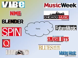
Task 5 
Emily Sampson 
Research into similar music 
magazines on which I could base my 
magazine.
-Blender is an American music magazine that calls 
itself “the ultimate guide to music and more”. 
Blender is also known for sometimes steamy pictures 
of celebrities. It compiled lists of albums, artists, and 
songs, including both “best of” and “worst of” lists. 
-Blender was published by Dennis Publishing and the 
magazine began in 1994 as the first digital CD-ROM 
magazine by Jason Pearson, David Cherry, and 
Regina Joseph, acquired by Felix Dennis/Dennis 
Publishing. 
-In the UK, it published fifteen digital CD issues, and 
launched on the web in 1997. Blender then started 
publishing a print edition again in 1999 in its most 
recent form. The first digital advertisers Blender had 
included Calvin Klein, Apple computer and Nike. 
-This example that I found on the internet shows a style of a magazine that best reflects 
how I want my front cover of my magazine to look like. The effectiveness of this magazine 
is to target a younger audience of 16-20 because of the cover star used as the main 
image, being Taylor Swift. The colour scheme is very simple yet eye catching because the 
white background highlights the cover lines, mast head and draws the main attention to 
the celebrity. The celebrity is within the centre of the rule of thirds. 
-The photograph the magazine has intentionally used effective eye contact which is also 
known as extra diegetic gaze. It is a marketing strategy because the audience believes that 
Taylor Swift is looking at them.
-Blender as a music magazine company overall highlights the kind of ideas I would like to 
include in my music magazine front cover. I would like my target audience to be both 
females and males, but more females will be drawn towards it. I would think the target 
audiences would range between the ages of 16-24 so this will mean I will have to 
include features that attract both sexes and I will have to consider wisely the photograph 
of my magazines front cover. I will use colours that are relatively matched to both sexes, 
however the front cover’s image which will be a girl may attract more females than 
males.
-This magazine uses a similar colour 
scheme to what the celebrity is wearing 
in the main image, being purple and 
black against the white background that 
is used in every Blender issue. This 
colour scheme makes the magazine very 
eye catching which is what my aim is to 
do for my music magazine. The colour 
scheme makes it all come together 
professionally and allows the main 
image to look correctly in place on the 
music magazine front cover. Again, like 
every issue, the main cover line is the 
name of the celebrity in the main image 
which shows that she is a big part of the 
issue. Not too much purple is used 
within the front cover as a main part of 
it is in the main image. (her shirt) 
-This issue of the Blender magazine 
represents a good unisex colour scheme 
which is what I will be looking to do for 
my music magazine. Blues and light 
browns are used in the issue which is 
both female and male orientated. The 
main image of Fergie, a celebrity, is quite 
steamy which is well known with the 
Blender issues which would most likely 
attract a young audience such as the 
range I am aiming for: 16-24. Fergie is 
also an attractive celebrity which would 
possibly attract males to the music 
magazine, and again the main cover line 
is of the celebrities name to show that 
there is an article(s) about Fergie within 
the magazine. The colours against the 
white background stand out and are eye-catching, 
like what I want to do. 
-The issue above again represents the 
kind of theme I am looking to recreate 
in the making of my music magazine. 
Whereas on this one, the masthead is 
overlapping the main image which is 
what I will do as my music magazine 
will be brand new, and if the masthead 
is covered, it may be difficult to read 
and recognise as it is never been seen 
before. Again, the main image is of a 
female, Kelly Clarkson which is what I 
will be intending to do, and the colour 
scheme of the front cover is of unisex 
colours to attract a wider audience of 
not just females but also males. The 
issue is following codes and 
conventions as it has a white 
background which is what I think I will 
want to do.
Similar Music 
Magazines
Fonts

Task 5

  • 1.
    Task 5 EmilySampson Research into similar music magazines on which I could base my magazine.
  • 2.
    -Blender is anAmerican music magazine that calls itself “the ultimate guide to music and more”. Blender is also known for sometimes steamy pictures of celebrities. It compiled lists of albums, artists, and songs, including both “best of” and “worst of” lists. -Blender was published by Dennis Publishing and the magazine began in 1994 as the first digital CD-ROM magazine by Jason Pearson, David Cherry, and Regina Joseph, acquired by Felix Dennis/Dennis Publishing. -In the UK, it published fifteen digital CD issues, and launched on the web in 1997. Blender then started publishing a print edition again in 1999 in its most recent form. The first digital advertisers Blender had included Calvin Klein, Apple computer and Nike. -This example that I found on the internet shows a style of a magazine that best reflects how I want my front cover of my magazine to look like. The effectiveness of this magazine is to target a younger audience of 16-20 because of the cover star used as the main image, being Taylor Swift. The colour scheme is very simple yet eye catching because the white background highlights the cover lines, mast head and draws the main attention to the celebrity. The celebrity is within the centre of the rule of thirds. -The photograph the magazine has intentionally used effective eye contact which is also known as extra diegetic gaze. It is a marketing strategy because the audience believes that Taylor Swift is looking at them.
  • 3.
    -Blender as amusic magazine company overall highlights the kind of ideas I would like to include in my music magazine front cover. I would like my target audience to be both females and males, but more females will be drawn towards it. I would think the target audiences would range between the ages of 16-24 so this will mean I will have to include features that attract both sexes and I will have to consider wisely the photograph of my magazines front cover. I will use colours that are relatively matched to both sexes, however the front cover’s image which will be a girl may attract more females than males.
  • 4.
    -This magazine usesa similar colour scheme to what the celebrity is wearing in the main image, being purple and black against the white background that is used in every Blender issue. This colour scheme makes the magazine very eye catching which is what my aim is to do for my music magazine. The colour scheme makes it all come together professionally and allows the main image to look correctly in place on the music magazine front cover. Again, like every issue, the main cover line is the name of the celebrity in the main image which shows that she is a big part of the issue. Not too much purple is used within the front cover as a main part of it is in the main image. (her shirt) -This issue of the Blender magazine represents a good unisex colour scheme which is what I will be looking to do for my music magazine. Blues and light browns are used in the issue which is both female and male orientated. The main image of Fergie, a celebrity, is quite steamy which is well known with the Blender issues which would most likely attract a young audience such as the range I am aiming for: 16-24. Fergie is also an attractive celebrity which would possibly attract males to the music magazine, and again the main cover line is of the celebrities name to show that there is an article(s) about Fergie within the magazine. The colours against the white background stand out and are eye-catching, like what I want to do. -The issue above again represents the kind of theme I am looking to recreate in the making of my music magazine. Whereas on this one, the masthead is overlapping the main image which is what I will do as my music magazine will be brand new, and if the masthead is covered, it may be difficult to read and recognise as it is never been seen before. Again, the main image is of a female, Kelly Clarkson which is what I will be intending to do, and the colour scheme of the front cover is of unisex colours to attract a wider audience of not just females but also males. The issue is following codes and conventions as it has a white background which is what I think I will want to do.
  • 5.
  • 6.