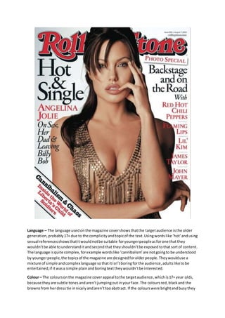
Language – The language used on the magazine cover shows that the target audience is the older 
generation, probably 17+ due to the complicity and topic of the text. Using words like ‘hot’ and using 
sexual references shows that it would not be suitable for younger people as for one that they 
wouldn’t be able to understand it and second that they shouldn’t be exposed to that sort of content. 
The language is quite complex, for example words like ‘cannibalism’ are not going to be understood 
by younger people, the topics of the magazine are designed for older people. They would use a 
mixture of simple and complex language so that it isn’t boring for the audience, adults like to be 
entertained, if it was a simple plain and boring text they wouldn’t be interested. 
Colour – The colours on the magazine cover appeal to the target audience, which is 17+ year olds, 
because they are subtle tones and aren’t jumping out in your face. The colours red, black and the 
browns from her dress tie in nicely and aren’t too abstract. If the colours were bright and busy they
would probably attract the wrong audience, younger people tend to go for magazines which are 
colourful and fun. The gentle colours on the cover attract to the target audience because they are 
more ‘adult’ as such, they form a nice contrast with each other and are calming to the eye, they 
aren’t harming to look at. 
Images – The image appeals to the target audience because it has adult content. The audience 
would not expect a teenager’s dream boy band singer on the front of this magazine, they would 
expect a respectable celebrity of whom is probably between 20-40. On this particular magazine 
cover it features Angelina Jolie, she has been in the industry for a while and is a well -known celebrity 
to those of the older generation, if you asked a teenager who she was they probably wouldn’t know. 
Angelina is an attractive female so she would be appealing to both sexes. Female would be attracted 
to her because they want to be her, they want her style tips etc so they can be the best, just like her. 
Males would be attracted to her for the sexual side of it, they would probably want to marry 
someone like her as she is a beautiful woman. The magazine probably used Angelina Jolie as she is 
an all-round appealing lady, she is well-known and has a lot of character to her. 
Content – The content of this magazine also appeals to the target audience because it has adult and 
explicit content. Referencing sexual activities for example, this is obvious adult content, you 
wouldn’t design a magazine for younger teenagers and put this sort of topics in it. They would have 
used content like this because it would appeal to older people as they can relate to it. This would 
make the audience want to read it as they can see how someone else, especially a celebrity, is going 
through what they are going through.

Task 4

  • 1.
    Language – Thelanguage used on the magazine cover shows that the target audience is the older generation, probably 17+ due to the complicity and topic of the text. Using words like ‘hot’ and using sexual references shows that it would not be suitable for younger people as for one that they wouldn’t be able to understand it and second that they shouldn’t be exposed to that sort of content. The language is quite complex, for example words like ‘cannibalism’ are not going to be understood by younger people, the topics of the magazine are designed for older people. They would use a mixture of simple and complex language so that it isn’t boring for the audience, adults like to be entertained, if it was a simple plain and boring text they wouldn’t be interested. Colour – The colours on the magazine cover appeal to the target audience, which is 17+ year olds, because they are subtle tones and aren’t jumping out in your face. The colours red, black and the browns from her dress tie in nicely and aren’t too abstract. If the colours were bright and busy they
  • 2.
    would probably attractthe wrong audience, younger people tend to go for magazines which are colourful and fun. The gentle colours on the cover attract to the target audience because they are more ‘adult’ as such, they form a nice contrast with each other and are calming to the eye, they aren’t harming to look at. Images – The image appeals to the target audience because it has adult content. The audience would not expect a teenager’s dream boy band singer on the front of this magazine, they would expect a respectable celebrity of whom is probably between 20-40. On this particular magazine cover it features Angelina Jolie, she has been in the industry for a while and is a well -known celebrity to those of the older generation, if you asked a teenager who she was they probably wouldn’t know. Angelina is an attractive female so she would be appealing to both sexes. Female would be attracted to her because they want to be her, they want her style tips etc so they can be the best, just like her. Males would be attracted to her for the sexual side of it, they would probably want to marry someone like her as she is a beautiful woman. The magazine probably used Angelina Jolie as she is an all-round appealing lady, she is well-known and has a lot of character to her. Content – The content of this magazine also appeals to the target audience because it has adult and explicit content. Referencing sexual activities for example, this is obvious adult content, you wouldn’t design a magazine for younger teenagers and put this sort of topics in it. They would have used content like this because it would appeal to older people as they can relate to it. This would make the audience want to read it as they can see how someone else, especially a celebrity, is going through what they are going through.