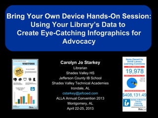
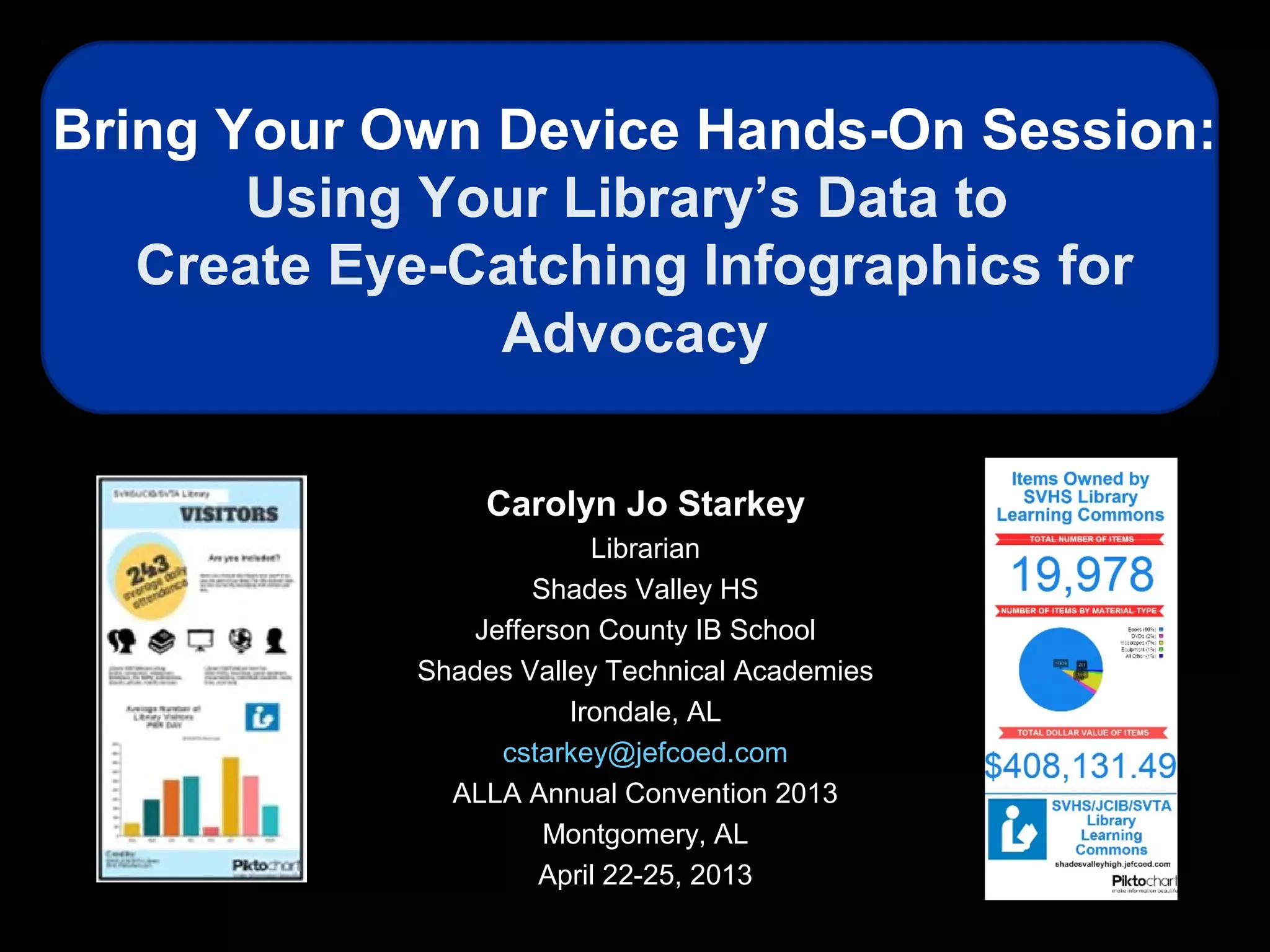
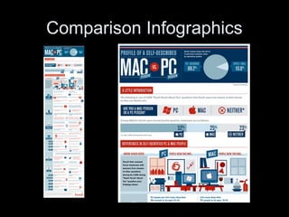
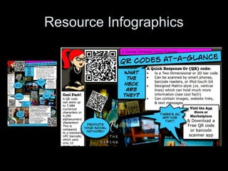
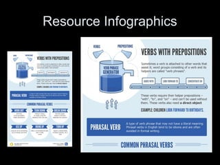
Bring Your Own Device Hands-On Session:
Using Your Library’s Data to
Create Eye-Catching Infographics for
Advocacy
Carolyn Jo Starkey
Librarian
Shades Valley HS
Jefferson County IB School
Shades Valley Technical Academies
Irondale, AL
cstarkey@jefcoed.com
ALLA Annual Convention 2013
Montgomery, AL
April 22-25, 2013
Carolyn Jo
Starkey
School Librarian,
Shades Valley High School
Jefferson County IB School
Shades Valley Technical
Academies
Irondale, AL
Carolyn Starkey has been in education for 24 years, the last 14 related to school library
media. She served as the library media specialist at Sloman Primary School for seven
years, obtaining her certification by the National Board of Professional Teaching
Standards in library media in 2003 while there. After a 4 ½ year stint as Assistant
Professor of Library Education Media at Alabama State University, Carolyn is currently
serving as a school librarian alongside Carla Crews at Shades Valley High School,
Jefferson County IB School, and the Shades Valley Technical Academies. Her other
professional commitments include positions as Chair of the Children's and School Library
Division of the Alabama Library Association, Editor of the ALLA Communicator, and
President-Elect of the Alabama School Library Association (ASLA). She also serves as a
member of American Association of School Librarians' Publications Committee, Co-
Manager of the American Association of School Librarians (AASL) blog, and as a
Councilor-at-Large for the American Library Association (ALA). Carolyn is a frequent
conference and professional development presenter on a wide range of topics in school
librarianship, technology, and online learning.
Biography
Session Description
• This BYOD session is a hands-on
exploration of online tools and easy
artistic techniques that can be utilized
to create colorful infographics to
convey advocacy messages. Topics
under discussion will include types of
infographics, characteristics of good
infographics, sources of infographics,
and tools for creating infographics.
Session Resources
http://www.livebinders.com/play/play_or_edit?id=143539
http://www.piktochart.com http://www.slideshare.net/cjstarkey
Section 1:
Introduction to Infographics
Definition: Infographics
• An umbrella term for illustrations and
charts that instruct people, which
otherwise would be difficult or impossible
with only text. --PC.com
Encyclopedia
http://www.pcmag.com/encyclopedia_term/0,2542,t=infographics&i=59903,00.asp
• A representation of information in a
graphic format designed to make the data
easily understandable at a glance.
--whatis.com IT Encyclopedia
http://whatis.techtarget.com/definition/infographics.html
Why Use Infographics?
• They make information
easy to digest.
– Large amounts of
information can be
presented.
– Easier to see
relationships and
patterns.
• They make information
easy to share.
– Rapid communication
of ideas.
Why Use Infographics?
Visualizing Information
for Advocacy: An
Introduction to
Information Design
http://backspace.com/infodesign.p
The manual was written and designed by
John Emerson, Principal at Apperceptive
LLC.
http://backspace.com,
http://apperceptive.com
Types of Infographics
• Status
• Comparison
• Resource
• Evolution
Status Infographics
• These infographics visualize the
current status or ‘state of’ an
industry, trend or idea. They
often show change over time by
means of timelines.
Status Infographics
Status Infographics
Comparison Infographics
• These infographics provide a
visualization of a comparison of
two or more things.
Comparison Infographics
Resource Infographics
• These infographics are
informational and provide readers
with facts or how-to about a topic.
Resource Infographics
Evolution Infographics
• These infographics are meant to
be thought-provoking. They are
intended generally to encourage
deep discussion and analysis.
Evolution Infographics
What Makes a Good Infographic?
The Anatomy of an Infographic: 5 Steps to
Create a Powerful Visual
http://spyrestudios.com/the-anatomy-of-an-infog
What Makes a Good Infographic?
The core of an
infographic is
composed of 3
important parts:
1.Visual
2.Content
3.Knowledge
The Anatomy of an Infographic: 5 Steps to Create a Powerful Visual
http://spyrestudios.com/the-anatomy-of-an-infographic-5-steps-to-create-a-powerful-v
What Makes a Good Infographic?
Visual
1.Color Coding
2.Graphics
3.Reference Icons
The Anatomy of an Infographic: 5
Steps to Create a Powerful Visual
http://spyrestudios.com/the-
anatomy-of-an-infographic-5-
steps-to-create-a-powerful-visual/
What Makes a Good Infographic?
Content
1.Time Frames
2.Statistics
3.References
The Anatomy of an Infographic: 5
Steps to Create a Powerful Visual
http://spyrestudios.com/the-
anatomy-of-an-infographic-5-
steps-to-create-a-powerful-visual/
What Makes a Good Infographic?
Knowledge
1.Facts
2.Deductions
The Anatomy of an Infographic: 5
Steps to Create a Powerful Visual
http://spyrestudios.com/the-
anatomy-of-an-infographic-5-
steps-to-create-a-powerful-visual/
Tutorials
Kathy
Schrock: A
Picture is
Worth a
Thousand
Words—
Infographics
as a Creative
Assessment http://thejournal.com/articles/2012/03/26/5-
ways-to-visualize-information.aspx
Tutorials
http://www.schrockguide.net/infographics-
as-an-assessment.html
Tutorials
How To Create Outstanding
Modern Infographics
http://vector.tutsplus.com/tutorials/d
esigning/how-to-create-
outstanding-modern-infographics/
Tutorials
Tutorial: Create cool infographics
http://www.digitalartsonline.co.uk/tu
torials/?featureid=1823&pn=1
Tutorials
5 Unbeatable Types of Infographic
+ Free Tools to Create Them
http://www.searchenginejournal.co
m/5-unbeatable-types-of-
infographic-free-tools-to-create-
them/27010/
Section 2:
A Great FREE Online Tool
for Creating Infographics
Piktochart
http://www.piktochart.com
Section 3:
Creating Infographics
for Advocacy
A Step-by-Step Process
Step 1
• What are your goals? Planning or
advocacy? Are you trying to tell a specific
story? Or are you trying to create a more
neutral map to guide a process of
discovery? Represent a statistic in a
visually and/or emotionally striking way.
This increases the chances of your
engaging a wider base of potential
supporters.
Credit: movements.org
Step 2
• Try putting yourself in the role of your
audiences. What are they looking for?
What is their point of view? What do they
already know about the issue? In what
context will they read your graphics? Distill
this information into profiles of “typical”
users.
Credit: movements.org
Step 3
• What information should you collect?
Where will you obtain it? Don’t forget the
importance of context in understanding
the meaning and importance of facts. It’s
often easier to remember a story than to
remember raw data.
Credit: movements.org
Step 4
• Sort your information. One method that
you can try is card sorting. To start, put
notes on a wall describing aspects of your
information. Arrange these notes freely
into shapes and clusters that make sense.
Rearranging these clusters should help
you start to form an organizing scheme
that you can use as the basis for your
initial designs.
Credit: movements.org
Step 5
• Sketch your information out on paper or
on a white board. Think in broad strokes at
first, saving detail for later. Sketching out
your ideas first will help you think outside
the confines of the page or the screen. It
will free your ideas from the limitations of
your design program and tools.
Credit: movements.org
Step 6
• Decide on the format that you will
disseminate the visualization in: Paper?
Screen?
Credit: movements.org
Step 7
• Design your graphics. Innovative design
ideas come from embracing your
constraints. Being obliged to adjust your
graphics to your medium of publication,
budget, and technology of reproduction
may lead you to discover unexpected
opportunities.
Credit: movements.org
Step 8
• Structure: The way information is
presented and organized is as important
as the content. What information is
presented first? How will your reader’s eye
move across the design? Structure your
design so that the most important
information is the most prominent.
Credit: movements.org
Step 9
• Elements: The style of your elements can
convey meaning. Objects can be
differentiated by size, color, pattern, and
placement. However, too many styles may
clutter the page. Thin lines are generally
preferable to thick lines, which may
compete with text and other information.
Credit: movements.org

Starkey byod eye_catching_infographics_for_advocacy

  • 1.
    Bring Your OwnDevice Hands-On Session: Using Your Library’s Data to Create Eye-Catching Infographics for Advocacy Carolyn Jo Starkey Librarian Shades Valley HS Jefferson County IB School Shades Valley Technical Academies Irondale, AL cstarkey@jefcoed.com ALLA Annual Convention 2013 Montgomery, AL April 22-25, 2013
  • 2.
    Carolyn Jo Starkey School Librarian, ShadesValley High School Jefferson County IB School Shades Valley Technical Academies Irondale, AL Carolyn Starkey has been in education for 24 years, the last 14 related to school library media. She served as the library media specialist at Sloman Primary School for seven years, obtaining her certification by the National Board of Professional Teaching Standards in library media in 2003 while there. After a 4 ½ year stint as Assistant Professor of Library Education Media at Alabama State University, Carolyn is currently serving as a school librarian alongside Carla Crews at Shades Valley High School, Jefferson County IB School, and the Shades Valley Technical Academies. Her other professional commitments include positions as Chair of the Children's and School Library Division of the Alabama Library Association, Editor of the ALLA Communicator, and President-Elect of the Alabama School Library Association (ASLA). She also serves as a member of American Association of School Librarians' Publications Committee, Co- Manager of the American Association of School Librarians (AASL) blog, and as a Councilor-at-Large for the American Library Association (ALA). Carolyn is a frequent conference and professional development presenter on a wide range of topics in school librarianship, technology, and online learning. Biography
  • 3.
    Session Description • ThisBYOD session is a hands-on exploration of online tools and easy artistic techniques that can be utilized to create colorful infographics to convey advocacy messages. Topics under discussion will include types of infographics, characteristics of good infographics, sources of infographics, and tools for creating infographics.
  • 4.
  • 5.
  • 6.
  • 7.
    Definition: Infographics • Anumbrella term for illustrations and charts that instruct people, which otherwise would be difficult or impossible with only text. --PC.com Encyclopedia http://www.pcmag.com/encyclopedia_term/0,2542,t=infographics&i=59903,00.asp • A representation of information in a graphic format designed to make the data easily understandable at a glance. --whatis.com IT Encyclopedia http://whatis.techtarget.com/definition/infographics.html
  • 8.
    Why Use Infographics? •They make information easy to digest. – Large amounts of information can be presented. – Easier to see relationships and patterns. • They make information easy to share. – Rapid communication of ideas.
  • 9.
    Why Use Infographics? VisualizingInformation for Advocacy: An Introduction to Information Design http://backspace.com/infodesign.p The manual was written and designed by John Emerson, Principal at Apperceptive LLC. http://backspace.com, http://apperceptive.com
  • 10.
    Types of Infographics •Status • Comparison • Resource • Evolution
  • 11.
    Status Infographics • Theseinfographics visualize the current status or ‘state of’ an industry, trend or idea. They often show change over time by means of timelines.
  • 12.
  • 13.
  • 14.
    Comparison Infographics • Theseinfographics provide a visualization of a comparison of two or more things.
  • 15.
  • 16.
  • 17.
    Resource Infographics • Theseinfographics are informational and provide readers with facts or how-to about a topic.
  • 18.
  • 19.
  • 20.
  • 21.
    Evolution Infographics • Theseinfographics are meant to be thought-provoking. They are intended generally to encourage deep discussion and analysis.
  • 22.
  • 23.
    What Makes aGood Infographic? The Anatomy of an Infographic: 5 Steps to Create a Powerful Visual http://spyrestudios.com/the-anatomy-of-an-infog
  • 24.
    What Makes aGood Infographic? The core of an infographic is composed of 3 important parts: 1.Visual 2.Content 3.Knowledge The Anatomy of an Infographic: 5 Steps to Create a Powerful Visual http://spyrestudios.com/the-anatomy-of-an-infographic-5-steps-to-create-a-powerful-v
  • 25.
    What Makes aGood Infographic? Visual 1.Color Coding 2.Graphics 3.Reference Icons The Anatomy of an Infographic: 5 Steps to Create a Powerful Visual http://spyrestudios.com/the- anatomy-of-an-infographic-5- steps-to-create-a-powerful-visual/
  • 26.
    What Makes aGood Infographic? Content 1.Time Frames 2.Statistics 3.References The Anatomy of an Infographic: 5 Steps to Create a Powerful Visual http://spyrestudios.com/the- anatomy-of-an-infographic-5- steps-to-create-a-powerful-visual/
  • 27.
    What Makes aGood Infographic? Knowledge 1.Facts 2.Deductions The Anatomy of an Infographic: 5 Steps to Create a Powerful Visual http://spyrestudios.com/the- anatomy-of-an-infographic-5- steps-to-create-a-powerful-visual/
  • 28.
    Tutorials Kathy Schrock: A Picture is Wortha Thousand Words— Infographics as a Creative Assessment http://thejournal.com/articles/2012/03/26/5- ways-to-visualize-information.aspx
  • 29.
  • 30.
    Tutorials How To CreateOutstanding Modern Infographics http://vector.tutsplus.com/tutorials/d esigning/how-to-create- outstanding-modern-infographics/
  • 31.
    Tutorials Tutorial: Create coolinfographics http://www.digitalartsonline.co.uk/tu torials/?featureid=1823&pn=1
  • 32.
    Tutorials 5 Unbeatable Typesof Infographic + Free Tools to Create Them http://www.searchenginejournal.co m/5-unbeatable-types-of- infographic-free-tools-to-create- them/27010/
  • 33.
    Section 2: A GreatFREE Online Tool for Creating Infographics
  • 34.
  • 35.
  • 36.
  • 37.
    Step 1 • Whatare your goals? Planning or advocacy? Are you trying to tell a specific story? Or are you trying to create a more neutral map to guide a process of discovery? Represent a statistic in a visually and/or emotionally striking way. This increases the chances of your engaging a wider base of potential supporters. Credit: movements.org
  • 38.
    Step 2 • Tryputting yourself in the role of your audiences. What are they looking for? What is their point of view? What do they already know about the issue? In what context will they read your graphics? Distill this information into profiles of “typical” users. Credit: movements.org
  • 39.
    Step 3 • Whatinformation should you collect? Where will you obtain it? Don’t forget the importance of context in understanding the meaning and importance of facts. It’s often easier to remember a story than to remember raw data. Credit: movements.org
  • 40.
    Step 4 • Sortyour information. One method that you can try is card sorting. To start, put notes on a wall describing aspects of your information. Arrange these notes freely into shapes and clusters that make sense. Rearranging these clusters should help you start to form an organizing scheme that you can use as the basis for your initial designs. Credit: movements.org
  • 41.
    Step 5 • Sketchyour information out on paper or on a white board. Think in broad strokes at first, saving detail for later. Sketching out your ideas first will help you think outside the confines of the page or the screen. It will free your ideas from the limitations of your design program and tools. Credit: movements.org
  • 42.
    Step 6 • Decideon the format that you will disseminate the visualization in: Paper? Screen? Credit: movements.org
  • 43.
    Step 7 • Designyour graphics. Innovative design ideas come from embracing your constraints. Being obliged to adjust your graphics to your medium of publication, budget, and technology of reproduction may lead you to discover unexpected opportunities. Credit: movements.org
  • 44.
    Step 8 • Structure:The way information is presented and organized is as important as the content. What information is presented first? How will your reader’s eye move across the design? Structure your design so that the most important information is the most prominent. Credit: movements.org
  • 45.
    Step 9 • Elements:The style of your elements can convey meaning. Objects can be differentiated by size, color, pattern, and placement. However, too many styles may clutter the page. Thin lines are generally preferable to thick lines, which may compete with text and other information. Credit: movements.org