Here is aclue, the site’s mission statement
is to organize the world’s information and
make it universally accessible and useful.”
You have probably guessed it by now,
5.
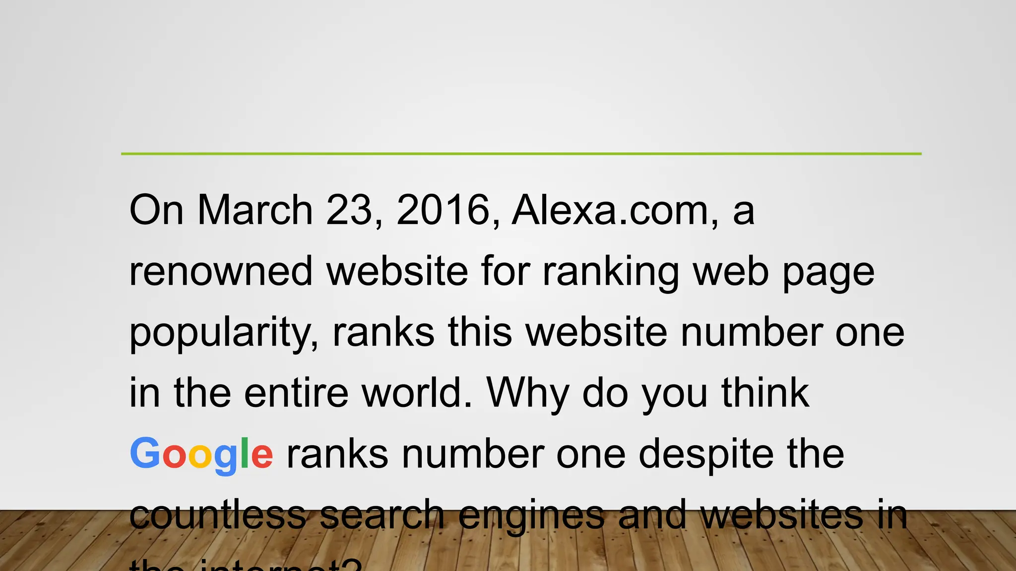
On March 23,2016, Alexa.com, a
renowned website for ranking web page
popularity, ranks this website number one
in the entire world. Why do you think
Google ranks number one despite the
countless search engines and websites in
6.
Creating a webpage is like creating a
work of art. There are certain things
that you need to consider in order to
get your message across.
7.
In the previouslesson, you learned
how to create an effective PowerPoint
Presentation. Some of those tips can
help you in graphics and layout
design.
8.
L4- FINALS (SECONDQUARTER)
IMAGING AND DESIGN FOR
ONLINE ENVIRONMENT
Prepared by:
MR. JOSHUA A. CASAS
E-Tech Instructor
9.
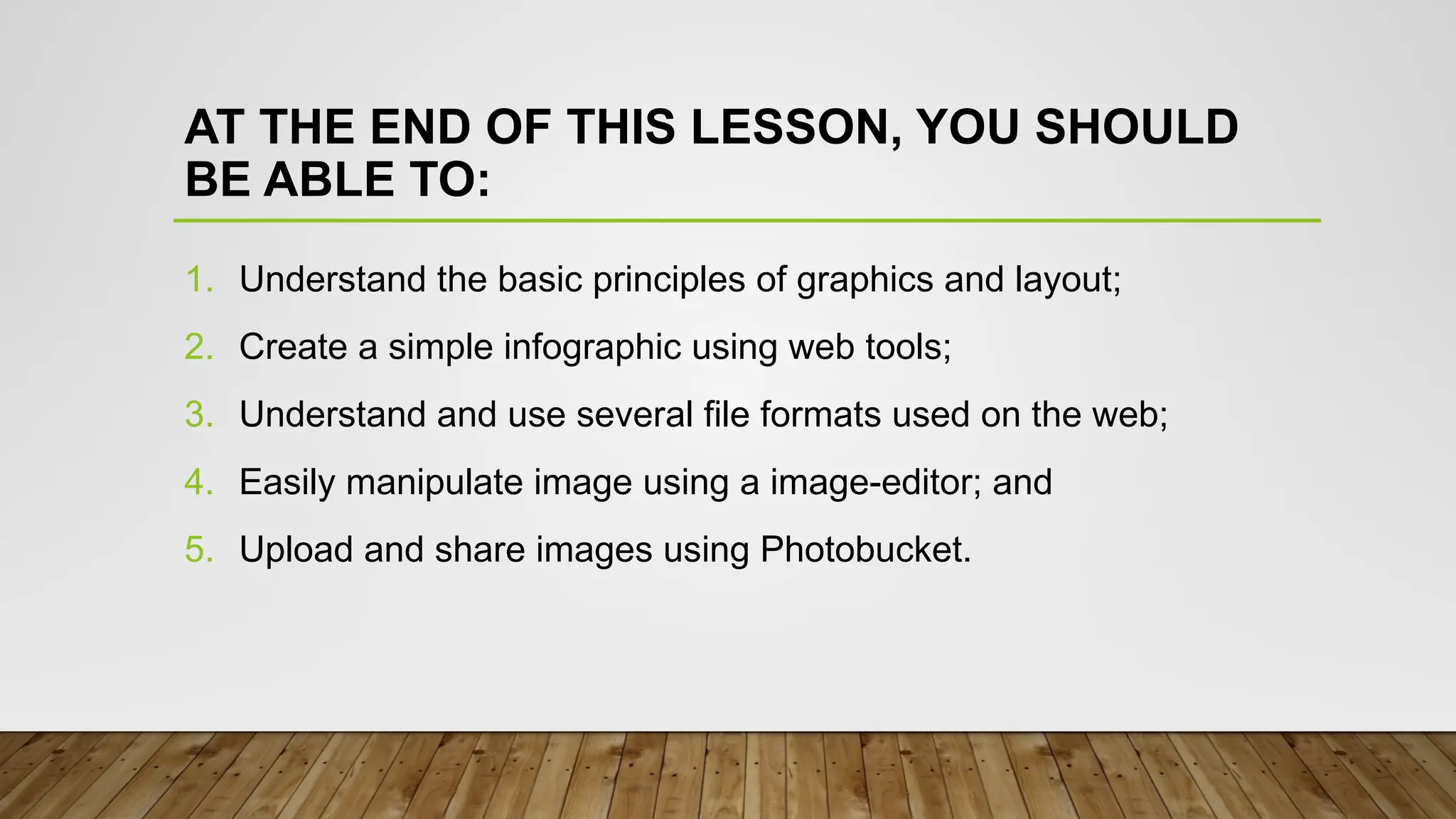
AT THE ENDOF THIS LESSON, YOU SHOULD
BE ABLE TO:
1. Understand the basic principles of graphics and layout;
2. Create a simple infographic using web tools;
3. Understand and use several file formats used on the web;
4. Easily manipulate image using a image-editor; and
5. Upload and share images using Photobucket.
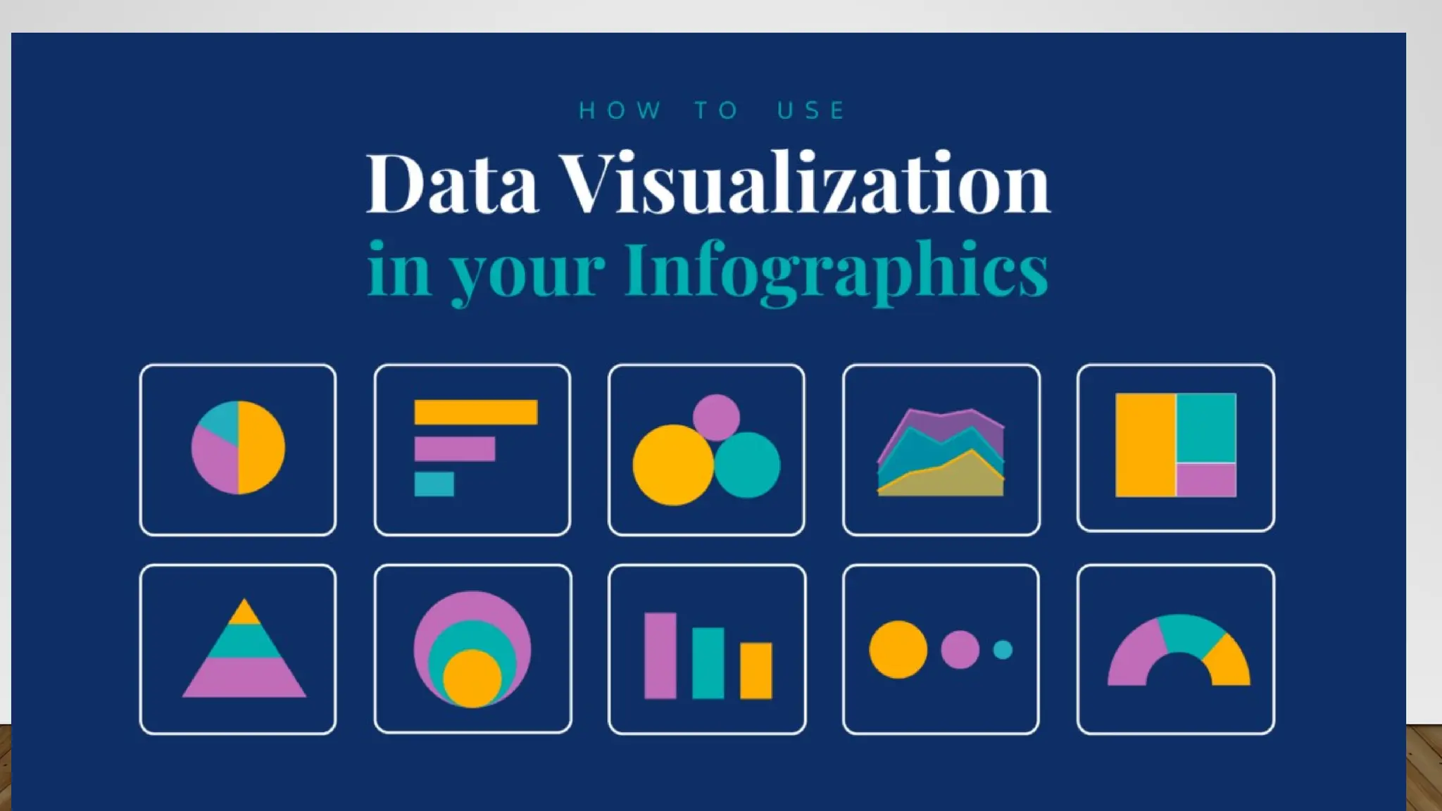
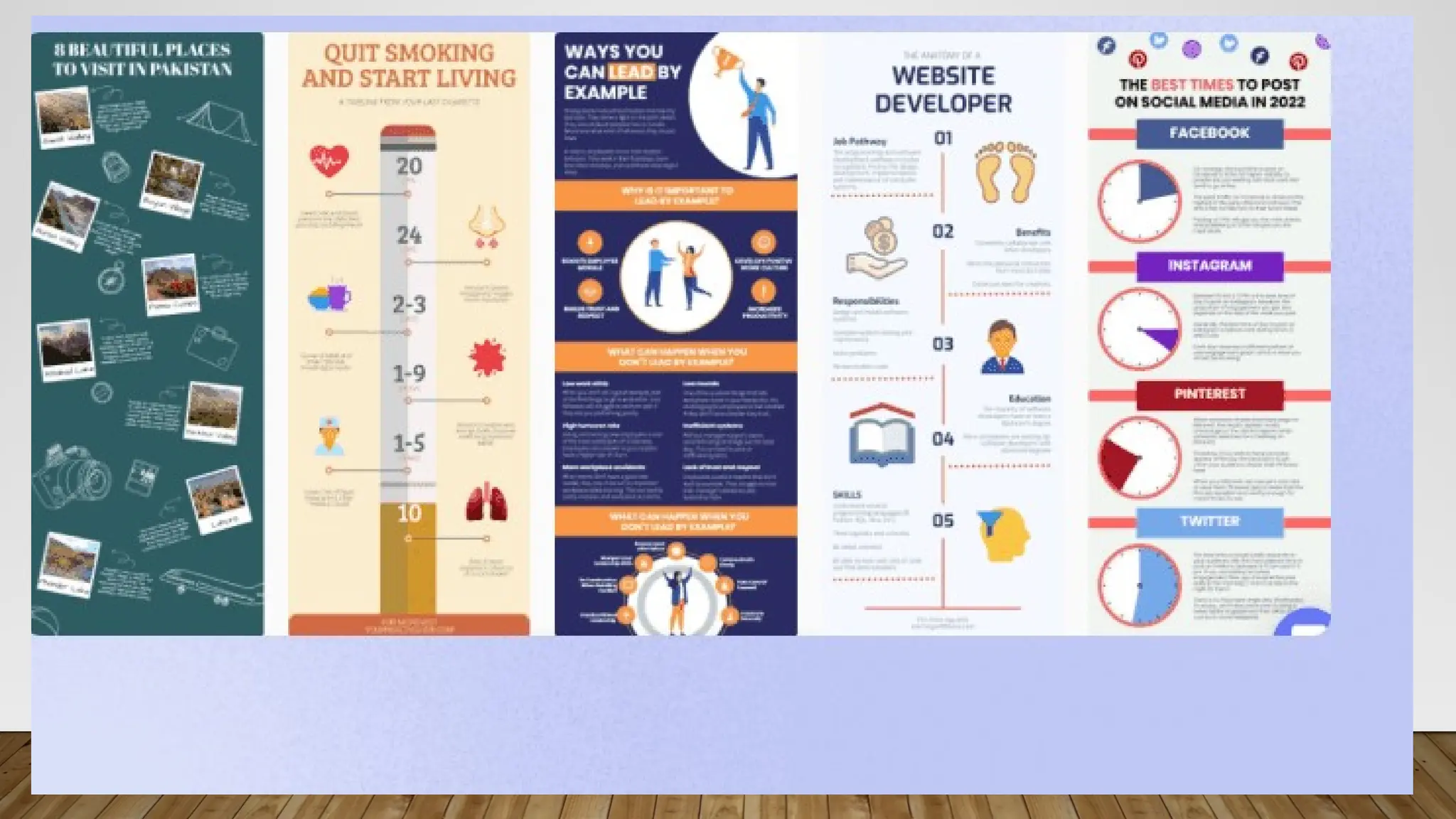
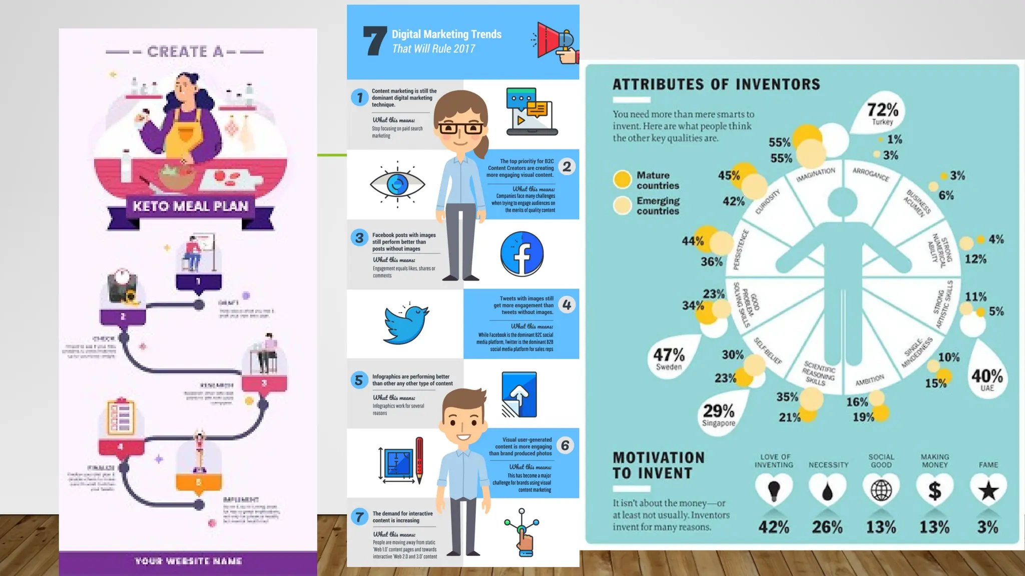
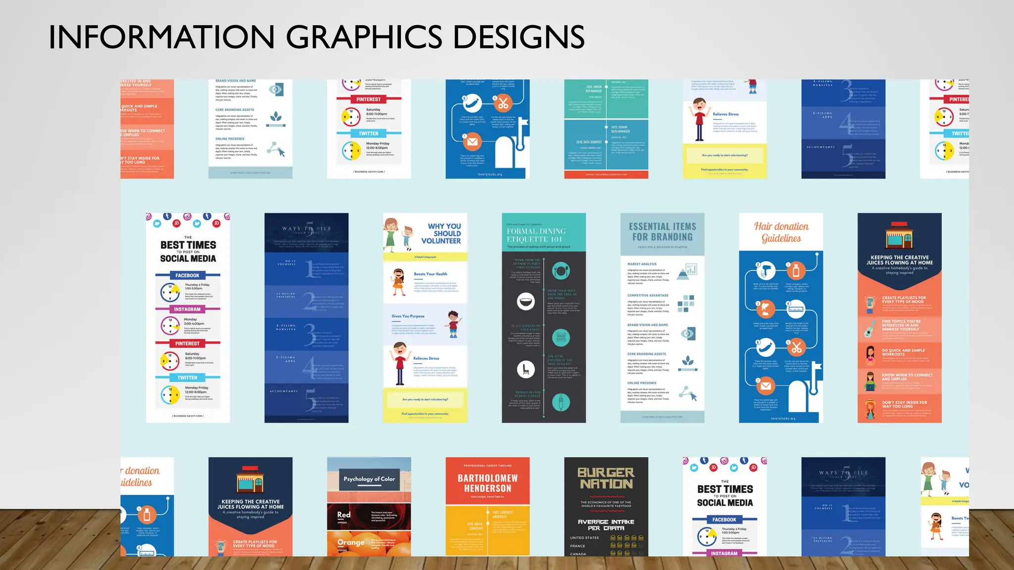
WHAT IS INFOGRAPHICSDESIGN?
• INFORMATION GRAPHICS DESIGN - An infographic is a clear and visual
representation of data and information. Leaning on elements like imagery, symbols, charts
and diagrams, an infographic can make complex ideas easy to understand.The simple
meaning of an infographic is to tell a story through visual aids
13.
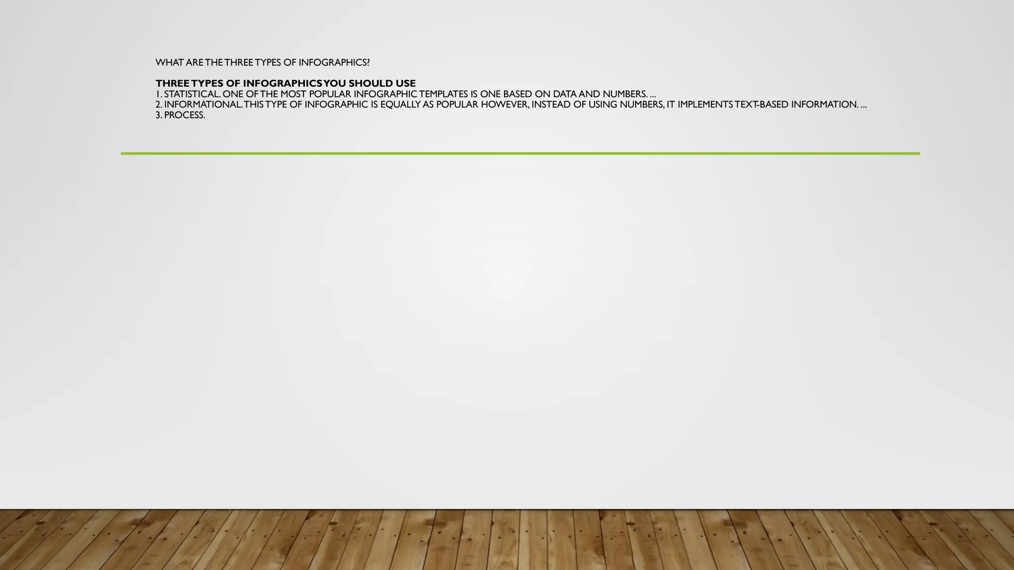
WHAT ARE THETHREE TYPES OF INFOGRAPHICS?
THREETYPES OF INFOGRAPHICSYOU SHOULD USE
1. STATISTICAL. ONE OF THE MOST POPULAR INFOGRAPHIC TEMPLATES IS ONE BASED ON DATA AND NUMBERS. ...
2. INFORMATIONAL.THISTYPE OF INFOGRAPHIC IS EQUALLY AS POPULAR HOWEVER, INSTEAD OF USING NUMBERS, IT IMPLEMENTSTEXT-BASED INFORMATION. ...
3. PROCESS.
14.
• 1. Statistical
•One of the most popular infographic templates is one based on data and numbers.All infographics should have a compelling
story, useful data for support, and visually appealing illustrations to emphasize the content.A statistical infographic will use large
bold text to illustrate the data in an order that makes the most sense to the storyline. Data can be boring to read but when
displayed in a creative way your audience will pay attention to the numbers!
• 2. Informational
• This type of infographic is equally as popular however, instead of using numbers, it implements text-based information. Because
it is focused on text, it covers a broad range of other templates.This could include brochures, instructional guidelines, even short
presentations.The best way to incorporate text with any template is to use lists. Consumers like bullet points, numbers, and easy
ways to read short text fast.When creating your infographic, think carefully about the direction your consumer is reading and
create a storyline that makes the most sense.All parts of your content will be read and understood by your consumer once
created properly.
• 3. Process
• Infographics that display a process show points in a linear order.They break down a task into a series of easy-to-follow steps.
The goal of this kind of graphic is to turn complex information of any sort into easily understood concepts.The key to a
successful process infographic is being able to clearly label directions so a consumer can easily follow all steps. Using icons and
numerical lists help lead the viewer through each of these steps.After reading, a consumer should feel prepared to complete the
task included.
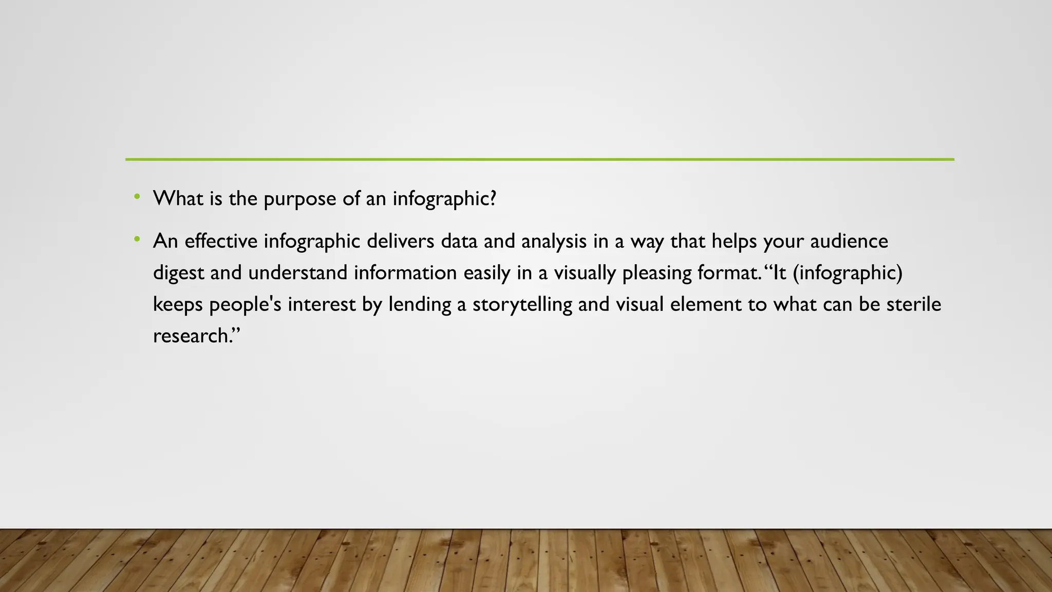
• What isthe purpose of an infographic?
• An effective infographic delivers data and analysis in a way that helps your audience
digest and understand information easily in a visually pleasing format.“It (infographic)
keeps people's interest by lending a storytelling and visual element to what can be sterile
research.”
19.
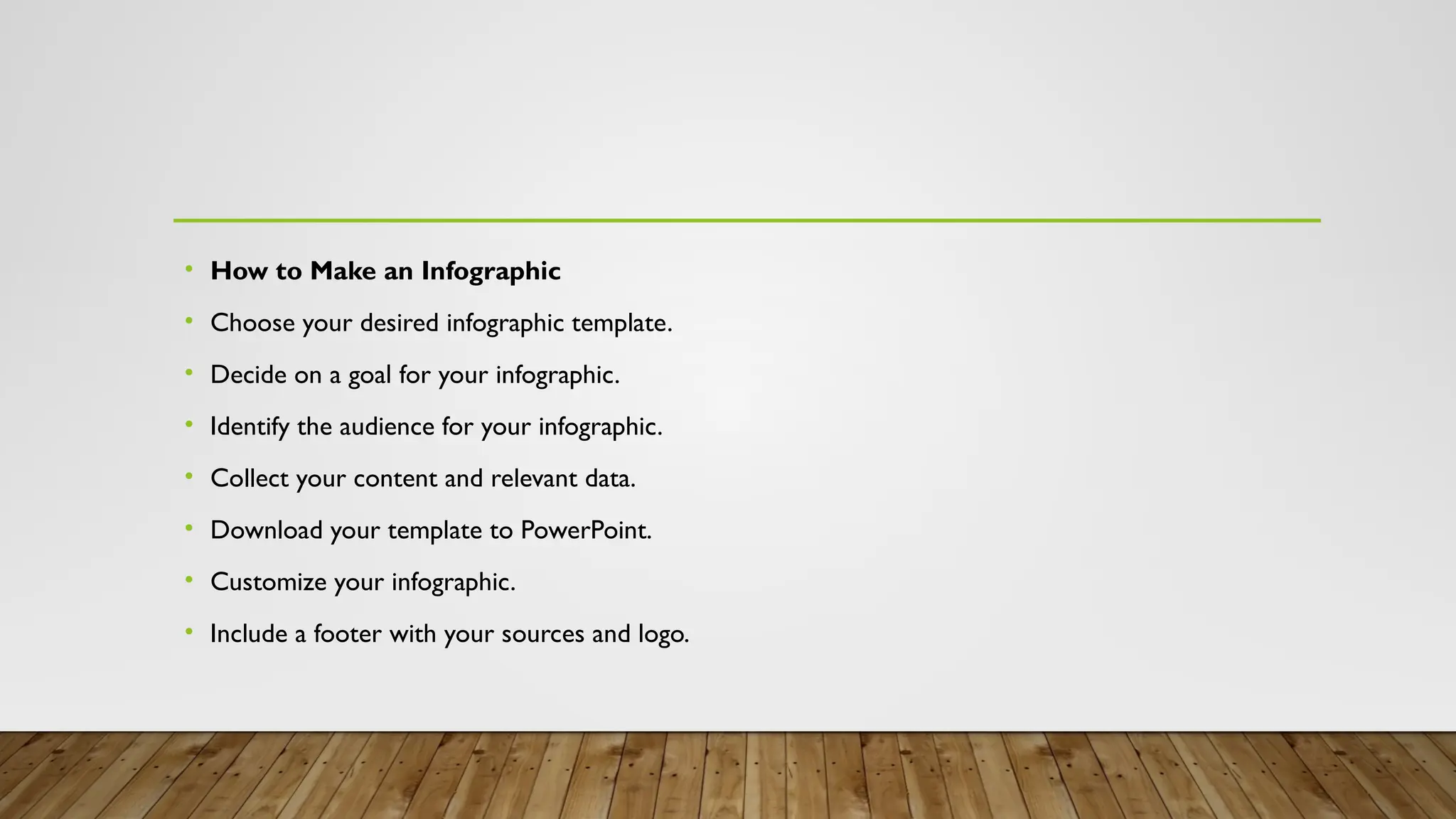
• How toMake an Infographic
• Choose your desired infographic template.
• Decide on a goal for your infographic.
• Identify the audience for your infographic.
• Collect your content and relevant data.
• Download your template to PowerPoint.
• Customize your infographic.
• Include a footer with your sources and logo.
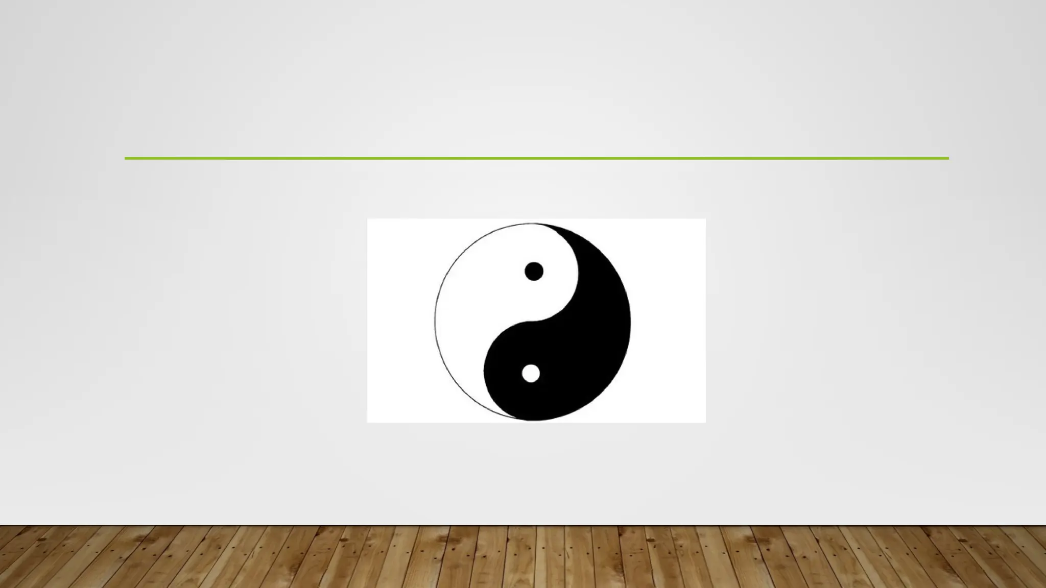
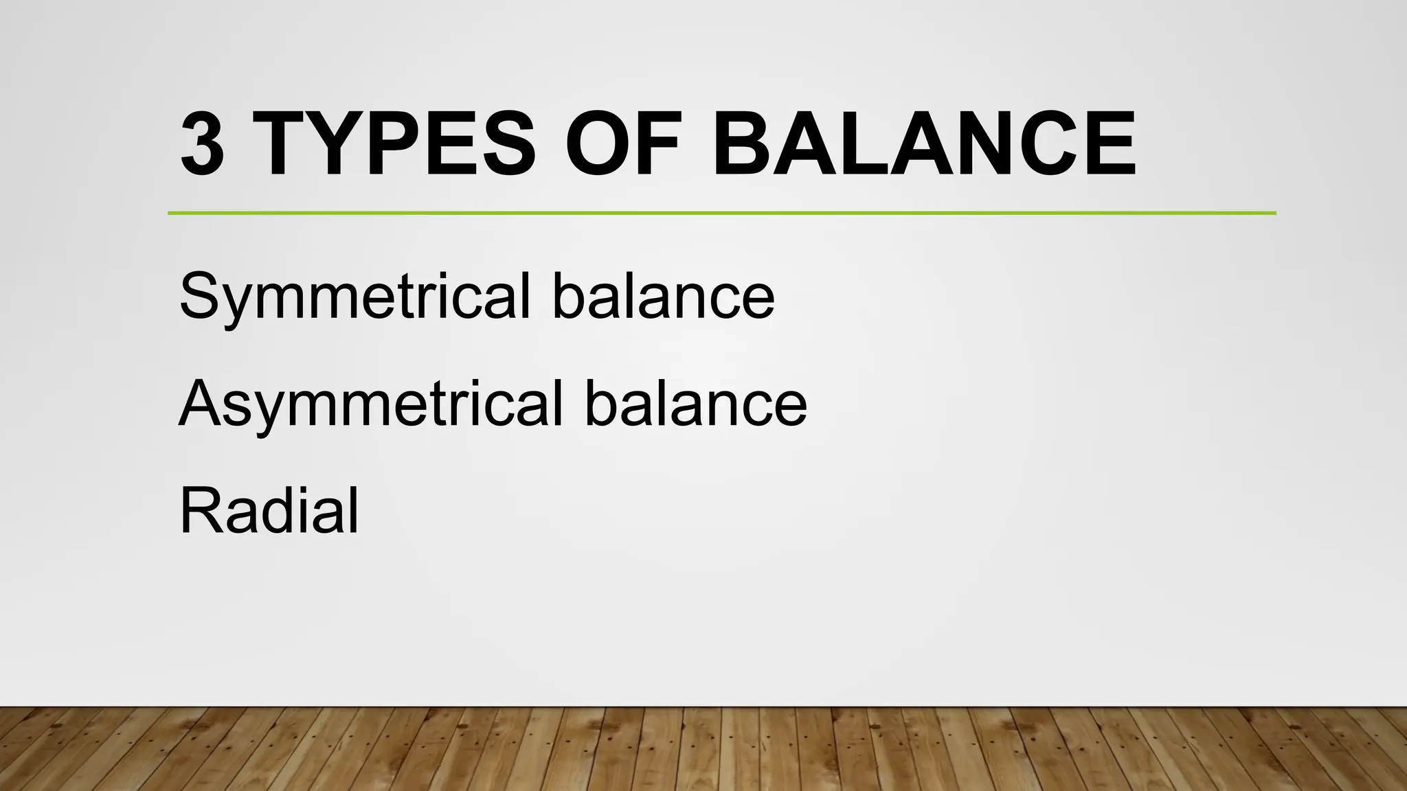
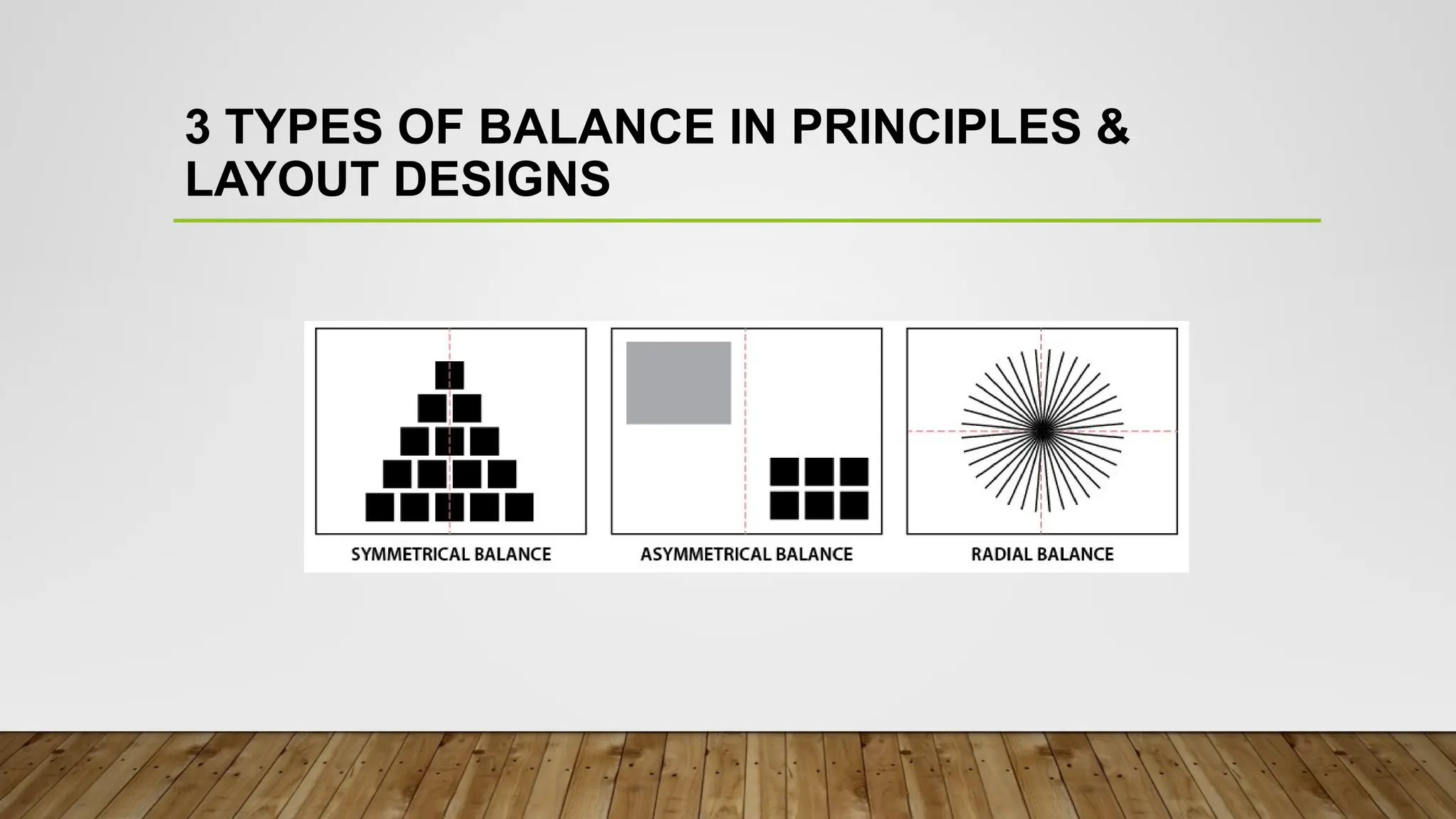
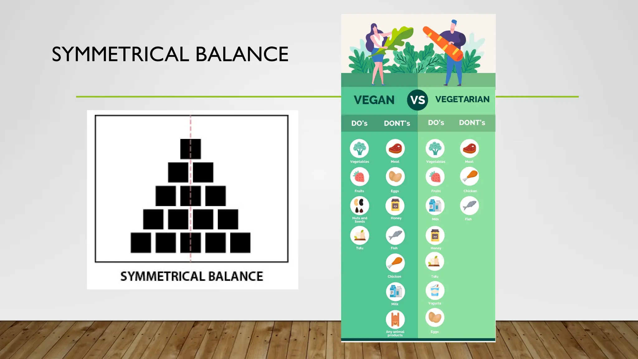
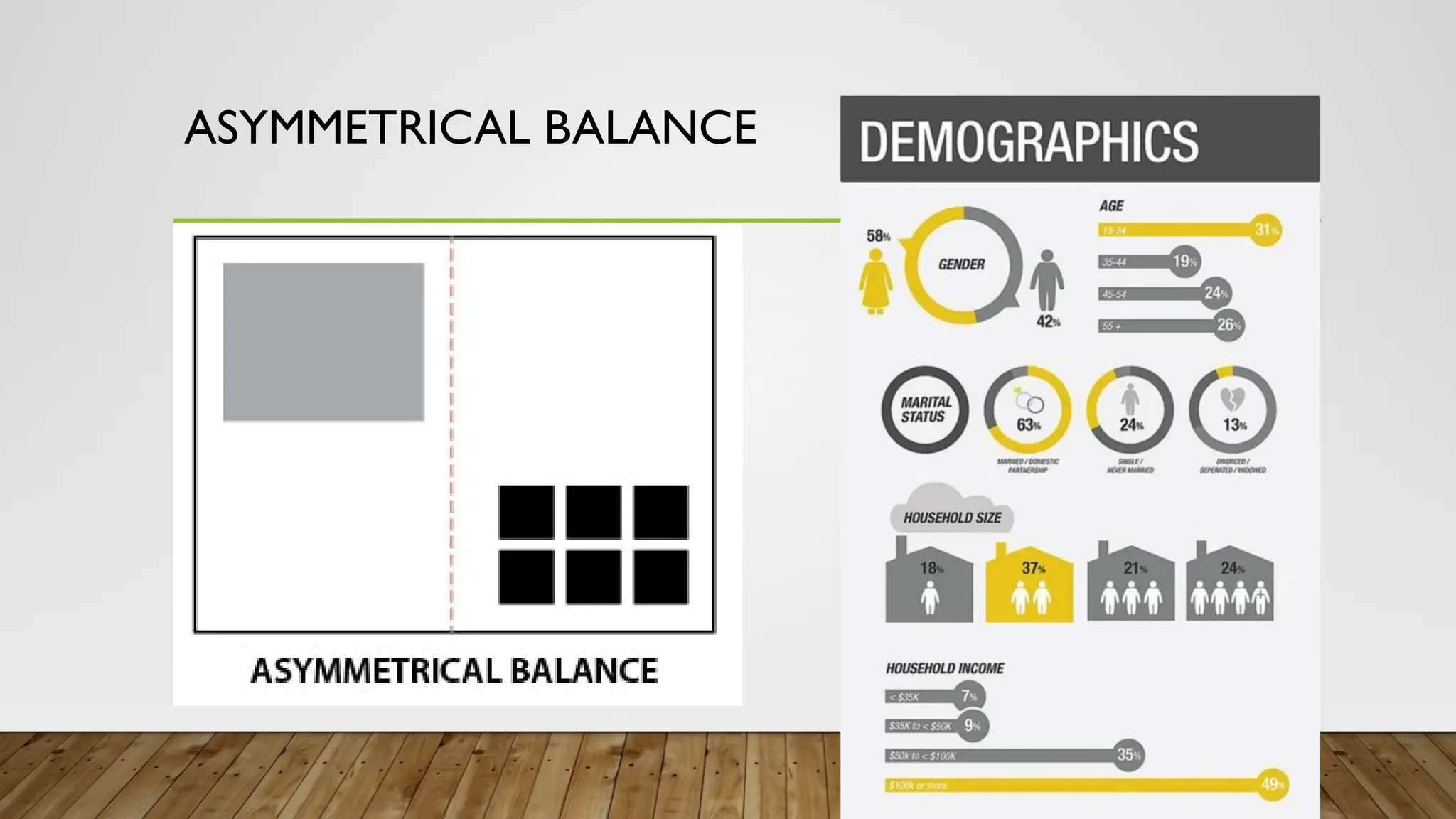
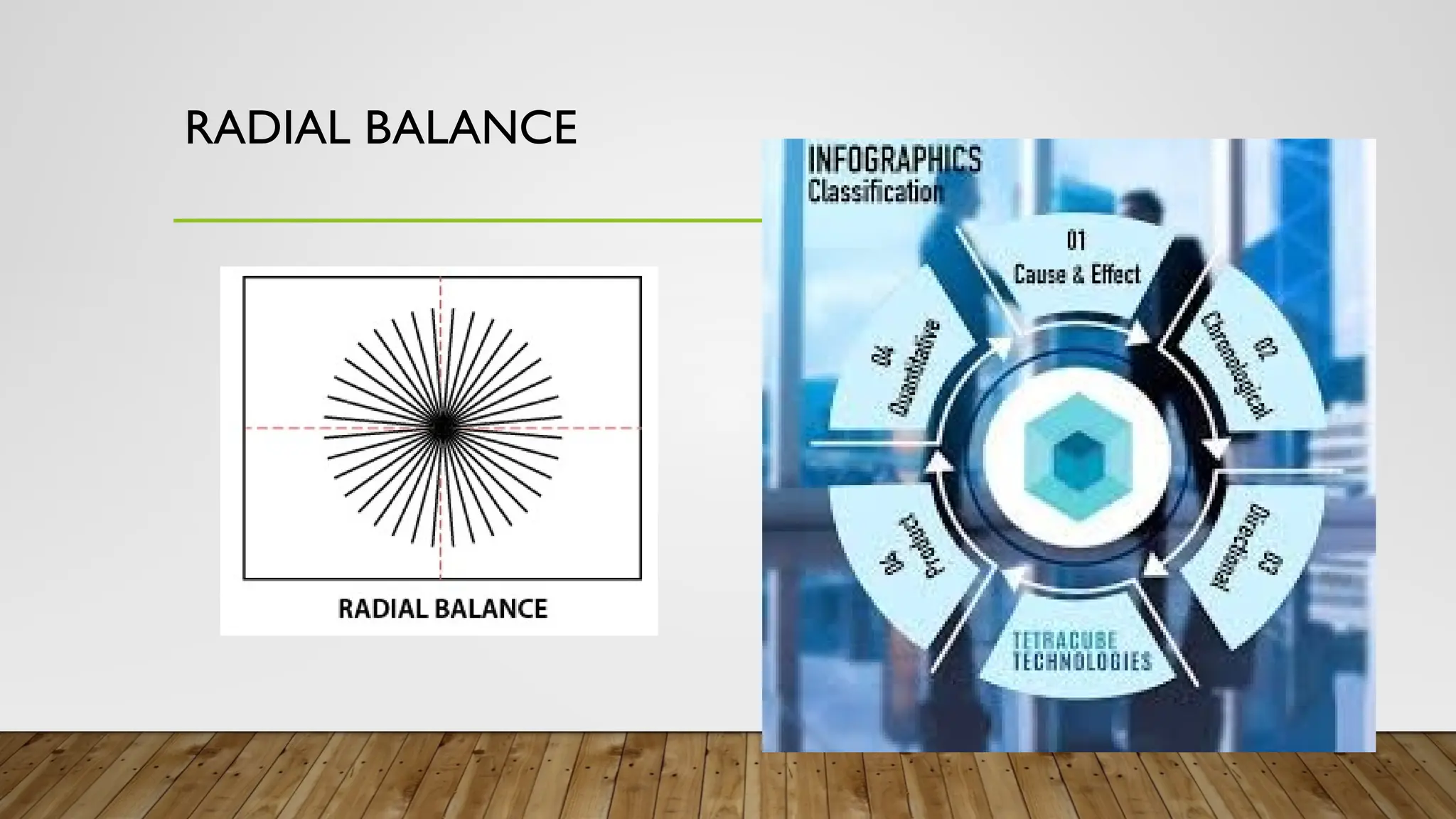
BALANCE
A distribution ofvisual weight on either
side of the vertical axis. Symmetrical
balance uses the same characteristics.
Asymmetrical uses different but equally
weighted features.
CONTRAST
The arrangement ofopposite
elements (light vs. dark, rough vs.
smooth, small vs. large, etc…) in a
composition so as to create visual
interest.
33.
EMPHASIS
Used to makecertain parts of an
Artwork stand out. It creates the
center of interest or focal point. It is
the place in which an Artist draws
your eyes first.
36.
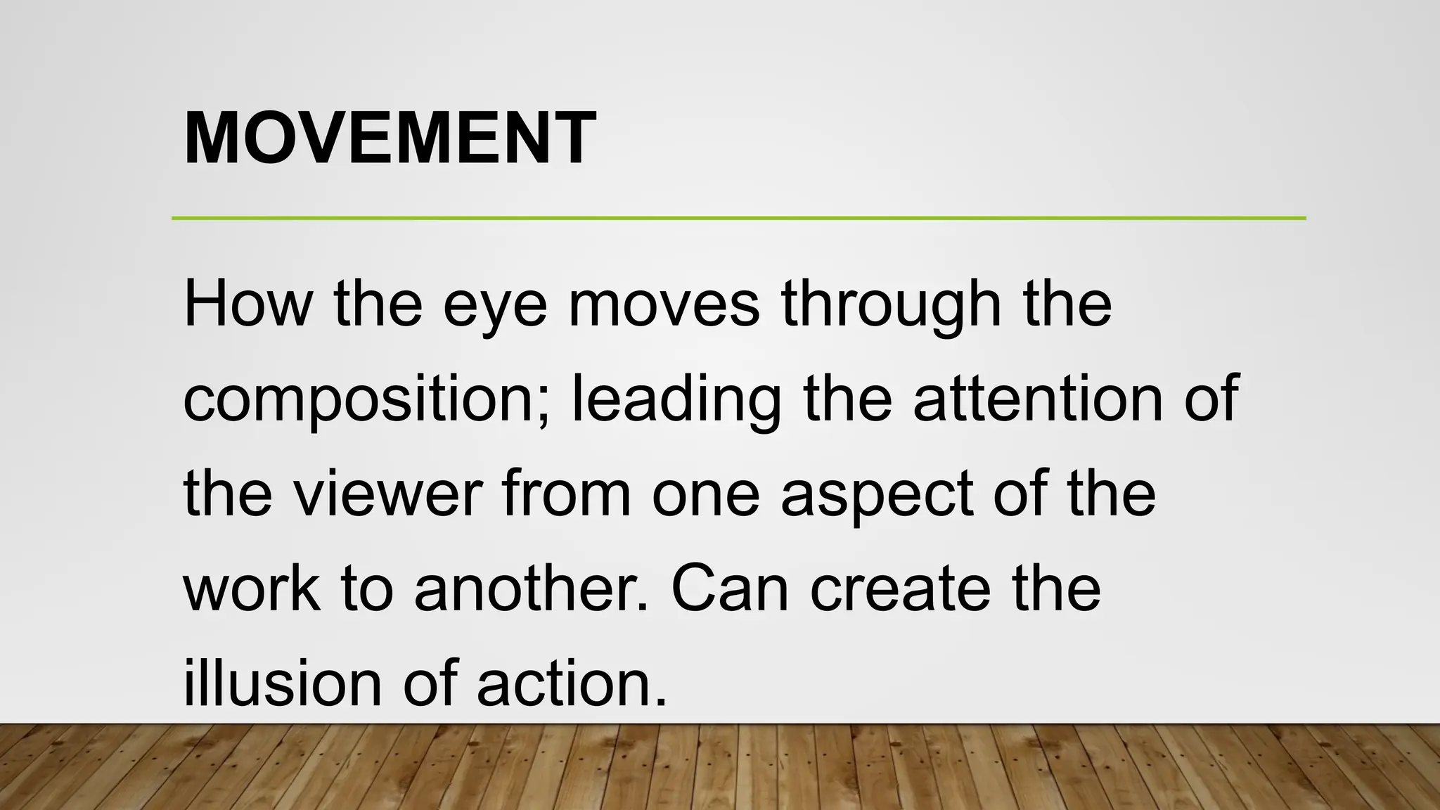
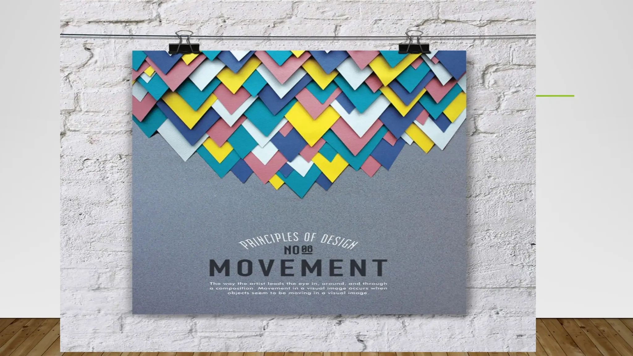
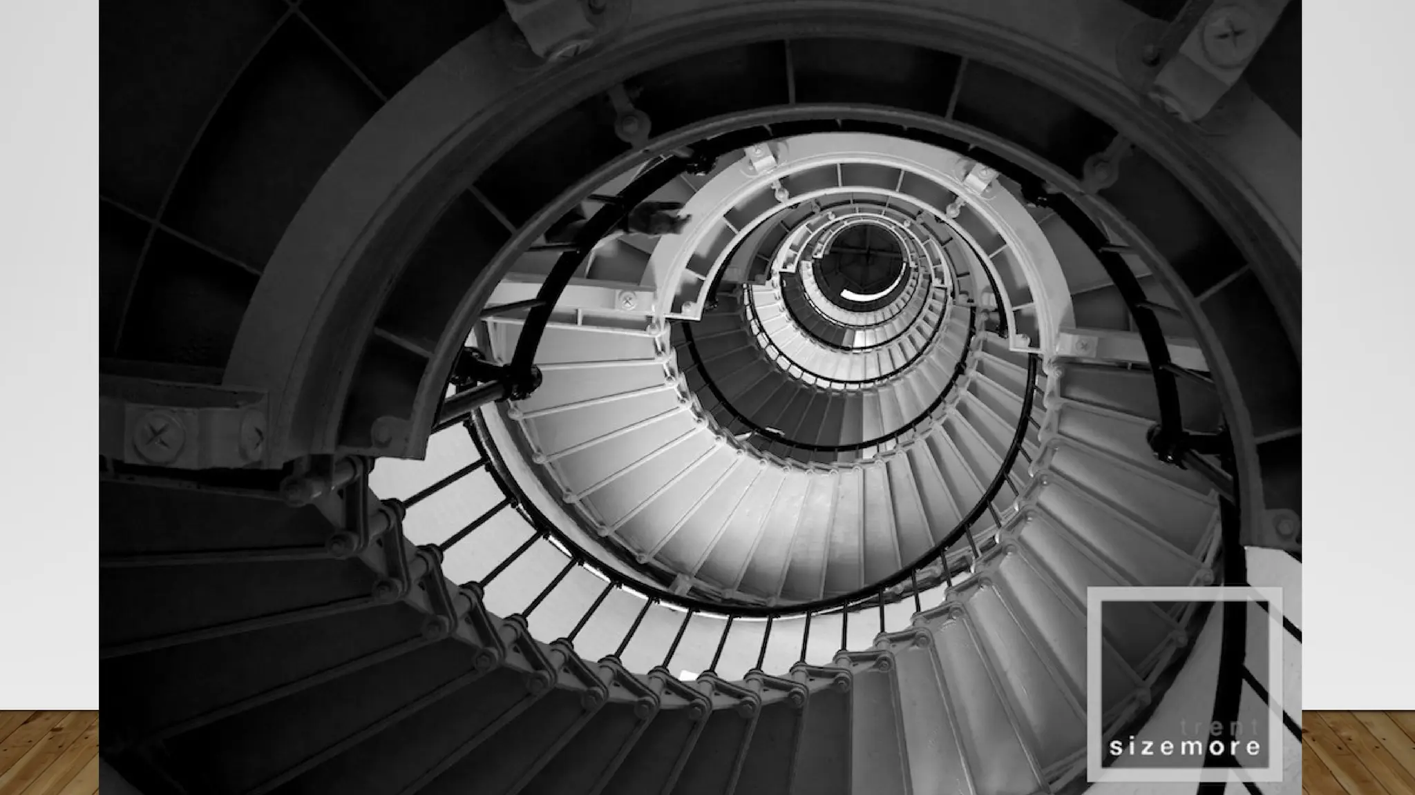
MOVEMENT
How the eyemoves through the
composition; leading the attention of
the viewer from one aspect of the
work to another. Can create the
illusion of action.
39.
CERTIFICATE
Of Recognition
is givento
MICHAEL JOHN AGUILOS
Class Adviser
W I T H H I G H E S T H O N O R S
STEM 11-A
For her excellent academic performance during the School Year 2024-
2025
Given this 11th
day of October 2024 at Biliran Province State University,
Naval Biliran.
JOSHUA A. CASAS MAE V. CEBLANO, MAT
Chairperson, Laboratory High School
Dean, School of Teacher Education
MARIBEL N. ZIPAGAN, PhD
41.
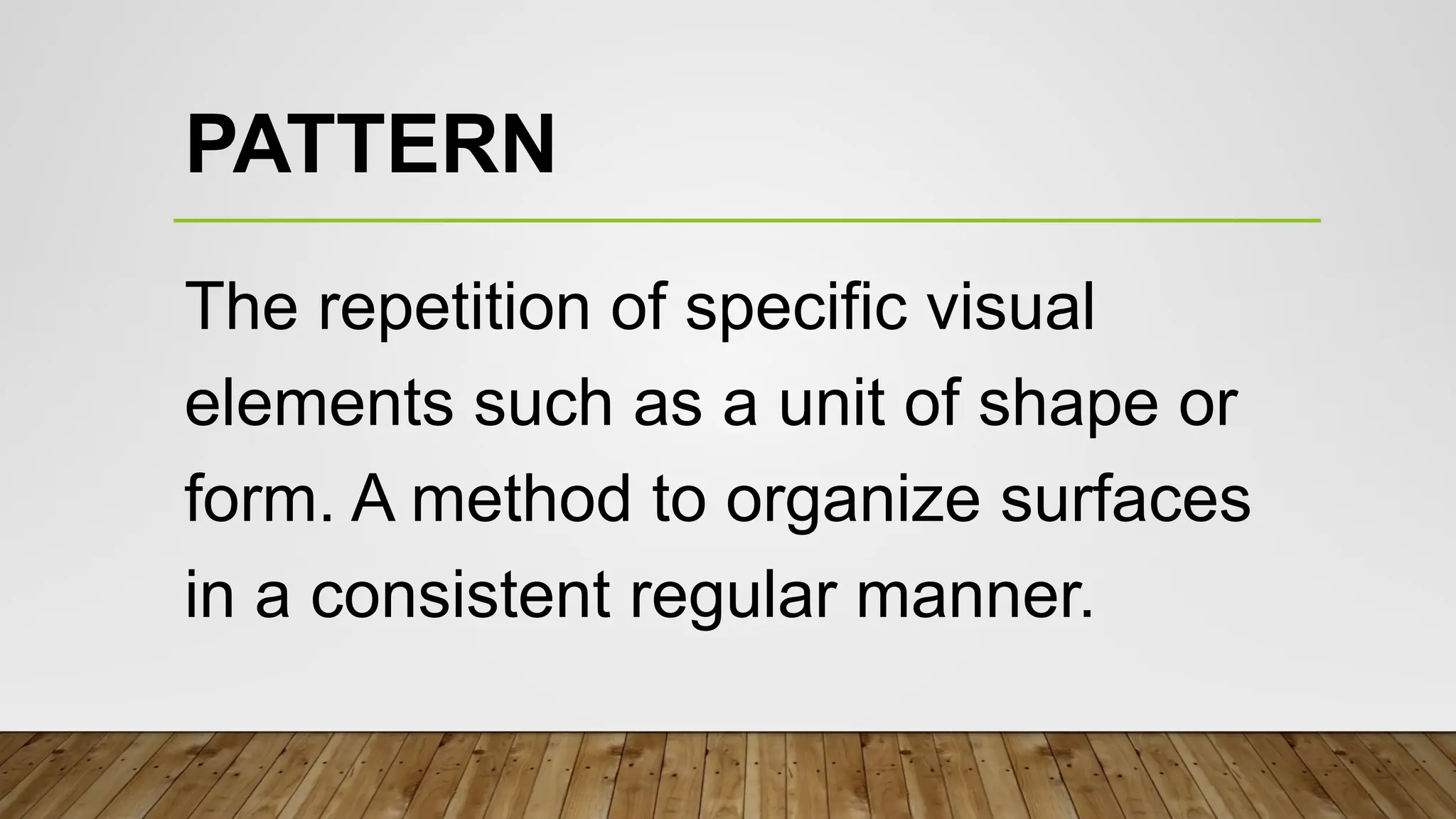
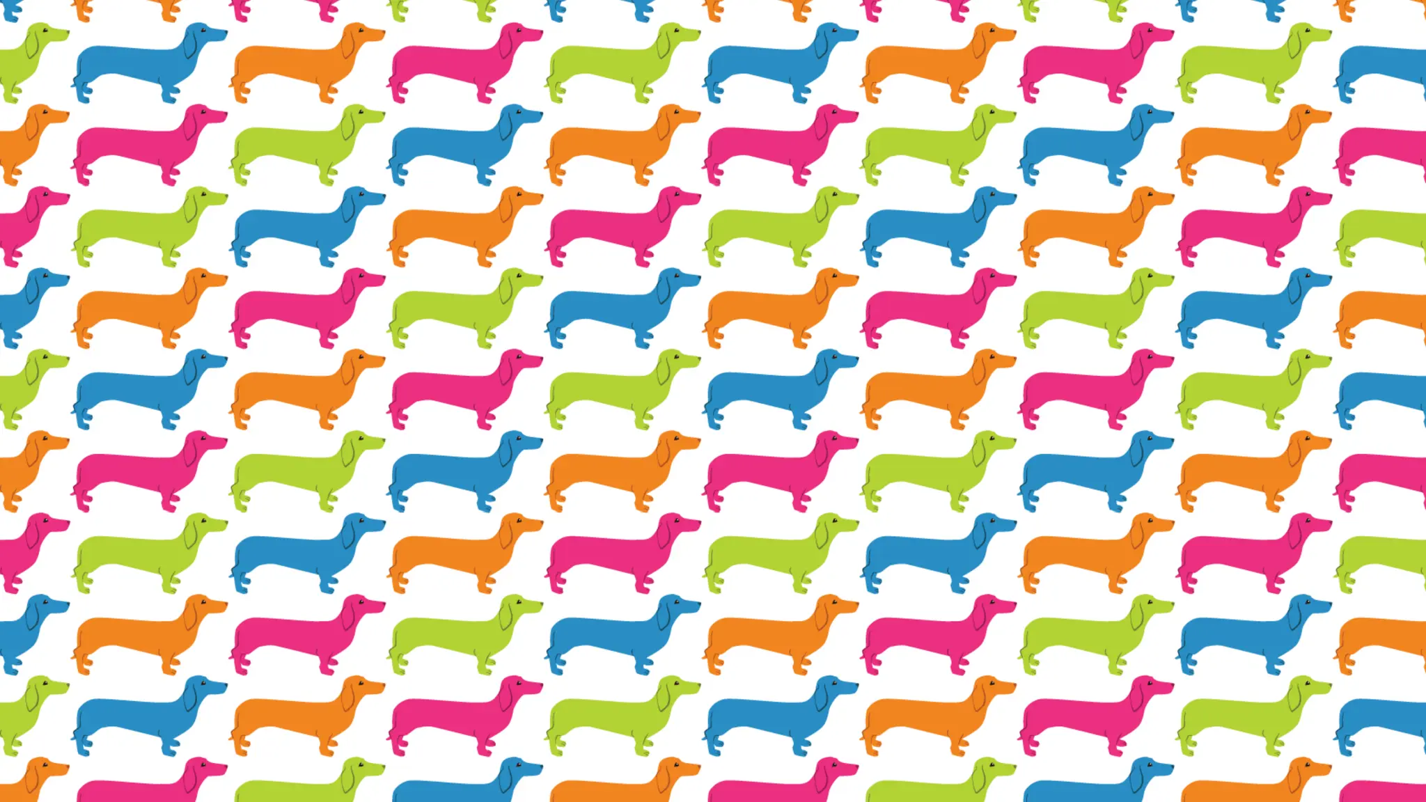
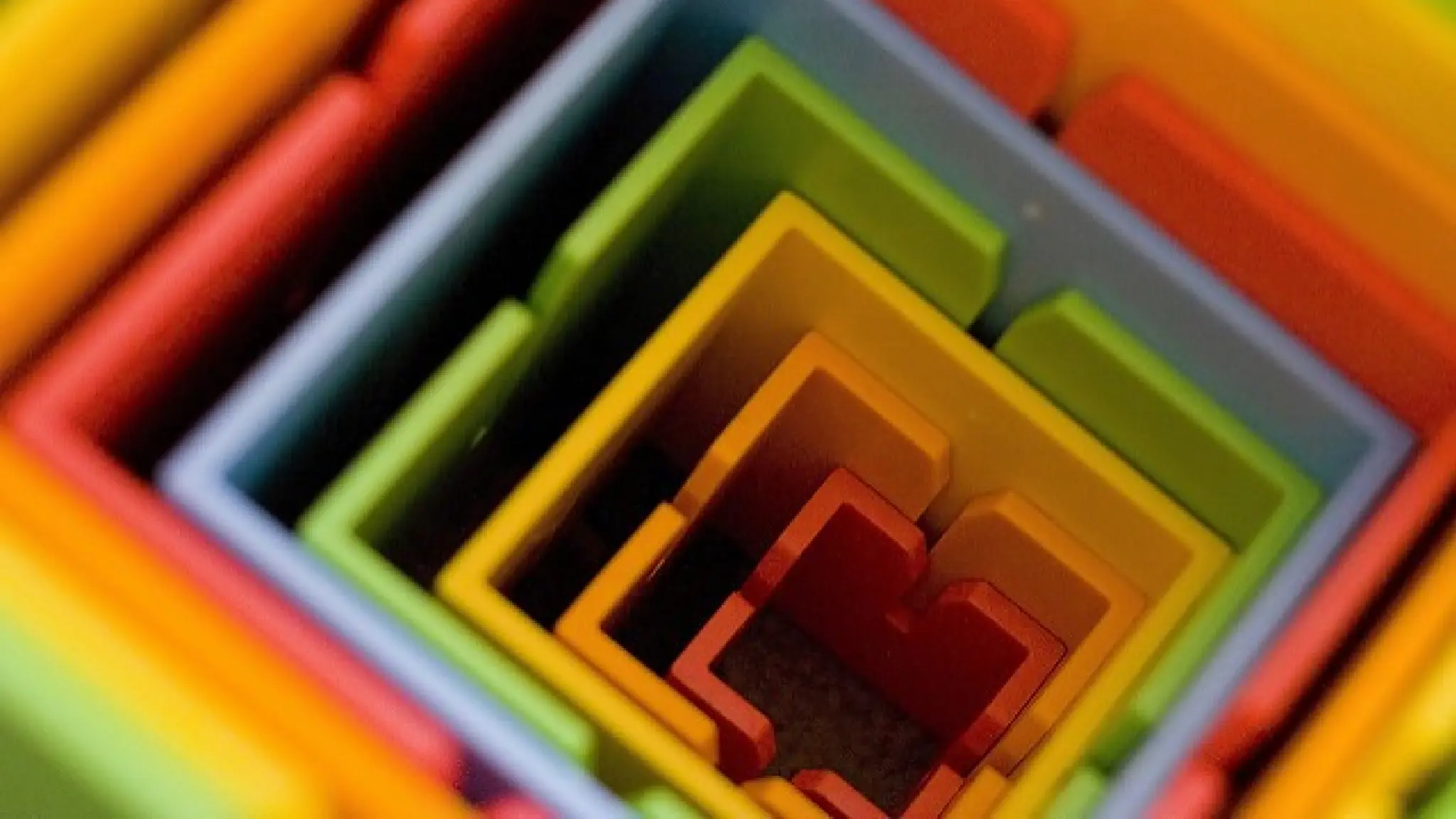
PATTERN
The repetition ofspecific visual
elements such as a unit of shape or
form. A method to organize surfaces
in a consistent regular manner.
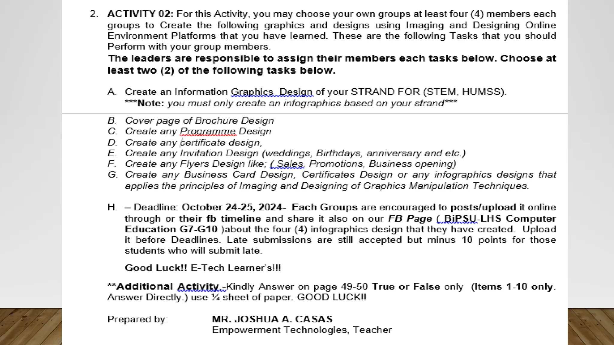
PERFORMANCE TASKS /
FORMATIVEACTIVITY FOR ONLINE
GRAPHICS AND LAYOUT DESIGNS.
ENRICHING EXPERIENCE
NOTE: EACH GROUP WILL CREATE OR MAKE A INFOGRAPHICS
DESIGNS ABOUTTHE FOLLOWING ACTIVITIES.
55.
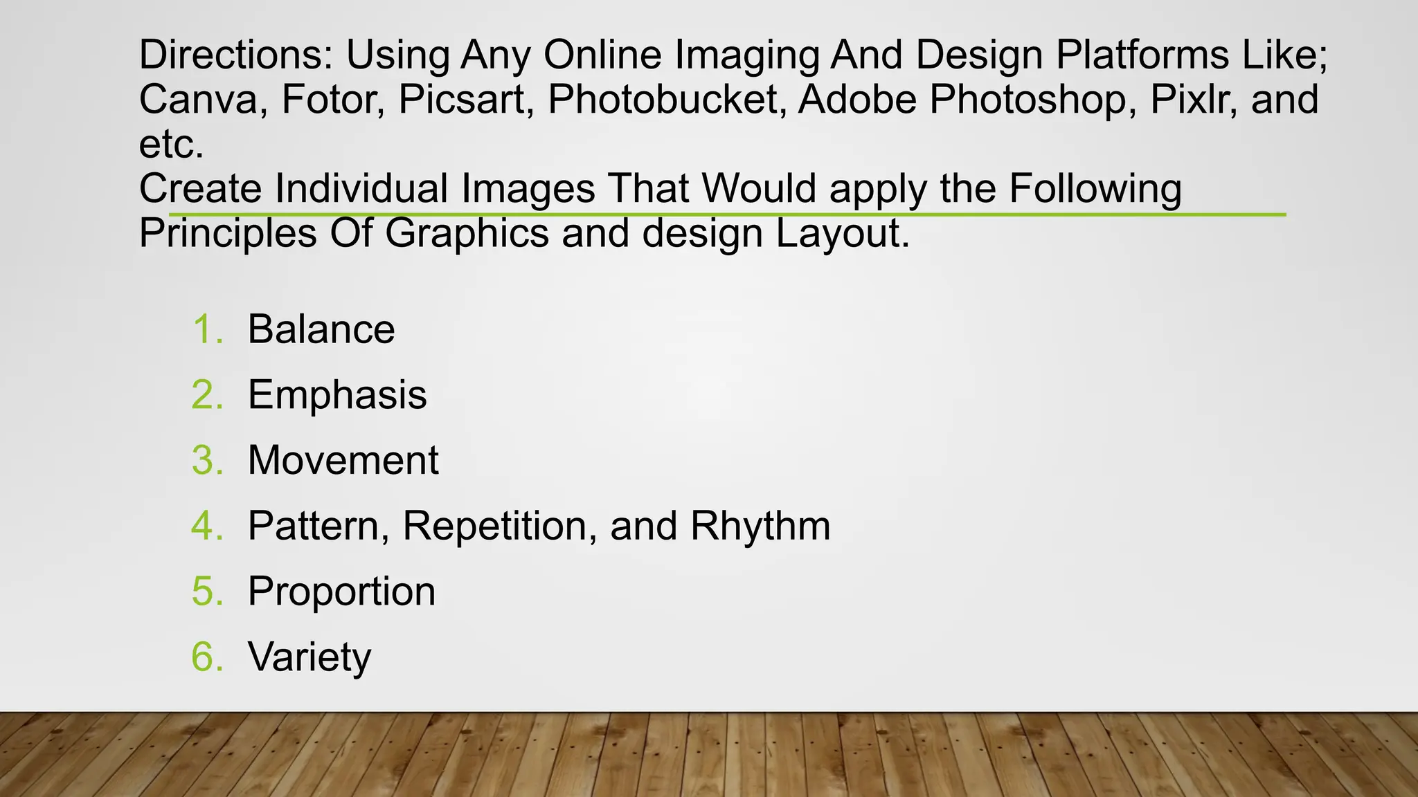
Directions: Using AnyOnline Imaging And Design Platforms Like;
Canva, Fotor, Picsart, Photobucket, Adobe Photoshop, Pixlr, and
etc.
Create Individual Images That Would apply the Following
Principles Of Graphics and design Layout.
1. Balance
2. Emphasis
3. Movement
4. Pattern, Repetition, and Rhythm
5. Proportion
6. Variety
Editor's Notes
#27 Symmetrical balance uses the same characteristics. While
Asymmetrical uses different but equally weighted features. and
Radial balance equal to the distribution of visual weight.
#34 Figure 1. An example page of balance and emphasis
#35 One of example of balance ang iya color and elements or designs.
#37 Figure 2. The edge of a drawer leads the eye toward the green frog. It’s bright color, which stands out in this picture, also helps draw the viewer’s eyes.
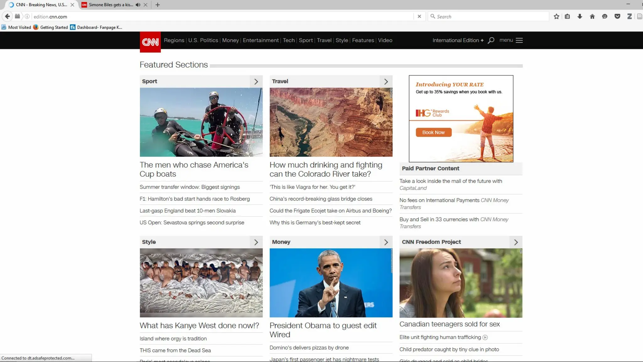
#50 Figure 4. A screenshot of CNN.com web page shows how the font size of header is proportional to the size of its content. This is done so that the viewer can easily see what the article is all about.
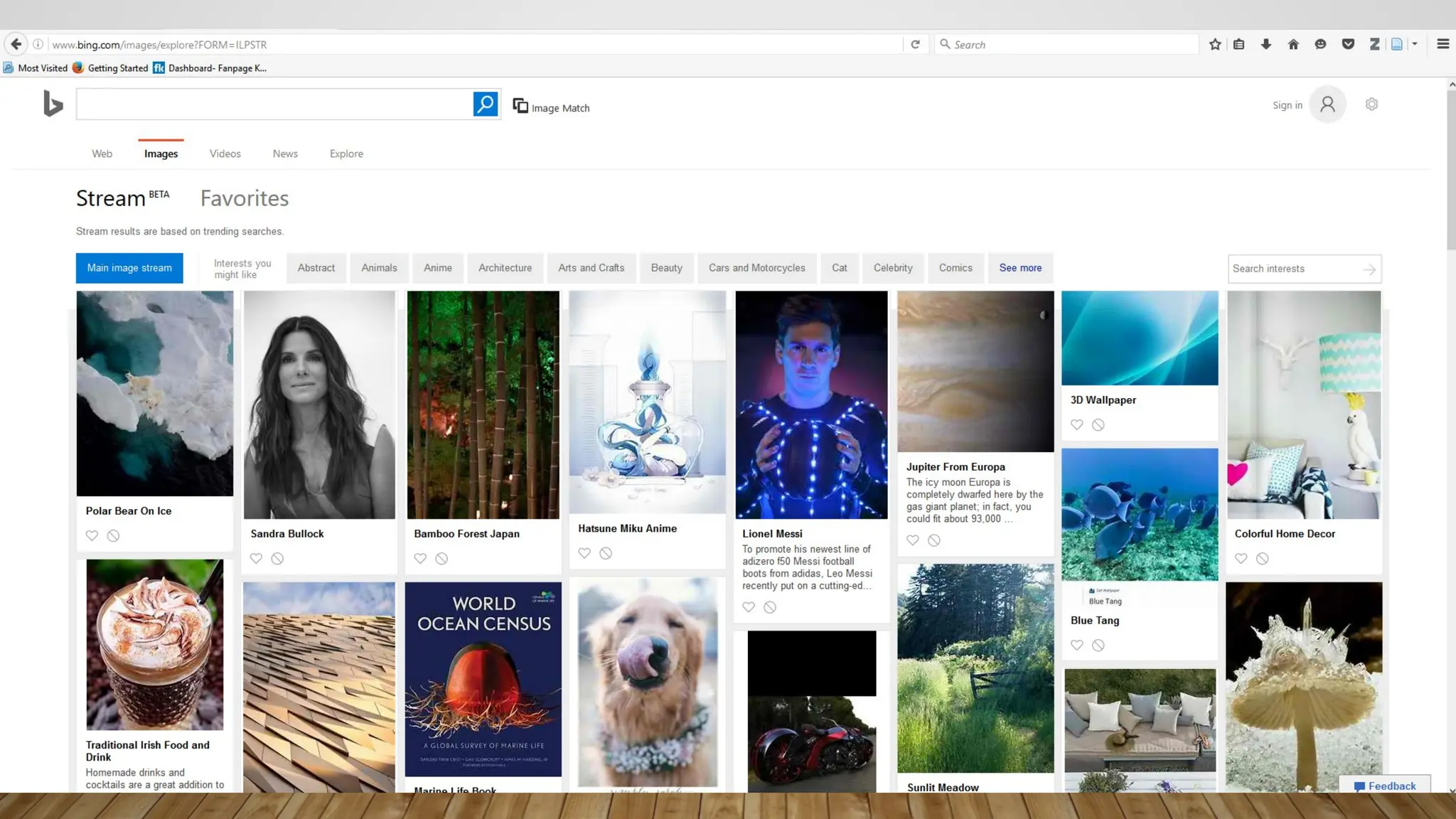
#52 Figure 5. Bing uses a combination of text and images to make the site more appealing but not distracting from the site’s purpose.


![L2 COMPUTER ETHICS PPT [Autosaved].pptx](https://cdn.slidesharecdn.com/ss_thumbnails/l2computerethicspptautosaved-230719075512-af676688-thumbnail.jpg?width=640&height=640&fit=bounds)


