with our magic
Our capabilities encompass everything in the web design and digital marketing space, including web design and hosting, SEO, social media, PPC, content writing, email marketing and more
PPC
Pay Per Click
While SEO offers long-term growth, sometimes you need an immediate boost. Pitchcliff PPC campaign ensures that the money you spend is put to the very best possible use.
YOUTUBE/VIMEO
Video Production
There is no more powerful way to get your message across than through video. Engage your audience by telling your story and sharing your mission.
MAILCHIMP
Email Marketing
Keep your customers coming back with easy, cost effective email marketing. Whether automated or a standard email newsletter, we can solve your email marketing needs.
CRO
Converstion Optimization
Turn more site visitors into customers! Our experts utilize the latest Conversion Optimization techniques to help increase the percentage of passive website visitors into active users.
ENCHANCEMENTS
SERP Optimization
Through careful keyword research and white-hat practices, we can help you achieve high rankings in the major search engines.
B2C
Social Media Marketing
Social media marketing is a critical element in staying connected with your audience. Working independently of, or side-by-side
Why Infographics Are Important for Your Professional PowerPointRRGraph Design
When it comes to making infographics, there are many software options to choose from. Many people want to use software they already have readily on hand or are already familiar with, so PowerPoint is a common choice. However, infographics are unique products that need a careful review of all options.
Read this article: https://rrgraphdesign.com/blog/infographics-are-important-for-powerpoint/
10 Best Infographic ideas to Inspire You - Layout, Topic, Template.pdfDrawtify,Inc.
Are you looking for some infographic design ideas to inspire you?
I’m sure you’ve heard about the rise of infographics. Data-based visual representations of information, these graphics are quickly becoming an effective way for businesses and organizations to share their knowledge with the public. The infographic design ideas in this top 10 list will inspire you to create eye-catching infographics to engage your audience.
We’ve got you covered with these 10 best infographic design ideas.
Infographics are a great way to convey complex data visually and engagingly, perfect for social media. This post will walk you through 10 ways to create infographics for your business.
In this list, you will find practical infographic design ideas. These tips will help you create eye-catching infographics that will engage your audience and help you achieve your goals.
Find the perfect design for the following infographic.
The process of creating infographics is not always easy. It can become overwhelming in the competitive world of journalism and blogging, where pages compete for attention and clicks. You must consider many steps, from selecting a topic to finding an appropriate design.
A new service called Drawtify Infographic Maker is here to help. Drawtify will provide a variety of designs for infographic creators to choose from. Professional graphic designers who have been operating for over 15 years create these designs.
Check out our top 10 infographic design ideas to inspire you!
Infographics are a great way to present information in a format that’s easy to understand. They’re an attractive visual medium becoming increasingly popular, so we’ve compiled this list of the best infographic design ideas from around the web.
Timeline Infographic Templates
Comparison Infographic Templates
Process Infographic ideas Templates
Roadmap Infographic Templates
Health Infographic Poster ideas Templates
Education Infographic Layout ideas Templates
Food Infographic Topic ideas Templates
Business Infographic ideas Templates
Marketing Infographic Layout ideas Templates
Worldmap Infographic Design Templates
Editable Certificate and Transcript Design_ Enhancing Your Brand’s Profession...aminulislam661165
Get the best quality, affordable online graphic design services for your business with FotoWorkz. Our expert designers provide custom designs that fit your budget and brand.
An introduction to infographic design written for global health and development professionals, including ideas for storyboarding, design tools, and tips and tricks to create fun, meaningful infographics. Lots of links to free web-based tools and great resources.
Comparison Infographic Template & Design ideas for Free.pdfDrawtify,Inc.
Creating your comparison infographic
The template is ready to go. All you need to do is add a few key points, choose the best layout for your idea, and you’re all set!
You can use the comparison infographic templates for any topic. If you want to illustrate how something works, use our templates. If you are explaining a concept or idea, create an infographic using our tools too! The options are endless when using these templates: they can show anyone how something works or why they should care about something in particular—all while looking beautiful and quickly engaging the reader’s imagination.
How to create a compelling comparison infographic
Use a template to get started.
Make sure your data is accurate and complete.
Remember the 3 R’s of good design: relevance, readability, and resonance.
Make sure the infographic is visually appealing.
Use a clear, concise title and subtitle that tells readers what they’re about to see and why they should care about it (and put in some keywords).
By using a template, you can create your infographic faster.
A template is a pre-designed layout that is used to create an infographic. By using a template, you can create your infographic faster.
Templates are available in many formats, you can design and export to image, PDF, SVG, etc,. For example, if you use Microsoft Office programs like Word or Excel for work, it might be easiest for you to use templates created there instead of starting from scratch every time.
Choosing a comparison infographic template
Choosing the proper comparison infographic templates is essential in creating your infographics. The goal is to select a template that works for your industry or topic, makes it easy for you to create an infographic, and looks visually appealing.
The first step in this process is finding the right balance between ease of use and design. If you’re starting infographics, selecting a template with pre-made data sets and graphics may be better. It will give you more time to focus on other aspects of your project, such as writing content or analyzing data. On the other hand, some templates require more work by people with little or no experience designing infographics.
Some customers also prefer working with templates designed by third parties because they don’t have enough time on their hands due to busy lifestyles or other commitments like family life where there might not always be enough hours in each day!
When looking at different types available online today, though, make sure these factors aren’t sacrificed over anything else because otherwise, there really wouldn’t be much point using them at all (and as someone who works full-time doing this type work daily, I know firsthand how frustrating seeing these things happen).
What is an Infographic (Definition, ideas, Tips).pdfDrawtify,Inc.
The Complete Guide on what is an Infographic Definition and How They Can Attract Attention to Your Content.
The infographic definition represents information, data, or knowledge in a chart, diagram, or other illustration. Infographics can be created by anyone with the right infographic maker software and design skills.
Infographics are a powerful way to communicate complex information in a clear, concise, and easy-to-understand format.
You can use infographics, from statistics and data visualization to visual storytelling. You can use them in any industry to increase brand awareness, educate audiences, and improve communication skills.
Infographics are a great way to communicate, share information and attract attention to your content. They are visually appealing and can quickly convey information that would take paragraphs of text to explain. They can be used for many purposes and are an excellent way to introduce new ideas or concepts.
An infographic is a graphical representation of information, data, or knowledge intended to present complex information quickly and clearly. The primary purpose of an infographic is to communicate a message promptly.
The design of the infographic should be appropriate for the content it contains. It should also be suitable for the audience that will be viewing it. For example, if you are designing an infographic about healthy eating habits for children, you may want to use bright and appealing colors for children.
To create compelling infographics, you need to take into consideration several factors:
– Text
– Images
– Data visualization
– Charts and graphs
– Quotes from experts
– Video clips
In conclusion, an infographic is perfect for getting your message across to your target audience. You can use it to help you sell your product or service and make it stand out among competitors. You can also educate and inform the public about a topic they may not know much about. It’s always good to have a firm understanding of the range of what an infographic can do for you and your business. With that in mind, you can decide which is the most beneficial route for your company.
An infographic definition is a tool for communicating your message to your target audience. It helps you sell your product or service and make it stand out among competitors. It can also educate and inform the public about a topic they may not know much about. It’s always good to have a firm understanding of the range of what an infographic can do for you and your business.
How to Communicate Effectively via Infographics - ColorWhistleColorWhistle
Tips To Create Effective Infographics:
1)Define your purpose and audience
2)Keep it simple
3) Use strong visuals
4)Tell a story
5)Use fonts wisely
and many more.......
To get a clear idea, visit the ColorWhistle website and check out the entire blog.
Tools to Create Eye-Catching Infographics for Your WebsiteHTS Hosting
Looking for an efficient tool to design infographics for your website? Then this blog is a must-read for you as it provides you the most user-friendly tools to design you infographics as well as social media posts for your business.
How to Generate Leads with InfographicsSeedling Inc.
Unless you’ve been completely o ine over the past few years, you’ve probably noticed that Infographics -- visual content that combine data/graphics with text- based information to communicate ideas and messages -- have been all the rage for marketers.
5 Tips for Creating Infographics That Win the War for AttentionClearEdge Marketing
You all know the old adage: “A picture is worth a thousand words.” Today’s world of instant gratification means average attention spans of less than 8 seconds, and a whopping 4 seconds for website viewing. Infographics are a great solution for conveying solid content and winning the war for the few seconds of your audience’s attention.
8 Factors to Keep in Mind for Your Next Business Report.pptxDebt Nirvana
Unlock the potential of your business reports with Debt Nirvana's expert guidance. Our comprehensive approach to crafting efficient business information reports ensures that your data is not just presented, but truly understood. From easy-to-understand visualizations to strategic color palettes and clear structural layouts, we empower you to convey your message effectively. With attention to detail on every aspect, including background design and font selection, our solutions guarantee a professional and impactful presentation of your achievements. Say goodbye to mundane reports and hello to insightful presentations that command attention. Contact us at +91-9810010294 or via email at rvm@debtnirvana.com to elevate your reporting game today!
Information graphics or infographics are graphic visual representations of information, data or knowledge intended to present information quickly and clearly. They can improve cognition by utilizing graphics to enhance the human visual system's ability to see patterns and trends.
This presentation tries to clear the concept of Data Visualization and Infographics. How to approach both the processes and whats takes to create stunning data visualization or Amazing infographics!
Cracking the Workplace Discipline Code Main.pptxWorkforce Group
Cultivating and maintaining discipline within teams is a critical differentiator for successful organisations.
Forward-thinking leaders and business managers understand the impact that discipline has on organisational success. A disciplined workforce operates with clarity, focus, and a shared understanding of expectations, ultimately driving better results, optimising productivity, and facilitating seamless collaboration.
Although discipline is not a one-size-fits-all approach, it can help create a work environment that encourages personal growth and accountability rather than solely relying on punitive measures.
In this deck, you will learn the significance of workplace discipline for organisational success. You’ll also learn
• Four (4) workplace discipline methods you should consider
• The best and most practical approach to implementing workplace discipline.
• Three (3) key tips to maintain a disciplined workplace.
Personal Brand Statement:
As an Army veteran dedicated to lifelong learning, I bring a disciplined, strategic mindset to my pursuits. I am constantly expanding my knowledge to innovate and lead effectively. My journey is driven by a commitment to excellence, and to make a meaningful impact in the world.
What is the TDS Return Filing Due Date for FY 2024-25.pdfseoforlegalpillers
It is crucial for the taxpayers to understand about the TDS Return Filing Due Date, so that they can fulfill your TDS obligations efficiently. Taxpayers can avoid penalties by sticking to the deadlines and by accurate filing of TDS. Timely filing of TDS will make sure about the availability of tax credits. You can also seek the professional guidance of experts like Legal Pillers for timely filing of the TDS Return.
Remote sensing and monitoring are changing the mining industry for the better. These are providing innovative solutions to long-standing challenges. Those related to exploration, extraction, and overall environmental management by mining technology companies Odisha. These technologies make use of satellite imaging, aerial photography and sensors to collect data that might be inaccessible or from hazardous locations. With the use of this technology, mining operations are becoming increasingly efficient. Let us gain more insight into the key aspects associated with remote sensing and monitoring when it comes to mining.
Unveiling the Secrets How Does Generative AI Work.pdfSam H
At its core, generative artificial intelligence relies on the concept of generative models, which serve as engines that churn out entirely new data resembling their training data. It is like a sculptor who has studied so many forms found in nature and then uses this knowledge to create sculptures from his imagination that have never been seen before anywhere else. If taken to cyberspace, gans work almost the same way.
Explore our most comprehensive guide on lookback analysis at SafePaaS, covering access governance and how it can transform modern ERP audits. Browse now!
Accpac to QuickBooks Conversion Navigating the Transition with Online Account...PaulBryant58
This article provides a comprehensive guide on how to
effectively manage the convert Accpac to QuickBooks , with a particular focus on utilizing online accounting services to streamline the process.
Taurus Zodiac Sign_ Personality Traits and Sign Dates.pptxmy Pandit
Explore the world of the Taurus zodiac sign. Learn about their stability, determination, and appreciation for beauty. Discover how Taureans' grounded nature and hardworking mindset define their unique personality.
Skye Residences | Extended Stay Residences Near Toronto Airportmarketingjdass
Experience unparalleled EXTENDED STAY and comfort at Skye Residences located just minutes from Toronto Airport. Discover sophisticated accommodations tailored for discerning travelers.
Website Link :
https://skyeresidences.com/
https://skyeresidences.com/about-us/
https://skyeresidences.com/gallery/
https://skyeresidences.com/rooms/
https://skyeresidences.com/near-by-attractions/
https://skyeresidences.com/commute/
https://skyeresidences.com/contact/
https://skyeresidences.com/queen-suite-with-sofa-bed/
https://skyeresidences.com/queen-suite-with-sofa-bed-and-balcony/
https://skyeresidences.com/queen-suite-with-sofa-bed-accessible/
https://skyeresidences.com/2-bedroom-deluxe-queen-suite-with-sofa-bed/
https://skyeresidences.com/2-bedroom-deluxe-king-queen-suite-with-sofa-bed/
https://skyeresidences.com/2-bedroom-deluxe-queen-suite-with-sofa-bed-accessible/
#Skye Residences Etobicoke, #Skye Residences Near Toronto Airport, #Skye Residences Toronto, #Skye Hotel Toronto, #Skye Hotel Near Toronto Airport, #Hotel Near Toronto Airport, #Near Toronto Airport Accommodation, #Suites Near Toronto Airport, #Etobicoke Suites Near Airport, #Hotel Near Toronto Pearson International Airport, #Toronto Airport Suite Rentals, #Pearson Airport Hotel Suites
Putting the SPARK into Virtual Training.pptxCynthia Clay
This 60-minute webinar, sponsored by Adobe, was delivered for the Training Mag Network. It explored the five elements of SPARK: Storytelling, Purpose, Action, Relationships, and Kudos. Knowing how to tell a well-structured story is key to building long-term memory. Stating a clear purpose that doesn't take away from the discovery learning process is critical. Ensuring that people move from theory to practical application is imperative. Creating strong social learning is the key to commitment and engagement. Validating and affirming participants' comments is the way to create a positive learning environment.
Buy Verified PayPal Account | Buy Google 5 Star Reviewsusawebmarket
Buy Verified PayPal Account
Looking to buy verified PayPal accounts? Discover 7 expert tips for safely purchasing a verified PayPal account in 2024. Ensure security and reliability for your transactions.
PayPal Services Features-
🟢 Email Access
🟢 Bank Added
🟢 Card Verified
🟢 Full SSN Provided
🟢 Phone Number Access
🟢 Driving License Copy
🟢 Fasted Delivery
Client Satisfaction is Our First priority. Our services is very appropriate to buy. We assume that the first-rate way to purchase our offerings is to order on the website. If you have any worry in our cooperation usually You can order us on Skype or Telegram.
24/7 Hours Reply/Please Contact
usawebmarketEmail: support@usawebmarket.com
Skype: usawebmarket
Telegram: @usawebmarket
WhatsApp: +1(218) 203-5951
USA WEB MARKET is the Best Verified PayPal, Payoneer, Cash App, Skrill, Neteller, Stripe Account and SEO, SMM Service provider.100%Satisfection granted.100% replacement Granted.
RMD24 | Debunking the non-endemic revenue myth Marvin Vacquier Droop | First ...BBPMedia1
Marvin neemt je in deze presentatie mee in de voordelen van non-endemic advertising op retail media netwerken. Hij brengt ook de uitdagingen in beeld die de markt op dit moment heeft op het gebied van retail media voor niet-leveranciers.
Retail media wordt gezien als het nieuwe advertising-medium en ook mediabureaus richten massaal retail media-afdelingen op. Merken die niet in de betreffende winkel liggen staan ook nog niet in de rij om op de retail media netwerken te adverteren. Marvin belicht de uitdagingen die er zijn om echt aansluiting te vinden op die markt van non-endemic advertising.
RMD24 | Debunking the non-endemic revenue myth Marvin Vacquier Droop | First ...
Nediger_Infographics_2019.pdf
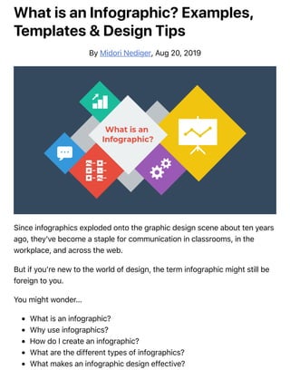
1. What is an Infographic? Examples,
Templates & Design Tips
By Midori Nediger, Aug 20, 2019
Since infographics exploded onto the graphic design scene about ten years
ago, they’ve become a staple for communication in classrooms, in the
workplace, and across the web.
But if you’re new to the world of design, the term infographic might still be
foreign to you.
You might wonder…
What is an infographic?
Why use infographics?
How do I create an infographic?
What are the different types of infographics?
What makes an infographic design effective?
2. Today, I’ll give you a crash course on infographics and infographic design
(along with examples of infographic templates) to answer all of these
questions and more!
What is an infographic? Infographics defined:
According to the Oxford English Dictionary, an infographic (or information
graphic) is “a visual representation of information or data”
.
But the meaning of an infographic is something much more specific.
An infographic is a collection of imagery, charts, and minimal text that
gives an easy-to-understand overview of a topic.
As in the example below, infographics use striking, engaging visuals to
communicate information quickly and clearly.
3.
4. The most visually unique, creative infographics are often the most effective,
because they grab our attention and don’t let go.
But it’s crucial to remember that the visuals in an infographic must do more
than excite and engage. They must help us understand and remember the
content of the infographic, as seen in this infographic about palm reading
from Jing Zhang:
Ready to dive right in and create your first infographic? Check out our
ultimate infographic design guide for everything you need to get
started.
Why are infographics used?
Infographics are great for making complex information easy to digest. They
can be helpful anytime you want to:
Provide a quick overview of a topic
Explain a complex process
Display research findings or survey data
Summarize a long blog post or report
Compare and contrast multiple options
Raise awareness about an issue or cause
When you need to give someone a really quick rundown on something
that can be hard to explain in words alone, an infographic is a good way
to go.
5. This means that infographics can be useful in pretty much any industry.
Marketers use infographics to build brand awareness and boost
engagement:
Consultants use timeline infographics to visualize project timelines and to
simplify new/industry-specific topics to their clients:
Governments use infographics to share statistics and census data:
Source
Educators use infographics to make content more memorable for students:
6.
7. And nonprofits use infographics to promote events and raise awareness for
their causes:
Need to explain a complex process? Our process infographics can help
communicate cumbersome processes in a visual way.
Infographics can be useful whenever you need to communicate information
quickly, or any time you want to make an impact with your data or your
message.
How do I create an infographic?
If I’ve convinced you that infographics are a tool you should be using, you’re
probably wondering how you can create your own infographic.
Our step-by-step guide on how to create an infographic is a great resource.
This video guide will also show you how you can make an infographic in
just 5 steps:
No matter how excited you are to get started making your very first
infographic, you shouldn’t jump into the design process without a game
plan.
Instead, start by creating an infographic outline.
Organize your information with an infographic outline
The process of creating an outline will help you organize your thoughts and
ensure that your content will work in an infographic.
8. Create an infographic outline from existing content using these 4
steps:
1. Determine the key takeaways of your content
2. Determine the title, headers, subheaders and facts
3. Consider the length of paragraphs and points
4. Include notes for the designer
Starting with an outline in this format will ensure that the rest of the design
process goes smoothly.
For a more detailed run-down of this process, check out our guide on
how to create an infographic outline.
Pick an infographic template
Once you’ve got an outline, you’re ready to pick an infographic template.
Pre-made infographic templates (like the one below) can give you the
design inspiration you need to get your infographic rolling. Even just using
them as a jumping-off point can be helpful.
There’s a lot to consider when picking an infographic template, including
the colors, fonts, length, size, and style of each template, and how well
each of those factors aligns with your content.
But most importantly, you need to pick the right type of infographic
template for your content.
What are the different types of infographics, you ask?
9. What are the different types of infographics?
At Venngage, our library of infographic templates is sorted into 9 different
categories:
1. Statistical infographics
2. Informational infographics
3. Timeline infographics
4. Process infographics
5. Geographic infographics
6. Comparison infographics
7. Hierarchical infographics
8. List infographics
9. Resume infographics
This video summarizes these 9 types of infographics and when to use
them:
Each type of infographic is tailored to visualizing a different type of content.
Informational infographics, for example, are typically more text-heavy
than the other types of infographics. Like this example from Course Hero
below, they work best as summative, standalone pieces that provide a high-
level explanation of a topic.
There are also informational infographics that explain something niche, but
very simply. These are handy to have as visual references for topics that are
new and unfamiliar. TalentLyft’s infographic on recruitment metrics is a
great example – a short and sweet summary on the six key recruitment
metrics hiring managers should understand and track.
10. Statistical infographics, on the other hand, are more focused on numbers,
charts, and data.
They tend to contain much less text than informational infographics and
have less of a narrative flow. Instead, they make a statement with big
numbers and standalone facts, like this infographic from Mobile Future.
Similarly, this infographic from Podia on the “State of the Side Hustle” uses
numbers and stylization to make its most important points prominent with
sparse supporting text.
Choosing the right type of template for your content is one of the keys to a
successful infographic.
For a full description of each type of infographic, and when to use
them, check out this guide to the 9 types of infographic templates.
What makes an infographic design effective?
When it comes to designing an effective infographic, it’s important to
recognize that our brain seeks patterns in visual information to help us
make sense of the world.
We can use this idea to structure our information visually and create
patterns that will enhance the message that we’re trying to communicate.
Let’s run through some infographic design best practices to help you create
infographics are as effective as they are beautiful.
Also, check out our post on 7 ways to customize your infographic template
for more easy hacks on how to make your design pop.
Use lines, borders, and shapes to group related
information
11. Even something as simple as the position and grouping of elements on a
page can influence the way our readers understand our graphics.
If we use basic design elements like borders, lines, circles, and squares to
visually organize our content, our readers will find it easier to interpret that
content.
For example, we can enclose related elements within an outline or a shape.
Most infographics, like the one below, use tactic this to break up the design
into multiple sections, making the graphic easier to scan.
Alternatively, when the structure of the information is the main focus of the
infographic (like in an organizational chart or a flow chart) it can be helpful
to explicitly connect related elements with lines. Like in this marketing flow
chart infographic:
Click the template above to make an organizational chart. Edit the template
to your liking–no design experience needed.
Want more tips on organizing your information in an infographic?
Check out our step-by-step guide on how to summarize information
and present it visually.
Use one contrasting color to guide your readers’ attention
Another major design element to think about is color. We’re naturally
inclined to use color to make infographics look pretty, but color can also be
used as a powerful communication tool.
Just like lines and borders, colors can be used to indicate information
12. groupings, as seen in the business strategy infographic example below:
But more importantly, we can use color to draw attention to particular
pieces of information and push supporting information into the background.
Pick one color that contrasts with all of the other colors in the graphic,
and use it to make the most important information stand out.
Take the infographic below, for example. The bright yellow circles contrast
with the blue background to make the icons (the most important visual
aspect of the graphic) stand out. This strategy also happens to be highly
trendy–pops of color are one of the biggest graphic design trends of 2020.
Need some infographic color scheme inspiration? Check out our guide
on how to pick colors for infographics.
Create a text hierarchy with three different font styles
Fonts are one of the first things people notice when they first look at an
infographic. If chosen poorly, fonts can ruin an otherwise great
infographic. Our roundup of popular font types will steer you on the right
path.
The key to using fonts correctly in infographics is to create a clear text
hierarchy with three different font styles–one for the main heading, one for
the section headings, and one for the body text.
The main header font should be the biggest and can be the most stylized.
Think of it as the way to set the mood of your infographic.
13. The font for the section headers should be a bit smaller and less stylized,
but it should still stand out on the page.
Finally, the font for the body text should be smallest, and not stylized at all.
It needs to be as easy to read as possible.
Not sure what a readable font looks like? Here’s a quick reference guide to
fonts that are great for body text:
For more infographic font tips and best practices, check out our guide
all about choosing infographic fonts.
Use images, icons, and illustrations to make key
takeaways memorable
Last but certainly not least, make sure that the focus of your infographic is
on visuals like images, symbols, icons, illustrations, and charts.
Visuals are crucial for making your information engaging and memorable.
The best infographics have an equal balance of text and visuals.
The easiest way to make sure you have enough visuals in your graphic is to
add an icon to represent each header, as seen in the example below:
Or even better, create visual examples of each main point in the infographic,
as seen in this example from Elle & Company:
It’s important to have fun with your design, too. It doesn’t need to be strictly
business-y and serious. Infographics are supposed to be engaging and
14. memorable, and illustrations are great story-telling devices.
If you’re feeling really ambitious, you can even create a feature visualization
like the one below that represents all of your information visually, eliminating
the need for almost all of the text.
Source
Making a data-heavy infographic and need help visualizing your data?
Check out our guides on designing effective charts and choosing the
best charts for your infographic.
Conclusion
The best infographics use a combination of text, images, and data to inform
and engage.
If you’re ready to create infographics that strike the perfect balance
between fun and educational, make sure you follow these infographic
design best practices:
Use lines, borders, and shapes to group related information.
Use one contrasting color to draw attention to key information.
Create a text hierarchy with three different font styles.
Use images, icons, and illustrations to make key takeaways memorable.
For more help getting started on your first infographic, check out this
guide: How to make an infographic in 5 steps.