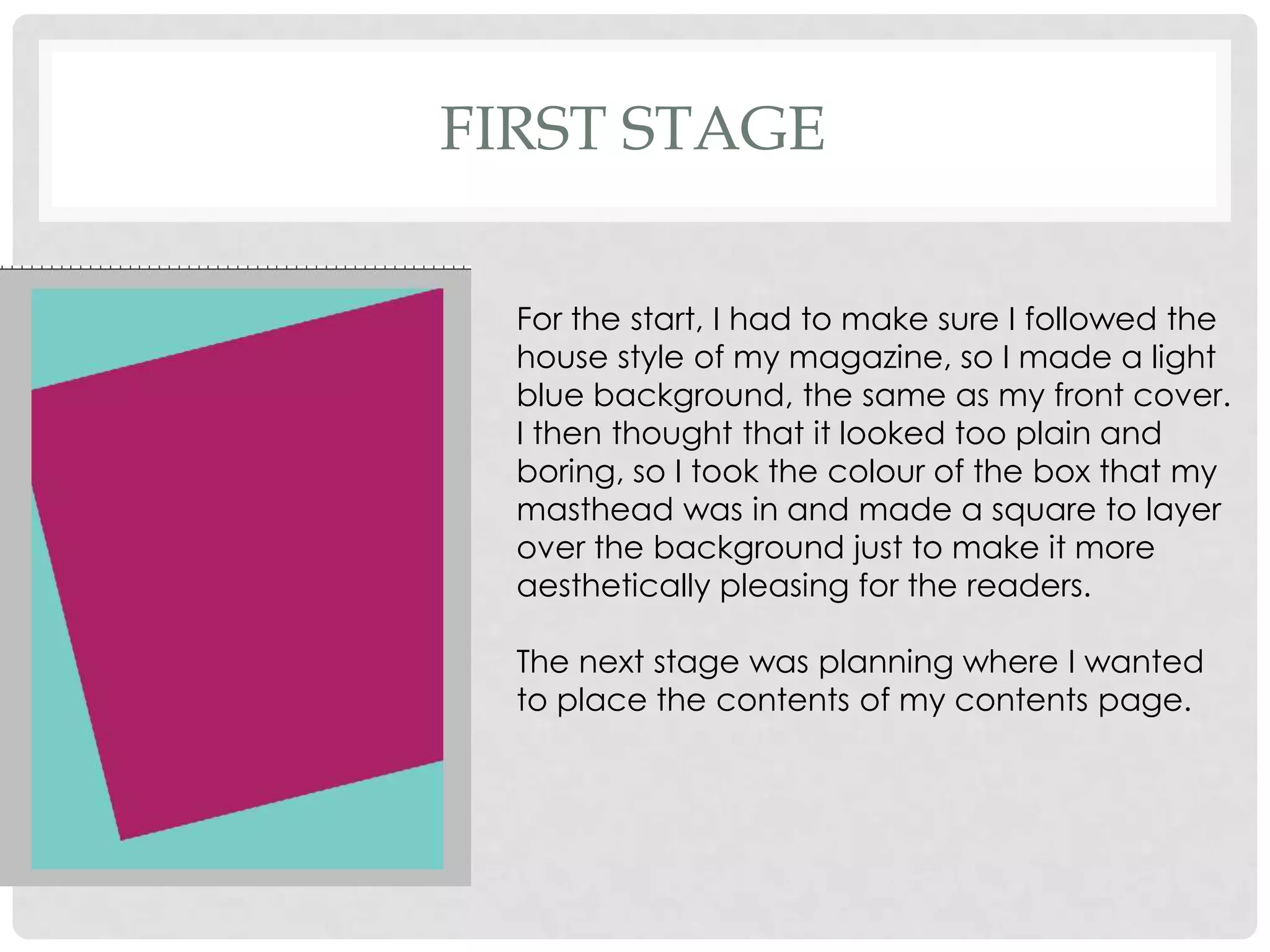
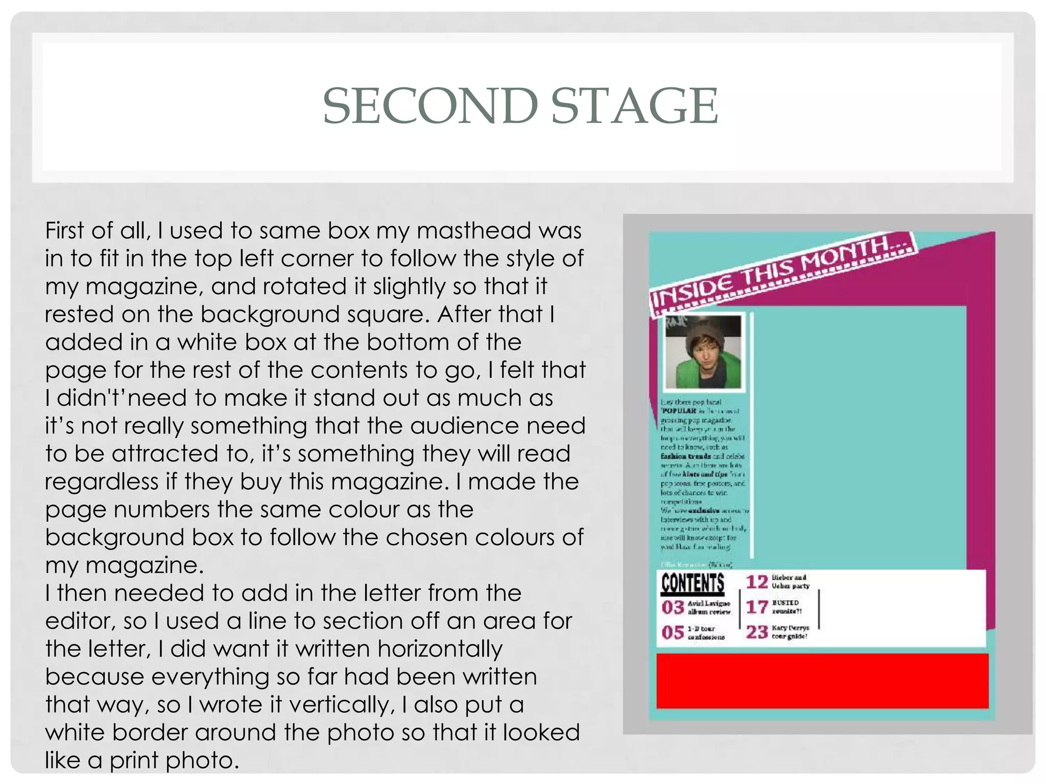
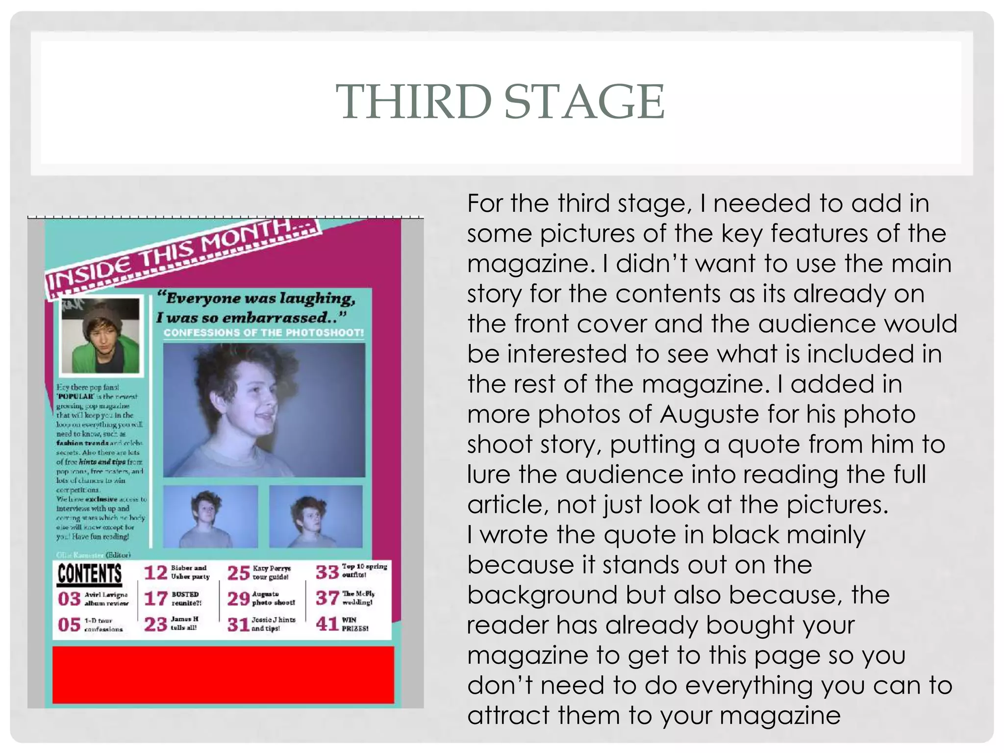
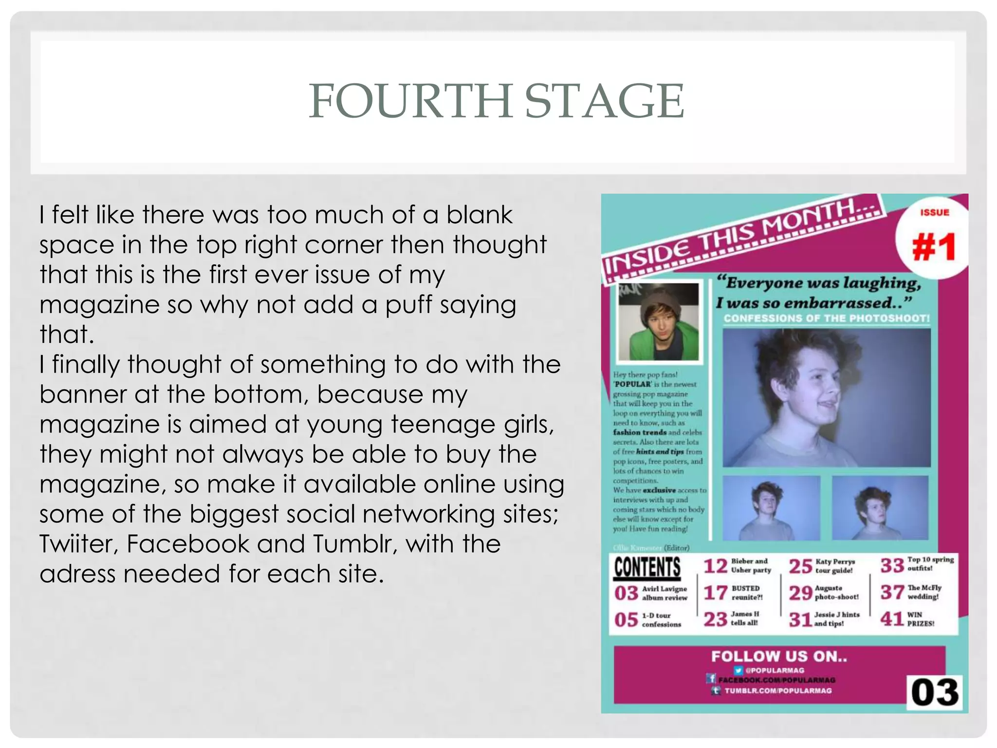
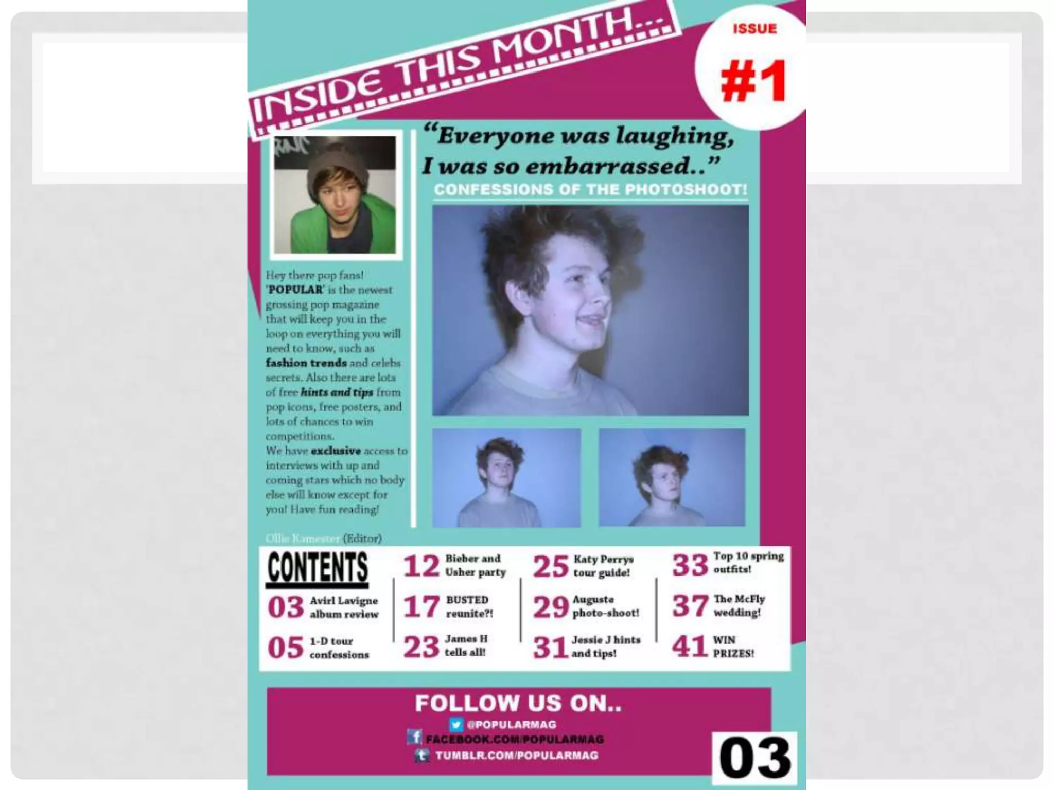
STAGES OF
DEVELOPMENT
  CONTENTS PAGE
FIRST STAGE

  For the start, I had to make sure I followed the
  house style of my magazine, so I made a light
  blue background, the same as my front cover.
  I then thought that it looked too plain and
  boring, so I took the colour of the box that my
  masthead was in and made a square to layer
  over the background just to make it more
  aesthetically pleasing for the readers.

  The next stage was planning where I wanted
  to place the contents of my contents page.
SECOND STAGE

First of all, I used to same box my masthead was
in to fit in the top left corner to follow the style of
my magazine, and rotated it slightly so that it
rested on the background square. After that I
added in a white box at the bottom of the
page for the rest of the contents to go, I felt that
I didn't’need to make it stand out as much as
it’s not really something that the audience need
to be attracted to, it’s something they will read
regardless if they buy this magazine. I made the
page numbers the same colour as the
background box to follow the chosen colours of
my magazine.
I then needed to add in the letter from the
editor, so I used a line to section off an area for
the letter, I did want it written horizontally
because everything so far had been written
that way, so I wrote it vertically, I also put a
white border around the photo so that it looked
like a print photo.
THIRD STAGE
    For the third stage, I needed to add in
    some pictures of the key features of the
    magazine. I didn’t want to use the main
    story for the contents as its already on
    the front cover and the audience would
    be interested to see what is included in
    the rest of the magazine. I added in
    more photos of Auguste for his photo
    shoot story, putting a quote from him to
    lure the audience into reading the full
    article, not just look at the pictures.
    I wrote the quote in black mainly
    because it stands out on the
    background but also because, the
    reader has already bought your
    magazine to get to this page so you
    don’t need to do everything you can to
    attract them to your magazine
FOURTH STAGE

I felt like there was too much of a blank
space in the top right corner then thought
that this is the first ever issue of my
magazine so why not add a puff saying
that.
I finally thought of something to do with the
banner at the bottom, because my
magazine is aimed at young teenage girls,
they might not always be able to buy the
magazine, so make it available online using
some of the biggest social networking sites;
Twiiter, Facebook and Tumblr, with the
adress needed for each site.
Stages of development contents

Stages of development contents

  • 1.
  • 2.
    FIRST STAGE For the start, I had to make sure I followed the house style of my magazine, so I made a light blue background, the same as my front cover. I then thought that it looked too plain and boring, so I took the colour of the box that my masthead was in and made a square to layer over the background just to make it more aesthetically pleasing for the readers. The next stage was planning where I wanted to place the contents of my contents page.
  • 3.
    SECOND STAGE First ofall, I used to same box my masthead was in to fit in the top left corner to follow the style of my magazine, and rotated it slightly so that it rested on the background square. After that I added in a white box at the bottom of the page for the rest of the contents to go, I felt that I didn't’need to make it stand out as much as it’s not really something that the audience need to be attracted to, it’s something they will read regardless if they buy this magazine. I made the page numbers the same colour as the background box to follow the chosen colours of my magazine. I then needed to add in the letter from the editor, so I used a line to section off an area for the letter, I did want it written horizontally because everything so far had been written that way, so I wrote it vertically, I also put a white border around the photo so that it looked like a print photo.
  • 4.
    THIRD STAGE For the third stage, I needed to add in some pictures of the key features of the magazine. I didn’t want to use the main story for the contents as its already on the front cover and the audience would be interested to see what is included in the rest of the magazine. I added in more photos of Auguste for his photo shoot story, putting a quote from him to lure the audience into reading the full article, not just look at the pictures. I wrote the quote in black mainly because it stands out on the background but also because, the reader has already bought your magazine to get to this page so you don’t need to do everything you can to attract them to your magazine
  • 5.
    FOURTH STAGE I feltlike there was too much of a blank space in the top right corner then thought that this is the first ever issue of my magazine so why not add a puff saying that. I finally thought of something to do with the banner at the bottom, because my magazine is aimed at young teenage girls, they might not always be able to buy the magazine, so make it available online using some of the biggest social networking sites; Twiiter, Facebook and Tumblr, with the adress needed for each site.