SlideShare a Scribd company logo
Front Cover Development By Christian Whelan
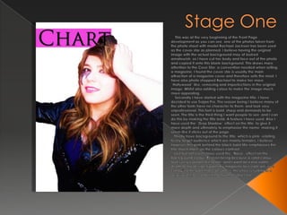
Stage One     This was at the very beginning of the Front Page development as you can see, one of the photos taken from the photo shoot with model Rachael Jackson has been used as the cover star as planned. I believe having the original image with the actual background may of looked amateurish, so I have cut her body and face out of the photo and copied it onto this blank background. This draws more attention to the Cove Star, a convention needed when selling a magazine, I found the cover star is usually the main attraction of a magazine cover and therefore sells the most. I have also photo shopped Rachael to make her more “Hollywood” like, removing and imperfections in the original image. Whilst also adding colour to make the image much more appealing.    Secondly I have started with the magazine title. I have decided to use Trajan Pro. The reason being I believe many of the other fonts have no character to them, and look very unprofessional. This font is bold, sharp and demands to be seen. The title is the third thing I want people to see, and I can do this by making the title bold. A feature I have used. Also I have used the “Drop Shadow” effect on the title, to give it more depth and ultimately to emphasise the name, making it seem like it sticks out of the page.   Thirdly have background to the title, which is pink, relating to my target audience which are mainly females. I believe however this pink behind the black bold title emphasises the title much more, as the colours contrast.   Last but not least I have used the “Noise” effect on the background colour. Reason being because a solid colour looks very cartoon like to me, and I want an extra subtle depth to my design. I want my magazine to create an “eye candy” to the potential consumers, therefore resulting in a larger profit, accomplishing my main objective.
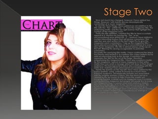
Stage Two    Here not much has changed, however I have added two things. However I will mainly discuss stereotypically convention of a music magazine.  To start the three things I have added are ad addition to the title with the “The” withitn the  “C” from the magazine title. The underlying motto, and the top right banner that hghlight the number of the magazine Issue.   Firstly the title addition. I wanted the title to have a certain appeal to it, therfore by having the “The” in an unconventional area withint the “C” i believe i have added a certain interesting feature that will please consumers. Thsi add tion was also written in the font Trajan Pro to give the magazine soemconsistancy.T rap up the magazine title I have placed everything there as it is conventional of a every day music magazine, the title is almost always at the op on the left. Making the desing recognisable to potential consumers. Secondly the unerlying title motto. I have continued the black text theme and twisted it, to continue the colour pallete but to add an interesting look to the design. It unerlines and seperates the title for the ret of the page, therefore empahsising the magazine title. I have also created a motto for the magazine, typical of many magazine in that witha  motto they can send a mesage which will draw in their target audience. The background is balck also contrasting with the white text, making it look prfoessional yet readable. Fianlly the banner on the top left, here I have added to the colour lpallete, using  yellow to kkeep to a much more feminine audience, sterotypically females are associated with the brighter primary colours. This has been put on a rotation in the far corner to hide it from the reader yet keeping it visible, a detail such as magazine issue is a minor selling point ina magazine but people still would like to know. The magazine issue is suaulyl small and relativley hidden. Therefore my design sticks to the normal conventions. TO further hide the magazine issue I have used a faint grey against the yellow, although alost contrasting colours it keeps the issue number hidden whilst simultaniouslymakign it clearly and easily readble.
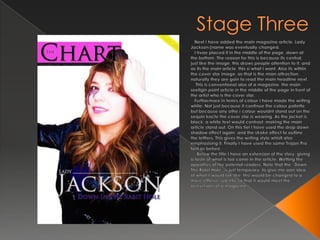
Stage Three    Next I have added the main magazine article. Lady Jackson (name was eventually changed.   I hvae placed it in the middle of the page, down at the bottom. The reason for this is because its central, just like the image, this draws people attention to it, and as its the main article, this si what I want. Also its within the cover star image, as that is the mian attraction, naturally they are goin to read the main headline next.     This is conventional also of a magazine, the main seellgin point article in the middle of the page in front of the artist who is the cover star.   Furthermore in temrs of colour I have made the writing white. Not just because it continue the colour pallette but because any othe r colour wouldnt stand out on the sequin kacte the cover star is wearing. As the jacket is black, a white text would contrast, making the main article stand out. On this tiel I have used the drop down shadow effect again, and the stroke effect to outline the lettters. This gives the writing style whislt also emphasising it. Finally I have used the same Trajan Pro font as before.     Below the title I have an extension of the story, giving a taste of what is too come in the article. Wetting the appatties of the potenial readers. Note that the “Down The Rabit Hole” is just temparary, to give me aan idea of what it would lok like, thsi would be changed to a more efffeive sub title so that it would meet the ocnvetions of a magazine.
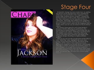
Stage Four    A dramatic change has been made here, by adding one picture as the background I have changed the entire look, feel and theme of the magazine. I have used a high resoltuon picture of space. I wanted the jacket of seuins to create a style. Theyalmostloklieksars, this is what gave me the inpiration to have a “Glam Pop” spaceage style added to the magazine. I am really proud of what i have achieved with this one picture. It add so much colour the the magazine that no matter where you are you are drawn to it by its intense colours.   The reason I have gone for such a bod design is because I felt like althouhg my prelimanery was technically at a good standard, it was terribly dull. As I was scared to use colours, believing it would become too childlike and cartoony. I now know that using colours only adds extra character and depth to the magazine design. Resulting in a highly profitabe product.    Now as you can see this overall lookand fell reflect a retro “Glam Pop” style, highlightin the cover stars unique musical direction and tyle. This theme bring together all the colours I have added previously. Making this magazine less female driven, and actually although it contains steroetypicaly feminine colours, ts cool enough to be bought byu a unisex audience. Thereofeer in creasing the proft. This them i have used throughout the Cover Page will reflectonto the double page spread also. Not soo much the contents page however.
Stage Five   Here I cannot write much, as I have onyl added one thing. The circle behind the magazine title.   This orgional was supposed to be a splash for an advertisment related to free posters within the magazine. However I placed I looked at it and as the spae age theme was intriuging me at this moment i decided to place it somewhere else.. Its shaeprmeinded me of a planet.     So ideided to place it behind the magazine title, as although i thought it looked good, i felt the area around the magazine title was  a bit plain and boring. So by adding a shape i believe i added some more depth. I used the otergloweffec ton the circle to give it a white border, so that his addition would stand out.   The problem I faced doing this was that the motto was now barely visible. To creectr this I added the “drop Shadow” effect onto the motto text aswell at the stroke effect. This highlighted and emphasised the text, Elimanating that issue.
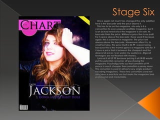
Stage Six    Once again not much has changed.The only addition here is the barcode and the price above it.   This has to be on the magazine, nto only is it a convention fo every popular profitble magazine, but it is an actrual need once the magazine is on sale. Its barcode finds the price. Without a price ther is no proft. For t epriceabova the barcode I have used it because again, this is common in magasine. The price isnt always above the barcode, hhoweveer often it is. In small font also. The price itself is £3.99, reason being because this is the nromalpprice a magazine sells for, if i have a price that is between the cheapest and the dearest of prices I can widen my audience. Afgerall teenagers are not flushed with money.   I priced it at £3.99 because pricing it at £4.00 would put the potential consumer off purchasing the magazine. Pyscholigytellesus that somethin at 99 pence is much cheaper than somethin a penny more. This convetion is used in almost every single product. Including magazines.  These two convetions used not only have a practicle use but make the magazine look professional and marketable.
Stage Seven    The main change here are the articles on the left side. Looking at them I really liek the design, however I may make the m smaller and add another artist advertisemtn for an article. Because i want to use the rule of three. Without having anythin distract form Rachael and her antire pose.   In terms of colour, I have chosen pink to continue the colour pallete for the headers. For the subtext below i have chosen white, and the font size is much smaller. The reason for this is because I want the headers to be much more bold than the subtext, larger font and bolder colorus draw attenion to the artist names. The artists are what the buyers are more itnerested in. Through questionnaire i found that the artist within the magazines are abig selling point. Therefore highlightin the names increases the ahcnes of the magazine being bought.   For the subtext i have made it smaller and lighter, this is conventional, below the artist names there is usually smaller text exlaining what the article is about in summary of one short sentence. Short and snappy is easier to read an much mroe interesting for teenagers, which happens to be my audience.    Finally i have added to date on the Cover above the barcode, this gives the consumer an idea of hwo recent the magazine is, the more recent the issue is the more chance of being baught it has. This date palcement is conventional of any form of magazine.
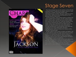
Stage Seven    The main change here are the articles on the left side. Looking at them I really like the design, however I may make the m smaller and add another artist advertisement for an article. Because i want to use the rule of three. Without having anything distract form Rachael and her entire pose.   In terms of colour, I have chosen pink to continue the colour palette for the headers. For the subtext below i have chosen white, and the font size is much smaller. The reason for this is because I want the headers to be much more bold than the subtext, larger font and bolder colours draw attention to the artist names. The artists are what the buyers are more interested in. Through questionnaire I found that the artist within the magazines are a big selling point. Therefore highlighting the names increases the chances of the magazine being bought.   For the subtext I have made it smaller and lighter, this is conventional, below the artist names there is usually smaller text explaining what the article is about in summary of one short sentence. Short and snappy is easier to read an much more interesting for teenagers, which happens to be my audience.    Finally I have added to date on the Cover above the barcode, this gives the consumer an idea of how recent the magazine is, the more recent the issue is the more chance of being bought it has. This date placement is conventional of any form of magazine.
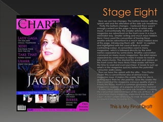
Stage Eight   Here we see two changes. The bottom banner with the splash add and the alteration of the side sub-headlines.     Firstly the bottom changes,  I believed there wasn't enough content on the page in terms of artists and music. Conventionally the smaller articles within the magazine are advertised on the front cover in a much minimalist way. Smaller writing and much more hidden. Here I have used the convention of having these smaller articles advertised in a much more hidden area of the page. Introducing them with “ALSO” in capitals and highlighted with the used of Bold or another contrasting colour. A convention used in many magazines, which is followed directly by the artist names separated by semicolons. Another convention conveyed on many music magazines, the artist names separated by semicolons to make it easier to read in bite sixed chunks. The shorted the words and names on the front cover the more likely it that reader will have the time to read and even purchase. It needs to sum up what's in the magazine quickly before the potential consumer walks away.   Then we have the splash with the offer. “Free Poster Inside! This is conventional also of almost every magazine issue. It makes the reader think he/she is getting more than he/she paid for. Give the reader the impression that the magazine conveys quality of price. Finally the Poster itself is a common giveaway within magazines, a poster of a popular artist at the moment.    Finally I have added an extra sub-headline, creating the convention and technique of the rule of three. A convention many magazine implement into the front cover, its fast, simple and easy to read. A convention used within many media forms. This is My Final Draft

More Related Content

What's hot

Question 1
Question 1Question 1
Question 1
kelsey ryan
 
Generationpresentation
GenerationpresentationGenerationpresentation
GenerationpresentationBeckie Wickham
 
Final content page and double spread article designs
Final content page and double spread article designsFinal content page and double spread article designs
Final content page and double spread article designs
IllyaBoyko1
 
Evaluation-Conventions
Evaluation-ConventionsEvaluation-Conventions
Evaluation-Conventionsemily_rhian18
 
Magazine cover analysis
Magazine cover analysisMagazine cover analysis
Magazine cover analysis
GurjitSembi
 
In what ways does your media product use
In what ways does your media product useIn what ways does your media product use
In what ways does your media product use
Ellie Freckleton
 
Magazine Planning
Magazine PlanningMagazine Planning
Magazine Planning2033x
 
Contents Page Analysis
Contents Page AnalysisContents Page Analysis
Contents Page Analysis
AmyShields00
 
Unit 30- LO2
Unit 30- LO2Unit 30- LO2
Unit 30- LO2
lewis269
 
Evaluation question 1
Evaluation question 1Evaluation question 1
Evaluation question 1smithy_tom
 
Progress on contents
Progress on contentsProgress on contents
Progress on contentsellenronan
 
Q1
Q1Q1
Drafts
DraftsDrafts
Drafts
RyanLock10
 
Media film magazine
Media film magazineMedia film magazine
Media film magazineMija_Valdez
 
My evaluation!
My evaluation!My evaluation!
My evaluation!
ElspethGray
 

What's hot (20)

Question 1
Question 1Question 1
Question 1
 
Generationpresentation
GenerationpresentationGenerationpresentation
Generationpresentation
 
Final content page and double spread article designs
Final content page and double spread article designsFinal content page and double spread article designs
Final content page and double spread article designs
 
Evaluation-Conventions
Evaluation-ConventionsEvaluation-Conventions
Evaluation-Conventions
 
Evaluation
EvaluationEvaluation
Evaluation
 
Evaluation
EvaluationEvaluation
Evaluation
 
Magazine cover analysis
Magazine cover analysisMagazine cover analysis
Magazine cover analysis
 
In what ways does your media product use
In what ways does your media product useIn what ways does your media product use
In what ways does your media product use
 
Magazine Planning
Magazine PlanningMagazine Planning
Magazine Planning
 
Contents Page Analysis
Contents Page AnalysisContents Page Analysis
Contents Page Analysis
 
Unit 30- LO2
Unit 30- LO2Unit 30- LO2
Unit 30- LO2
 
Evaluation question 1
Evaluation question 1Evaluation question 1
Evaluation question 1
 
Task 3
Task 3Task 3
Task 3
 
Progress on contents
Progress on contentsProgress on contents
Progress on contents
 
Q1
Q1Q1
Q1
 
Task 10 pp
Task 10 pp Task 10 pp
Task 10 pp
 
Textual analysis
Textual analysisTextual analysis
Textual analysis
 
Drafts
DraftsDrafts
Drafts
 
Media film magazine
Media film magazineMedia film magazine
Media film magazine
 
My evaluation!
My evaluation!My evaluation!
My evaluation!
 

Viewers also liked

Final Piece And Preliminary Task Comparison
Final Piece And Preliminary Task ComparisonFinal Piece And Preliminary Task Comparison
Final Piece And Preliminary Task ComparisonThomas Griffiths
 
Effectiveness of main and ancillary tasks
Effectiveness of main and ancillary tasksEffectiveness of main and ancillary tasks
Effectiveness of main and ancillary tasksThomas Griffiths
 
Marj Silva Portfolio
Marj Silva PortfolioMarj Silva Portfolio
Marj Silva Portfolio
marjsilva
 
Textkernel - Recruiting richtig machen.
Textkernel - Recruiting richtig machen.Textkernel - Recruiting richtig machen.
Textkernel - Recruiting richtig machen.
Marcus Fischer
 
Recruiting richtig machen.
Recruiting richtig machen.Recruiting richtig machen.
Recruiting richtig machen.
Marcus Fischer
 
Feed back questions results
Feed back questions resultsFeed back questions results
Feed back questions resultsThomas Griffiths
 

Viewers also liked (13)

Questionnaire results
Questionnaire resultsQuestionnaire results
Questionnaire results
 
snatch
snatchsnatch
snatch
 
Questionnaire results
Questionnaire resultsQuestionnaire results
Questionnaire results
 
Final Piece And Preliminary Task Comparison
Final Piece And Preliminary Task ComparisonFinal Piece And Preliminary Task Comparison
Final Piece And Preliminary Task Comparison
 
Cover analysis 3
Cover analysis 3Cover analysis 3
Cover analysis 3
 
Effectiveness of main and ancillary tasks
Effectiveness of main and ancillary tasksEffectiveness of main and ancillary tasks
Effectiveness of main and ancillary tasks
 
Marj Silva Portfolio
Marj Silva PortfolioMarj Silva Portfolio
Marj Silva Portfolio
 
6300 l13_flow_measurementinpipes
6300  l13_flow_measurementinpipes6300  l13_flow_measurementinpipes
6300 l13_flow_measurementinpipes
 
Textkernel - Recruiting richtig machen.
Textkernel - Recruiting richtig machen.Textkernel - Recruiting richtig machen.
Textkernel - Recruiting richtig machen.
 
Flat plan
Flat planFlat plan
Flat plan
 
Recruiting richtig machen.
Recruiting richtig machen.Recruiting richtig machen.
Recruiting richtig machen.
 
Feed back questions results
Feed back questions resultsFeed back questions results
Feed back questions results
 
Motivation1
Motivation1Motivation1
Motivation1
 

Similar to Development

How do you attract the audience
How do you attract the audienceHow do you attract the audience
How do you attract the audience
asmediae15
 
Front cover development
Front cover developmentFront cover development
Front cover developmentrobnmbec15
 
Evaluation question 1
Evaluation question 1Evaluation question 1
Evaluation question 1
asmediae15
 
Development page 1 draft one
Development page 1 draft oneDevelopment page 1 draft one
Development page 1 draft oneThomas Griffiths
 
Evaluation 1 – in what ways does your
Evaluation 1 – in what ways does yourEvaluation 1 – in what ways does your
Evaluation 1 – in what ways does your07foste
 
Development final draft
Development final draftDevelopment final draft
Development final draftguestaac3c87b
 
Conventions of my media product
Conventions of my media productConventions of my media product
Conventions of my media product
BethCoxon
 
Tolu Awojobi AS Media Coursework - Front Cover Development
Tolu Awojobi AS Media Coursework - Front Cover DevelopmentTolu Awojobi AS Media Coursework - Front Cover Development
Tolu Awojobi AS Media Coursework - Front Cover DevelopmentToluAwojobi
 
Evaluation Question 5
Evaluation Question 5Evaluation Question 5
Evaluation Question 5040807
 
As media evaluation
As media evaluation As media evaluation
As media evaluation
BenTibbits
 
Cover progression
Cover progressionCover progression
Cover progressionryanrococo
 
Contents progress
Contents progressContents progress
Contents progressryanrococo
 

Similar to Development (20)

Development
DevelopmentDevelopment
Development
 
How do you attract the audience
How do you attract the audienceHow do you attract the audience
How do you attract the audience
 
Front cover development
Front cover developmentFront cover development
Front cover development
 
Evaluation question 1
Evaluation question 1Evaluation question 1
Evaluation question 1
 
Development page 1 draft one
Development page 1 draft oneDevelopment page 1 draft one
Development page 1 draft one
 
Evaluation
EvaluationEvaluation
Evaluation
 
Evaluation 1 – in what ways does your
Evaluation 1 – in what ways does yourEvaluation 1 – in what ways does your
Evaluation 1 – in what ways does your
 
Development final draft
Development final draftDevelopment final draft
Development final draft
 
Evaluation (4)
Evaluation (4)Evaluation (4)
Evaluation (4)
 
Presentation
PresentationPresentation
Presentation
 
Presentation
PresentationPresentation
Presentation
 
Evaluation
EvaluationEvaluation
Evaluation
 
Conventions of my media product
Conventions of my media productConventions of my media product
Conventions of my media product
 
Tolu Awojobi AS Media Coursework - Front Cover Development
Tolu Awojobi AS Media Coursework - Front Cover DevelopmentTolu Awojobi AS Media Coursework - Front Cover Development
Tolu Awojobi AS Media Coursework - Front Cover Development
 
Evaluation Question 5
Evaluation Question 5Evaluation Question 5
Evaluation Question 5
 
As media evaluation
As media evaluation As media evaluation
As media evaluation
 
Cover progression
Cover progressionCover progression
Cover progression
 
Evaluation
EvaluationEvaluation
Evaluation
 
Contents progress
Contents progressContents progress
Contents progress
 
Presentation
PresentationPresentation
Presentation
 

More from Thomas Griffiths

Like tears in the rain’ postmodern media
Like tears in the rain’ postmodern mediaLike tears in the rain’ postmodern media
Like tears in the rain’ postmodern mediaThomas Griffiths
 
G325 introduction to critical perspectives.
G325 introduction to critical perspectives.G325 introduction to critical perspectives.
G325 introduction to critical perspectives.Thomas Griffiths
 
Media representation theory
Media representation theoryMedia representation theory
Media representation theoryThomas Griffiths
 
3 Music Video Analyses by Thomas Griffiths - 0601 FINAL
3 Music Video Analyses by Thomas Griffiths - 0601 FINAL3 Music Video Analyses by Thomas Griffiths - 0601 FINAL
3 Music Video Analyses by Thomas Griffiths - 0601 FINALThomas Griffiths
 
3 Music Video Analyses by Thomas Griffiths - 0601
3 Music Video Analyses by Thomas Griffiths - 06013 Music Video Analyses by Thomas Griffiths - 0601
3 Music Video Analyses by Thomas Griffiths - 0601Thomas Griffiths
 
My magazine and evaluation
My magazine and evaluationMy magazine and evaluation
My magazine and evaluationThomas Griffiths
 
For my photo shoot i arranged my cover star model
For my photo shoot i arranged my cover star modelFor my photo shoot i arranged my cover star model
For my photo shoot i arranged my cover star modelThomas Griffiths
 
Textual Analysis Part one
Textual Analysis Part one  Textual Analysis Part one
Textual Analysis Part one Thomas Griffiths
 
Questionnaire Feedback Page
Questionnaire Feedback PageQuestionnaire Feedback Page
Questionnaire Feedback PageThomas Griffiths
 

More from Thomas Griffiths (20)

Set planning FINAL
Set planning FINALSet planning FINAL
Set planning FINAL
 
Set planning
Set planningSet planning
Set planning
 
Like tears in the rain’ postmodern media
Like tears in the rain’ postmodern mediaLike tears in the rain’ postmodern media
Like tears in the rain’ postmodern media
 
G325 introduction to critical perspectives.
G325 introduction to critical perspectives.G325 introduction to critical perspectives.
G325 introduction to critical perspectives.
 
Media representation theory
Media representation theoryMedia representation theory
Media representation theory
 
3 Music Video Analyses by Thomas Griffiths - 0601 FINAL
3 Music Video Analyses by Thomas Griffiths - 0601 FINAL3 Music Video Analyses by Thomas Griffiths - 0601 FINAL
3 Music Video Analyses by Thomas Griffiths - 0601 FINAL
 
3 Music Video Analyses by Thomas Griffiths - 0601
3 Music Video Analyses by Thomas Griffiths - 06013 Music Video Analyses by Thomas Griffiths - 0601
3 Music Video Analyses by Thomas Griffiths - 0601
 
My magazine and evaluation
My magazine and evaluationMy magazine and evaluation
My magazine and evaluation
 
Evaluation
EvaluationEvaluation
Evaluation
 
For my photo shoot i arranged my cover star model
For my photo shoot i arranged my cover star modelFor my photo shoot i arranged my cover star model
For my photo shoot i arranged my cover star model
 
Textual Analysis Part one
Textual Analysis Part one  Textual Analysis Part one
Textual Analysis Part one
 
Questionnaire Feedback Page
Questionnaire Feedback PageQuestionnaire Feedback Page
Questionnaire Feedback Page
 
Questionnaire as
Questionnaire asQuestionnaire as
Questionnaire as
 
Img 0006
Img 0006Img 0006
Img 0006
 
Img 0007
Img 0007Img 0007
Img 0007
 
Flat Plan Continued
Flat Plan Continued Flat Plan Continued
Flat Plan Continued
 
Img
ImgImg
Img
 
Img 0006
Img 0006Img 0006
Img 0006
 
Img 0005
Img 0005Img 0005
Img 0005
 
Img 0007
Img 0007Img 0007
Img 0007
 

Recently uploaded

special B.ed 2nd year old paper_20240531.pdf
special B.ed 2nd year old paper_20240531.pdfspecial B.ed 2nd year old paper_20240531.pdf
special B.ed 2nd year old paper_20240531.pdf
Special education needs
 
Acetabularia Information For Class 9 .docx
Acetabularia Information For Class 9  .docxAcetabularia Information For Class 9  .docx
Acetabularia Information For Class 9 .docx
vaibhavrinwa19
 
The Challenger.pdf DNHS Official Publication
The Challenger.pdf DNHS Official PublicationThe Challenger.pdf DNHS Official Publication
The Challenger.pdf DNHS Official Publication
Delapenabediema
 
June 3, 2024 Anti-Semitism Letter Sent to MIT President Kornbluth and MIT Cor...
June 3, 2024 Anti-Semitism Letter Sent to MIT President Kornbluth and MIT Cor...June 3, 2024 Anti-Semitism Letter Sent to MIT President Kornbluth and MIT Cor...
June 3, 2024 Anti-Semitism Letter Sent to MIT President Kornbluth and MIT Cor...
Levi Shapiro
 
The Diamond Necklace by Guy De Maupassant.pptx
The Diamond Necklace by Guy De Maupassant.pptxThe Diamond Necklace by Guy De Maupassant.pptx
The Diamond Necklace by Guy De Maupassant.pptx
DhatriParmar
 
Lapbook sobre os Regimes Totalitários.pdf
Lapbook sobre os Regimes Totalitários.pdfLapbook sobre os Regimes Totalitários.pdf
Lapbook sobre os Regimes Totalitários.pdf
Jean Carlos Nunes Paixão
 
"Protectable subject matters, Protection in biotechnology, Protection of othe...
"Protectable subject matters, Protection in biotechnology, Protection of othe..."Protectable subject matters, Protection in biotechnology, Protection of othe...
"Protectable subject matters, Protection in biotechnology, Protection of othe...
SACHIN R KONDAGURI
 
Supporting (UKRI) OA monographs at Salford.pptx
Supporting (UKRI) OA monographs at Salford.pptxSupporting (UKRI) OA monographs at Salford.pptx
Supporting (UKRI) OA monographs at Salford.pptx
Jisc
 
A Strategic Approach: GenAI in Education
A Strategic Approach: GenAI in EducationA Strategic Approach: GenAI in Education
A Strategic Approach: GenAI in Education
Peter Windle
 
1.4 modern child centered education - mahatma gandhi-2.pptx
1.4 modern child centered education - mahatma gandhi-2.pptx1.4 modern child centered education - mahatma gandhi-2.pptx
1.4 modern child centered education - mahatma gandhi-2.pptx
JosvitaDsouza2
 
The basics of sentences session 5pptx.pptx
The basics of sentences session 5pptx.pptxThe basics of sentences session 5pptx.pptx
The basics of sentences session 5pptx.pptx
heathfieldcps1
 
S1-Introduction-Biopesticides in ICM.pptx
S1-Introduction-Biopesticides in ICM.pptxS1-Introduction-Biopesticides in ICM.pptx
S1-Introduction-Biopesticides in ICM.pptx
tarandeep35
 
Multithreading_in_C++ - std::thread, race condition
Multithreading_in_C++ - std::thread, race conditionMultithreading_in_C++ - std::thread, race condition
Multithreading_in_C++ - std::thread, race condition
Mohammed Sikander
 
Synthetic Fiber Construction in lab .pptx
Synthetic Fiber Construction in lab .pptxSynthetic Fiber Construction in lab .pptx
Synthetic Fiber Construction in lab .pptx
Pavel ( NSTU)
 
Chapter 4 - Islamic Financial Institutions in Malaysia.pptx
Chapter 4 - Islamic Financial Institutions in Malaysia.pptxChapter 4 - Islamic Financial Institutions in Malaysia.pptx
Chapter 4 - Islamic Financial Institutions in Malaysia.pptx
Mohd Adib Abd Muin, Senior Lecturer at Universiti Utara Malaysia
 
Model Attribute Check Company Auto Property
Model Attribute  Check Company Auto PropertyModel Attribute  Check Company Auto Property
Model Attribute Check Company Auto Property
Celine George
 
How libraries can support authors with open access requirements for UKRI fund...
How libraries can support authors with open access requirements for UKRI fund...How libraries can support authors with open access requirements for UKRI fund...
How libraries can support authors with open access requirements for UKRI fund...
Jisc
 
STRAND 3 HYGIENIC PRACTICES.pptx GRADE 7 CBC
STRAND 3 HYGIENIC PRACTICES.pptx GRADE 7 CBCSTRAND 3 HYGIENIC PRACTICES.pptx GRADE 7 CBC
STRAND 3 HYGIENIC PRACTICES.pptx GRADE 7 CBC
kimdan468
 
Overview on Edible Vaccine: Pros & Cons with Mechanism
Overview on Edible Vaccine: Pros & Cons with MechanismOverview on Edible Vaccine: Pros & Cons with Mechanism
Overview on Edible Vaccine: Pros & Cons with Mechanism
DeeptiGupta154
 
Best Digital Marketing Institute In NOIDA
Best Digital Marketing Institute In NOIDABest Digital Marketing Institute In NOIDA
Best Digital Marketing Institute In NOIDA
deeptiverma2406
 

Recently uploaded (20)

special B.ed 2nd year old paper_20240531.pdf
special B.ed 2nd year old paper_20240531.pdfspecial B.ed 2nd year old paper_20240531.pdf
special B.ed 2nd year old paper_20240531.pdf
 
Acetabularia Information For Class 9 .docx
Acetabularia Information For Class 9  .docxAcetabularia Information For Class 9  .docx
Acetabularia Information For Class 9 .docx
 
The Challenger.pdf DNHS Official Publication
The Challenger.pdf DNHS Official PublicationThe Challenger.pdf DNHS Official Publication
The Challenger.pdf DNHS Official Publication
 
June 3, 2024 Anti-Semitism Letter Sent to MIT President Kornbluth and MIT Cor...
June 3, 2024 Anti-Semitism Letter Sent to MIT President Kornbluth and MIT Cor...June 3, 2024 Anti-Semitism Letter Sent to MIT President Kornbluth and MIT Cor...
June 3, 2024 Anti-Semitism Letter Sent to MIT President Kornbluth and MIT Cor...
 
The Diamond Necklace by Guy De Maupassant.pptx
The Diamond Necklace by Guy De Maupassant.pptxThe Diamond Necklace by Guy De Maupassant.pptx
The Diamond Necklace by Guy De Maupassant.pptx
 
Lapbook sobre os Regimes Totalitários.pdf
Lapbook sobre os Regimes Totalitários.pdfLapbook sobre os Regimes Totalitários.pdf
Lapbook sobre os Regimes Totalitários.pdf
 
"Protectable subject matters, Protection in biotechnology, Protection of othe...
"Protectable subject matters, Protection in biotechnology, Protection of othe..."Protectable subject matters, Protection in biotechnology, Protection of othe...
"Protectable subject matters, Protection in biotechnology, Protection of othe...
 
Supporting (UKRI) OA monographs at Salford.pptx
Supporting (UKRI) OA monographs at Salford.pptxSupporting (UKRI) OA monographs at Salford.pptx
Supporting (UKRI) OA monographs at Salford.pptx
 
A Strategic Approach: GenAI in Education
A Strategic Approach: GenAI in EducationA Strategic Approach: GenAI in Education
A Strategic Approach: GenAI in Education
 
1.4 modern child centered education - mahatma gandhi-2.pptx
1.4 modern child centered education - mahatma gandhi-2.pptx1.4 modern child centered education - mahatma gandhi-2.pptx
1.4 modern child centered education - mahatma gandhi-2.pptx
 
The basics of sentences session 5pptx.pptx
The basics of sentences session 5pptx.pptxThe basics of sentences session 5pptx.pptx
The basics of sentences session 5pptx.pptx
 
S1-Introduction-Biopesticides in ICM.pptx
S1-Introduction-Biopesticides in ICM.pptxS1-Introduction-Biopesticides in ICM.pptx
S1-Introduction-Biopesticides in ICM.pptx
 
Multithreading_in_C++ - std::thread, race condition
Multithreading_in_C++ - std::thread, race conditionMultithreading_in_C++ - std::thread, race condition
Multithreading_in_C++ - std::thread, race condition
 
Synthetic Fiber Construction in lab .pptx
Synthetic Fiber Construction in lab .pptxSynthetic Fiber Construction in lab .pptx
Synthetic Fiber Construction in lab .pptx
 
Chapter 4 - Islamic Financial Institutions in Malaysia.pptx
Chapter 4 - Islamic Financial Institutions in Malaysia.pptxChapter 4 - Islamic Financial Institutions in Malaysia.pptx
Chapter 4 - Islamic Financial Institutions in Malaysia.pptx
 
Model Attribute Check Company Auto Property
Model Attribute  Check Company Auto PropertyModel Attribute  Check Company Auto Property
Model Attribute Check Company Auto Property
 
How libraries can support authors with open access requirements for UKRI fund...
How libraries can support authors with open access requirements for UKRI fund...How libraries can support authors with open access requirements for UKRI fund...
How libraries can support authors with open access requirements for UKRI fund...
 
STRAND 3 HYGIENIC PRACTICES.pptx GRADE 7 CBC
STRAND 3 HYGIENIC PRACTICES.pptx GRADE 7 CBCSTRAND 3 HYGIENIC PRACTICES.pptx GRADE 7 CBC
STRAND 3 HYGIENIC PRACTICES.pptx GRADE 7 CBC
 
Overview on Edible Vaccine: Pros & Cons with Mechanism
Overview on Edible Vaccine: Pros & Cons with MechanismOverview on Edible Vaccine: Pros & Cons with Mechanism
Overview on Edible Vaccine: Pros & Cons with Mechanism
 
Best Digital Marketing Institute In NOIDA
Best Digital Marketing Institute In NOIDABest Digital Marketing Institute In NOIDA
Best Digital Marketing Institute In NOIDA
 

Development

  • 1. Front Cover Development By Christian Whelan
  • 2. Stage One This was at the very beginning of the Front Page development as you can see, one of the photos taken from the photo shoot with model Rachael Jackson has been used as the cover star as planned. I believe having the original image with the actual background may of looked amateurish, so I have cut her body and face out of the photo and copied it onto this blank background. This draws more attention to the Cove Star, a convention needed when selling a magazine, I found the cover star is usually the main attraction of a magazine cover and therefore sells the most. I have also photo shopped Rachael to make her more “Hollywood” like, removing and imperfections in the original image. Whilst also adding colour to make the image much more appealing. Secondly I have started with the magazine title. I have decided to use Trajan Pro. The reason being I believe many of the other fonts have no character to them, and look very unprofessional. This font is bold, sharp and demands to be seen. The title is the third thing I want people to see, and I can do this by making the title bold. A feature I have used. Also I have used the “Drop Shadow” effect on the title, to give it more depth and ultimately to emphasise the name, making it seem like it sticks out of the page. Thirdly have background to the title, which is pink, relating to my target audience which are mainly females. I believe however this pink behind the black bold title emphasises the title much more, as the colours contrast. Last but not least I have used the “Noise” effect on the background colour. Reason being because a solid colour looks very cartoon like to me, and I want an extra subtle depth to my design. I want my magazine to create an “eye candy” to the potential consumers, therefore resulting in a larger profit, accomplishing my main objective.
  • 3. Stage Two Here not much has changed, however I have added two things. However I will mainly discuss stereotypically convention of a music magazine. To start the three things I have added are ad addition to the title with the “The” withitn the “C” from the magazine title. The underlying motto, and the top right banner that hghlight the number of the magazine Issue. Firstly the title addition. I wanted the title to have a certain appeal to it, therfore by having the “The” in an unconventional area withint the “C” i believe i have added a certain interesting feature that will please consumers. Thsi add tion was also written in the font Trajan Pro to give the magazine soemconsistancy.T rap up the magazine title I have placed everything there as it is conventional of a every day music magazine, the title is almost always at the op on the left. Making the desing recognisable to potential consumers. Secondly the unerlying title motto. I have continued the black text theme and twisted it, to continue the colour pallete but to add an interesting look to the design. It unerlines and seperates the title for the ret of the page, therefore empahsising the magazine title. I have also created a motto for the magazine, typical of many magazine in that witha motto they can send a mesage which will draw in their target audience. The background is balck also contrasting with the white text, making it look prfoessional yet readable. Fianlly the banner on the top left, here I have added to the colour lpallete, using yellow to kkeep to a much more feminine audience, sterotypically females are associated with the brighter primary colours. This has been put on a rotation in the far corner to hide it from the reader yet keeping it visible, a detail such as magazine issue is a minor selling point ina magazine but people still would like to know. The magazine issue is suaulyl small and relativley hidden. Therefore my design sticks to the normal conventions. TO further hide the magazine issue I have used a faint grey against the yellow, although alost contrasting colours it keeps the issue number hidden whilst simultaniouslymakign it clearly and easily readble.
  • 4. Stage Three Next I have added the main magazine article. Lady Jackson (name was eventually changed. I hvae placed it in the middle of the page, down at the bottom. The reason for this is because its central, just like the image, this draws people attention to it, and as its the main article, this si what I want. Also its within the cover star image, as that is the mian attraction, naturally they are goin to read the main headline next. This is conventional also of a magazine, the main seellgin point article in the middle of the page in front of the artist who is the cover star. Furthermore in temrs of colour I have made the writing white. Not just because it continue the colour pallette but because any othe r colour wouldnt stand out on the sequin kacte the cover star is wearing. As the jacket is black, a white text would contrast, making the main article stand out. On this tiel I have used the drop down shadow effect again, and the stroke effect to outline the lettters. This gives the writing style whislt also emphasising it. Finally I have used the same Trajan Pro font as before. Below the title I have an extension of the story, giving a taste of what is too come in the article. Wetting the appatties of the potenial readers. Note that the “Down The Rabit Hole” is just temparary, to give me aan idea of what it would lok like, thsi would be changed to a more efffeive sub title so that it would meet the ocnvetions of a magazine.
  • 5. Stage Four A dramatic change has been made here, by adding one picture as the background I have changed the entire look, feel and theme of the magazine. I have used a high resoltuon picture of space. I wanted the jacket of seuins to create a style. Theyalmostloklieksars, this is what gave me the inpiration to have a “Glam Pop” spaceage style added to the magazine. I am really proud of what i have achieved with this one picture. It add so much colour the the magazine that no matter where you are you are drawn to it by its intense colours. The reason I have gone for such a bod design is because I felt like althouhg my prelimanery was technically at a good standard, it was terribly dull. As I was scared to use colours, believing it would become too childlike and cartoony. I now know that using colours only adds extra character and depth to the magazine design. Resulting in a highly profitabe product. Now as you can see this overall lookand fell reflect a retro “Glam Pop” style, highlightin the cover stars unique musical direction and tyle. This theme bring together all the colours I have added previously. Making this magazine less female driven, and actually although it contains steroetypicaly feminine colours, ts cool enough to be bought byu a unisex audience. Thereofeer in creasing the proft. This them i have used throughout the Cover Page will reflectonto the double page spread also. Not soo much the contents page however.
  • 6. Stage Five Here I cannot write much, as I have onyl added one thing. The circle behind the magazine title. This orgional was supposed to be a splash for an advertisment related to free posters within the magazine. However I placed I looked at it and as the spae age theme was intriuging me at this moment i decided to place it somewhere else.. Its shaeprmeinded me of a planet. So ideided to place it behind the magazine title, as although i thought it looked good, i felt the area around the magazine title was a bit plain and boring. So by adding a shape i believe i added some more depth. I used the otergloweffec ton the circle to give it a white border, so that his addition would stand out. The problem I faced doing this was that the motto was now barely visible. To creectr this I added the “drop Shadow” effect onto the motto text aswell at the stroke effect. This highlighted and emphasised the text, Elimanating that issue.
  • 7. Stage Six Once again not much has changed.The only addition here is the barcode and the price above it. This has to be on the magazine, nto only is it a convention fo every popular profitble magazine, but it is an actrual need once the magazine is on sale. Its barcode finds the price. Without a price ther is no proft. For t epriceabova the barcode I have used it because again, this is common in magasine. The price isnt always above the barcode, hhoweveer often it is. In small font also. The price itself is £3.99, reason being because this is the nromalpprice a magazine sells for, if i have a price that is between the cheapest and the dearest of prices I can widen my audience. Afgerall teenagers are not flushed with money. I priced it at £3.99 because pricing it at £4.00 would put the potential consumer off purchasing the magazine. Pyscholigytellesus that somethin at 99 pence is much cheaper than somethin a penny more. This convetion is used in almost every single product. Including magazines. These two convetions used not only have a practicle use but make the magazine look professional and marketable.
  • 8. Stage Seven The main change here are the articles on the left side. Looking at them I really liek the design, however I may make the m smaller and add another artist advertisemtn for an article. Because i want to use the rule of three. Without having anythin distract form Rachael and her antire pose. In terms of colour, I have chosen pink to continue the colour pallete for the headers. For the subtext below i have chosen white, and the font size is much smaller. The reason for this is because I want the headers to be much more bold than the subtext, larger font and bolder colorus draw attenion to the artist names. The artists are what the buyers are more itnerested in. Through questionnaire i found that the artist within the magazines are abig selling point. Therefore highlightin the names increases the ahcnes of the magazine being bought. For the subtext i have made it smaller and lighter, this is conventional, below the artist names there is usually smaller text exlaining what the article is about in summary of one short sentence. Short and snappy is easier to read an much mroe interesting for teenagers, which happens to be my audience. Finally i have added to date on the Cover above the barcode, this gives the consumer an idea of hwo recent the magazine is, the more recent the issue is the more chance of being baught it has. This date palcement is conventional of any form of magazine.
  • 9. Stage Seven The main change here are the articles on the left side. Looking at them I really like the design, however I may make the m smaller and add another artist advertisement for an article. Because i want to use the rule of three. Without having anything distract form Rachael and her entire pose. In terms of colour, I have chosen pink to continue the colour palette for the headers. For the subtext below i have chosen white, and the font size is much smaller. The reason for this is because I want the headers to be much more bold than the subtext, larger font and bolder colours draw attention to the artist names. The artists are what the buyers are more interested in. Through questionnaire I found that the artist within the magazines are a big selling point. Therefore highlighting the names increases the chances of the magazine being bought. For the subtext I have made it smaller and lighter, this is conventional, below the artist names there is usually smaller text explaining what the article is about in summary of one short sentence. Short and snappy is easier to read an much more interesting for teenagers, which happens to be my audience. Finally I have added to date on the Cover above the barcode, this gives the consumer an idea of how recent the magazine is, the more recent the issue is the more chance of being bought it has. This date placement is conventional of any form of magazine.
  • 10. Stage Eight Here we see two changes. The bottom banner with the splash add and the alteration of the side sub-headlines. Firstly the bottom changes, I believed there wasn't enough content on the page in terms of artists and music. Conventionally the smaller articles within the magazine are advertised on the front cover in a much minimalist way. Smaller writing and much more hidden. Here I have used the convention of having these smaller articles advertised in a much more hidden area of the page. Introducing them with “ALSO” in capitals and highlighted with the used of Bold or another contrasting colour. A convention used in many magazines, which is followed directly by the artist names separated by semicolons. Another convention conveyed on many music magazines, the artist names separated by semicolons to make it easier to read in bite sixed chunks. The shorted the words and names on the front cover the more likely it that reader will have the time to read and even purchase. It needs to sum up what's in the magazine quickly before the potential consumer walks away. Then we have the splash with the offer. “Free Poster Inside! This is conventional also of almost every magazine issue. It makes the reader think he/she is getting more than he/she paid for. Give the reader the impression that the magazine conveys quality of price. Finally the Poster itself is a common giveaway within magazines, a poster of a popular artist at the moment. Finally I have added an extra sub-headline, creating the convention and technique of the rule of three. A convention many magazine implement into the front cover, its fast, simple and easy to read. A convention used within many media forms. This is My Final Draft