1. Typical conventionsof filmreviewinclude aheader andfeature title.These textsare displayedincontrastingwhitetonestoshowthe difference between them rather than a
link.As superman is a recognised product worldwide the main image takes up the majority of the review, furthermore the audience who are reading this a more likely to
prefera visual reference tothe filmratherthana large sum of textthusthe reasoningwhytheyenjoyfilmsastheyare avisual audience.The readeris most likely to view the
image firstthanread whatthe feature title Isdue to large amountof recognitionthatfollowsthisparticularfilm.The textisdisplayedwithincolumns as this format perceives
a formal lookto the review,howevermost filmreviewscontainanunformal styleof language especiallytotargetayoungeraudience.The textitself is a typical san serif font,
withthe mainarticle appearinginthe same texttype as the feature title howeveritisshowninboldto helpthe audience recognisethe filmif theyare unaware of the success
of the first film. The use of ‘2’ helps the audience to identify that in fact this is a sequel to an original production.
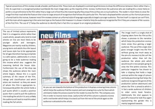
The image itself is a single shot of
clipping taken form the film as this
shows a preview to the narrative
which helps the production receive
more views thus gaining a larger
audience.The use of the single shot
gives enough insight into the film
without giving too much away as
the aim of a reviewisto the sell the
production rather than tell the
audience the whole plot which
wouldresultin less people going to
view the film within cinemas. This
particular magazine has chosen to
take a clipping that holds a large
contrast withinthe range of colours
and bodypositioning that helps the
audience recognisethe genre of this
production (action adventure) and
whom the film is aimed to which is
in fact a wide audience of children
to older comic book fanatics.
Additionally the shot appears to
give off a masculine look thus again
representing the gender this is
mainly targeted towards.
The use of limited colours represents
that it is a magazine article rather than
a web article, people who tend to read
articles on line are most likely to be
younger adults and teenagers.
Magazinesare mainly read by children,
young teens and adults thus the layout
and house style has to be appropriate
for all agestherefore havingasimplistic
isa saferoption, additionally it is more
going to be a male audience reading
this review which also suggests the
reasoning behind the house style.
Furthermore the use of the drop cap
shows the audience where the main
article begins. Above this is a quick
summary of the nature of the film,
ratings and classification and which
actors are involved so they are aware
of whom this film is appropriate to.
Consequentlywithin the article holds a
pull quote which is usually a positive
quote that is used to pull the audience
intoreadingthe article itIs veryunlikely
the audience will waittoreadthiswhen
reading the full article.
As youcan see towardsthe bottomof the productionitdisplaysaviewingtimescolumn
whichhelpsthe audience findthe nearestandnextviewingtime suite forthemwhich
ultimatelymakesthe processeasierforthe readertoviewthe film.The companyuses
thisinorder to receive more views.Lastlytothe leftof thiscolumnisplaceda review
witha red borderwhichhelpsittostand outfrom the restof the article againso the
audience isattractedtothe article.