2. INTRODUCTION
The slides you are about to see are an evaluation of my
overall A2 media work and they include all the work I have
done in Media so far this year
This evaluation will involve my final teaser trailer, my
magazine front cover, my film poster and the animation I
created at the start of the year to prepare me for this unit of
work
In addition, I will answer a set of four questions and will refer
to the products I have made when answering the questions.
Finally, this year, I feel I have really grown as a media student
and I feel I have really strengthened my knowledge of the
subject and widened my capabilites. I now have a whole new
grasp of knowledge of the film industry that I didn‘t have
before and I also have discovered new skills and developed
on those skills I already had.
4. In what ways does your media product use, develop or
challenge forms and conventions of real media products?
5. Films can be promoted by using many different
platforms
In the following slides, I will evaluate my trailer, my
film poster and my magazine front cover and I will
decide whether they use, develop, or challenge the
codes and conventions of real media products.
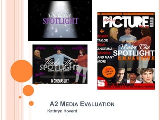
6. Firstly, I created my teaser trailer for the upcoming film Under The Spotlight
after spending some extensive periods of time researching the codes and
conventions of successful, professional teaser trailers, in particular trailers
from the romantic comedy genre as this is the type of trailer I wanted to
create.
Before constructing the product, I spent time researching into current trailers to
see what codes and conventions they followed. I particularly focused on the
edits they used, the camera shots and angles, the mise-en-scene and the
atmosphere that was often created in these trailers. I knew I would find this
useful as it would enable me to product a more professional, successful and
realistic trailer rather than one that was obviously not professionally made. I
found this research really useful as it gave me inspiration for ideas towards
my film and it also allowed me know which codes and conventions I should
follow for that certain genre of film that I wanted to create. Also, through this
research, it would allow my target audience to understand my trailer and
recognise its narrative structure and storyline if I adhered to the common
codes and conventions found in trailers. This research can be seen on my
blog which you can access and look through here
I also looked specifically into my chosen genre, romantic comedy, so that I
could establish whether each genre had specific codes and conventions and
if so, what I needed to do to follow these codes and conventions to produce
a professional romantic comedy trailer and also so that my target audience
would understand and recognise the fact that it is a romantic comedy teaser
trailer.
7. CONVENTIONS OF A TRAILER
Below, I will highlight the features and conventions of a trailer
by highlighting them on successful examples.
The aim of a trailer is to entice the audience into going to see
a film and they generally include a 3 part structure of a
beginning, middle and an end.
I have chosen mean girls and friends with benefits as they
both have a similar target audience and appeal to the same
type of people that I might want to appeal to when I create my
trailer. I have analysed these trailers in more depth on my
blog. The following slides highlight the codes and conventions
that these two films followed and I will then go on to explain
the ways my own trailer uses and develops forms and
conventions of real media products by comparing them with
these two trailers and I will also talk about how these two
trailers influenced my own trailer and how they allowed me to
develop my ideas by giving me inspiration.
8. The green screen is a graphic that is shown at the beginning of the majority of
trailers. It is used at the start of both mean girls and friends with benefits. It states
that the film has been approved for all audiences and all ages and allows the
audience to establish that what they are watching is real and it hasnt been
copyrighted or illegally copied. This green screen enables people to know that it is
the real film and not a fake.
By using this green screen at the start of my own trailer, it will allow the audience
to realise that a trailer is about to come on and so hopefully the anticipation will
build up and a sense of verisimiltude will be created because the audience will
forget about the stresses of life and everyday living and be lured in to watch my
trailer.
9. Company logo‘s and idents are another common feature of
trailers. In the majority of trailers, they appear at the beginning
of the trailer, before the action starts to pull audiences in.
However, through my research, I have found that some trailers
have subverted the conventions and put them at the end, in the
middle and some have even put some bits of the film before
and then added the company logo after that. If the companies
and institutions that have invested money into the film are
recogniseable, successful and well known then they are more
likely to lure in larger audiences as they would be recognised as
a professional and excellent film distributor that has produced
many successful films in the past and fans of these companies
would be pursuaded to go and watch the next film that that
certain company is bringing out. This is particularly true for
Paramount as this is the top production company out there
today.
10. Captions and text drive the narrative across without spoiling the plot. They are often
short, sharp pieces of text that give some information to let the audience know about the
narrative structure, but not too much that the audience will know what happens, so that
they can be pursuaded to go and watch the film in the cinemas. As they don‘t offer too
much information about the film, they often leave the audience wanting to know more and
anticipating the restof the film, leaving them wanting more. Therefore, they would be lured
in to go and watch the film.
In most of the romantic comedies I have watched, the text often appears on a black screen
and the font is often very effective as it stand out on the screen. The text has to be clear so
that the audience can read it and understand what the text is trying to show. Also, in
romantic comedies, there are often a lot of bright, querky colours and font types used as it
would stand out on the black background and lure audiences in.
I have also noticed that with the text and the captions, there is normally more than one
colour used. For example, in the image used above, there are two colours used: orange
and white. This again stands out more than using just one colour on the black background
and would lure audiences in to watch the trailer and subsequently to go and watch the film
in the cinema.
11. All good film trailers use varying camera shots and angles to create tension and suspense and to
build up the pace and the trailer goes on. They also keep the audience interested and enticed as
using the same camera shots and angles might bore the audience so it is always benefical to vary
the shots and angles you use.
I have found that romantic comedies use lots of high angle and low angle shots to make a
character feel vulnerable if they are appearing inferior or to make a character look better than
anyone else if they appear superior.
Romantic comedies also use lots of two person shots to show an engaging conversation and to
help with characterisation and to show to relationship two people have in the film
Close ups are also used to show characters reactions and to build up a relationship between this
character and the audience. They are also used to show emotions and how a character might be
feeling at that one moment. They can create sympathy with the audience as they might know how
that character is feeling through the facial expresion and their reaction.
12. Quick, fast edits
The edits are quite difficult to show through still images because they are so
fast they‘re hard to capture. The use of these fast edits build up the pace of
the trailer and so as the trailer goes along, the edits and the cuts increase in
speed as the pace of the trailer increases too. These edits are used to keep
the audience interested and curious as to what is going to happen. They are
so short and sharp, not just because they want the audience to stay
interested but also because they don‘t want to give too much about the film
away and ruin the end of the film. This lures the audience in as they will
probably want to know what is going to happen in the latter end of the film
and so will be pursuaded to go and watch the film in the cinema, which is
what the producers of the film want to happen.
Because the fast edits are so hard to document, here are links to the two
trailers I have been analysing.
http://www.youtube.com/watch?v=iJS-wWqVAyk
http://www.youtube.com/watch?v=6YjSIvmNjT8
13. TITLES
The title of the film is an obvious convention of a trailer. There would be no point in
creating a trailer and advertising it on many different media platforms if the name wasn‘t
included because then audiences wouldn‘t know what the film was called and wouldn‘t
be tempted to go and watch it in the cinema if they didn‘t know the name. This is why it
is crucial that the name of the film should be included in the trailer, as obvious as it may
seem. The name of the film is the majority of the time included right at the end of the
film, and is used as the lasting memory that the audiences will have as it normally is the
last thing they see of the trailer and so the name of the film really needs to stick in their
mind so they can be pursuaded to go and watch it in the cinema.
Commonly, the title of the film normally has a screen on its own with no other
interference to emphasise its importance to the audience and so that they will remember
what the film is called.
14. CREDITS AND RELEASE DATES
The credits and release dates are another common, yet extremely important
convention of a trailer. The credits allow the audience to know who is in the film
and it provides information on the film‘s website and the production company
which will result in more promotion for them. The release date for the trailer can
often be included with the credits of the film and it is often the last thing that the
audience will see after the name of the film as it probably is one of the most
important features. This is because the production company will want the
audience to know when the film is coming out so that they can go and see it in
the cinema so it is left until last because it will hopefully be the last thing they
remember about the trailer and so if thet enjoyed the trailer and know the name
of the film and the date it is released, then they can go and see it in the
cinemas. Also, a common convention of trailers is to include the names of the
actors and actresses involved in the film. An example of this is above with mean
girls, who advertise the fact that Lindsay Lohan is starring in the film within the
first 10 seconds of the trailer. This is important because she is an established,
successful actress and so if the audience and the people that enjoy to watch
her as an actress see that she is starring in this film, they will be tempted and
lured in to go and watch this film in the cinema, simply because she is starring
in it and this can be said for other films and other actresses and actors too as
this is an extremely common technique used by film makers to lure audiences
in.
15. Other general tyrailer conventions include:
Key moments from the film which are not placed in the sequence of the film
and do not give away any crucial plot details
The title of the film is not usually put on the screen until the end of the
trailer, usually followed by a release date
The names of the main stars are put on the screen early on in the trailer. This
is important as it lets audiences know who they can expect to see in the film.
Audiences will often decide they want to see a film just because of the stars in
it
Sometimes the names of the director and/or producer are included, with
phrases such as from the director,/makers of... This helps the audience to
make connections between the film being trailed and previously successful
and recognised films
Many mainstream films will often use a powerful voice-over that draws our
attention to the key points of the film.
On-screen text gives important information about the film, including the
stars, directors/producers, tag line, title and release date. Notice the style of
this text and how it is often accompanied by a musical beat.
Musical is essential in trailers as it can suggest the genre, style and plot of the
film. Look at how music is used cleverly to bring all the elements of the trailer
together.
16. The previous slides have been the main
conventions of trailers with reference to
specific genres such as romantic comedy,
which is the genre in which my trailer fits
into.
In the following slides, I will use examples
from my own trailer and explain how I
followed codes and conventions and also
for some codes and convetions I have
challenged.
17. WHAT CONVENTIONS HAVE I FOLLOWED?
I have included the green screen at the beginning of my trailer
that is common at the start of all trailers. I have decided to use
this because I feel it adds authenticity to my trailer and enables
the audience to know that a trailer for a film will be following this
green screen as it more commonly used in trailers rather than
short films. I have also used it because it allows audiences to
know it has been approved for all audiences and so is a real
product and isn‘t fake.
18. Andrea and I also created our very own production
company and logo at the beginning of our trailer after the
green screen. We knew we wanted to make an animation
because we had researched existing production
companies and we realised that they all used animations
rather than still images and so we wanted to follow this
convention by creating our own ident. I feel our ident
turned out to be really professional and creates
anticipation for the rest of the trailer.
19. Another convention we followed was using captions and text
throughout our trailer. We followed the convention of using a black
screen and then colourful fonts, including two different colours as
when we were researching romantic comedy trailers we found that
they often included two different colours in their captions so we
thought it would be a good idea to follow that convention. I feel our
text looks really professional and the use of the white and the pink
against the black background really stands out and I hope it would
lure the audience in.
20.
21. VARIED CAMERA SHOTS AND ANGLES
I also used a varied amount of camera shots and angles. In
the slide above are some examples of the different camera
shots and angles that I used in my trailer. These include an
establishing shot, panning, a long shot, two person shot,
reaction shots and close ups. I think the use of the camera
shots and angles are really effective because the establishing
shot lets the audience know the setting of the film and where
all the action is going to take place. The use of panning
follows the action so that the audience don‘t miss anything.
Long shots enable the audience to see the whole character
and so can build up a sense of characterisation through what
the character is wearing from head to toe and that character‘s
body language and posture. Two person shots normally occur
a conversation which once again can build up characterisation
for the audience. Close-ups and reaction shots often show
facial expressions and the reaction to some of the action
during the trailer. The use of these allows the audience to see
how a character may react to something or how their facial
expression may translate to a feeling or an emotion in which
they audience could sympathise with.
22. My media trailer also encorporates titles and credits. They appear after one another at the end of
my trailer in quick succession, which is following the conventions of the majority of other trailers.
The title comes flying in and we added a spotlight background to emphasise the name of the film
and what the narrative structure and storyline of the film is about. Hopefully, through the use of the
title and the background that the title appears on, the audience will realise that we have tried to
signify what the film is wholly about by having a spotlight in the background.
The second image shows the credits and when the film is due to be released. Me and my partner
decided to just put coming soon rather than an actual date because when we were researching
trailers, we realised that some trailers but the date of release but others don‘t, they just put coming
soon and then release another, shortened trailer closer to the release date with the actual date at
the end this time. We decided that this is what we would do as we know that if our audience
watched this an enjoyed the trailer and wanted to go and see it in the cinemas, then they would be
looking out for the next time it was advertised to see if the release date had been included in the
trailer. If we were to create another trailer that was a shortened version and closer to the release
date we had in mind, then we would definitely include the proper release date at the end of the
trailer.
23. We also spent hours and hours editing our trailer and encorporating
short and quick cuts into our trailer as we knew this was a crucial
convetion of a trailer. We used many different cuts at different times.
At the start of the trailer, the cuts were quite slow and some of the
scenes were lengthy. However, as the pace of the trailer increased,
the speed and frequency of the cuts increased too and the length of
the scenes decreased so to not give too much away about the film to
the audience so that they would be pursuaded to go and watch it in
the cinema.
Other conventions I have followed are establishing the plot and the
mise-en-scene and the setting of the whole film by using an
establishing shot, introducing characters through their speech, their
appearance, their body language and their facial expressions and
finally I have created a sense of enigma by ending the trailer on the
two main female characters running up to the cast list to see who has
got the main part in the school show. I have created enigma by not
revealing which girl got which part in the show and I have also
created enigma by not revealing which girl gets the most popular boy
in school either. Through creating this enigma throughout my trailer, I
hope that the audience would be lured into these two storylines and
be pursuaded to go and watch the film in the cinema.
24. DID MY TRAILER BREAK AWAY FROM
ANY CODES AND CONVENTIONS?
One convetion that me and my partner subverted and decided
to challenge was the use of music in the trailer.
In successful and professional trailers, popular and
established songs are normally used as the audience will
know the music as they will know it is familiar and so because
of this, they might have a stronger attraction to the film.m
Copyright free music is often not as popular or familiar.
However, I feel that the music we did use, which was recorded
by us when our friend was playing piano, was successful and
really went well with the atmosphere of our trailer.
However saying that, I do believe that our trailer could have
been more successful if we did use already established music
and I think it would have been much better by using
identifiable music. But I am still extremely happy with the
music we did use in our trailer.
25. CONVENTIONS OF A FILM MAGAZINE
Before creating my own front cover of a film magazine, I spent some time
researching into current and successful film magazines already in the market
to see what the common codes and conventions were.
I am familiar with some of the codes and conventions of magazines due to
creating one at AS level. However, I constructed a music magazine at AS
level so I wanted to see if some codes and conventions were comparable
between music magazines and film magazines as there might have been
some codes and conventions that I knew from doing music magazines but
that might be different for film magazines. Film magazines might entice a
different audience and so that‘s why I needed to research the codes and
conventions of film magazines.
Empire magazine and Total Film are the two most popular and successful film
magazines that are current and in the market today and these fuelled most of
the film magazine research on my blog. I took a lot of inspiration and ideas
from these magazines which I translated into the creation of my own front
cover of a film magazine.
In the following slides, I will highlight the forms and conventions of a Total film
front cover and an Empire front cover and then I will evaluate my own film
magazine front cover and explain the forms and conventions I used and
developed in the making of it.
26. Price: The price of the magazine is small so that it doesn‘t stand out as it is quite expensive and so the price shouldn‘t be too big as it might put audiences
off buying it. This contrasts to music magazines which usually have the price quite large on the front cover to show how cheap they are
Masthead: this large title attracts the
Date line: the date line is a
audience and the bright colour of the
convention on all magazines
red stands out on the rest of the
and one that I must adhere to
magazine, especially against the use of
when creating my own film
the dark background. The red colour
magazine. It is small and fairly
scheme is also used in other elements
unnoticeable.
of the front cover such as anchorage
Main image: the image is very and other graphic elements. The main
striking, as it has to be to attract the image covers some of the masthead
audience and lure them in to but this is common on well established
wanting to buy the magazine. film magazines because a brand
Commonly, it has a direct address identity has been built up and so the
audience know what magazine it is
to the reader to entice them in. even though some of the masthead has
been covered.
Layout: the magazine uses lots of
Secondary images: appeals to a wider
layering which makes it look more
audience as fans of the films shown in
professional. The designs are also
the pictures will be interested. It also
very slick and straight. I will
tells the audience what else will be
attempt to use layering in my own
included in the magazine and gives
magazine to acheive the same
them something else to look at other
professional effect.
than the main image.
Teaser/plug: this is normally in a
Anchorage text: the anchorage text
circular design and commonly offers a
stands out against the dark
prize of a competition or a feature
backgroundso that the audience are
inside that is important and is used to
attracted to it to read it and to lure
entice readers in.
them in to buying the magazine. The
colouring used the red of the title but
Secondary stories: this gives the in a darker tone to make the main
audience something else to look at on
the front cover apart from the cover masthead stand out the most.
story. Secondary stories include other
features inside the magazine that are
also important. Most film magazines use Barcode: magazines predominantly
the word plus in big font to show the feature the barcode on the front
audience what else is included inside cover. It is a cemented feature on all
the magazine. magazines.
27. Masthead: the large title attracts the audience. This
diffes to empire as it is black rather than bright red. Date line: the date line is a convention on
However, the masthead does fit in with the colour all magazines and one I must adhere to
scheme and the layout of the front page. However, with my own film magazine. It is small and
the typography is also almost identical to empire‘s, fairly unnoticeable.
particularly the M. The main image covers some of
the masthead which shows how the magazine is
established and popular as audiences will still know
what magazine it is even though some of the Price: the price is small so that it
doesn‘t stand out against everything
masthead is covered up, due to brand recognition.
else as it quite expensive and the
makers of the magazine don‘t want this
to put audiences off. Music magazines
often have the price big and bold as
Teaser/plug: in a circular design once again luring they want to flaunt the fact that it is
the audience in to buy the magazine. cheap.
Layout: the magazine uses lots of layering which
Secondary stories: this gives the
makes it look very professional. The designs are
audience something else to look
also very slick, sleek and straight. I will try to use
at apart from the main story. This
layering in my magazine to acheive the same
examples doesn‘t use a plus to
professionalism
entice the audience in but instead
simply lists the stories. However,
Main image: the image has a direct address to the the use of the white text on the
reader and takes up most of the blue background does stand out.
page, emphasising its importance. The eyes look It also doesn‘t feature any other
like they are looking at you and the image is images to distract from the main
extremely clear. The use of the blood as well images which adds emphasis and
entices the audience as as they will be curious as importance to the main image as
to why he has blood on his face. Anchorage text: the colourful anchorage text stands out it is the only image used.
against the background and makes it one of the focal
Barcode: magazines predominantly feature the points on the front cover that will entice readers and
barcode on the front cover. It is a cemented lure them in. The title or introduction to the stories also
feature on all magazines. have a background to make them stand out from the
text.
28. CODES AND CONVETIONS OF MY
Main image: The image has a direct address to the reader as the
MAGAZINE male character is looking straight at you. The use of two female
protagonists fighting over the one male protagonist signifies for a
romantic comedy.
Masthead: Large title attracts the audience
and the bright colour of the white againt
Price and date: I have included the price and
the black stands out. I used inspiration
date because it is a convention of all types o
from Empire magazine which is where the
magazine. I have followed the film magazine
red colour throughout the magazine front
convention of having the price small as it is
cover comes from. I also put the masthead
quite expensive. I have also done this
at the top of the magazine because that‘s
magazine as a monthly issue as this is
where the masthead normally goes. I have
normally the case with film magazines.
tried to give the magazine some credibility
and brand recognition by having the main
image and the slogan cover some of the
masthead to suggest it is an established Teaser/plug: I have followed the
magazine. circular design that is common with
pugs and teasers in all magazines.
The bright colour stands out and
Anchorage text: give other stories going on entices audiences into the magazine.
in the magazine.
Barcode: the barcode is a fundamental convention of
the magazine industry. I decided to put mine at the top
Secondary images: images attract an audience so other whereas some chose to put it at the bottom but I felt it
characters from other romantic comedies emphasise the would deflect from the information at the bottom so I
romantic comedy theme to this issue of the magazine. decided to put it at the top to create space. In the end,
I feel it does look better up there.
29. CONVENTIONS OF A FILM POSTER
I analysed many different film posters on
my blog to get inspiration for my own. I was
quite familiar with the features of a film
poster because I do watch a lot of films and
I have seen many film posters out and
about. However, there were some
conventions I wasn‘t too familiar with and
that is why I found my research into film
posters really useful and it really helped
me with creating my own film poster.
One of my favourite posters was the Mean
Girls poster as I loved the colour scheme
and the layout of the images and the text
and it was generally just an excellent
poster. I love it so much because when the
film first came out, I saw the poster and
was lured in toward it, which made me
want to go and see the film in the cinemas,
which I did.
30. Small font: this is a convention of all film
Colour scheme: the whole colour scheme
posters. It is small print that reveals all about
of the poster is very colourful and the use
the directors and producers etc and everyone
of the colours comes across as feminine as
else who has had some input into the film. It
there is a lot of purple and pink. The pink
also includes the production company and often
stands out against the purple really well
a logo. Alongside the small print there is
and it would easily lure audiences in to look
sometimes a certificate of the film and the
at the poster. The purple and pink colours
release date.
help to signify that this film is going to be
mostly based around girls because pink Typography: the font that is used is very
and purple and predominantly signified as easy to read and straight to the point.
‘girly’ colours. Once again, the use of pink and purple
alludes that this film might be directed
Slogan: nearly all film posters have a slogan more towards the female sex rather than
so that the audience has something to the male sex. Also, the name of the main
recognise it by. It usually fits in with the actress is included because the makers of
narrative of the film and it’s normally quite the film know that fans of the main
clever and catchy. In this case it is ‘watch character will come and see the film just to
your back’. This immediately gives ideas to see the main person, regardless of the film
the audience that the characters on the poster so it is important that the audience know
and in the film could be quite nasty and bitchy who is in the film.
and this alludes to the fact that there might be
rivalry between some girls in the film.
Main image: in this poster, there are two
main images. Firstly, there is the image of
Other films by the director: this can be
the girl at the front who is seen to be
quite common on film posters. It is
looking over her shoulder and then behind
used to entice the audiences who liked
her there appears to be a ‘gang’ of three
the film listed and to suggest to them
girls who are striking poses. The slogan of
that the film advertised will be
‘watch your back’ is effective here as the
something they like or a similar nature.
main character is turning around as if she
is watching her back from the three girls
behind. The two images really stand out
and I think are very effective in giving little
bits of characterisation away and giving
the audience an insight into what the film
might be about.
31. CONVENTIONS OF MY FILM POSTER Typography: Here, I wanted my fonts to be really quirky
Colour scheme: the whole colour
and different and stand out on the page as I could take
scheme of the poster is quite bright
advantage of the black background. I feel I have done this
and the use of the two colours:
by the use of the stars in the word ‘spotlight’ as it really
purple and white works well I feel.
emphasises the word and allows it to stand out on the
The use of the black curtain in the
page. I also think the contrast between the words ‘Under
background really allows the
The’ and ‘Spotlight’ is really effective also. I have tried to
characters and the text to stand out
do the same with the actors/actresses names also.
on top of it. The purple signifies a
feminine target audience. I chose
to use these colours because when
I researched romantic comedy film
posters, I found that they often use
bright colours and so I wanted to
follow this convention.
Small font: I created my own small font
that includes all the people who worked
on the film and the production company.
This adds verisimilitude and allows
audiences recognise this as a real film
poster.
Slogan: the slogan I created is effective
I feel as it is short, sharp and catchy. It
gives the audience the slightest
information about the film but ultimately Main image: the main image I have used in this poster really
leaves the audience wanting to know emphasises the narrative structure of the trailer. The use of the black
more about the film and therefore being curtain in the background emphasise the storyline of the school show
lured in to go and see it in the cinema. I and the two girls competing for the main part and then the image of
chose to use this slogan because I think the two female characters fighting over the boy as the second
it’s really appropriate and it fits in the storyline of the film. I think this image is effective, because it allows
with the narrative structure of the school some characterisation to occur and for the audience to get an insight
show and the audition process as as to what the film might be about and hopefully tempting them to
‘Lights Camera Action’ is a well known want to go and see it in the cinema. I think it also gives of a comedic
term when it comes to putting on a atmosphere as the facial expression of the male character looks like
show and performing and so I felt this he’s wanting help with these two girls fighting over him and as my film
slogan signified the use of some sort of is a romantic comedy, it’s important to get across the comedic side of
show in the film. the film as well as the romantic side and I feel that this image and the
overall poster does this.
32. DID MY POSTER BREAK AWAY FROM
ANY CODES AND CONVENTIONS?
Landscape instead of portrait: When researching romantic comedy film posters, I noticed most of them
were constructed in a portrait design. However, when I went to construct my film poster, I felt that the
image I was using didn’t really work in the portrait format and I really wanted to use that image because
I had spent a lot of time setting it up and working with the image to get it right and so I really wanted to
use it because I felt it came across as a really good promoter for the film. Because of this, I decided to
use the landscape format and my image worked much better like this than in portrait. I am really glad
that I did change the format to landscape and even though I went against the conventions of most
romantic comedy film posters, I feel my film poster is still as effective in landscape.
Showing the certificate: When researching romantic comedy film posters, I noticed that most of them
included the use of the certificate of the film in the bottom right hand corner. To start with, I felt I should
adhere to this convention as it lets my audience know who can see it and who can’t. However, when I
was constructing my film poster, me and my teacher decided that I shouldn’t include the certificate on
my poster because we felt it deflected from the actual poster and it had no real relevence or point in
being there. Because of this, I decided to not include the certificate and I’m glad I didn’t in the end
because I know some film posters have done the same and not included the certificate in it and even
though I went against a convention of most film posters, I still feel my film poster is very effective.
34. MY FILM POSTER
When making my film poster, I knew exactly
in my mind the design I wanted. I knew the
image I wanted to create and the
characterisation and the storyline that I
wanted to portray to the audience.
However, I wasn’t quite sure how it was all
going to come together on one page and all
be incorporated to look like a film poster.
I will show my progress to get to the final
product in the next few slides and the few
problems and encountered and how I
overcome them to reach my final film poster.
35.
36. In the first image is my initial ideas of what I wanted my film poster to look like. All I have started to do
here is play around with the actors and actresses names and how I wanted them to look. I knew I
definitely wanted them to be at the top of the page and I knew I wanted their surnames to be bigger than
their first names because this was a common convention I noticed when I was researching film posters.
I had also started to look for fonts to use for the slogan of my film and I had also started to construct the
release date of my film.
While I was experimenting with layout and colour schemes, I was also constructing my image for the
film poster. Once I had taken this image and editing it in the way I thought was effective, I added it onto
the poster in a portrait format. As I have already talked about earlier, the image was stretched and didn’t
fit in with the format so I decided to change it to portrait and this is where I carried on editing and
constructing my film poster in images 2 and 3.
37. Image 2 shows my image on landscape format for the first time.
I have also changes the style of my actors and actresses names at the top of the page. I have done this
because when researching film posters, I noticed that it was normally the surname that stood out the
most and was bigger than the first name. I also noticed that the surname was always in a bold font
whereas the first name was often more subtle, smaller and in a nicer font.
Also, I have developed the creation of my film name and I did this by searching through websites such
as http://www.dafont.com/ and http://www.fontspace.com/category/magazine. These websites were
really useful because they allowed me to create fonts and use colours that I wouldn’t have been able to
use on publisher, which is what I was creating my film poster on. I really like the style use for
‘SPOTLIGHT’ as I think the stars in the name are really effective because it gives an insight into the title
of the film and why it is called what it is and this then alludes to what the film might be about and what
the storyline might entail.
I have also started to construct my small font that includes all the actors and actresses names, the
directors, the producers, all the people that have worked on the film and the production company that
the film is associated with. I managed to create my own by researching what is included in the small text
on existing film posters and we also have some posters on the walls in the media room and so I looked
the these for inspiration and research which really helped.
38. In the third image, I have taken off the certificate that was in the second image. I have done this because me and
my teacher discussed and decided that the film poster would look better without it because it was distracting from
the film poster itself and the message it was portraying. I was encouraged to do this because I noticed that some
romantic comedy film posters also don’t incorporate the certificate either.
I have also changed when the film is coming out from ‘July’ to ‘In Cinemas July’. I have decided to this because
my media teacher advised it would be better to put ‘in cinemas’ and I agreed with her because then my audience
will know exactly when it is in cinema rather than just saying ‘July’ and so using ‘In Cinemas’ certifies when the
film is actually coming out.
I have finally added comments from pundits and those who have already seen the film and reviewed it. I added
comments such as ‘Best Film of the year!’ because I found this to be quite common when researching film
posters. Also, the audience will see the others have seen the film and really enjoyed it, which could persuade and
lure them in to go and see it.
39. Strengths of my poster Weaknesses of my poster
It follows all of the codes and I feel like I could have editing the
conventions that I identified in an image to make it stand out a little
earlier slide such as actors names, more and to scream romantic
release date, a slogan, a main comedy genre a little more because
image, small text. even though I think it is a comedic
and romantic image all in one, I feel
I could emphasised the romantic
comedy genre a bit more.
It has a striking image that stands I didn’t include other actresses and
out against the black curtain actors that played a dominant part
background. The image also in the film as I felt it took up too
signifies a romantic comedy genre I much space on the page and the
feel and so fans of this genre would names would have deflected from
hopefully be lured in to the poster the image. This reduces their
and into watching the film. importance in the film when they are
just as importance as the three
characters included on the poster
The text is clear and can be easily I feel I could have incorporated the
read. The title is dominant, adding to certificate somewhere on the page
the effectiveness and the appeal of to allow the audience to know who
the film poster and also catches can see the film.
people’s attention
It has a catchy tagline that would
lure people in, creating curiosity
about what the film might be about
40. MY FILM MAGAZINE
Unlike my film poster, I had many different ideas
about the design I wanted to have
In the following slides I will highlight the different
ideas I had, the stages I went through to get to my
final film magazine front cover. I will also highlight
the strengths and weaknesses of my final product.
41. Here is the development of my magazine front cover. In the first image, I have just
begun creating my masthead. In the second image, my magazine has developed
much further. I chose to change the colour of my masthead from red to white
because I felt that white would stand out more on the black background compared
to the red and also I didn‘t want my masthead to look too much like Empire. I have
also started to add typical conventions of magazines onto the front page such as a
barcode, a plug, a tagline, my slogan, secondary stories etc.
42. Me and my teacher took a look at my second
image because I was going to submit that
one as my final product. However, we
decided that there were still more things I
could to do improve it and make it look more
like a magazine front cover. I decided to
make my colour scheme still red and white,
but add some orange to it because that is an
unusual colour and I felt it worked well with
the other two colours and it also stands out
on the page and so would lure audiences in.
I‘ve also added some more images onto my
page and changed the way I‘ve layed out my
secondary stories. I‘ve also changed my
skyline at the bottom from a white colour to a
red as I felt this was more eye catching.
Because I changed this, I moved the barcode
and the price up to the top of the magazine
because I didn‘t want the barcode to deflect
from the skyline. I am really happy with the
changes that I did make as I feel my
magazine has been much improved now.
43. MY TRAILER
Andrea and I did vigorous planning and research before we
came up with the final concept for our trailer.
Ever since we were given the full A2 brief, we knew we
wanted to create a romantic comedy trailer because that
genre is both of our favourite and it’s the type of genre we
would go to the cinema to watch.
We made several changes throughout the planning, filming
and editing processes and I think our skills, knowledge and
our final product has benefited from these changes
In the following slides, I will highlight the different stages that
we went through to get to our final trailer and the strengths
and weaknesses of the trailer.
44. ORGINIAL STORYBOARDS
We made these storyboards right at the
beginning of the course and we knew that
as our ideas developed and changed
slightly, we knew our storyboards wouldn’t
be as accurate as they were at the
beginning as many of the scenes we had
planned on using have been cut and the
narrative has been changed.
I thought the storyboards were really
useful as it helped us document our ideas
down and get into the mindset of going
scene by scene in creating the trailer. It
also made filming much easier as we
knew what we had to film, how long it was
going to be, what props we needed, the
shot size and angle we were using and
the mise-en-scene we were using too.
45. We also documented our ideas onto an A2 piece of paper
using post-it notes.
I found this extremely useful as well as the storyboards
because if we decided to change something or change the
order of the narrative, we could just move the post-it notes
around to get the storyline in the right order and it helped us to
visualise our trailer from beginning to end.
46. REASONING BEHIND OUR TRAILER
Characters: the characters in our trailer were your average teenager/adolscent. We chose the
characters around this age because we wanted the audience to be able to relate to them and we
wanted the characters to be believable to the audience.
We used both male and female characters because we obviously needed one main male character to
play the character of the most popular boy in school. We used two main female characters so that we
could incorporate and challenge stereotypes.
Also, the characters we used are interested in drama and singing and so I felt this was really useful
because they were taking part in something they really enjoyed and if this were real life, they would
probably be auditioning for the school show.
However, a downside of using everyday people meant that the action seemed a bit staged as they are
obviously professional actors.
An improvement would be to use real professional or people that have some experience in acting.
47. The setting: when researching romantic comedies, we found that the films that were created for the same target
audience were often filmed in school and had an education setting, for example, mean girls. Others not set in
schools were often set in busy towns and cities where things were always happening.
After this research, me and Andrea decided to film the majority of our scenes in school because we thought it
would be much easier to film in school because we would have all the equipment to hand and all of our actresses
and actors wouldn’t be far away. We also thought that the setting needed to be in school as the storyline is based
around the idea of a school show.
The strengths of filming in school was that we have all the equipment close, the actors and actresses didn’t have
to give up too much time to film, we knew the setting so we knew the best places to film. Also, we had our media
teachers not far away if anything went wrong or if we needed any help
However, a weakness we found was that it was hard to film at break times and lunch times because the corridors
and other rooms were really busy and the younger children in school would often try to ruin the filming and so it
was really hard to get a good shot. It was also hard to eliminate background noise too. To get around this, we
tried to film in our frees and afterschool but that was also hard because me and Andrea and our actors didn’t all
have frees at the same time so we did try to film as best as we could in the frees we did have together and the
quiet time at break and lunchtime.
48. Lighting: We knew that we wanted to create spotlights for
every audition that occurred in our trailer to emphasise the
name of the trailer itself as ‘Under the Spotlight’ so each time
we went to film an audition, we had to book the hall out and
we had to sort out the lighting systems in the school.
Sometimes there were small lights to hand that we could just
use and sometimes we had to use the proper spotlights
encorporated within the school lighting system. Either way
was really useful and both ways worked excellently. We are
lucky that we had these facilities in our school to create a
spotlight effect otherwise the whole concept of our film and the
audition scenes would have been effectively ruined or the
scenes wouldn’t have come out as well as they did.
49. COSTUMES
In our trailer, we have three main characters: Miranda the popular girl, Millie the geeky
girl and Greg the most popular boy in school. We are going to be quite stereotypical with
our characters in what they look like and how they act. The costumes they were are
extremely important in how they are portrayed to the audience and building up a
characterisation and a relationship with the audience based on what they look like. What
they look like will be the first thing the audience sees so it's important that they realise
who is the geeky girl and who is the popular girl which is fairly easy to distinguish.
50. PROPS
There are many different props that we intend to use in our teaser trailer. The auditionees for the show
need a microphone to create the effect of a real audition.
Also, in the audition scenes we have to use the lighting systems in the school hall as we want to create
a spotlight effect on each person singing so that all the audience's attention is on them.
When it comes to costumes, Miranda, the popular girl's costume, will be very sophisticated and
everyone will look up to her and want to look up to her. She's stunning and her whole appearance will be
perfect; make-up, hair and clothes.
The character of Greg, the popular boy, will have a costume that is very rocky. He will do his audition
with a guitar because he loves to play this and will come across as the 'jock' sort of character with a
leather jacket and the sweep-across hair.
The character of Millie, the geeky girl, will fulfill what a stereotypical 'geek' will look like. She will wear
glasses and dress very geeky so that everyone makes fun of her.
Other props also include make-up, that will be stolen in the sabotage scenes.
We also will use folders and other utensils used in schools to bring across the idea that this film is being
set in a school.
The judge's panel in the audition scenes will be sitting on chairs behind a table so for those scenes we
will need a table and some chairs and clipboards and pencils so they can write things down during the
audition so to give off the effect of a real audition.
We also need to create a cast list that will be used at the end of the trailer. We have to create this
because the two girls will walk up to the castlist up on the board to find out who has gotten the main
part. However, the audience will not be able to see who has got the part so that the curiosity is built up
so much that the audience have to go and watch the film to see who gets the part.
51.
52. THE TITLE
Andrea and I thought long and hard about what we wanted to call our film. If I’m honest, it was probably
one of the last things we thought about. We didn’t create a title until all the filming was complete and we
were onto editing the text and captions for our trailer. Every name we thought of didn’t seem to fit with
what we wanted. We eventually, after lots of looking on the internet and searching through dictionaries
came up with ‘Under the Spotlight’. We chose this because we felt it was really relevant to what our film
is actually about. The name of the film immediately gives this sense of being under a spotlight and being
under pressure. The use of the spotlight signifies for being on a stage and doing a performance of some
sort because when I first thought of ‘Under the Spotlight’, the idea of performing and auditioning is the
first thing that came to mind which I hope will be the same for our audience.
In the terms of the layout, I really like what we did with the title. We created a spotlight background with
glitter shimmering down which I thought was really nice. Then, we knew that in romantic comedies, if the
film was more than one word long then there were often two different styles for the different words and
they were often in different colours so we decided to follow this convention by having ‘Under The’ in a
different font and a different colour than ‘Spotlight’. I think overall, the name of our film and the layout of
it is excellent because I really think it stands out, it’s not a boring style of a boring name and therefore I
think it really does lure the audience in to want to go and watch it in the cinema.
54. The first image is a close up of Natalie, it is slightly at an angle too though. We chose to
use a close up to show her reaction to her comments from the judges so that the
audience can empathise with her. The slant also makes Natalie appear quite vulnerable
also and it aims to belittle her
The second image is an establishing shot. We went up to the top of the hill that our
school is at the bottom of to create this shot and it lets the audience know where the
narrative is going to be taking place
The second image is a mixture of a two person shot, a reaction shot and a medium close
up. Here, the two main female characters are running up to the cast list to see if they
have got the part or not. The two person shot is because there is two of them in the
scene and so the audience needs to see the interaction between the two of them. Also,
the reaction shot is used to show their reaction, although, we didn‘t want them to show
too much emotion when they saw the castlist because then it might give what happens at
the end of the film away to the audience and we don‘t want that to happen.
The next two images were both long shots of the two female characters. We decided to
have two long shots one after another because it would be the first time that the two
characters are introduced to the audience and so it was important that the audience get a
good visualisation of the whole of the character, from top to bottom, so that the audience
could then build up a characterisation and a relationship with the character.
Finally, the last image is a panning shot, although it‘s hard to document that. This is the
reaction from the judges after Kieran has felt into the camera and made a complete fool
of himself. The camera pans from one judge to the next and to the next one, showing that
they‘re all laughing. This would prompt the audience to laugh as they will be able to see
that this part of the film is supposed to be funny.
55. THE MUSIC
Over the past week I have been adding the sound onto my trailer which is one of the last
things me and my partner needed to do.
To start with, me and my partner browsed the internet and some websites to look for
some non-copyright music that we could use in our film. However, after a while of
searching websites such as http://freeplaymusic.com/ we couldn't find any music that
would be effective in our trailer.
The music we did decide on was created by one of our peers and friends, Joe Perrins
who is excellent player of the piano. We told him that we wanted the sound on our trailer
to be upbeat and have a jolly, happy sound to it as our trailer is that of a comedic tone.
So, we got him to just create some chords on the piano and we recorded this with a
sound recorder. We recorded a few different types of sound and then transferred the
sounds by USB to the computer so we could listen intently and decide which one we
thought would work best with the trailer. In the end, we came to a conclusion on which
sound we were going to use on our trailer and I'm really happy with it. The main sound in
my trailer is conventional to the type of genre my trailer is because it is upbeat and lures
the audience in because it creates a happy atmosphere that makes the audience want to
know what the song is playing played for, therefore making them watch the trailer and
being pursuaded to go and watch the film in the cinema.
There are a few other sound effects that me and my partner chose to use on our trailer.
56. This is the heartbeat sound we use towards the end of our teaser trailer as
the two girls, Miranda and Millie and running up the castlist to see if they
have got the part in the show. We wanted to use the heartbeat because it
creases a tense atmosphere and builds up the tension as the audience will
want to know which girl has got the main part in the film as this is what the
rest of the trailer builds up to. The heartbeat sound effect also allows for the
pace to slow down at the end so that the narrative of the end of the trailer can
be brought across to the audience and so that they know what's going on
because the beginning of the trailer starts of slow and then the camera shots
and edits begin to pick up pace as the narration is established and I think it is
effective to bring the trailer back round to the slow pace at the end again, like
the beginning, so that the message of the teaser trailer is determined by the
audience and so that they can really establish what is going on towards the
end of the trailer because if the trailer just carried on at a fast pace
throughout, then the audience may not have a clue what the narrative
storyline of the trailer actually is and so wont be lured in to go and watch the
film at the cinemas so I think the use of the heartbeat sound effect allows for
the contrast in the fast pace and the slow pace so that the audience really
grasps the ending of the trailer and so want to go and see it in the cinema
because that is the main outcome that me and my partner want for this trailer
http://www.youtube.com/watch?v=7eFn8Cgcx8g
57. Finally, the last bit of sound we used in our trailer comes right at the
start of the trailer and is encorporated in our ident. Our production
company is called 'Shooting Star Productions' and the ident involves
those words coming down from the sky and then a shooting star
flying over the sky. When we were playing our finished film back, we
realised that the effect of the shooting star wasn't as great as it could
be because it made no noise when it flew across so once again, we
spent some time browsing through internet and websites to find
some suitable 'whooshing' sound effects that would emphasis the
use of the shooting star. We went onto YouTube and searched for
'shooting star sound effects' and we finally found one that we thought
would fit in with our ident. I think the use of this sound effect really
emphasises the shooting star as it flies across the sky and therefore
shows what our production company is all about. I think the sound
effect is very effective in that it makes the star stand out during the
ident and therefore makes the finish production of the teaser trailer
better as a whole
http://www.youtube.com/watch?v=dpQo9EW318c
58. I found adding sound to my trailer suprisingly easy. All I had to
do was convert the youtube videos into MP3 files using a
youtube converter website such
as http://www.video2mp3.net/ and then once the video was in
My Documents, I could just go onto the software I was using
to make my trailer, encorporate the sound into the programme
and then just drag it down onto the 'soundtrack' part of the
timeline. Then, I could cut and extend the piece of sound and
move it around my timeline as much as I liked to get in the
right part of the trailer and going at the right speed. I could
even make it longer or shorter using the cutting tool to make
sure that the sound was added to the trailer in the professional
way. Through this, I feel we have added some very effective
sound onto our trailer that fits in very well with the narrative of
the trailer and therefore contributes to it being a professional
finished product.
59. LEFT ON THE EDITING FLOOR
Some of the footage was left out of the trailer due to
time constraints and trying to move the plot
forwards.
Click on the links below to see the footage that
didn’t make it to the final trailer.
http://www.youtube.com/watch?v=kTByA50Cdzg
http://www.youtube.com/watch?v=6mtgPt_oeRI
http://www.youtube.com/watch?v=TmwRxjDvITU
http://www.youtube.com/watch?v=0rb3eh3DdzI
http://www.youtube.com/watch?v=Bjh3LbcNqg4
60. OVERALL EVALUATION OF FILMING AND
EDITING
Overall film Camera shots Editing Equipment
Overall, I am really pleased with the outcome of We effectively used a We found the editing The editing software was often slow and
my trailer. I think we have created a good variety of camera shots software really hard to kept crashing which was a downfall. Also,
romantic comedy trailer with a good story that and angles to keep the use in the beginning but the programme was only installed on the
follows all of the codes and conventions we had audience interested got used to it towards media computers so we couldn’t edit
researched. We have a clear narrative and lure and enticed. the end of the editing anywhere else if the computers were taken
audiences in by not telling them what happens in process. I feel our
the end editing is of really good
quality because we had
lots of footage and did
well to cut it down to
the final product. I also
like our text and
captions too.
I think our trailer is appropriate for our target The camera is almost The editing software The tripod was often stiff and towards the
audience always still and in focus often crashed and shut end of the filming process, most of the
and in frame down which was time equipment was either missing or broken so
consuming it was hard when it came to re-filming some
scenes.
The plot is original and we have not copied ideas Some sections of the There were no tutorials Through using this new software, my
from other films. film have loud for the programme computing skills have improved vastly over
background sound which meant we had to the course.
which could have been teach ourselves quickly
prevented and we could and get used to the
have used a larger software.
variety of camera shots
and angles.