1. Text: The text features the
lead actors in the film as
well as quotes from
reviews on the film. The
steel tongs font at the
bottom of the poster is
also conventional of film
posters, as it allows more
space for the information
to be on the poster.
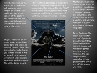
Image: The Picture on the
poster draws in the viewer
as it is dark, and relates to
the dark themes of war. The
theme is also made clear as
you can see the use of mis
en scene for the costume,
viewers will know straight
away what kind of story this
film will be based around.
Title: The title is positioned in the bottom
centre of the poster and isn’t that big in
comparison other posters. The title “WAR”
is written in a metallic texture font, witch
can relate to all kinds of conventions of
war films, such as; weapons or vehicles.
My Opinion: This Poster
Isn’t an actual poster for
a real film, I found it as a
tutorial online. However
it followed the codes
and conventions of a
movie poster especially
a war film, and will help
me when as a guide
when I come to making
my poster.
Target Audience: The
target audience for
this kind of poster is
clear. Obviously they
would like war films
in the first place and
maybe sub genres
such as action or
historical. The age
range can vary
depending on how
gruesome the film is
e.g. 15/18 for some
war films.