This document discusses charity campaigns and advertising techniques. It provides information on:
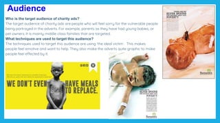
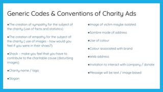
- The target audience of charity ads, which are typically middle-class families, and techniques used like portraying vulnerable people to elicit emotions.
- Issues like audience desensitization to graphic charity ads over time.
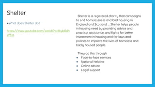
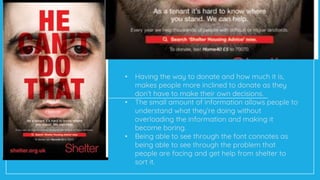
- Details on the charity Shelter, which helps people with homelessness. It summarizes Shelter's 2011 campaign in the UK that aimed to raise awareness and encourage people at risk of losing homes to seek advice.
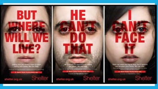
- An analysis of one of Shelter's print ads, discussing design elements like the red font and use of an everyday woman, and how these aim to personally target the audience and communicate Shelter
2. Audience
Who is the target audience of charity ads?
The target audience of charity ads are people who will feel sorry for the vulnerable people
being portrayed in the adverts. For example, parents as they have had young babies, or
pet owners. It is mainly middle class families that are targeted.
What techniques are used to target this audience?
The techniques used to target this audience are using ‘the ideal victim’. This makes
people feel emotive and want to help. They also make the adverts quite graphic to make
people feel effected by it.
4. Text in childish
handwriting, also uses of
quotation marks these both
give the effect that a child
has written it themselves, it
also makes the audience
realize they may not just
be damaging themselves
but also their children.
The fact at the
bottom is used to
shock the audience;
showing that this ad
is aimed at adults.
They have taken the
well known fear of
spiders, to show
what really scares
this girl, the audience
can tell it is a girl,
from the flowers in
the background, the
spider is also made
to look big thanks to
shadows and
lighting.
6. Shelter
●What does Shelter do?
https://www.youtube.com/watch?v=8kyb0dh
W5ss
Shelter is a registered charity that campaigns
to end homelessness and bad housing in
England and Scotland. ... Shelter helps people
in housing need by providing advice and
practical assistance, and fights for better
investment in housing and for laws and
policies to improve the lives of homeless and
badly housed people.
They do this through
● Face-to-face services
● National helpline
● Online advice
● Legal support
7. Context: Shelter’s 2011 campaign
Founded in 1966 in London. Ken Loach’s Cathy Come Home was pivotal in
establishment of the charity. https://www.youtube.com/watch?v=xky8ZqhNAlo
Aims to help people with homelessness and bad housing. Gives advice and lobbies
government to make changes to improve housing.
Campaign launched in 2011 to encourage people at risk of losing their home to
ask for advice earlier
Main focus of campaign is poster ads, but FB and mobile messaging also used
The poster campaign initially launched in four towns identified as hotspots for
housing problems, and ran from 21 August for six weeks.
8. Discuss
Shelter’s campaign was created by Amplify on a pro bono basis. Jonathan Emmins, founder of
Amplify said:
“It was crucial to us that the creative had the ability to shock and stand out but without resorting to
gimmicks. We wanted people to empathise, to never lose sight of the real people, the real faces
impacted by the current economic and housing situation.”
Purpose:
To campaign
To provide information
Aims:
The aims of this campaign is to raise awareness of homelessness arising in todays society,
especially with the recession and the current climate, which is relatable to many people in
todays society because it coincides with the issues of debt which people are faced with.
Some of slogans used to really catch to eye of the reader include; ‘but where will we live?’
9.
10. •The red font conveys a negative image to the audience, as it
connotes as pain or death, also it the colour of the shelter logo.
•The use of a ‘normal’ looking woman allows people to relate to
the advert and think that shelter could help them.
•The small amount of information allows people to understand
what they’re doing without overloading the information and
making it become boring.
•Being able to see through the font connotes as being able to
see through the problem that people are facing and get help
from shelter to sort it.
•Using the word ‘your’ targets each person individually and
makes them feel more personally targeted.
11. • Having the way to donate and how much it is,
makes people more inclined to donate as they
don’t have to make their own decisions.
• The small amount of information allows people to
understand what they’re doing without
overloading the information and making it
become boring.
• Being able to see through the font connotes as
being able to see through the problem that
people are facing and get help from shelter to
sort it.
12. •The red font conveys a negative image to the audience, as
it connotes as pain or death, also it the colour of the
shelter logo.
•The use of a ‘normal’ looking woman allows people to
relate to the advert and think that shelter could help them.
•The small amount of information allows people to
understand what they’re doing without overloading the
information and making it become boring.
•Being able to see through the font connotes as being able
to see through the problem that people are facing and get
help from shelter to sort it.
•Using the word ‘your’ targets each person individually and
makes them feel more personally targeted.
13. Analyse the ad
●1. what is the aim of the ad?
The aim of the ad is to make people feel bad and want to donate to their charity.
●2. what messages are being communicated? (How is this communicated via media language)
The messages being communicated are that the people or animals need help from you the audience.
●3. what does Shelter value? (How is this communicated via media language)
Shelter value that people need help from them and value families staying together.
●4. who is represented and how is this constructed? (age, race, class, issues)
‘Normal’ people are represented so that people can relate to the advert. Also, mixed races and
genders so it doesn’t target a specific person.
Annotate analysing colour scheme, copy, font, tone, images
14.
15. Social Context: Social Anxieties
●How many households are homeless? (2013-2014) 81,000
●In the East Midlands? 5440
●In London? 24,543
●In England? 81,880
●https://www.theguardian.com/society/2017/nov/08/one-in-every-200-people-
in-uk-are-homeless-according-to-shelter
17. Contexts
Social Context
•Social Anxieties – makes it realistic to
people that there are people who
actually face these problems
•Inequalities (gender, race, sexuality,
class) – doesn’t target a specific
gender, race, sexuality or class as
these problems can happen to
anyone.
•Conflicting Social Values – Values of
people facing losing their home is
different to people who value trivial
matters, latest x box, make up etc
Cultural Context
•Consumerism - Homelessness can be
seen as one of the effects of
consumerism (over spending, debt)
•Celebrity Culture – celebrities may
not want to advertise it as they wont
relate to it.
•Postmodernism - Media saturated
world, shocking images, desensitised
to shocking images and statistics,
focusing on individual, personal
experiences rather than mass stats /
data
18. Social Context Cultural Context
●Inequalities
Reminds us of the inequalities of wealth in society
●Social Values
Values of people facing losing their home is different
to people who value trivial matters, latest x box,
make up etc
●Consumerism
Homelessness can be seen as one of the
effects of consumerism (over spending, debt)
● Postmodernism
Media saturated world, shocking images,
desensitised to shocking images and statistics,
focusing on individual, personal experiences rather
than mass stats / data
20. Generic Codes & Conventions of Charity Ads
●The creation of sympathy for the subject of
the charity (use of facts and statistics)
●The creation of empathy for the subject of
the charity ( use of images - how would you
feel if you were in their shoes?)
●Shock – make you feel that you have to
contribute to the charitable cause (disturbing
images)
●Charity name / logo
●Slogan
●Image of victim maybe isolated
●Sombre mode of address
●Use of colour
●Colour associated with brand
●Web address
●Invitation to interact with company / donate
●Message will be text / image based