The document analyzes the front cover and contents page of a sixth form magazine.
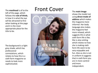
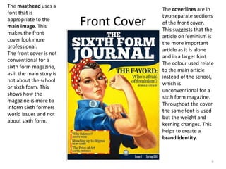
The front cover follows design conventions with the masthead on the left and uses colors and images to convey the magazine's tone of being relaxed and enjoyable.
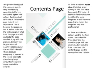
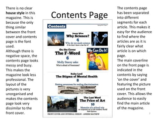
The contents page has an aesthetically pleasing design but is impractical with its disorganized layout and inconsistent fonts. It lacks a clear house style compared to the uniform front cover.
The document examines how elements on the covers relate to the target demographic and convey messages about the magazine and school. It provides suggestions for improving the consistency and professionalism of the magazine's visual design.


![Contents analysid[1]](https://cdn.slidesharecdn.com/ss_thumbnails/contentsanalysid1-111104073147-phpapp02-thumbnail.jpg?width=640&height=640&fit=bounds)


