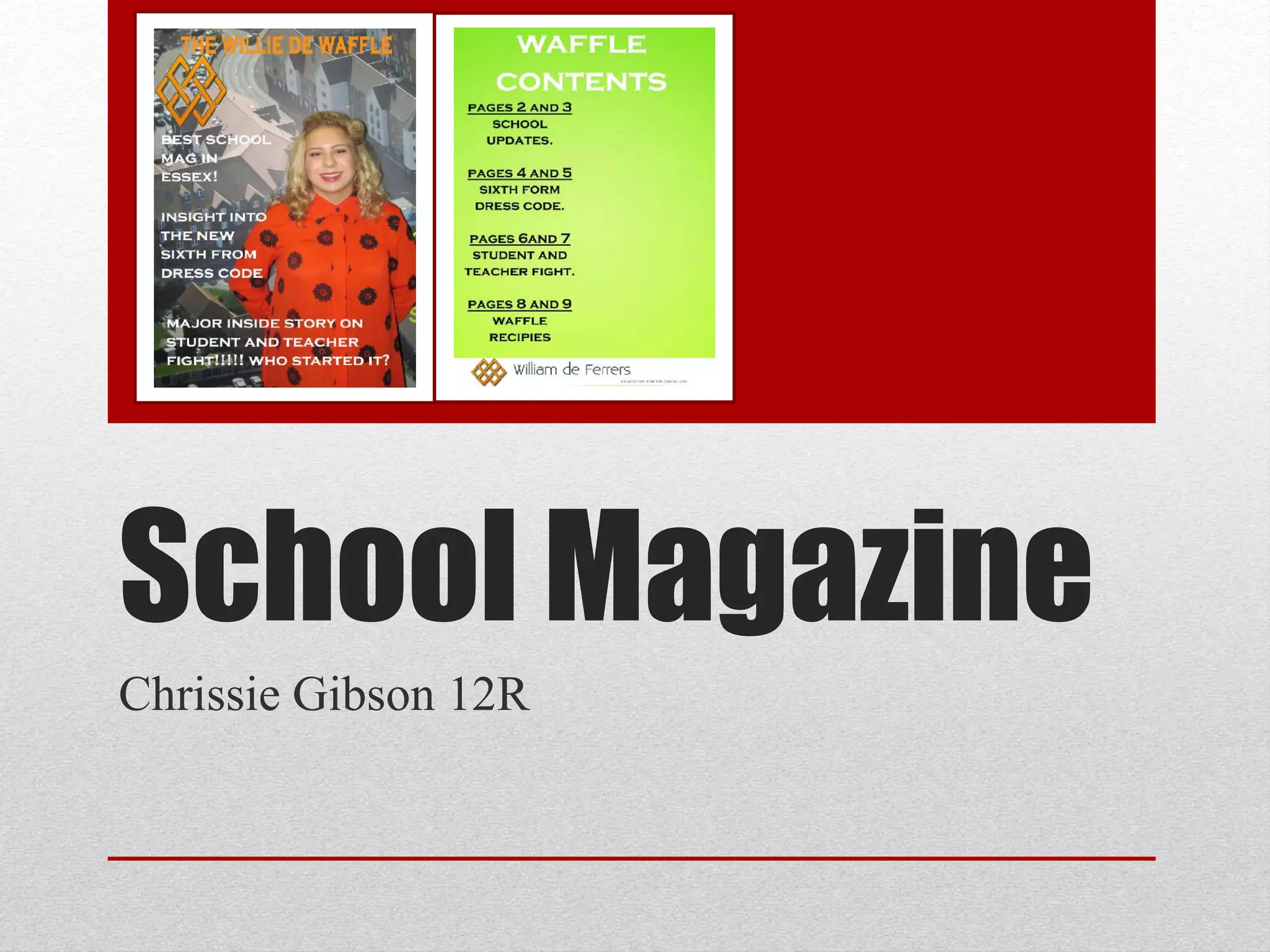
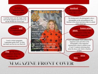
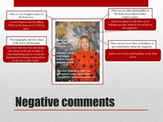
The document summarizes the design process for magazine covers and contents pages for a school magazine. For the front cover, the student used selection tools to cut out the school logo and set the title in a bold gothic font flush left. A photo was chosen that related to the magazine's demographic and an article on the school dress code. Feedback suggested adding more photos and text to fill space and make the design more interesting. For the contents page, a background image and two font colors were used alongside page numbers, but negative space and inconsistent formatting and colors were issues raised.
We at KS Designers constitutes the professional designers and writes to worked out with the most innovative and creative ideas to formulate the concept of the perfect magazine. That meets your all necessities. Our professionals are trained to handle adverse situations and deliver under pressure in short time frames.
In a perfect world, if you were to ask”What does it cost to print 1,000 magazines, 5,000 magazines, 10,000 magazines, etc…?” you would get a quick answer, but unfortunately, it’s not that simple. There are many costs associated with printing a magazine, and it’s important for publishers to be familiar with the factors that affect these costs to avoid being taken advantage of and ensure that they are securing the best deal possible from their printer. Here David Reimherr, Vice President of Sales for Shweiki, breaks down the factors that determine printing costs in a must-watch webinar.
Here I have analysed my mock up magazine cover and contents page which will help me understand what I can improve when I do my actual cover and contents page.
This is a presentation by Dada Robert in a Your Skill Boost masterclass organised by the Excellence Foundation for South Sudan (EFSS) on Saturday, the 25th and Sunday, the 26th of May 2024.
He discussed the concept of quality improvement, emphasizing its applicability to various aspects of life, including personal, project, and program improvements. He defined quality as doing the right thing at the right time in the right way to achieve the best possible results and discussed the concept of the "gap" between what we know and what we do, and how this gap represents the areas we need to improve. He explained the scientific approach to quality improvement, which involves systematic performance analysis, testing and learning, and implementing change ideas. He also highlighted the importance of client focus and a team approach to quality improvement.
Read| The latest issue of The Challenger is here! We are thrilled to announce that our school paper has qualified for the NATIONAL SCHOOLS PRESS CONFERENCE (NSPC) 2024. Thank you for your unwavering support and trust. Dive into the stories that made us stand out!
How to Create Map Views in the Odoo 17 ERPCeline George
The map views are useful for providing a geographical representation of data. They allow users to visualize and analyze the data in a more intuitive manner.
How to Make a Field invisible in Odoo 17Celine George
It is possible to hide or invisible some fields in odoo. Commonly using “invisible” attribute in the field definition to invisible the fields. This slide will show how to make a field invisible in odoo 17.
Palestine last event orientationfvgnh .pptxRaedMohamed3
An EFL lesson about the current events in Palestine. It is intended to be for intermediate students who wish to increase their listening skills through a short lesson in power point.
The Art Pastor's Guide to Sabbath | Steve ThomasonSteve Thomason
What is the purpose of the Sabbath Law in the Torah. It is interesting to compare how the context of the law shifts from Exodus to Deuteronomy. Who gets to rest, and why?
2. The masthead is related
to the school logo, as it
looks like a waffle.
Includes a puff
to emphasise the
magazine
Includes a feature article
photo that relates to the
information within the
school magazine.
Plug giving some
information about the
contents of the
magazine
Includes cover
lines for major
article.
Includes a
magazine logo
from the school.
I used the eraser tool, the magic wand
tool and the magnetic lasso tool to cut
out the William de Ferrers logo.
I used a certain typography
“copperplate gothic bold” in white
and made sure the text was flush left.
I used a photograph which enhances the
magazines style and refers to the
demographic of the magazines
characteristics which is aimed at year
12 and 13 students informing them
about the dress code which is familiar
to them.
The background to the photograph is also a
demographic as the surrounding are very
familiar to the school and shows that it is aimed
at the school age.
3. Negative comments
There is a lot of negative space on
the front cover.
I would improve this by adding
fillers to the front cover to fill up
space.
The typography and the colour
of the text is all the same.
Use more than one font and change
the colour of the text to make it
more interesting and so it suits the
background or feature article photo
so the text is still visible.
There are no other photographs on
the front cover which creates
negative space.
Add more photos to the front cover
making sure they relate to the articles in
the magazine.
There are no cover lines or headlines to
give information about the magazine.
Add in cover lines and headlines to the front
cover.
4. Includes a title for
contents page which
relates to the
magazine headline
and title.
Has information
about the articles
inside the
magazine.
Includes the William
de Ferrer's name and
logo to show it is the
school magazine.
I got a picture off the internet to
use as the background and
merged it into the layer.
I used a certain typography
“copperplate gothic bold”
and used two different
colours for font, white and
black.
I included the page
number references
so people can find
the pages they are
looking to read.
5. Negative comments
There is a lot of negative
space.
The overall design of the page
needs more pictures for effect
and needs to be placed in a
different format.
The coloured background
does not suit the house style
or colour scheme.
There should be a wider
variety of contents page
numbers and there should be
a variety in text giving some
more information to be put on
to the contents page.
There should be a conventional
colour scheme that matches the
front cover and carries on
throughout the magazine.