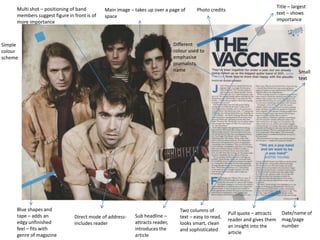
1. Multi shot – positioning of band Title – largest
Main image – takes up over a page of Photo credits
members suggest figure in front is of text – shows
space
more importance importance
Simple Different
colour colour used to
scheme emphasise
journalists
name Small
text
Blue shapes and Two columns of
Pull quote – attracts Date/name of
tape – adds an Direct mode of address- Sub headline – text – easy to read,
reader and gives them mag/page
edgy unfinished includes reader attracts reader, looks smart, clean
an insight into the number
feel – fits with introduces the and sophisticated
genre of magazine article
article
2. Main image - takes up large Long shot – shows bigger Large article title –
amount of space on the page picture – suggest article will attention grabbing
do the same
Image plays
to
stereotypes
as the Fancy font
article is not – suggests
about one class &
specific style
celebrity
By-line –
introduces
Bright
article
colour
content
scheme -
eye-catching
Large letter
– draws
attention to
start of
article,
shows
importance
Showing behind
the scenes – Journalist & photographer
suggests article Small text Two columns – Date / page
details
goes behind the easy to read number
scenes adds
sophistication
3. Name of One main image – eye
band at top Attention grabbing font used for title is drawn straight to it Pull quote – attracts reader
of page –
shows they
are
important Article
/image
credits
By-line –
introduces
article
Dark
colour
scheme –
gives a
heavier
feel and
suggests
heavier
music
such as
rock
Use of
different
colours makes Three columns of small
the interview Black and white effect – Smaller images – text – easy to read, Name of mag/page
easy to follow adds a sense of calm give a better insight allows for a lot of number
and mystery into the band content
4. Similarities
• All have a large image that takes up a
considerable amount of the page.
• All use small text.
• All have a large title and a by-line to attract the
audience.
• All have a running colour scheme that suits the
genre of the magazine.
• All have page numbers.
• All include the name of the magazine somewhere
on the page.
5. Differences
• The amount of article on show is different for each
magazine with Mixmag showing the least amount of
the article.
• Kerrang! uses a mixture of images and sizes which
gives the magazine a more informal and thrown
together look.
• The style of writing changes depending on the
magazine, NME is more serious than Mixmag and
Kerrang! uses a more informal interview technique.
• The layout of the pages are dramatically different from
magazine to magazine, this allows for some room to be
creative and unique when creating my product.