1. COMPLEX
MAGAZINE
ANALYSIS,
FRONT
COVER
MASTHEAD
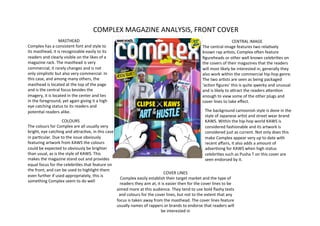
CENTRAL
IMAGE
Complex
has
a
consistent
font
and
style
to
The
central
image
features
two
relaNvely
its
masthead,
it
is
recognizable
easily
to
its
known
rap
arNsts,
Complex
oQen
feature
readers
and
clearly
visible
on
the
likes
of
a
figureheads
or
other
well
known
celebriNes
on
magazine
rack.
The
masthead
is
very
the
covers
of
their
magazines
that
the
readers
commercial,
it
rarely
changes
and
is
not
will
most
likely
be
interested
in,
generally
they
only
simplisNc
but
also
very
commercial.
In
also
work
within
the
commercial
hip-‐hop
genre.
this
case,
and
among
many
others,
the
The
two
arNsts
are
seen
as
being
packaged
masthead
is
located
at
the
top
of
the
page
‘acNon
figures’
this
is
quite
qwerky
and
unusual
and
is
the
central
focus
besides
the
and
is
likely
to
aWract
the
readers
aWenNon
imagery,
it
is
located
in
the
center
and
lies
enough
to
view
some
of
the
other
plugs
and
in
the
foreground,
yet
again
giving
it
a
high
cover
lines
to
take
effect.
eye
catching
status
to
its
readers
and
potenNal
readers
alike.
The
background
cartoonish
style
is
done
in
the
style
of
Japanese
arNst
and
street
wear
brand
COLOURS
KAWS.
Within
the
hip-‐hop
world
KAWS
is
The
colours
for
Complex
are
all
usually
very
considered
fashionable
and
its
artwork
is
bright,
eye
catching
and
aWracNve,
in
this
case
considered
just
as
current.
Not
only
does
this
in
parNcular.
Due
to
the
issue
obviously
make
Complex
appear
very
up
to
date
with
featuring
artwork
from
KAWS
the
colours
recent
affairs,
it
also
adds
a
amount
of
could
be
expected
to
obviously
be
brighter
adverNsing
for
KAWS
when
high
status
than
usual,
as
is
the
style
of
KAWS.
This
celebriNes
such
as
Pusha
T
on
this
cover
are
makes
the
magazine
stand
out
and
provides
seen
endorsed
by
it.
equal
focus
for
the
celebriNes
that
feature
on
the
front,
and
can
be
used
to
highlight
them
COVER
LINES
even
further
if
used
appropriately,
this
is
Complex
easily
establish
their
target
market
and
the
type
of
something
Complex
seem
to
do
well
readers
they
aim
at,
it
is
easier
then
for
the
cover
lines
to
be
aimed
more
at
this
audience.
They
tend
to
use
bold
flashy
texts
and
colours
for
the
cover
lines,
but
not
to
the
extent
that
any
focus
is
taken
away
from
the
masthead.
The
cover
lines
feature
usually
names
of
rappers
or
brands
to
endorse
that
readers
will
be
interested
in
2. COLOUR
COMPLEX
MAGAZINE
ANALYSIS,
As
far
as
colours
go,
TABLE
OF
CONTENTS
Complex
seem
to
have
been
scarce
in
their
table
TAGLINES
of
contents.
This
is
The
subheadings
Complex
deliberate,
oQen
Complex
have
used
are
simply
to
use
massively
bright
and
aWract
the
readers
aWenNon
aWracNve
front
covers,
for
to
the
more
appealing
example
in
this
KAWS
arNcles
of
the
magazine,
the
ediNon,
the
front
cover
is
text
underneath
is
used
to
very
‘outrageous’
in
its
go
into
further
detail
about
use
of
colour,
Complex
these
arNcles
and
hopefully
haven't
carried
on
this
convince
the
reader
to
buy.
colour
theme
through
to
Complex
use
this
contents
the
table
of
contents,
to
table
to
not
only
appeal
to
make
the
cover
stand
out
the
market
they
want
to
and
to
keep
the
contents
address
but
also
for
simplisNc
and
easy
to
convenience,
the
taglines
read,
its
lack
of
colours
and
lay
out
together
help
and
black
and
white
provide
a
simplisNc
way
to
theme
to
the
contents
maneuver
round
Complex
make
the
text
a
more
magazine.
important
feature
and
also
makes
it
stand
out
to
IMAGES
a
greater
extent
for
the
The
images
of
the
contents
table
Complex
and
most
other
magazines
use
are
to
allow
reader.
readers
to
have
a
beWer
insight
into
the
more
interesNng
aspects
of
the
magazine.
Complex
have
done
this
here,
the
first
image
on
the
leQ
is
a
recognizable
KAWS
model
that
readers
are
probably
interested
in,
obviously
Complex
have
used
text
specific
to
the
image
next
to
it,
not
only
because
it
is
pracNcal
but
it
also
enNces
the
reader
further.
The
other
image
in
this
contents
table
is
that
of
another
music
arNst,
because
Complex
focus
heavily
on
current
musical
affairs
and
upcoming
arNsts,
it
makes
sense
to
have
a
predominant
photo
of
the
arNst
they
choose
in
the
contents,
as
it
is
most
likely
the
‘point
of
call’
that
decides
whether
the
reader
should
buy
the
magazine
or
not,
unless
they
are
a
subscriber.
3. COMPLEX
MAGAZINE
ANALYSIS,
DOUBLE
PAGE
SPREAD
IMAGE
The
very
background
of
this
Complex
double
page
spread
is
a
Kid
Cudi
image,
rather
than
just
a
smaller
image
it
makes
the
2
page
spread
about
Kid
Cudi
seem
more
important
and
relevant.
This
is
not
an
unusual
thing
for
Complex
to
do,
oQen
if
a
parNcular
ediNon
focuses
on
a
arNst
or
brand,
it
is
likely
that
a
certain
amount
of
pages
will
be
dedicated
to
them
and
receive
this
sort
of
extensive
detail
in
both
image
and
text.
I
think
this
is
a
clever
ploy,
if
a
percentage
of
readers
are
likely
to
buy
a
certain
ediNon
of
Complex
due
to
it
featuring
one
of
their
favorite
arNsts,
it
is
only
just
to
cater
for
their
taste.
TITLE
COLOUR
The
Ntle
of
this
double
page
The
background
image
is
full
Kid
Cudi
arNcle
is
‘WZRD’,
this
of
neutral-‐ish
colours,
many
happens
to
be
the
name
of
a
beiges
and
light
browns
and
recent
Kid
Cudi
album,
by
blues
dominate
the
Complex
placing
what
was
background,
this
is
so
no
probably
the
debut
album
focus
can
be
drawn
from
the
Ntle
‘WZRD’
at
the
head
of
text,
yet
there
is
enough
of
a
the
arNcle,
readers
colourful
pallet
to
stop
the
immediately
know
that
the
double
page
spread
looking
central
theme
of
the
double
dull
and
lifeless.
The
colour
of
page
spread
is
more
than
the
actual
text
is
on
a
likely
the
album
Kid
Cudi
has
translucent
blue
backing,
this
released,
rather
than
just
contrasts
directly
with
the
general
occurrences
that
the
dark
reds
that
make
up
the
arNst
has
been
through
main
heading
and
the
recently.
From
this,
readers,
borders,
I
think
this
works
parNcularly
if
they
are
more
TEXT
well
due
to
the
fact
that
there
interested
in
other
topics
in
The
actual
font
of
the
main
text
body
is
not
extravagant
or
is
enough
there
to
keep
the
the
magazine,
can
skip
on,
or
parNcularly
impressive,
however
there
is
an
abundance
of
it,
I
eye
entertained
through
two
can
in
fact
decide
to
read
in
like
this
feature,
more
oQen
than
not
big
corporate
magazines
pages
packed
with
textual
detail
about
a
topic
that
such
as
Complex
forget
about
good
quality
and
considerable
content.
interests
them.
I
think
that
amounts
of
content
such
as
text.
However
in
this
case,
though
this
is
a
fairly
obvious
yet
a
large
image
dominates
the
spread,
it
is
clear
to
see
a
good
useful
method
Complex
have
amount
of
aWenNon
has
been
paid
by
Complex
to
the
arNcle
employed.
and
what
it
features,
ulNmately
pleasing
the
reader.