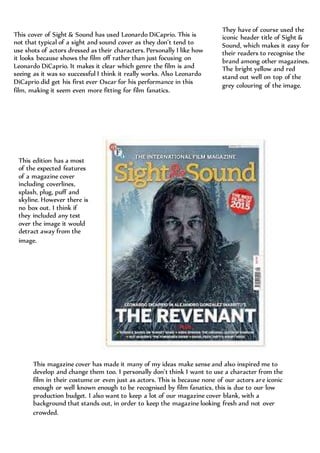
1. This cover of Sight & Sound has used Leonardo DiCaprio. This is
not that typical of a sight and sound cover as they don’t tend to
use shots of actors dressed as their characters. Personally I like how
it looks because shows the film off rather than just focusing on
Leonardo DiCaprio. It makes it clear which genre the film is and
seeing as it was so successful I think it really works. Also Leonardo
DiCaprio did get his first ever Oscar for his performance in this
film, making it seem even more fitting for film fanatics.
They have of course used the
iconic header title of Sight &
Sound, which makes it easy for
their readers to recognise the
brand among other magazines.
The bright yellow and red
stand out well on top of the
grey colouring of the image.
This edition has a most
of the expected features
of a magazine cover
including coverlines,
splash, plug, puff and
skyline. However there is
no box out. I think if
they included any text
over the image it would
detract away from the
image.
This magazine cover has made it many of my ideas make sense and also inspired me to
develop and change them too. I personally don’t think I want to use a character from the
film in their costume or even just as actors. This is because none of our actors are iconic
enough or well known enough to be recognised by film fanatics, this is due to our low
production budget. I also want to keep a lot of our magazine cover blank, with a
background that stands out, in order to keep the magazine looking fresh and not over
crowded.