
Recommended
More Related Content
What's hot
What's hot (20)
Similar to Magazine review analysis
Similar to Magazine review analysis (20)
More from Beth Carberry
Recently uploaded
Recently uploaded (20)
Magazine review analysis
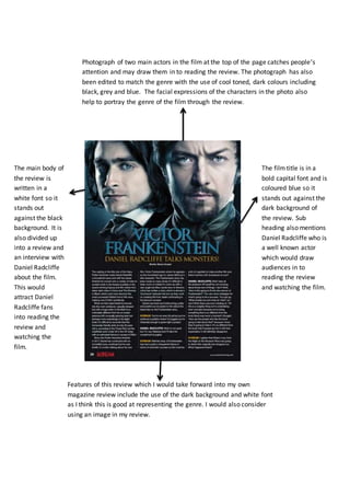
- 1. Photograph of two main actors in the film at the top of the page catches people’s attention and may draw them in to reading the review. The photograph has also been edited to match the genre with the use of cool toned, dark colours including black, grey and blue. The facial expressions of the characters in the photo also help to portray the genre of the film through the review. The filmtitle is in a bold capital font and is coloured blue so it stands out against the dark background of the review. Sub heading also mentions Daniel Radcliffe who is a well known actor which would draw audiences in to reading the review and watching the film. The main body of the review is written in a white font so it stands out against the black background. It is also divided up into a review and an interview with Daniel Radcliffe about the film. This would attract Daniel Radcliffe fans into reading the review and watching the film. Features of this review which I would take forward into my own magazine review include the use of the dark background and white font as I think this is good at representing the genre. I would also consider using an image in my review.
- 2. Using images from the film help to portray the genre of the film through the review and also draw the audience in as the images would catch their attention. The images also use cool toned, dark colours such as black and grey and blood is also used which is conventional for the genre. The title and sub title of the film are in a bold capital font to make them stand out. They are also red and white which makes them stand out against the dark background and are also colours that a used stereotypically in the horror genre. The use of ellipsis also creates a sense of mystery and encourages the audience to want to read the review and perhaps watch the film. The main body of the review is written in a white font so that it stands out against the black background. It is also in the centre of the page which is where the audiences eyes are drawn to. Features of this review which I would take forward into my own magazine review include the use of the dark background and white font. I would also make my title bold and big to stand out against the background and be more attention grabbing.