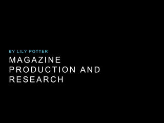
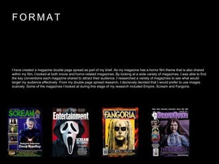
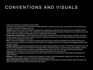
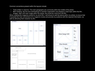
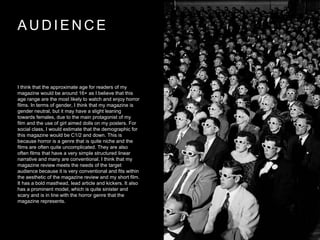
Lily Potter designed a magazine review spread for her short horror film in Adobe Illustrator. She researched conventions from the magazine Scream to design a layout that would appeal to its audience. For the article, Lily used Microsoft Word and had a peer review her draft before finalizing the double page spread. She included typical elements like the film title, genre, ratings, and a plot summary while limiting revealing details. Lily aimed her magazine review at a 16+ audience that might enjoy horror films across gender and social classes C1/C2 and below.