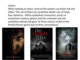
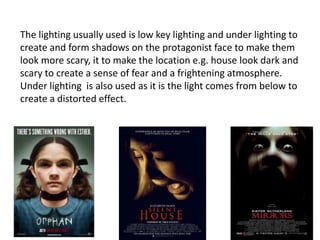
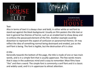
Most psychological horror movie posters feature an extreme close-up of an eye that appears unnatural and scared. Editing is often used to add silhouettes or hands in the eye to create mystery around what the protagonist sees. Houses are also commonly shown in the background of posters to unsettle viewers by depicting an unsafe location. Color schemes usually involve black, red, and white to symbolize themes like death, blood, and mystery. Text is kept bold and clear against dark backgrounds to stand out and reflect horror themes through effects like erosion. Key information like the movie title and release date are placed prominently to attract attention.
2. Picture-
Some of the common pictures used are extreme close up of the eye. The eye is often
edited to look unnatural and scary; this is done to draw the audience’s attention to it as it
is unusual and eerie. The eye is usually wide open to express the fear in the protagonist.
This is effective and creates enigma due to the fact that nothing else can be seen other
than the look of emotion from the eye which makes the audience want to know why the
protagonist is scared and what they can see.
Editing is also used to enhance the effectiveness of the poster, for example in the
majority of the posters above, inside the eye is a silhouette of a dark figure, creating
further enigma as we know the eye is seeing something we cant but we don’t know who
or why which creates a sense of mystery. Also in the posters ‘The Eye’ and ‘The Return’
there is a hand in the eye which looks like there is something trapped inside the
protagonist which creates a more disturbing effect and attracts the audience.
3. Also in most posters, the eye is often that of the victims, as they
are the character that feels fear along with the audience, as we
almost see what they see. The close crop and close up zoom
means the viewer only gets a small sense of the themes and
storyline of the film, making it a teaser poster, leading the
audience to want to find out more and see the film. I feel that
using this convention in our poster would be very effective in
attracting the audience and creating the sense of horror and
fright however the editing used in these posters may be hard to
copy as we don’t have the right software and editing skills.
4. Picture-
Many horror films use a house as a setting, so there are a number of
horror film posters with a eerie photograph of the house, either with
the protagonist in the foreground or the house on its own. The
background around the house used is often dark and the sky is foggy
or manipulated in order to look strange and unnatural. They are often
old Victorian looking houses that are large and have the and look
haunted and creepy. The house as a setting also unsettles the viewer
because of the feeling of safety linked with the home whereas these
houses used in the posters look frightening and unsafe. Posters in
which a house is used often create enigma because we do not know
whether it is the people who live in the house or the house itself that
is causing the disequilibrium.
5. Colour-
When looking at colour, most of the posters use black red and
white. The use of black can symbolise death, loss of hope,
fear, darkness. White symbolises innocence, purity or
sometimes mystery, ghosts and the unknown and red
symbolises blood and gore. Al these colours relate to the
thriller/horror genre due to their connotations.
6. The lighting usually used is low key lighting and under lighting to
create and form shadows on the protagonist face to make them
look more scary, it to make the location e.g. house look dark and
scary to create a sense of fear and a frightening atmosphere.
Under lighting is also used as it is the light comes from below to
create a distorted effect.
7. Text-
Also in terms of text it is always clear and bold, in either white or red font to
stand out against the black background. Usually on film posters the title text or
text in general has themes of horror, such as an eroded text to show decay and
re-enforce the possessed element of the film. Another example could be
distortion to represent the aspect of confusion or paranormal themes. Or may
reflect the idea of something normal being destroyed and eroded, just as the
serif font is being. The font is legible, but the destruction of it is clear.
A title -
Generally towards the bottom of the page, the title is made of one or two main
words, and is in a simple font that is usually uppercase. The few words means
that it stays in the audiences mind and is easy to remember. Most films have
"the" and then a word. The simple font is commonly a serif font and it is classic
and widely used, and it is in uppercase to attract attention.
8. A release date – A vital piece of information is always used in any poster, the creator
can place the date towards the base of the poster, usually in the same font as the
title, to tell the audience when it is released. If a release date has not yet been
decided or announced, then "coming soon" will be used to create intrigue and
anticipation around the release date. The audience will then be checking regularly as
to when the film comes out in cinemas.
Institutional information - When featured, this section of information details the
information of who is starring, or worked on the film and is shown inconspicuously at
the very bottom of the page. This convention isn't always followed because the
audience doesn't find it that interesting or useful. Whilst it can be used to see who is
in the movie, horror movies tend to use actors that aren't famous so they
wouldn't recognise the name anyway. Were the name of a writer, director, producer
or actor to be classed as important, then they would place it somewhere else on the
poster to attract attention.