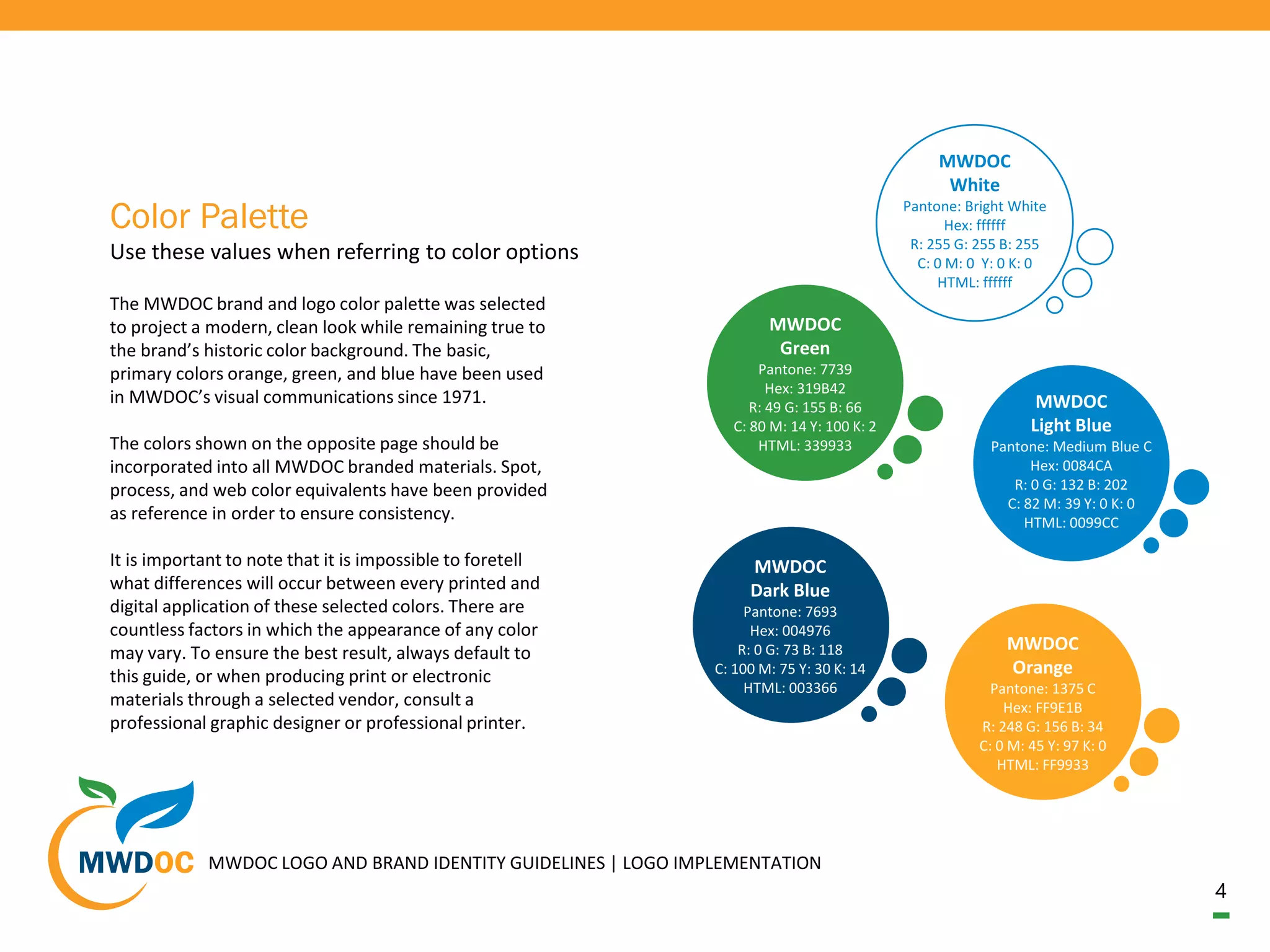
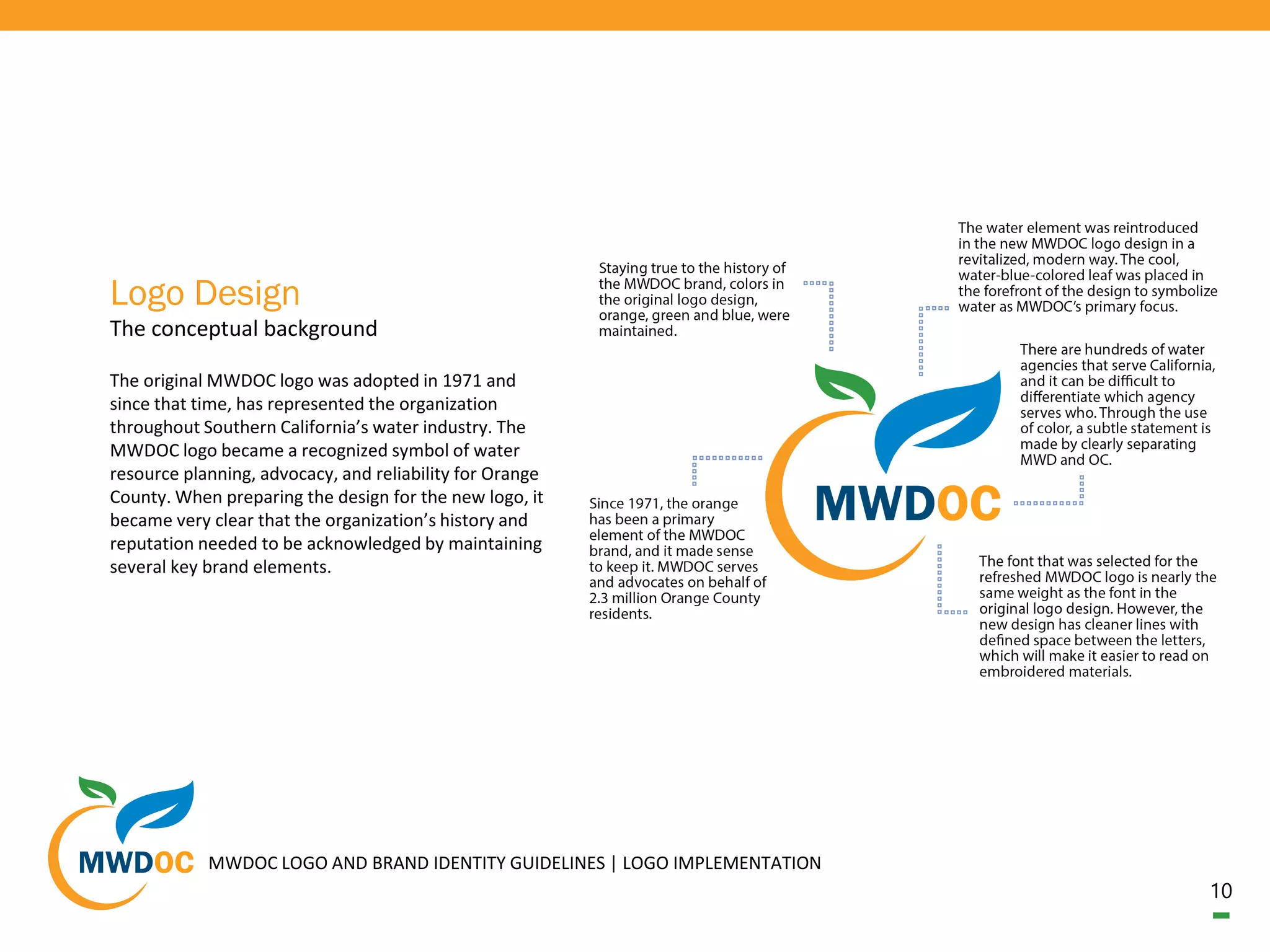
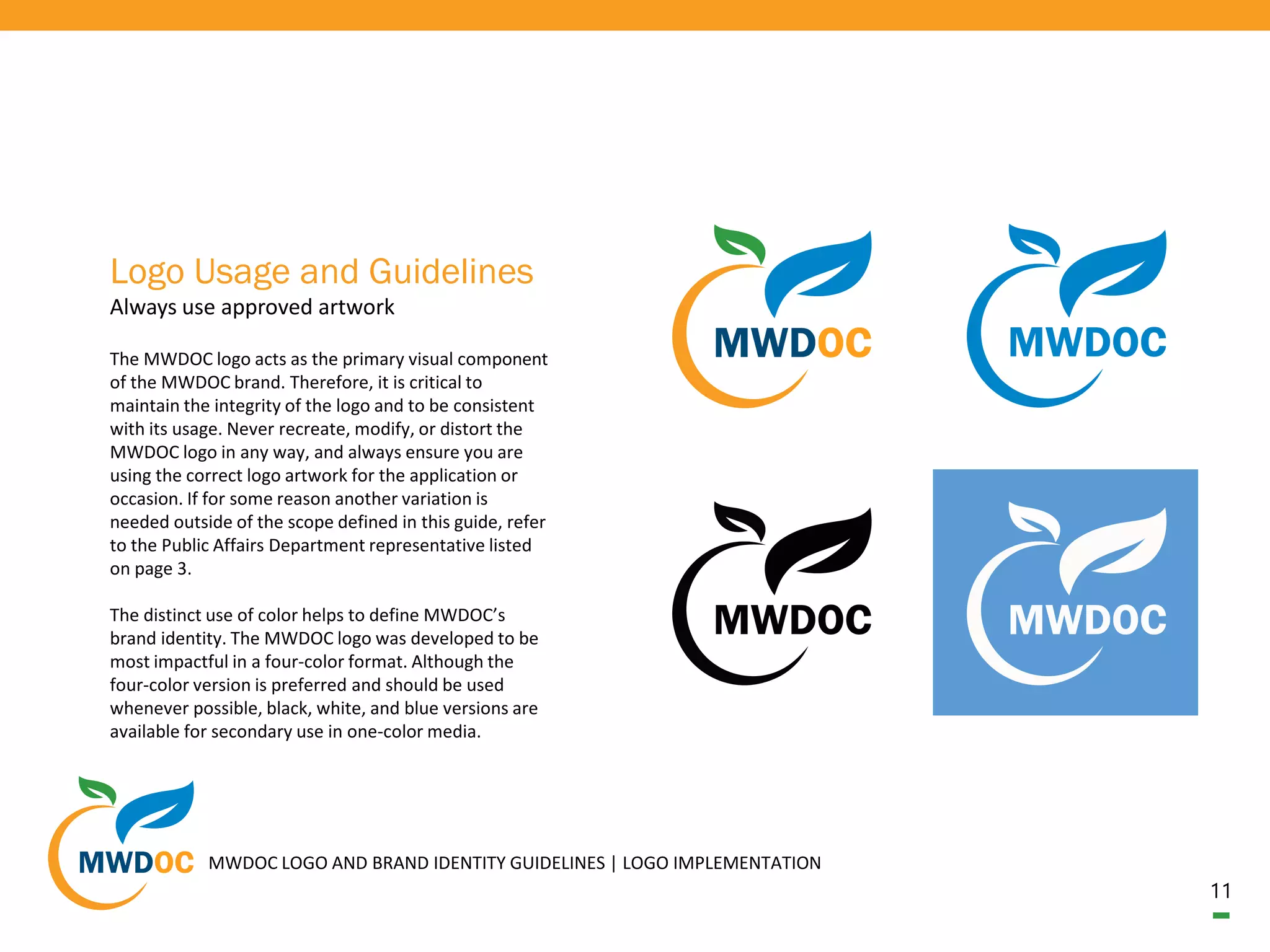
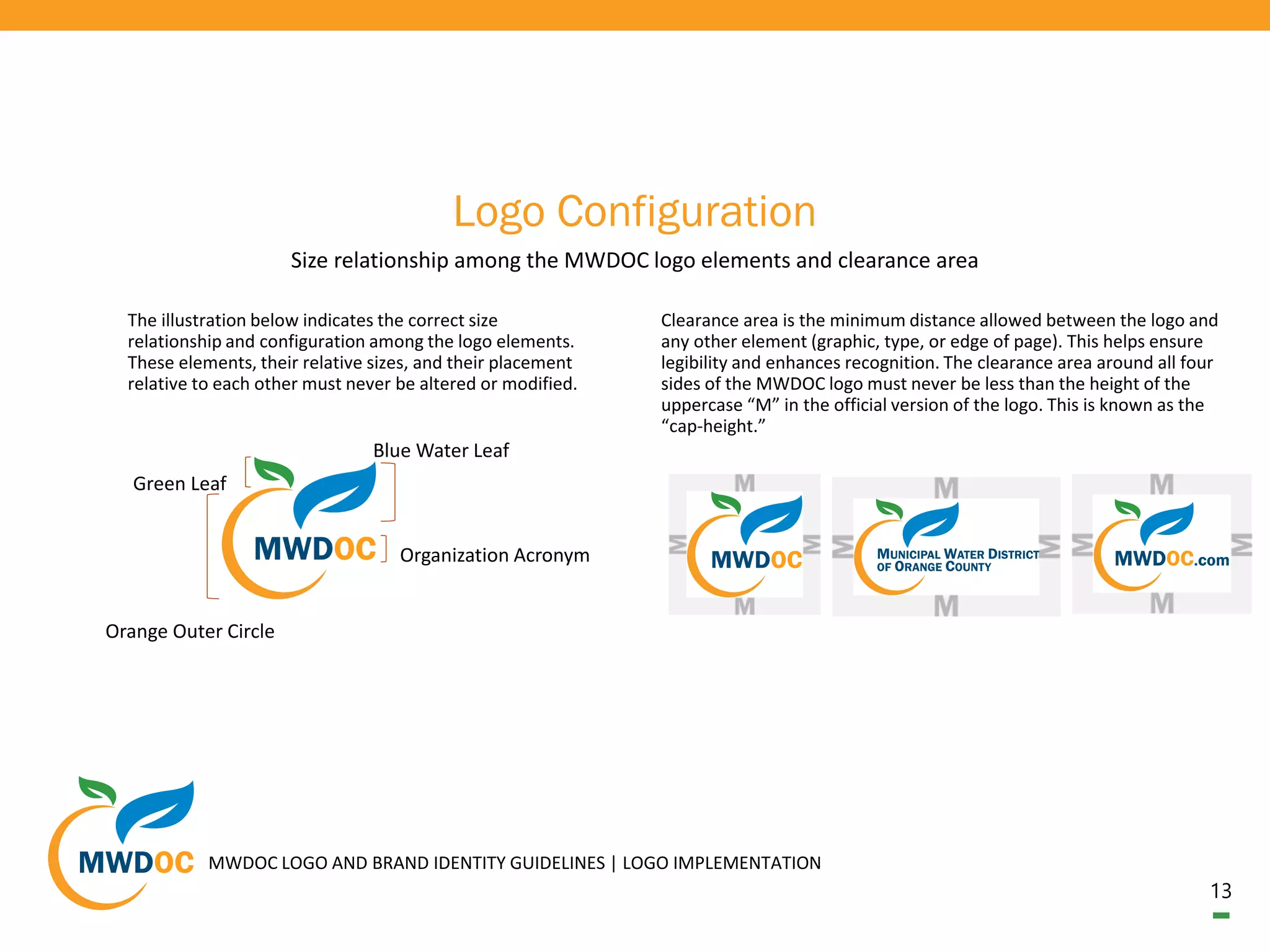
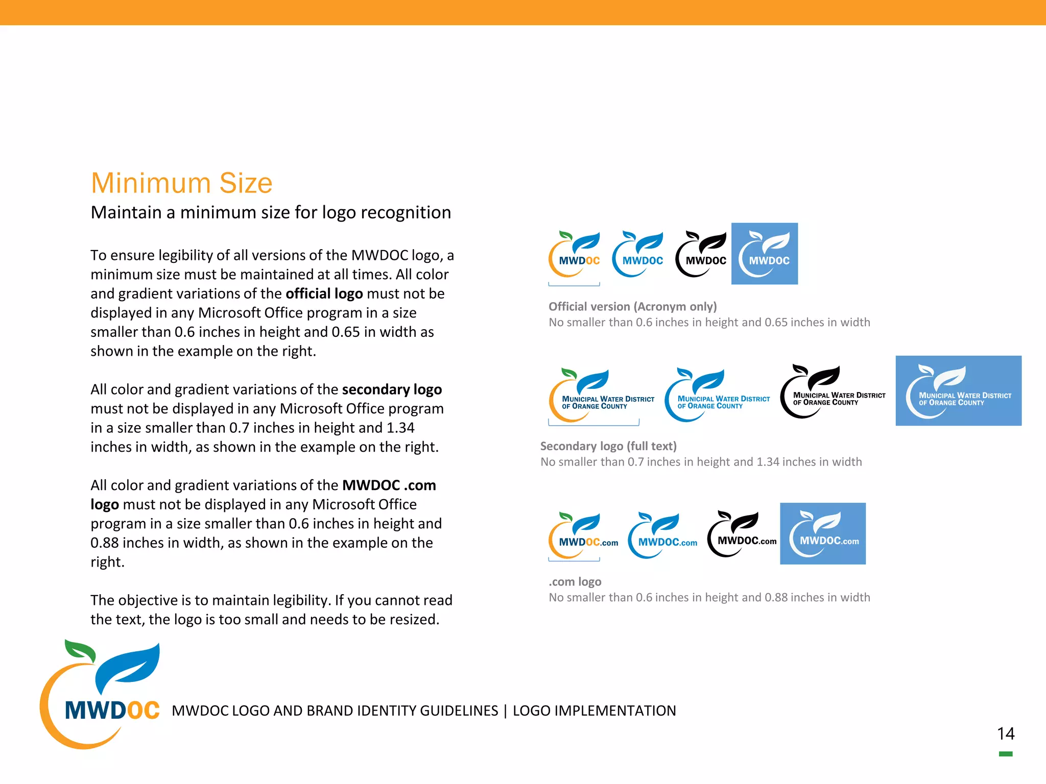
Municipal Water District of Orange County
Logo and Brand Identity Guidelines
2
Brand Implementation
04
Color Palette
Use these values when referring to
color options
03
Introduction
Guidelines for brand identity and
logo usage
05
Typeface
Simple. Legible. Clean.
06
Brand Voice and Messaging
Purposeful, consistent expression
through words
09
Photography
Clean, crisp imagery
10
Logo Design
The conceptual background
11
Logo Usage and
Guidelines
Always use approved
artwork
3
Introduction
Guidelines for Brand Identity and Logo Usage
This logo and brand identity resource will provide
guidelines for using the Municipal Water District of
Orange County (MWDOC) logo and will introduce the
color, typeface, and brand voice that should be used
across all MWDOC communications. The elements
described in this guide are a fundamental part of how
others recognize and relate to MWDOC and these
standards have been established to ensure the brand
remains consistent in appearance, sound, and feel.
While this resource covers most basic applications and
instances of the MWDOC brand and use of the logo, it
cannot anticipate all possible scenarios.
Any logo or brand identity issues not covered in this
guide must be referred to:
MWDOC Public Affairs
Attn: Tiffany Baca
(714) 593.5013
tbaca@Mwdoc.com
18700 Ward Street
Fountain Valley, CA 92708
MWDOC LOGO AND BRAND IDENTITY GUIDELINES | LOGO IMPLEMENTATION
4
The MWDOC brand and logo color palette was selected
to project a modern, clean look while remaining true to
the brand’s historic color background. The basic,
primary colors orange, green, and blue have been used
in MWDOC’s visual communications since 1971.
The colors shown on the opposite page should be
incorporated into all MWDOC branded materials. Spot,
process, and web color equivalents have been provided
as reference in order to ensure consistency.
It is important to note that it is impossible to foretell
what differences will occur between every printed and
digital application of these selected colors. There are
countless factors in which the appearance of any color
may vary. To ensure the best result, always default to
this guide, or when producing print or electronic
materials through a selected vendor, consult a
professional graphic designer or professional printer.
Use these values when referring to color options
Color Palette
MWDOC
Dark Blue
Pantone: 7693
Hex: 004976
R: 0 G: 73 B: 118
C: 100 M: 75 Y: 30 K: 14
HTML: 003366
MWDOC
Green
Pantone: 7739
Hex: 319B42
R: 49 G: 155 B: 66
C: 80 M: 14 Y: 100 K: 2
HTML: 339933
MWDOC
Orange
Pantone: 1375 C
Hex: FF9E1B
R: 248 G: 156 B: 34
C: 0 M: 45 Y: 97 K: 0
HTML: FF9933
MWDOC
Light Blue
Pantone: Medium Blue C
Hex: 0084CA
R: 0 G: 132 B: 202
C: 82 M: 39 Y: 0 K: 0
HTML: 0099CC
MWDOC LOGO AND BRAND IDENTITY GUIDELINES | LOGO IMPLEMENTATION
MWDOC
White
Pantone: Bright White
Hex: ffffff
R: 255 G: 255 B: 255
C: 0 M: 0 Y: 0 K: 0
HTML: ffffff
5
All variations of the MWDOC logo use only one font,
Franklin Gothic Demi. This font style was selected for
it’s simplicity and legibility, and also because it is
included as a default font style with any Microsoft
Office installation. The goal with all of the selected
typeface across the MWDOC brand is to keep it clean
and simple.
That said, when producing materials with text, the
typeface used should be consistent with the brand
image. Typeface to be used in instances that require
text are: Franklin Gothic Demi, Franklin Gothic
Medium, Franklin Gothic Book, Calibri, Calibri Light,
Arial, and in certain cases, English. The typeface
referenced here should be used for all internal and
public documents, stationery, outreach materials,
promotional items, and correspondence.
Simple. Legible. Clean.
Typeface
MWDOC LOGO AND BRAND IDENTITY GUIDELINES | LOGO IMPLEMENTATION
(Franklin Gothic Demi)
Municipal Water District of Orange County
1234567890!@#$%^&*()
(Franklin Gothic Medium)
Municipal Water District of Orange County
1234567890!@#$%^&*()
(Franklin Gothic Book)
Municipal Water District of Orange County
1234567890!@#$%^&*()
(Calibri)
Municipal Water District of Orange County
1234567890!@#$%^&*()
(Calibri Light)
Municipal Water District of Orange County
1234567890!@#$%^&*()
(Arial)
Municipal Water District of Orange County
1234567890!@#$%^&*()
(English)
Municipal Water District of Orange County
1234567890!@#$%^&*()
6
MWDOC LOGO AND BRAND IDENTITY GUIDELINES | LOGO IMPLEMENTATION
The brand voice consists of both messaging and tone.
These two aspects come together to create an effective
strategy when speaking to the public. It is important to
create clear, consistent messaging that reflects the
MWDOC brand personality. The brand message is
simply MWDOC’s mission statement. All roads lead
back to the mission statement. The tone is how you are
communicating the message.
Purposeful, consistent expression through words
Brand Voice and Messaging Our Mission:
“To provide reliable, high-quality
supplies from MWD and other sources
to meet present and future needs, at
an equitable and economical cost, and
to promote water use efficiency for all
of Orange County.”
~ MWDOC
7
MWDOC LOGO AND BRAND IDENTITY GUIDELINES | LOGO IMPLEMENTATION
To create effective messaging, is important to tell a
story from start to finish. Clarity and consistency are
key. Always have a goal when preparing messages for
both internal and external audiences. Define what you
are trying to achieve. Plan key messages and action
points before creating content to avoid including
technical jargon and fluff where it is not needed. If your
message requires the use of technical language and/or
acronyms, spell it out in clear language for your
audience. Avoid colloquialisms. Stick to the point, and
be as succinct as possible.
Have a plan – Have a goal
Brand Message The Lead
Introduction and main point(s)
Who, What, When, Where, Why
The Body
Evidence, background, primary details that
support The Lead
The Tail
Least important information; details for those
most interested
8
MWDOC LOGO AND BRAND IDENTITY GUIDELINES | LOGO IMPLEMENTATION
In order to communicate effectively, you have to know
who your audience is and present your message in a
way that they understand and respond to. Essentially,
each time you communicate with an audience, you
need to tailor your message in order to engage them.
Your voice is your voice, but you take on different
tones depending on who you are speaking to - Elected
Official vs Typical Homeowner, Education Partner vs
School Children, or describing an event vs giving
instructions. You may have to stretch or adapt your
tone to fit the audience or platform. The tone that
should be used to communicate the brand effectively
should always be:
Everything we write should be thoughtful,
interesting, and human
Brand Tone
CLEAR
KNOWLEDGEABLE
INFORMATIVEY.
ENGAGING
PROFESSIONAL
TRUSTWORTHY
CONSISTENT
APPROACHABLE
FOCUSED
9
PHOTOGRAPHY
BRANDING
BRANDING
PHOTOGRAPHY
When choosing photographs for presentations,
outreach, and promotional materials, select simple,
clean imagery that aligns with the MWDOC brand.
Whenever possible, use professional stock images that
are clean and crisp. To assist with this, the MWDOC
Public Affairs Department has put together a selection
of presentation images that have been saved in the
Shared O drive under Presentation Images.
10
The conceptual background
Logo Design
The original MWDOC logo was adopted in 1971 and
since that time, has represented the organization
throughout Southern California’s water industry. The
MWDOC logo became a recognized symbol of water
resource planning, advocacy, and reliability for Orange
County. When preparing the design for the new logo, it
became very clear that the organization’s history and
reputation needed to be acknowledged by maintaining
several key brand elements.
MWDOC LOGO AND BRAND IDENTITY GUIDELINES | LOGO IMPLEMENTATION
11
The MWDOC logo acts as the primary visual component
of the MWDOC brand. Therefore, it is critical to
maintain the integrity of the logo and to be consistent
with its usage. Never recreate, modify, or distort the
MWDOC logo in any way, and always ensure you are
using the correct logo artwork for the application or
occasion. If for some reason another variation is
needed outside of the scope defined in this guide, refer
to the Public Affairs Department representative listed
on page 3.
The distinct use of color helps to define MWDOC’s
brand identity. The MWDOC logo was developed to be
most impactful in a four-color format. Although the
four-color version is preferred and should be used
whenever possible, black, white, and blue versions are
available for secondary use in one-color media.
Always use approved artwork
Logo Usage and Guidelines
MWDOC LOGO AND BRAND IDENTITY GUIDELINES | LOGO IMPLEMENTATION
12
The MWDOC logo was created with three approved
versions, as shown on the right. These versions allow
for flexibility to optimize the logo’s visual presence
across multiple applications and should not be altered.
The official logo consists of the MWDOC icon and
acronym and should be considered the default choice
for all applications. The secondary logo consists of the
MWDOC icon and the full name “Municipal Water
District of Orange County” and should be used in less
formal applications or when the organization name is
unknown or necessary. The third logo option includes
the MWDOC icon and the official MWDOC website url.
This option should be used in promotional applications
only or in instances where it is critical to direct others
to the official MWDOC website. A gradient version for
all three logos is available for use only where you have
flexibility to be more artistic or expressive.
Approved designs
Logo Variations
Official MWDOC logo (Acronym only) Promotional version referencing the website
Secondary MWDOC logo All three approved versions include a
gradient option
MWDOC LOGO AND BRAND IDENTITY GUIDELINES | LOGO IMPLEMENTATION
13
Logo Configuration
Size relationship among the MWDOC logo elements and clearance area
The illustration below indicates the correct size
relationship and configuration among the logo elements.
These elements, their relative sizes, and their placement
relative to each other must never be altered or modified.
Organization Acronym
Blue Water Leaf
Green Leaf
Orange Outer Circle
Clearance area is the minimum distance allowed between the logo and
any other element (graphic, type, or edge of page). This helps ensure
legibility and enhances recognition. The clearance area around all four
sides of the MWDOC logo must never be less than the height of the
uppercase “M” in the official version of the logo. This is known as the
“cap-height.”
MWDOC LOGO AND BRAND IDENTITY GUIDELINES | LOGO IMPLEMENTATION
14
To ensure legibility of all versions of the MWDOC logo, a
minimum size must be maintained at all times. All color
and gradient variations of the official logo must not be
displayed in any Microsoft Office program in a size
smaller than 0.6 inches in height and 0.65 in width as
shown in the example on the right.
All color and gradient variations of the secondary logo
must not be displayed in any Microsoft Office program
in a size smaller than 0.7 inches in height and 1.34
inches in width, as shown in the example on the right.
All color and gradient variations of the MWDOC .com
logo must not be displayed in any Microsoft Office
program in a size smaller than 0.6 inches in height and
0.88 inches in width, as shown in the example on the
right.
The objective is to maintain legibility. If you cannot read
the text, the logo is too small and needs to be resized.
Maintain a minimum size for logo recognition
Minimum Size
Official version (Acronym only)
No smaller than 0.6 inches in height and 0.65 inches in width
Secondary logo (full text)
No smaller than 0.7 inches in height and 1.34 inches in width
.com logo
No smaller than 0.6 inches in height and 0.88 inches in width
MWDOC LOGO AND BRAND IDENTITY GUIDELINES | LOGO IMPLEMENTATION
15
A reversed (white) version of the MWDOC logo can be
reproduced on a black or dark colored background. In
one-color applications, sufficient contrast should be
maintained by using the reverse logo on tonal values of
40% black or darker and a one-color black version of
the logo on tonal values of lighter than 40%. If the
MWDOC logo is superimposed upon or reversed out of
a photograph, it should always be placed in an area
that offers a consistent background and provides
sufficient contrast.
When to use the black and white MWDOC logo
Reverse Treatment
Black MWDOC
Dark Blue
MWDOC
Light Blue
MWDOC
Orange
100% 85% 75% 65%
50% 40% 30% 20%
MWDOC LOGO AND BRAND IDENTITY GUIDELINES | LOGO IMPLEMENTATION
16
In an attempt to prevent common mistakes when using
the MWDOC logo, several examples of incorrect uses
are displayed here for reference. These variations are
representative, however, and are not all inclusive.
Please refer to the overall standards throughout this
guide when considering any form of reproduction or
application of the MWDOC logo.
Before using any questionable variation of the logo,
refer to the Public Affairs Department representative
listed on page 3.
Examples of common mistakes
Incorrect Usage Do not stretch, alter,
or skew the logo.
Resizing must be
proportionate.
Do not rotate
or flip the
logo.
Do not remove
any of the logo
elements.
Do not use the
acronym element
without the icon.
Do not change brand
colors. Use the official
color specification
detailed in this guide.
Do not crop
the logo.
Do not modify the logo
colors even if they look
similar. Use the official
color specification
detailed in this guide.
Do not place the logo
on a low-contrast or
similar colored
background if the logo
elements are not
clearly identifiable.
Do not
reconfigure the
logo elements.
Do not place the logo
on top of a busy
background.
Do not make the logo
transparent.
Do not place the logo on
top of a white box to make
the logo legible, unless that
box is part of an overall
design.
MWDOC LOGO AND BRAND IDENTITY GUIDELINES | LOGO IMPLEMENTATION
17
One of the most common issues with any logo
placement is the unavoidable instance where the logo
will be displayed on a low-contrast or similar colored
background. One example of this is when you must use
someone else’s template for a presentation. The easiest
fix is to select the white one-color logo option. However,
when the best representation of the brand is to display
the logo in full color, there are a few alternatives. The
first is to select the full color option with MWD in white
text. Another is to add a drop shadow (from the
Microsoft shape options, shadow offset center option)
to the logo which makes it pop out from the background.
The last and least preferable option is to place a white
stroke or outline around the logo. As mentioned in the
introduction text, it is impossible to predict all scenarios
or background variations that might come up. The rule
of thumb is when in doubt, seek assistance from the
Public Affairs representative on page 3 of this guide.
Logo on Low-Contrast or
Similar Colored Background
Rule of thumb, refer to the Public Affairs
representative on page 3
MWDOC LOGO AND BRAND IDENTITY GUIDELINES | LOGO IMPLEMENTATION
MWD white textWhite stroke and drop
shadow alternatives
THANK YOU
Thank you for supporting this significant milestone for our agency and for helping
build the MWDOC brand. If you have any questions, please contact the Public
Affairs representative referenced on page 3 of this guide.

Mwdoc brand style guide

  • 1.
    Municipal Water Districtof Orange County Logo and Brand Identity Guidelines
  • 2.
    2 Brand Implementation 04 Color Palette Usethese values when referring to color options 03 Introduction Guidelines for brand identity and logo usage 05 Typeface Simple. Legible. Clean. 06 Brand Voice and Messaging Purposeful, consistent expression through words 09 Photography Clean, crisp imagery 10 Logo Design The conceptual background 11 Logo Usage and Guidelines Always use approved artwork
  • 3.
    3 Introduction Guidelines for BrandIdentity and Logo Usage This logo and brand identity resource will provide guidelines for using the Municipal Water District of Orange County (MWDOC) logo and will introduce the color, typeface, and brand voice that should be used across all MWDOC communications. The elements described in this guide are a fundamental part of how others recognize and relate to MWDOC and these standards have been established to ensure the brand remains consistent in appearance, sound, and feel. While this resource covers most basic applications and instances of the MWDOC brand and use of the logo, it cannot anticipate all possible scenarios. Any logo or brand identity issues not covered in this guide must be referred to: MWDOC Public Affairs Attn: Tiffany Baca (714) 593.5013 tbaca@Mwdoc.com 18700 Ward Street Fountain Valley, CA 92708 MWDOC LOGO AND BRAND IDENTITY GUIDELINES | LOGO IMPLEMENTATION
  • 4.
    4 The MWDOC brandand logo color palette was selected to project a modern, clean look while remaining true to the brand’s historic color background. The basic, primary colors orange, green, and blue have been used in MWDOC’s visual communications since 1971. The colors shown on the opposite page should be incorporated into all MWDOC branded materials. Spot, process, and web color equivalents have been provided as reference in order to ensure consistency. It is important to note that it is impossible to foretell what differences will occur between every printed and digital application of these selected colors. There are countless factors in which the appearance of any color may vary. To ensure the best result, always default to this guide, or when producing print or electronic materials through a selected vendor, consult a professional graphic designer or professional printer. Use these values when referring to color options Color Palette MWDOC Dark Blue Pantone: 7693 Hex: 004976 R: 0 G: 73 B: 118 C: 100 M: 75 Y: 30 K: 14 HTML: 003366 MWDOC Green Pantone: 7739 Hex: 319B42 R: 49 G: 155 B: 66 C: 80 M: 14 Y: 100 K: 2 HTML: 339933 MWDOC Orange Pantone: 1375 C Hex: FF9E1B R: 248 G: 156 B: 34 C: 0 M: 45 Y: 97 K: 0 HTML: FF9933 MWDOC Light Blue Pantone: Medium Blue C Hex: 0084CA R: 0 G: 132 B: 202 C: 82 M: 39 Y: 0 K: 0 HTML: 0099CC MWDOC LOGO AND BRAND IDENTITY GUIDELINES | LOGO IMPLEMENTATION MWDOC White Pantone: Bright White Hex: ffffff R: 255 G: 255 B: 255 C: 0 M: 0 Y: 0 K: 0 HTML: ffffff
  • 5.
    5 All variations ofthe MWDOC logo use only one font, Franklin Gothic Demi. This font style was selected for it’s simplicity and legibility, and also because it is included as a default font style with any Microsoft Office installation. The goal with all of the selected typeface across the MWDOC brand is to keep it clean and simple. That said, when producing materials with text, the typeface used should be consistent with the brand image. Typeface to be used in instances that require text are: Franklin Gothic Demi, Franklin Gothic Medium, Franklin Gothic Book, Calibri, Calibri Light, Arial, and in certain cases, English. The typeface referenced here should be used for all internal and public documents, stationery, outreach materials, promotional items, and correspondence. Simple. Legible. Clean. Typeface MWDOC LOGO AND BRAND IDENTITY GUIDELINES | LOGO IMPLEMENTATION (Franklin Gothic Demi) Municipal Water District of Orange County 1234567890!@#$%^&*() (Franklin Gothic Medium) Municipal Water District of Orange County 1234567890!@#$%^&*() (Franklin Gothic Book) Municipal Water District of Orange County 1234567890!@#$%^&*() (Calibri) Municipal Water District of Orange County 1234567890!@#$%^&*() (Calibri Light) Municipal Water District of Orange County 1234567890!@#$%^&*() (Arial) Municipal Water District of Orange County 1234567890!@#$%^&*() (English) Municipal Water District of Orange County 1234567890!@#$%^&*()
  • 6.
    6 MWDOC LOGO ANDBRAND IDENTITY GUIDELINES | LOGO IMPLEMENTATION The brand voice consists of both messaging and tone. These two aspects come together to create an effective strategy when speaking to the public. It is important to create clear, consistent messaging that reflects the MWDOC brand personality. The brand message is simply MWDOC’s mission statement. All roads lead back to the mission statement. The tone is how you are communicating the message. Purposeful, consistent expression through words Brand Voice and Messaging Our Mission: “To provide reliable, high-quality supplies from MWD and other sources to meet present and future needs, at an equitable and economical cost, and to promote water use efficiency for all of Orange County.” ~ MWDOC
  • 7.
    7 MWDOC LOGO ANDBRAND IDENTITY GUIDELINES | LOGO IMPLEMENTATION To create effective messaging, is important to tell a story from start to finish. Clarity and consistency are key. Always have a goal when preparing messages for both internal and external audiences. Define what you are trying to achieve. Plan key messages and action points before creating content to avoid including technical jargon and fluff where it is not needed. If your message requires the use of technical language and/or acronyms, spell it out in clear language for your audience. Avoid colloquialisms. Stick to the point, and be as succinct as possible. Have a plan – Have a goal Brand Message The Lead Introduction and main point(s) Who, What, When, Where, Why The Body Evidence, background, primary details that support The Lead The Tail Least important information; details for those most interested
  • 8.
    8 MWDOC LOGO ANDBRAND IDENTITY GUIDELINES | LOGO IMPLEMENTATION In order to communicate effectively, you have to know who your audience is and present your message in a way that they understand and respond to. Essentially, each time you communicate with an audience, you need to tailor your message in order to engage them. Your voice is your voice, but you take on different tones depending on who you are speaking to - Elected Official vs Typical Homeowner, Education Partner vs School Children, or describing an event vs giving instructions. You may have to stretch or adapt your tone to fit the audience or platform. The tone that should be used to communicate the brand effectively should always be: Everything we write should be thoughtful, interesting, and human Brand Tone CLEAR KNOWLEDGEABLE INFORMATIVEY. ENGAGING PROFESSIONAL TRUSTWORTHY CONSISTENT APPROACHABLE FOCUSED
  • 9.
    9 PHOTOGRAPHY BRANDING BRANDING PHOTOGRAPHY When choosing photographsfor presentations, outreach, and promotional materials, select simple, clean imagery that aligns with the MWDOC brand. Whenever possible, use professional stock images that are clean and crisp. To assist with this, the MWDOC Public Affairs Department has put together a selection of presentation images that have been saved in the Shared O drive under Presentation Images.
  • 10.
    10 The conceptual background LogoDesign The original MWDOC logo was adopted in 1971 and since that time, has represented the organization throughout Southern California’s water industry. The MWDOC logo became a recognized symbol of water resource planning, advocacy, and reliability for Orange County. When preparing the design for the new logo, it became very clear that the organization’s history and reputation needed to be acknowledged by maintaining several key brand elements. MWDOC LOGO AND BRAND IDENTITY GUIDELINES | LOGO IMPLEMENTATION
  • 11.
    11 The MWDOC logoacts as the primary visual component of the MWDOC brand. Therefore, it is critical to maintain the integrity of the logo and to be consistent with its usage. Never recreate, modify, or distort the MWDOC logo in any way, and always ensure you are using the correct logo artwork for the application or occasion. If for some reason another variation is needed outside of the scope defined in this guide, refer to the Public Affairs Department representative listed on page 3. The distinct use of color helps to define MWDOC’s brand identity. The MWDOC logo was developed to be most impactful in a four-color format. Although the four-color version is preferred and should be used whenever possible, black, white, and blue versions are available for secondary use in one-color media. Always use approved artwork Logo Usage and Guidelines MWDOC LOGO AND BRAND IDENTITY GUIDELINES | LOGO IMPLEMENTATION
  • 12.
    12 The MWDOC logowas created with three approved versions, as shown on the right. These versions allow for flexibility to optimize the logo’s visual presence across multiple applications and should not be altered. The official logo consists of the MWDOC icon and acronym and should be considered the default choice for all applications. The secondary logo consists of the MWDOC icon and the full name “Municipal Water District of Orange County” and should be used in less formal applications or when the organization name is unknown or necessary. The third logo option includes the MWDOC icon and the official MWDOC website url. This option should be used in promotional applications only or in instances where it is critical to direct others to the official MWDOC website. A gradient version for all three logos is available for use only where you have flexibility to be more artistic or expressive. Approved designs Logo Variations Official MWDOC logo (Acronym only) Promotional version referencing the website Secondary MWDOC logo All three approved versions include a gradient option MWDOC LOGO AND BRAND IDENTITY GUIDELINES | LOGO IMPLEMENTATION
  • 13.
    13 Logo Configuration Size relationshipamong the MWDOC logo elements and clearance area The illustration below indicates the correct size relationship and configuration among the logo elements. These elements, their relative sizes, and their placement relative to each other must never be altered or modified. Organization Acronym Blue Water Leaf Green Leaf Orange Outer Circle Clearance area is the minimum distance allowed between the logo and any other element (graphic, type, or edge of page). This helps ensure legibility and enhances recognition. The clearance area around all four sides of the MWDOC logo must never be less than the height of the uppercase “M” in the official version of the logo. This is known as the “cap-height.” MWDOC LOGO AND BRAND IDENTITY GUIDELINES | LOGO IMPLEMENTATION
  • 14.
    14 To ensure legibilityof all versions of the MWDOC logo, a minimum size must be maintained at all times. All color and gradient variations of the official logo must not be displayed in any Microsoft Office program in a size smaller than 0.6 inches in height and 0.65 in width as shown in the example on the right. All color and gradient variations of the secondary logo must not be displayed in any Microsoft Office program in a size smaller than 0.7 inches in height and 1.34 inches in width, as shown in the example on the right. All color and gradient variations of the MWDOC .com logo must not be displayed in any Microsoft Office program in a size smaller than 0.6 inches in height and 0.88 inches in width, as shown in the example on the right. The objective is to maintain legibility. If you cannot read the text, the logo is too small and needs to be resized. Maintain a minimum size for logo recognition Minimum Size Official version (Acronym only) No smaller than 0.6 inches in height and 0.65 inches in width Secondary logo (full text) No smaller than 0.7 inches in height and 1.34 inches in width .com logo No smaller than 0.6 inches in height and 0.88 inches in width MWDOC LOGO AND BRAND IDENTITY GUIDELINES | LOGO IMPLEMENTATION
  • 15.
    15 A reversed (white)version of the MWDOC logo can be reproduced on a black or dark colored background. In one-color applications, sufficient contrast should be maintained by using the reverse logo on tonal values of 40% black or darker and a one-color black version of the logo on tonal values of lighter than 40%. If the MWDOC logo is superimposed upon or reversed out of a photograph, it should always be placed in an area that offers a consistent background and provides sufficient contrast. When to use the black and white MWDOC logo Reverse Treatment Black MWDOC Dark Blue MWDOC Light Blue MWDOC Orange 100% 85% 75% 65% 50% 40% 30% 20% MWDOC LOGO AND BRAND IDENTITY GUIDELINES | LOGO IMPLEMENTATION
  • 16.
    16 In an attemptto prevent common mistakes when using the MWDOC logo, several examples of incorrect uses are displayed here for reference. These variations are representative, however, and are not all inclusive. Please refer to the overall standards throughout this guide when considering any form of reproduction or application of the MWDOC logo. Before using any questionable variation of the logo, refer to the Public Affairs Department representative listed on page 3. Examples of common mistakes Incorrect Usage Do not stretch, alter, or skew the logo. Resizing must be proportionate. Do not rotate or flip the logo. Do not remove any of the logo elements. Do not use the acronym element without the icon. Do not change brand colors. Use the official color specification detailed in this guide. Do not crop the logo. Do not modify the logo colors even if they look similar. Use the official color specification detailed in this guide. Do not place the logo on a low-contrast or similar colored background if the logo elements are not clearly identifiable. Do not reconfigure the logo elements. Do not place the logo on top of a busy background. Do not make the logo transparent. Do not place the logo on top of a white box to make the logo legible, unless that box is part of an overall design. MWDOC LOGO AND BRAND IDENTITY GUIDELINES | LOGO IMPLEMENTATION
  • 17.
    17 One of themost common issues with any logo placement is the unavoidable instance where the logo will be displayed on a low-contrast or similar colored background. One example of this is when you must use someone else’s template for a presentation. The easiest fix is to select the white one-color logo option. However, when the best representation of the brand is to display the logo in full color, there are a few alternatives. The first is to select the full color option with MWD in white text. Another is to add a drop shadow (from the Microsoft shape options, shadow offset center option) to the logo which makes it pop out from the background. The last and least preferable option is to place a white stroke or outline around the logo. As mentioned in the introduction text, it is impossible to predict all scenarios or background variations that might come up. The rule of thumb is when in doubt, seek assistance from the Public Affairs representative on page 3 of this guide. Logo on Low-Contrast or Similar Colored Background Rule of thumb, refer to the Public Affairs representative on page 3 MWDOC LOGO AND BRAND IDENTITY GUIDELINES | LOGO IMPLEMENTATION MWD white textWhite stroke and drop shadow alternatives
  • 18.
    THANK YOU Thank youfor supporting this significant milestone for our agency and for helping build the MWDOC brand. If you have any questions, please contact the Public Affairs representative referenced on page 3 of this guide.