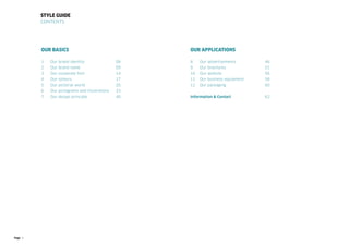
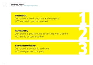
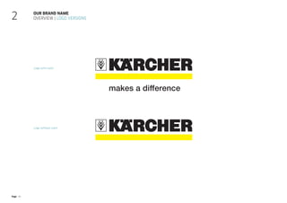
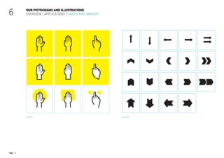
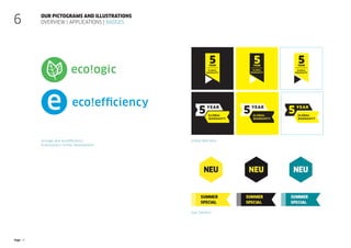
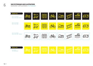
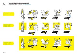
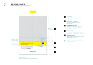
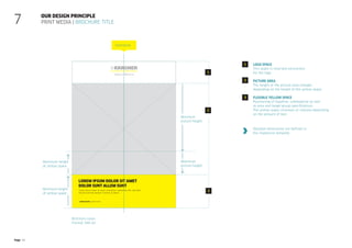
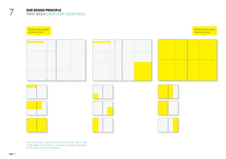
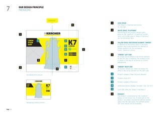
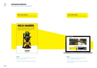
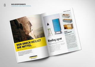
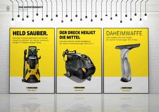
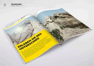
How to make
a difference
Our Brand Design
Status: 16. September 2014
Page 2
Our Basics
1 Our brand identity			 08
2 Our brand name			 09
3 Our corporate font			 14
4 Our colours			17
5 Our pictorial world			 20
6 Our pictograms and illustrations 33
7 Our design principle		 40
Style guide
Contents
Our applications
8 Our advertisements		 46
9 Our brochures			51
10 Our website			56
11 Our business equipment		 58
12 Our packaging			60
Information & Contact			 62
Page 3
Whether you start with
Mount Rushmore or your
own driveway – there are
many ways you can make
the world a little bit better.
Page 4
It is not just what you do that
counts. It is also how you do it.
That is why we design tools that
make a difference. For people
who make a difference every
day.
Page 5
We make every day
extraordinary. We make
everyday heroes.
Page 6
We make
everyday heroes
A strong joint
commitment
The three dimensions of importance:
Providing our customers with products they need
Appreciation of our employees
Excellent products and services
Our heritage as an engineer brand
“Can-do-Attitude”
Page 7
Our brand identity
Brand tonalities | How we make things
1
POWERFUL
Our brand is bold, decisive and energetic.
NOT uncertain and introverted.
REFRESHING
Our brand is positive and surprising with a smile.
NOT static or conservative.
STRAIGHTFORWARD
Our brand is authentic and clear.
NOT arrogant and complex.
Page 8
We want a world that shines – now and in the future.
We won’t achieve that by talking. But by doing.
We never stop working to make our design elements
as simple and efficient as our products. We’re always
powerful, refreshing, and straightforward. That’s how
we ensure results that are clean. And that applies to
our design as well.
OUR BRAND IDENTITY
WHAT WE STAND FOR
1
Page 9
TYPICAL KÄRCHER:
ALWAYS A
CLEAR MESSAGE.
OUR LOGO
2
Page 10
Our brand name
Overview | Logo versions
2
Logo with claim
Logo without claim
Page 11
The minimum protection zone around the logo with claim
is defined from the height of the capital letters of the brand name.
The minimum protection zone is 1K.
Our brand name
logo protection zone | Logo with claim
2
Page 12
The minimum protection zone around the logo without claim
is defined from the height of the capital letters of the brand name.
The minimum protection zone is 1K.
Our brand name
logo protection zone | Logo without claim
2
Page 13
Our brand name
Logo database
2
fileName
Kaercher
Logo
File specification
Claim
Logo with claim
Logo without claim
Colour
4C (four-colour print)
Black (1C Black)
White (1C White)
CO (Colour)
additional information
rgb (RGB Master file)
neg (Negative Version)
File format
eps
png
wmf
psd
Kaercher_Logo_claim_4C_neg.eps
The logo is available in two versions: with and without claim.
There are also three different colour versions:
 “4C” (Print) and “Colour” (Web and Office applications)
 “Black” and
 “White” with a bar under the brand name in the primary colour “Yellow”
The logo version primarily to be used is the defined 4C version with
brand name and logo in the primary colour “Black” and the bar in the
primary colour “Yellow”.
If the 4C version cannot be used, it is recommended to use the negative
­
version (brand name and logo in “White”, bar in “Yellow”). If these logo
­
versions cannot be used, it is recommended to use the “Black” or “White”
­version.
Defined in all files is a standard logo size with a width of 100 mm.
The logo database also contains different file formats: eps, jpg, png
and wmf.
Page 14
OUR PRODUCTS ARE
EFFICIENT, BUT AS QUIET
AS POSSIBLE.
THAT’S SOMETHING WE
CAN SAY LOUD AND CLEAR.
OUR TYPEFACE
3
Page 15
K7
Powerful, easy to read and versatile: Our corporate typeface
FF Clan Pro, designed by Lukasz Dziedzic, has character.
The modern Sans-Serif font accentuates our claims with a total
of seven styles and further narrow and condensed variants.
Our corporate typeface
FF Clan Pro
3
FF Clan Pro Narrow Black/FF Clan Pro Narrow Book
AaBbCcDdEeFfGgHh
1234567890?!
@€%¾§©®
FF Clan Pro
Headline (Print | Home & Garden indoor)
Narrow book
Copy texts (Print | Corporate,
Professional und Home & Garden) outdoor)
Book
Copy texts (Web)
News
Subheadline/Accentuations
(Print | Home & Garden indoor)
book/Medium
Headline (Print | Corporate, Professional
und Home & Garden outdoor)
Narrow Black
Subheadline/Accentuations
(Print | Corporate, Professional,
Home & Garden outdoor)
book/Bold
Medium
Headline 3, 4, 5, 6 (Web)
Narrow Black
Headline 1 (Web)
Headline 2 (Web)
Bold
Type font:
Page 16
Office and PowerPoint applications
Arial is defined as the substitute font for all Office applications
and PPT presentations. As a standard system font, it is available
on all computers and platforms worldwide.
Non-Latin alphabets
The following font is recommended for non-Latin text:
Cyrillic: Helvetica Neue LT
Our corporate typeface
Overview | Substitute fonts
3
Arial
AaBbCcDdEeFfGgHh
1234567890?!
@ €%¾§©®
Arial regular/italic
Arial bold/bold italic
Page 17
WITH YELLOW AND
BLACK, THERE’S NO ROOM
FOR EVERYDAY GREY.
OUR COLOURS
4
Page 18
Our colours
Overview
White
Black
Yellow
Petrol Olive Sand
Red Grey
4
The primary colours in our logo are “Yellow” and “White”.
Highlights are set by our five accent colours, which are defined in the following.
Page 19
PANTONE©
Yellow Basic
CMYK 0.0.100.0
RGB 255|236|0
HEX #FFDE00
HKS 3
RAL 1018 (zinc yellow matt)
3M Scotchcal Series 100 F-15
Yellow
petrol
PANTONE©
315 C
CMYK 80.30.35.0
RGB 35|140|150
90%
70%
50%
30%
10%
90% (HEX #2B2B2B)
70% (HEX #333333)
50% (HEX #757575)
30% (HEX #EDEDED)
10% (HEX #F8F8F8)
grey
PANTONE©
2334 C
CMYK 0.0.0.70
HEX #E3E3E3
RGB 110|110|110
90%
70%
50%
30%
10%
red
PANTONE©
7628 C
CMYK 30.100.80.0
RGB 182|26|45
CMYK
70.0.90.0
RAL
6018
Green Cyan
CMYK
85.19.0.0
RAL
2406040
90%
70%
50%
30%
10%
Sand
PANTONE©
414 C
CMYK 0.0.15.40
RGB 177|176|161
90%
70%
50%
30%
10%
olive
PANTONE©
5555 C
CMYK 55.0.50.40
RGB 75|137|105
Primary colours
Accent colours
Our colours
colour definition
Branding colour
PANTONE©
Black
CMYK 0.0.0.100
RGB 0|0|0
HEX #000000
HKS 8
RAL 9017 (traffic black)
Black
CMYK 0.0.0.0
RGB 255|255|255
HEX #FFFFFF
RAL 9010 (pure white)
White
4
Page 20
WE MAKE EVERYTHING
SHINE. THAT INCLUDES
OUR HEROES.
OUR IMAGERY
5
Page 21
Our solutions and services change the everyday lives of
our customers. Because we provide them with products
that enable them to make a real difference. Any time,
anywhere.
Our core message is reflected in our pictorial world:
“We make everyday heroes” means that our products,
customers and employees always come first. We are
proud of what we produce. And we also show it.
Our brand tonalities define what our pictures should
express:
Straightforward
Powerful
Refreshing
Our pictorial world
Introduction
5
Page 22
Straightforward
We are real, accessible and
straightforward and always
put people, products and
services first.
Our pictorial world
guide value | defined tonality definitions
5
Page 23
Refreshing
We always present our motives
with an element of surprise, exciting
and slightly exaggerated.
Our pictorial world
guide value | defined tonality definitions
5
Page 24
Powerful
We are proud of our products.
We like to show them – best of
all with a smile.
Our pictorial world
guide value | defined tonality definitions
5
Page 25
Our pictorial world
Formal criteria
We are contrast-rich, sharp, bold and frontal.
We use a slightly desaturated, but consistent
colour scheme and vibrant lighting across all
categories
5
Page 26
Our pictorial world
Picture categories
5
Communicative & brand characterising
Informative & explanatory
Our vision
Our target groups Our products
How we see the world.
 
Based on emotional,
metaphoric pictorial worlds
(Campaign)
 Landscapes (References)
 Architecture (References)
 
Person in room
 Portrait photos
What we provide.
 
Generous scenarios
(landscapes and architecture)
 
Persons (“heroes”, person in
room, person and product)
Product details.
 Product displays
 Product details
How we see our products.
 Product presentation
(Architecture and landscapes)
 
Product hero (product display
on a white platform with
yellow background)
Our products
References
Campaign Campaign, employees
Trade and industry Person and product
Person and product
Studio shot
Location shot Studio shot
Page 27
Our pictorial world
Picture categories | Communicative  Brand characterising | Our vision
5
Page 28
5 Our pictorial world
Picture categories | Communicative  Brand characterising | Our products
Studio shot
LOCATION shot
Products in the studio and location categories are always photographed confidently and
slightly exaggerated. Product form and details are emphasised by a high depth of focus and
detailed illumination to produce a slightly exaggerated effect.
For products in the studio category, the background is always one-colour in the primary ­
colour
“Yellow”. In addition, products are placed on a white platform (colour field in “White”).
For products in the location category, the background is always graphically reduced.
The platform can be presented with restrained image areas depending on the picture content.
Page 29
5 Our pictorial world
Picture categories | informative  explanatory | Our target groups
EXAMPLE: PROFESSIONAL
We present our products in generous, impressive scenarios.
Our main actors and products appear as heroes, whilst surrounding
elements and backgrounds are clear, graphic and reduced.
Page 30
5 Our pictorial world
Picture categories | informative  explanatory | “Everyday heroes”
Example: Everyday heroes
We present people confident, proud, credible and accessible – with
a smile. They stand as heroes centre stage – clear, graphic and reduced.
Page 31
Our pictorial world
Formal basic principle | Checklist
Slightly exaggerated
With a smile
Powerful
Straightforward
Refreshing
Formal criteria
Our vision Our products Our target groups
“Everyday heroes”
5
Real
Accessible
Uncomplicated
The following take centre stage:
people, products and services
Confident
Surprising
Exciting
Contrast-rich
High depth of focus
Bold
Desaturated
Consistent colour scheme
Vibrant light
Our target groups
Page 32
Our pictorial world
Formal basic principle | Picture composition and Perspective
5
Centreline
Image detail Image detail
Centreline
Image detail
Example of use in “Home  Garden”
advertisement DIN A4
Example of use in “Professional”
brochure DIN A4
Example of use in “Home  Garden””
poster DIN A1
Centreline
Page 33
A GLOBAL SYMBOL
AGAINST DIRT.
OUR PICTOGRAPHS
AND ILLUSTRATIONS
6
Page 34
Our pictograms and illustrations
Derivation | Form language
6
Formal style based on the logo
Angles, geometrical shapes, flatness
Formal style based on the new corporate typeface
FF CLAN PRO
KÄRCHER
ABCHKMNOX
Proportions
Weight of type differences
Pictorial world
 
The definition of the design elements is oriented on formal criteria for
the corporate typeface FF Clan Pro. Weight of type differences – as bold
­
outlines or thin lines for detailed presentations – are also an important
part of the design.
 
All pictograms and illustrations are two-dimensional and dispense with
three-dimensional or plastic effects.
 
Primarily used are the defined primary colours “Yellow”, “Black”
and “White”, whereby the accent colours are only used to a limited
extent for illustrations. The branding colours “Green” and “Cyan”
are only used for eco!ogic and eco!efficiency badges.
Page 35
Our pictograms and illustrations
Overview | basic modules
6
COMMUNICATIVE ELEMENTS (FOR EXAMPLE SPEECH BUBBLES)
ACCENTUATIONS (FOR EXAMPLE EMBLEM)
DIRECTION (FOR EXAMPLE ARROWS)
+
+
+
+
Page 36
Our pictograms and illustrations
Overview | Applications | Hands and arrows
6
Hands Arrows
Page 37
Our pictograms and illustrations
Overview | Applications | Badges
6
Global Warranty
GlOBAl
wArrAntY
GlOBAl
wArrAntY
GlOBAl
wArrAntY
eco!ogic and eco!efficiency:
Evolutionary further development
eco!efficiency
eco!ogic
Eye Catchers
Page 38
Special case
Our pictograms and illustrations
Overview | Applications | Pictograms
6
Use in all media
Use on the web: “Active”
Packaging:
“Not applicable”
Use in all media
Use on the web: —
Use in all media
Use on the web: “Default”
Primary use
Page 39
1. Background: “White”
Product: “White”
Highlight: “Yellow”
2. Background: “Yellow”
Product: “White”
Highlight: “Yellow”
3. Background: “Yellow”
Product: “White”
Highlight: “Yellow”
empTYing
300 W
Our pictograms and illustrations
Overview | Applications | Illustrations
6
cLeaning
cLeaning
cLeaning
empTYing
empTYing
BrUshing
BrUshing
Br
300 W
300 W
BrUshing
Page 40
WE STAND FOR
CLEAN SOLUTIONS.
IN OUR DESIGN
AS WELL.
OUR DESIGN PRINCIPLE
7
Page 41
Our design principle
Print media | Advertisements
7
Format: DIN A4
(Home  Garden indoor with product feature)
Minimum
picture height
Maximum
picture height
Maximum height
of yellow space
Centreline
Minimum height
of yellow space
Logo space
This space is reserved exclusively
for the logo.
White space “Platform”
This space is reserved exclusively
for copy texts.
Flexible yellow space
Positioning of headline, subheadline.
The yellow space increases or reduces
depending on the amount of text.
Picture area
The height of the picture area changes
depending on the height of the yellow space.
Product feature
Advertisements can be designed with and
without product feature.
1
1
4
3
4
5
5
2
2
3
Detailed dimensions are defined in the
respective template.
Page 42
Our design principle
Print media | Brochure title
7
Brochure cover
Format: DIN A4
Minimum
picture height
Maximum
picture height
Minimum height
of yellow space
Centreline
Maximum height
of yellow space
Logo space
This space is reserved exclusively
for the logo.
Picture area
The height of the picture area changes
depending on the height of the yellow space.
Flexible yellow space
Positioning of headline, subheadline as well
as area and target group specifications.
The yellow space increases or reduces depending
on the amount of text.
1
2
3
3
2
1
Detailed dimensions are defined in
the respective template.
Page 43
Our design principle
Print media | Brochure inside pages
7
The yellow space is also decisive for the Kärcher look on the
inside pages in all formats. It increases or reduces depending
on the pictorial and text contents.
Flexible yellow space
(minimum size)
Flexible yellow space
(maximum size)
Page 44
Our design principle
Packaging
7
Logo space
This space is reserved exclusively
for the logo.
White space “Platform”
Positioning of the product always takes
place on the “platform”. In addition, further
icons such as QR code or “Made in Germany”
can be positioned here.
Yellow space and design element “Arrow”
In addition to the yellow space in the back-
ground, two arrow elements are defined as
design elements for the packaging.
Colour: Yellow on yellow.
“Arrow” left side
An image can be placed in the arrow element
on the left side if required. The product name
is shown at the top of the arrow on a black
background.
“Arrow” right side
All product details are listed one below the
other in the arrow element on the right side.
Product category (High Pressure Washer)
Product name (K7)
Product category (Premium)
Additional details (Badges “eco!ogic” and “Car Kit”)
Icons (QR Code and “Made in Germany”)
Product
The product is positioned on the “platform” –
always on the centre line. A small part of the
product can project beyond the defined yellow
space into the logo space. The defined protec-
tion zone should not be exceeded.
1
3
4
5
1
2
3
4
5
6
2
Packaging with picture
Packaging without picture
Lorem
K7
+ lorem
+ dolor
www.kaercher.com/K7
Made in Germany
1
3
4
4
5
6
2
5
3
lorem
ipsum
sunt
Centreline
4 5
1 2
eco!ogic
Lorem
K7
+ lorem
+ dolor
lorem
ipsum
sunt
eco!ogic
Page 45
Our design principle
Yellow content in the media
7
High yellow content
Maximum attention for the “Kärcher” brand.
Low yellow content
Ensure clear communication of information.
Media
Kärcher is in direct competition and must be
bold and eye-catching.
Example: Fair, POS, Packaging, Sponsoring, ATL
Media
Kärcher provides detailed information about
the brand, product and services.
Example: Website, editorials, business equipment,
building signage
Page 46
HEROES OFTEN STAY
IN THE BACKGROUND.
WE PUT THEM
CENTRE STAGE.
OUR ADVERTISEMENTS
8
Page 47
8 Our advertisements
Corporate und Professional
Page 48
8 Our advertisements
Home  Garden | Outdoor
Page 49
Our advertisements
Home Garden | Indoor
8
Page 50
8 Our advertisements
Posters
Page 51
EVERYTHING ABOUT
US IS CLEAR AND CLEAN.
THAT INCLUDES OUR
LAYOUTS.
OUR BROCHURES
9
Page 52
Our brochures
COVER PAGES | DIN A4 and DIN long
9
Page 53
Our brochures
INSIDE PAGES | DIN A4
9
Page 54
Our brochures
INSIDE PAGES | DIN A4
9
Page 55
Our brochures
Home Garden indoor | Inside pages
9
Page 56
ALWAYS SHOWING
THE BEST SIDES.
OUR WEBSITE
10
Page 57
Our website
Responsive design
10
Page 58
OUR STANDARDS
USUALLY DON’T FIT
INTO A DRAWER.
BUT THIS TIME THEY DO.
OUR STATIONERY
11
Page 59
Our business equipment
Writing paper, BUSINESS CARD, postcard
11
Page 60
Clean results
from any angle.
OUR PACKAGING
12
Page 61
Our packaging
Landscape and portrait format
12
Page 63
Make a difference!
Thank you.

Lineamiento de marca de la marca Karcher

  • 1.
    How to make adifference Our Brand Design Status: 16. September 2014
  • 2.
    Page 2 Our Basics 1Our brand identity 08 2 Our brand name 09 3 Our corporate font 14 4 Our colours 17 5 Our pictorial world 20 6 Our pictograms and illustrations 33 7 Our design principle 40 Style guide Contents Our applications 8 Our advertisements 46 9 Our brochures 51 10 Our website 56 11 Our business equipment 58 12 Our packaging 60 Information & Contact 62
  • 3.
    Page 3 Whether youstart with Mount Rushmore or your own driveway – there are many ways you can make the world a little bit better.
  • 4.
    Page 4 It isnot just what you do that counts. It is also how you do it. That is why we design tools that make a difference. For people who make a difference every day.
  • 5.
    Page 5 We makeevery day extraordinary. We make everyday heroes.
  • 6.
    Page 6 We make everydayheroes A strong joint commitment The three dimensions of importance: Providing our customers with products they need Appreciation of our employees Excellent products and services Our heritage as an engineer brand “Can-do-Attitude”
  • 7.
    Page 7 Our brandidentity Brand tonalities | How we make things 1 POWERFUL Our brand is bold, decisive and energetic. NOT uncertain and introverted. REFRESHING Our brand is positive and surprising with a smile. NOT static or conservative. STRAIGHTFORWARD Our brand is authentic and clear. NOT arrogant and complex.
  • 8.
    Page 8 We wanta world that shines – now and in the future. We won’t achieve that by talking. But by doing. We never stop working to make our design elements as simple and efficient as our products. We’re always powerful, refreshing, and straightforward. That’s how we ensure results that are clean. And that applies to our design as well. OUR BRAND IDENTITY WHAT WE STAND FOR 1
  • 9.
    Page 9 TYPICAL KÄRCHER: ALWAYSA CLEAR MESSAGE. OUR LOGO 2
  • 10.
    Page 10 Our brandname Overview | Logo versions 2 Logo with claim Logo without claim
  • 11.
    Page 11 The minimumprotection zone around the logo with claim is defined from the height of the capital letters of the brand name. The minimum protection zone is 1K. Our brand name logo protection zone | Logo with claim 2
  • 12.
    Page 12 The minimumprotection zone around the logo without claim is defined from the height of the capital letters of the brand name. The minimum protection zone is 1K. Our brand name logo protection zone | Logo without claim 2
  • 13.
    Page 13 Our brandname Logo database 2 fileName Kaercher Logo File specification Claim Logo with claim Logo without claim Colour 4C (four-colour print) Black (1C Black) White (1C White) CO (Colour) additional information rgb (RGB Master file) neg (Negative Version) File format eps png wmf psd Kaercher_Logo_claim_4C_neg.eps The logo is available in two versions: with and without claim. There are also three different colour versions:  “4C” (Print) and “Colour” (Web and Office applications)  “Black” and  “White” with a bar under the brand name in the primary colour “Yellow” The logo version primarily to be used is the defined 4C version with brand name and logo in the primary colour “Black” and the bar in the primary colour “Yellow”. If the 4C version cannot be used, it is recommended to use the negative ­ version (brand name and logo in “White”, bar in “Yellow”). If these logo ­ versions cannot be used, it is recommended to use the “Black” or “White” ­version. Defined in all files is a standard logo size with a width of 100 mm. The logo database also contains different file formats: eps, jpg, png and wmf.
  • 14.
    Page 14 OUR PRODUCTSARE EFFICIENT, BUT AS QUIET AS POSSIBLE. THAT’S SOMETHING WE CAN SAY LOUD AND CLEAR. OUR TYPEFACE 3
  • 15.
    Page 15 K7 Powerful, easyto read and versatile: Our corporate typeface FF Clan Pro, designed by Lukasz Dziedzic, has character. The modern Sans-Serif font accentuates our claims with a total of seven styles and further narrow and condensed variants. Our corporate typeface FF Clan Pro 3 FF Clan Pro Narrow Black/FF Clan Pro Narrow Book AaBbCcDdEeFfGgHh 1234567890?! @€%¾§©® FF Clan Pro Headline (Print | Home & Garden indoor) Narrow book Copy texts (Print | Corporate, Professional und Home & Garden) outdoor) Book Copy texts (Web) News Subheadline/Accentuations (Print | Home & Garden indoor) book/Medium Headline (Print | Corporate, Professional und Home & Garden outdoor) Narrow Black Subheadline/Accentuations (Print | Corporate, Professional, Home & Garden outdoor) book/Bold Medium Headline 3, 4, 5, 6 (Web) Narrow Black Headline 1 (Web) Headline 2 (Web) Bold Type font:
  • 16.
    Page 16 Office andPowerPoint applications Arial is defined as the substitute font for all Office applications and PPT presentations. As a standard system font, it is available on all computers and platforms worldwide. Non-Latin alphabets The following font is recommended for non-Latin text: Cyrillic: Helvetica Neue LT Our corporate typeface Overview | Substitute fonts 3 Arial AaBbCcDdEeFfGgHh 1234567890?! @ €%¾§©® Arial regular/italic Arial bold/bold italic
  • 17.
    Page 17 WITH YELLOWAND BLACK, THERE’S NO ROOM FOR EVERYDAY GREY. OUR COLOURS 4
  • 18.
    Page 18 Our colours Overview White Black Yellow PetrolOlive Sand Red Grey 4 The primary colours in our logo are “Yellow” and “White”. Highlights are set by our five accent colours, which are defined in the following.
  • 19.
    Page 19 PANTONE© Yellow Basic CMYK0.0.100.0 RGB 255|236|0 HEX #FFDE00 HKS 3 RAL 1018 (zinc yellow matt) 3M Scotchcal Series 100 F-15 Yellow petrol PANTONE© 315 C CMYK 80.30.35.0 RGB 35|140|150 90% 70% 50% 30% 10% 90% (HEX #2B2B2B) 70% (HEX #333333) 50% (HEX #757575) 30% (HEX #EDEDED) 10% (HEX #F8F8F8) grey PANTONE© 2334 C CMYK 0.0.0.70 HEX #E3E3E3 RGB 110|110|110 90% 70% 50% 30% 10% red PANTONE© 7628 C CMYK 30.100.80.0 RGB 182|26|45 CMYK 70.0.90.0 RAL 6018 Green Cyan CMYK 85.19.0.0 RAL 2406040 90% 70% 50% 30% 10% Sand PANTONE© 414 C CMYK 0.0.15.40 RGB 177|176|161 90% 70% 50% 30% 10% olive PANTONE© 5555 C CMYK 55.0.50.40 RGB 75|137|105 Primary colours Accent colours Our colours colour definition Branding colour PANTONE© Black CMYK 0.0.0.100 RGB 0|0|0 HEX #000000 HKS 8 RAL 9017 (traffic black) Black CMYK 0.0.0.0 RGB 255|255|255 HEX #FFFFFF RAL 9010 (pure white) White 4
  • 20.
    Page 20 WE MAKEEVERYTHING SHINE. THAT INCLUDES OUR HEROES. OUR IMAGERY 5
  • 21.
    Page 21 Our solutionsand services change the everyday lives of our customers. Because we provide them with products that enable them to make a real difference. Any time, anywhere. Our core message is reflected in our pictorial world: “We make everyday heroes” means that our products, customers and employees always come first. We are proud of what we produce. And we also show it. Our brand tonalities define what our pictures should express: Straightforward Powerful Refreshing Our pictorial world Introduction 5
  • 22.
    Page 22 Straightforward We arereal, accessible and straightforward and always put people, products and services first. Our pictorial world guide value | defined tonality definitions 5
  • 23.
    Page 23 Refreshing We alwayspresent our motives with an element of surprise, exciting and slightly exaggerated. Our pictorial world guide value | defined tonality definitions 5
  • 24.
    Page 24 Powerful We areproud of our products. We like to show them – best of all with a smile. Our pictorial world guide value | defined tonality definitions 5
  • 25.
    Page 25 Our pictorialworld Formal criteria We are contrast-rich, sharp, bold and frontal. We use a slightly desaturated, but consistent colour scheme and vibrant lighting across all categories 5
  • 26.
    Page 26 Our pictorialworld Picture categories 5 Communicative & brand characterising Informative & explanatory Our vision Our target groups Our products How we see the world.  Based on emotional, metaphoric pictorial worlds (Campaign)  Landscapes (References)  Architecture (References)  Person in room  Portrait photos What we provide.  Generous scenarios (landscapes and architecture)  Persons (“heroes”, person in room, person and product) Product details.  Product displays  Product details How we see our products.  Product presentation (Architecture and landscapes)  Product hero (product display on a white platform with yellow background) Our products References Campaign Campaign, employees Trade and industry Person and product Person and product Studio shot Location shot Studio shot
  • 27.
    Page 27 Our pictorialworld Picture categories | Communicative Brand characterising | Our vision 5
  • 28.
    Page 28 5 Ourpictorial world Picture categories | Communicative Brand characterising | Our products Studio shot LOCATION shot Products in the studio and location categories are always photographed confidently and slightly exaggerated. Product form and details are emphasised by a high depth of focus and detailed illumination to produce a slightly exaggerated effect. For products in the studio category, the background is always one-colour in the primary ­ colour “Yellow”. In addition, products are placed on a white platform (colour field in “White”). For products in the location category, the background is always graphically reduced. The platform can be presented with restrained image areas depending on the picture content.
  • 29.
    Page 29 5 Ourpictorial world Picture categories | informative explanatory | Our target groups EXAMPLE: PROFESSIONAL We present our products in generous, impressive scenarios. Our main actors and products appear as heroes, whilst surrounding elements and backgrounds are clear, graphic and reduced.
  • 30.
    Page 30 5 Ourpictorial world Picture categories | informative explanatory | “Everyday heroes” Example: Everyday heroes We present people confident, proud, credible and accessible – with a smile. They stand as heroes centre stage – clear, graphic and reduced.
  • 31.
    Page 31 Our pictorialworld Formal basic principle | Checklist Slightly exaggerated With a smile Powerful Straightforward Refreshing Formal criteria Our vision Our products Our target groups “Everyday heroes” 5 Real Accessible Uncomplicated The following take centre stage: people, products and services Confident Surprising Exciting Contrast-rich High depth of focus Bold Desaturated Consistent colour scheme Vibrant light Our target groups
  • 32.
    Page 32 Our pictorialworld Formal basic principle | Picture composition and Perspective 5 Centreline Image detail Image detail Centreline Image detail Example of use in “Home Garden” advertisement DIN A4 Example of use in “Professional” brochure DIN A4 Example of use in “Home Garden”” poster DIN A1 Centreline
  • 33.
    Page 33 A GLOBALSYMBOL AGAINST DIRT. OUR PICTOGRAPHS AND ILLUSTRATIONS 6
  • 34.
    Page 34 Our pictogramsand illustrations Derivation | Form language 6 Formal style based on the logo Angles, geometrical shapes, flatness Formal style based on the new corporate typeface FF CLAN PRO KÄRCHER ABCHKMNOX Proportions Weight of type differences Pictorial world  The definition of the design elements is oriented on formal criteria for the corporate typeface FF Clan Pro. Weight of type differences – as bold ­ outlines or thin lines for detailed presentations – are also an important part of the design.  All pictograms and illustrations are two-dimensional and dispense with three-dimensional or plastic effects.  Primarily used are the defined primary colours “Yellow”, “Black” and “White”, whereby the accent colours are only used to a limited extent for illustrations. The branding colours “Green” and “Cyan” are only used for eco!ogic and eco!efficiency badges.
  • 35.
    Page 35 Our pictogramsand illustrations Overview | basic modules 6 COMMUNICATIVE ELEMENTS (FOR EXAMPLE SPEECH BUBBLES) ACCENTUATIONS (FOR EXAMPLE EMBLEM) DIRECTION (FOR EXAMPLE ARROWS) + + + +
  • 36.
    Page 36 Our pictogramsand illustrations Overview | Applications | Hands and arrows 6 Hands Arrows
  • 37.
    Page 37 Our pictogramsand illustrations Overview | Applications | Badges 6 Global Warranty GlOBAl wArrAntY GlOBAl wArrAntY GlOBAl wArrAntY eco!ogic and eco!efficiency: Evolutionary further development eco!efficiency eco!ogic Eye Catchers
  • 38.
    Page 38 Special case Ourpictograms and illustrations Overview | Applications | Pictograms 6 Use in all media Use on the web: “Active” Packaging: “Not applicable” Use in all media Use on the web: — Use in all media Use on the web: “Default” Primary use
  • 39.
    Page 39 1. Background:“White” Product: “White” Highlight: “Yellow” 2. Background: “Yellow” Product: “White” Highlight: “Yellow” 3. Background: “Yellow” Product: “White” Highlight: “Yellow” empTYing 300 W Our pictograms and illustrations Overview | Applications | Illustrations 6 cLeaning cLeaning cLeaning empTYing empTYing BrUshing BrUshing Br 300 W 300 W BrUshing
  • 40.
    Page 40 WE STANDFOR CLEAN SOLUTIONS. IN OUR DESIGN AS WELL. OUR DESIGN PRINCIPLE 7
  • 41.
    Page 41 Our designprinciple Print media | Advertisements 7 Format: DIN A4 (Home Garden indoor with product feature) Minimum picture height Maximum picture height Maximum height of yellow space Centreline Minimum height of yellow space Logo space This space is reserved exclusively for the logo. White space “Platform” This space is reserved exclusively for copy texts. Flexible yellow space Positioning of headline, subheadline. The yellow space increases or reduces depending on the amount of text. Picture area The height of the picture area changes depending on the height of the yellow space. Product feature Advertisements can be designed with and without product feature. 1 1 4 3 4 5 5 2 2 3 Detailed dimensions are defined in the respective template.
  • 42.
    Page 42 Our designprinciple Print media | Brochure title 7 Brochure cover Format: DIN A4 Minimum picture height Maximum picture height Minimum height of yellow space Centreline Maximum height of yellow space Logo space This space is reserved exclusively for the logo. Picture area The height of the picture area changes depending on the height of the yellow space. Flexible yellow space Positioning of headline, subheadline as well as area and target group specifications. The yellow space increases or reduces depending on the amount of text. 1 2 3 3 2 1 Detailed dimensions are defined in the respective template.
  • 43.
    Page 43 Our designprinciple Print media | Brochure inside pages 7 The yellow space is also decisive for the Kärcher look on the inside pages in all formats. It increases or reduces depending on the pictorial and text contents. Flexible yellow space (minimum size) Flexible yellow space (maximum size)
  • 44.
    Page 44 Our designprinciple Packaging 7 Logo space This space is reserved exclusively for the logo. White space “Platform” Positioning of the product always takes place on the “platform”. In addition, further icons such as QR code or “Made in Germany” can be positioned here. Yellow space and design element “Arrow” In addition to the yellow space in the back- ground, two arrow elements are defined as design elements for the packaging. Colour: Yellow on yellow. “Arrow” left side An image can be placed in the arrow element on the left side if required. The product name is shown at the top of the arrow on a black background. “Arrow” right side All product details are listed one below the other in the arrow element on the right side. Product category (High Pressure Washer) Product name (K7) Product category (Premium) Additional details (Badges “eco!ogic” and “Car Kit”) Icons (QR Code and “Made in Germany”) Product The product is positioned on the “platform” – always on the centre line. A small part of the product can project beyond the defined yellow space into the logo space. The defined protec- tion zone should not be exceeded. 1 3 4 5 1 2 3 4 5 6 2 Packaging with picture Packaging without picture Lorem K7 + lorem + dolor www.kaercher.com/K7 Made in Germany 1 3 4 4 5 6 2 5 3 lorem ipsum sunt Centreline 4 5 1 2 eco!ogic Lorem K7 + lorem + dolor lorem ipsum sunt eco!ogic
  • 45.
    Page 45 Our designprinciple Yellow content in the media 7 High yellow content Maximum attention for the “Kärcher” brand. Low yellow content Ensure clear communication of information. Media Kärcher is in direct competition and must be bold and eye-catching. Example: Fair, POS, Packaging, Sponsoring, ATL Media Kärcher provides detailed information about the brand, product and services. Example: Website, editorials, business equipment, building signage
  • 46.
    Page 46 HEROES OFTENSTAY IN THE BACKGROUND. WE PUT THEM CENTRE STAGE. OUR ADVERTISEMENTS 8
  • 47.
    Page 47 8 Ouradvertisements Corporate und Professional
  • 48.
    Page 48 8 Ouradvertisements Home Garden | Outdoor
  • 49.
  • 50.
    Page 50 8 Ouradvertisements Posters
  • 51.
    Page 51 EVERYTHING ABOUT USIS CLEAR AND CLEAN. THAT INCLUDES OUR LAYOUTS. OUR BROCHURES 9
  • 52.
    Page 52 Our brochures COVERPAGES | DIN A4 and DIN long 9
  • 53.
  • 54.
  • 55.
    Page 55 Our brochures Home Gardenindoor | Inside pages 9
  • 56.
    Page 56 ALWAYS SHOWING THEBEST SIDES. OUR WEBSITE 10
  • 57.
  • 58.
    Page 58 OUR STANDARDS USUALLYDON’T FIT INTO A DRAWER. BUT THIS TIME THEY DO. OUR STATIONERY 11
  • 59.
    Page 59 Our businessequipment Writing paper, BUSINESS CARD, postcard 11
  • 60.
    Page 60 Clean results fromany angle. OUR PACKAGING 12
  • 61.
    Page 61 Our packaging Landscapeand portrait format 12
  • 62.
    Page 63 Make adifference! Thank you.