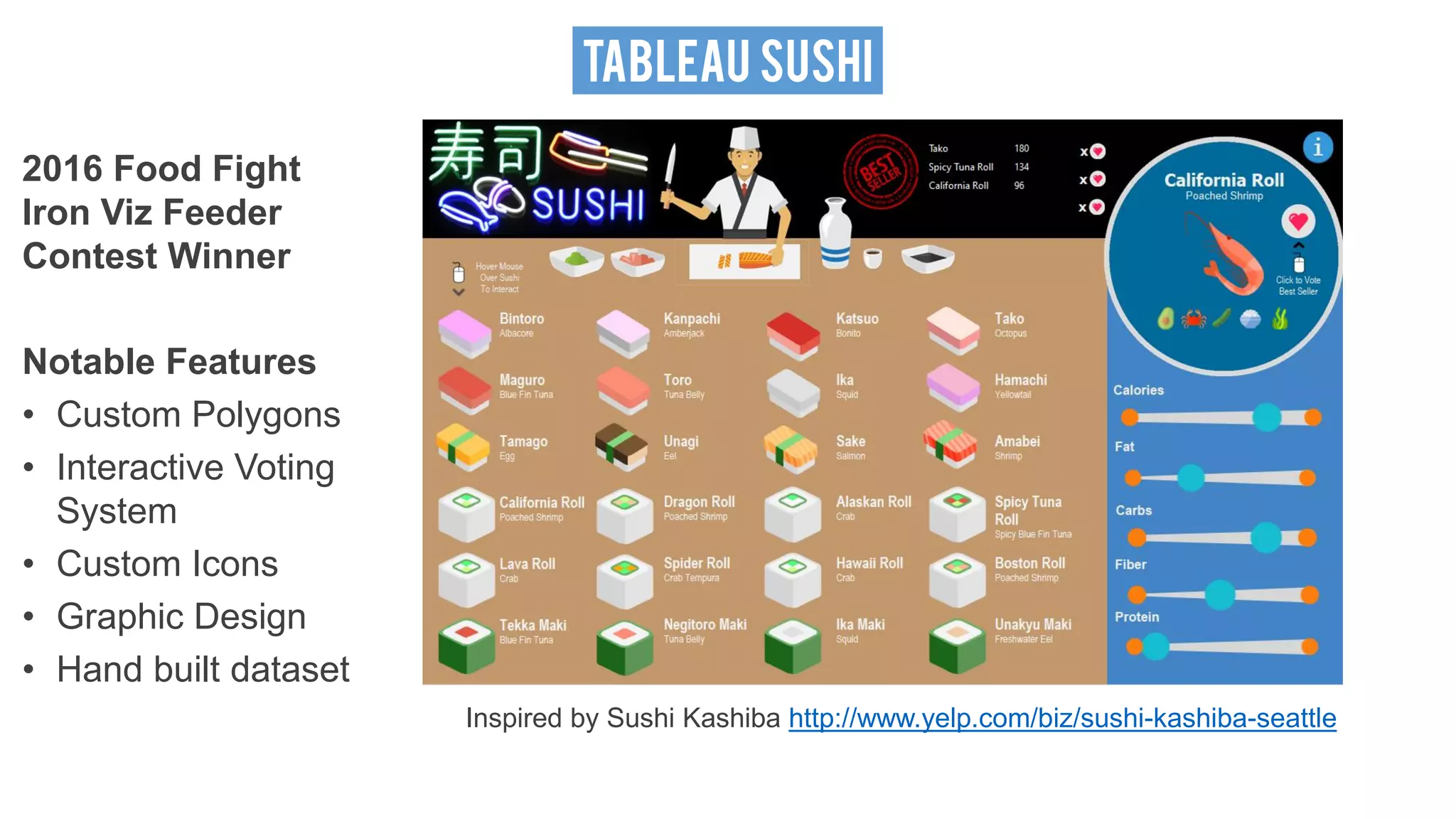
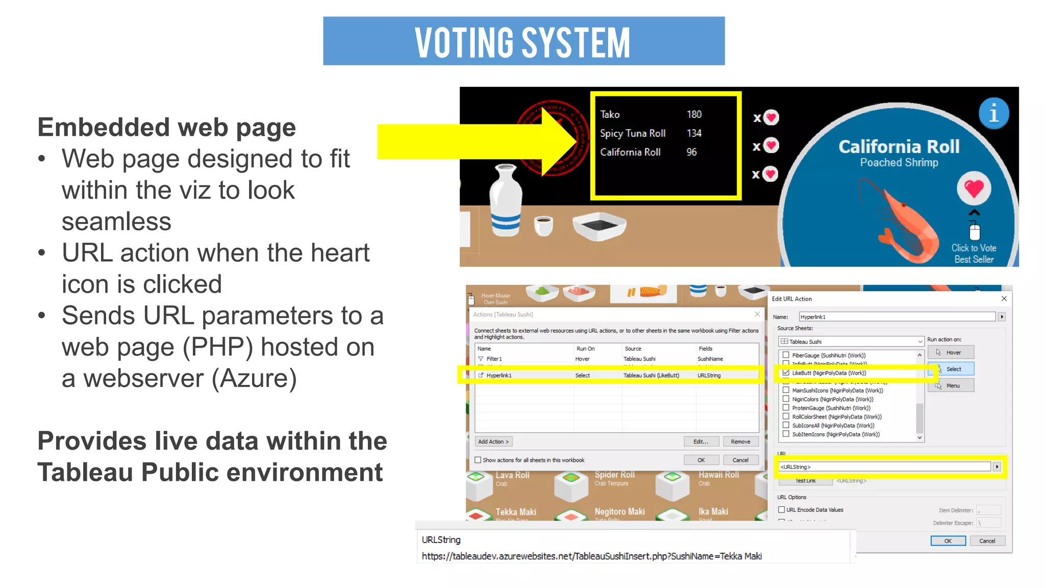
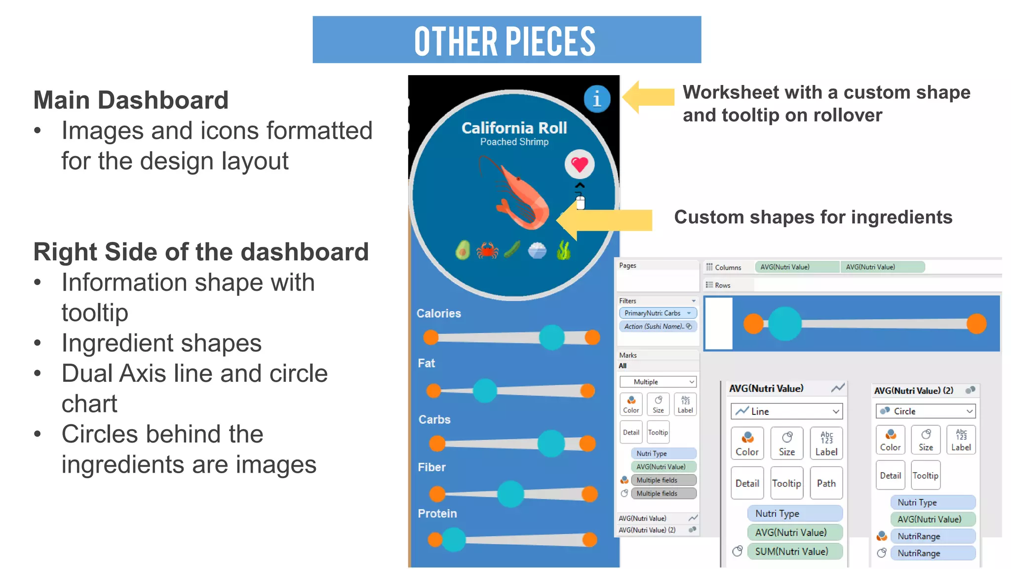
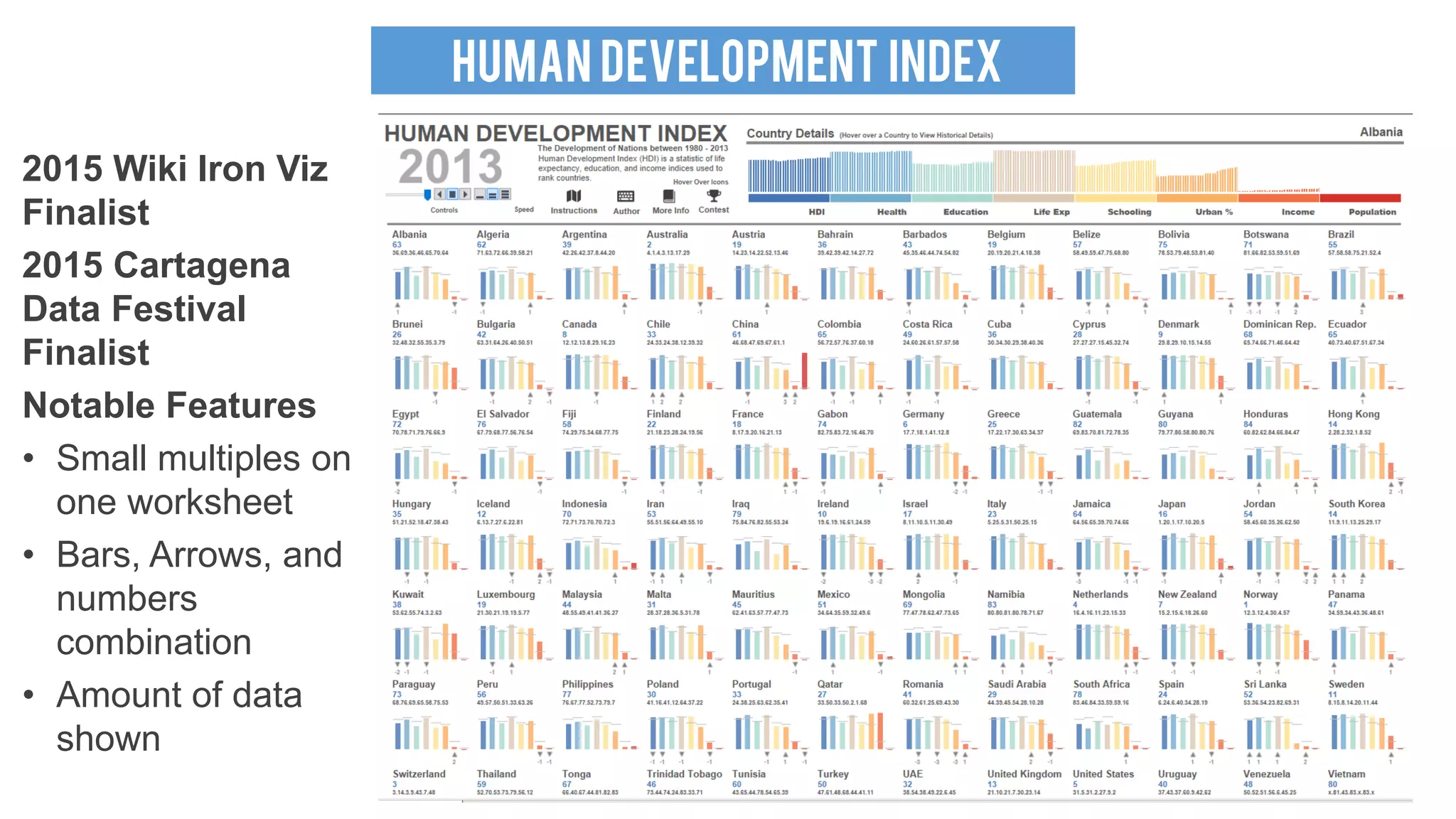
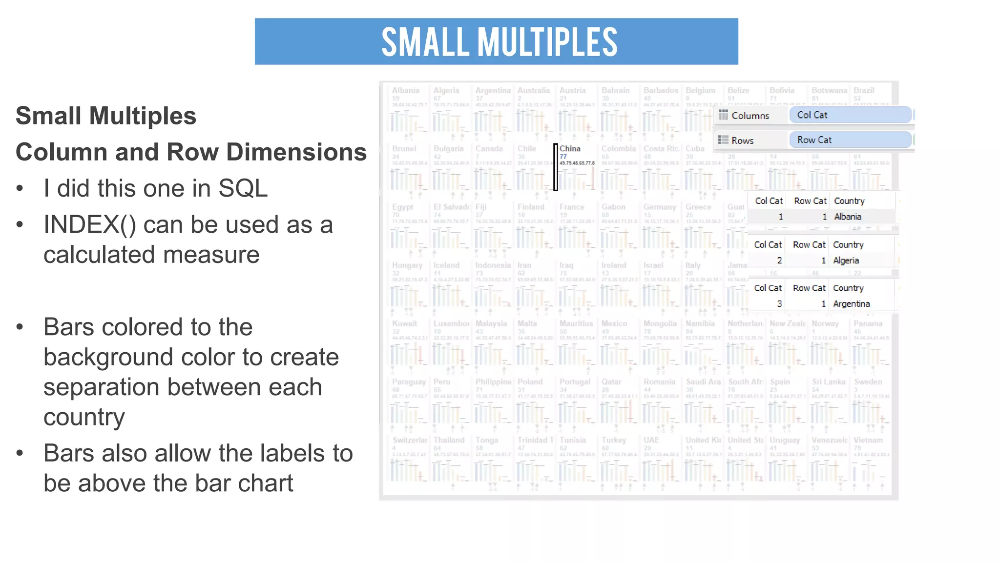
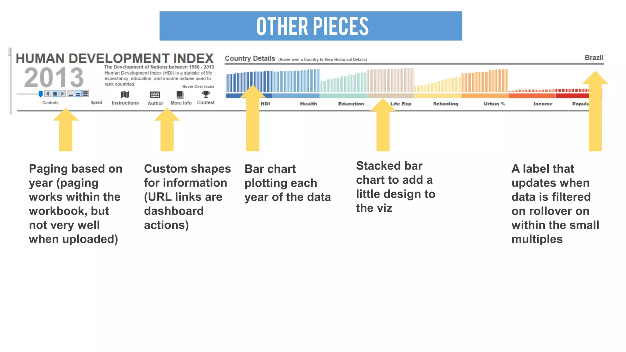
London Tableau User Group November 2017 Presentation - How To Build Tableau T...Russell Spangler
I cover the topic of how to build my Sushi viz (2016 Iron Viz qualifier winner) and my Tiger Viz (2017 Information is beautiful short listed).
Webinar recording on the workplace page for London TUG. https://t.co/TYGyWIXupP
Data Visualization - UC Analytics Conference 2018Russell Spangler
Data visualization presentation provided during the University of Cincinnati Data and Analytics conference. Discusses how to build out a data visualization group from scratch.
Design Principles of Excel Dashboards & ReportsWiley
Get yourself into a dashboard state of mine with these best practices for Excel dashboards and reports.
Content from Excel Dashboards & Reports For Dummies by Michael Alexander. Learn more: http://bit.ly/FDExcelDashboards
and
SalesForce.com For Dummies by Tom Wong, Liz Kao, Matt Kaufma. Learn more: http://bit.ly/ForDummiesSF
A table is a data structure that organizes information into rows and columns. A convenient and accessible way of displaying data.
The arrangement of data in rows and columns so that information can be quickly accessed on the table and to reduce visual noise.
Tableau online training and tableau desktop , tableau admin
tableau certification, tableau interview questions, tableau training institutes in hyderabad, tableau training institutes in Bangalore
Tableau Tutorial For Beginners | Tableau Training For Beginners | Tableau Cer...Edureka!
This Edureka Tableau Tutorial (Tableau Tutorial Blog: https://goo.gl/DaqKvp) helps you understand about Tableau in detail. This Tableau Tutorial is ideal for both beginners as well as professionals who want to master up their Tableau concepts.
This Edureka Tableau Tutorial provides knowledge on what Business Intelligence is and get an introduction to Tableau as well.This Tableau tutorial also gives a sample use case using a data set containing state wise population and crime rate, to create a Horizontal bar graph and Symbol map to represent the data.
2012 SAIR The Pie Maker - Automating the Fact Book Creation ProcessDavid Onder
SAIR presentation on redesign of university fact book using refreshable Excel files. Included discussion of structure and process of generating reports. Presenters: David Onder and Alison Joseph (Business Analyst)
Tableau Training For Beginners | Tableau Tutorial | Tableau Dashboard | EdurekaEdureka!
This Edureka Tableau Training for beginners (Tableau Tutorial Blog: https://goo.gl/DaqKvp) helps you understand about Tableau in detail. It provides knowledge on what Business Intelligence is and get an introduction to Tableau as well. This Tableau tutorial also gives a sample use case using a data set containing state wise population and crime rate, to create a Horizontal bar graph and Symbol map to represent the data.
Interactive data visualization products focused on business intelligence. Data Visualization and Communication. Tableau is considered a leader in the field of data discovery.
Tableau products are designed and built to meet the critical needs of the digital forensic community world-wide.
Visually Localizing Design Problems with Disharmony MapsRichard Wettel
Localizing design problems in a code city, by mapping the results of detection strategies. Presented at Softvis 2008 (Herrsching, Germany), September 2008.
Define insurance.
Differentiate between compulsory and non-compulsory insurance
Why would businesses need insurance
Difference between insurance and assurance
principles of insurance
Concepts in insurance
Grade 12 subject content
Seminario eMadrid sobre "Inteligencia natural y artificial en educación". Int...eMadrid network
Seminario eMadrid sobre "Inteligencia natural y artificial en educación". Inteligencia artificial como un asistente eficaz en clase. Benedict du Boulay. Universidad de Sussex. 17/03/2017.
PLOTCON NYC: The Architecture of Jupyter: Protocols for Interactive Data Expl...Plotly
Project Jupyter, evolved from the IPython environment, provides a platform for interactive computing that is widely used today in research, education, journalism and industry. The core premise of the Jupyter architecture is to design tools around the experience of interactive computing, building an environment, protocol, file format and libraries optimized for the computational process when there is a human in the loop, in a live iteration with ideas and data assisted by the computer.
In this talk, I will discuss what are the basic ideas that underpin Jupyter, and how they provide "lego blocks" that enable the project team, and the broader community, to develop a variety of tools and approaches to problems in interactive computing, data science, visualization and more.
Even though exploring data visually is an integral part of the data analytic pipeline, we struggle to visually explore data once the number of dimensions go beyond three. This talk will focus on showcasing techniques to visually explore multi dimensional data p 3. The aim would be show examples of each of following techniques, potentially using one exemplar dataset. This talk was given at the Strata + Hadoop World Conference @ Singapore 2015 and at Fifth Elephant conference @ Bangalore, 2015
The slide deck for my presentation at the Vancouver PowerBI user group September 2017. Latest and updates in PowerBI - PAge drill, Ribbon, colorful visuals. Custom Visual gallery and comparing 20 custom visuals. The Reports can be found int he Data Story Gallery: https://community.powerbi.com/t5/Data-Stories-The Anime Example: https://community.powerbi.com/t5/Data-Stories-Gallery/Anime-Rating/m-p/252271
The fish example: https://community.powerbi.com/t5/Data-Stories-Gallery/Fish/m-p/251903
The You tube video (45 min of a 60 min lecture): https://www.youtube.com/watch?v=aigmvBp-uX4&t=3s
Seattle DAA - Data Visualization - Russell Spangler December 2019 Russell Spangler
I presented at the Seattle DAA conference on Microsoft's conference. Presentation goes over principals and tips of data visualization and talks about inspiration on how to build awesome visuals!
The Pequonnock River Trail is 16 mile multi-use linear trail that runs from Bridgeport through Trumbull to Monroe in Connecticut and was planned by MetroCog thorough a coordinated effort with municipalities and the state.
MetroCog’s GIS team worked consultatively with a graphic designer to customize its GIS processes to create a vector file that is easy to stylize in Adobe Illustrator so that a print map could be produced. Through trial and error, the team found keys to GIS setup that are now utilized for any product for which a print map will be produced in the future. The team also setup a dynamic interactive storymap for use on the trail’s website.
This presentation provides and overview of what was discovered and how to customize any map setup in GIS to produce similar results.
This session will show some useful data visualisation tips and how they can be used in Oracle Business Intelligence and Data Visualization Cloud Services
An introduction to data presentation, manipulation and analysis techniques in Microsoft Excel. Session for undergraduate students as part of the Library's In The Zone programme.
www.lancaster.ac.uk/library/in-the-zone/
Similar to SeaTug Presentation (Viz & Share) Seattle Tableau User Group (20)
Adjusting primitives for graph : SHORT REPORT / NOTESSubhajit Sahu
Graph algorithms, like PageRank Compressed Sparse Row (CSR) is an adjacency-list based graph representation that is
Multiply with different modes (map)
1. Performance of sequential execution based vs OpenMP based vector multiply.
2. Comparing various launch configs for CUDA based vector multiply.
Sum with different storage types (reduce)
1. Performance of vector element sum using float vs bfloat16 as the storage type.
Sum with different modes (reduce)
1. Performance of sequential execution based vs OpenMP based vector element sum.
2. Performance of memcpy vs in-place based CUDA based vector element sum.
3. Comparing various launch configs for CUDA based vector element sum (memcpy).
4. Comparing various launch configs for CUDA based vector element sum (in-place).
Sum with in-place strategies of CUDA mode (reduce)
1. Comparing various launch configs for CUDA based vector element sum (in-place).
Show drafts
volume_up
Empowering the Data Analytics Ecosystem: A Laser Focus on Value
The data analytics ecosystem thrives when every component functions at its peak, unlocking the true potential of data. Here's a laser focus on key areas for an empowered ecosystem:
1. Democratize Access, Not Data:
Granular Access Controls: Provide users with self-service tools tailored to their specific needs, preventing data overload and misuse.
Data Catalogs: Implement robust data catalogs for easy discovery and understanding of available data sources.
2. Foster Collaboration with Clear Roles:
Data Mesh Architecture: Break down data silos by creating a distributed data ownership model with clear ownership and responsibilities.
Collaborative Workspaces: Utilize interactive platforms where data scientists, analysts, and domain experts can work seamlessly together.
3. Leverage Advanced Analytics Strategically:
AI-powered Automation: Automate repetitive tasks like data cleaning and feature engineering, freeing up data talent for higher-level analysis.
Right-Tool Selection: Strategically choose the most effective advanced analytics techniques (e.g., AI, ML) based on specific business problems.
4. Prioritize Data Quality with Automation:
Automated Data Validation: Implement automated data quality checks to identify and rectify errors at the source, minimizing downstream issues.
Data Lineage Tracking: Track the flow of data throughout the ecosystem, ensuring transparency and facilitating root cause analysis for errors.
5. Cultivate a Data-Driven Mindset:
Metrics-Driven Performance Management: Align KPIs and performance metrics with data-driven insights to ensure actionable decision making.
Data Storytelling Workshops: Equip stakeholders with the skills to translate complex data findings into compelling narratives that drive action.
Benefits of a Precise Ecosystem:
Sharpened Focus: Precise access and clear roles ensure everyone works with the most relevant data, maximizing efficiency.
Actionable Insights: Strategic analytics and automated quality checks lead to more reliable and actionable data insights.
Continuous Improvement: Data-driven performance management fosters a culture of learning and continuous improvement.
Sustainable Growth: Empowered by data, organizations can make informed decisions to drive sustainable growth and innovation.
By focusing on these precise actions, organizations can create an empowered data analytics ecosystem that delivers real value by driving data-driven decisions and maximizing the return on their data investment.
Opendatabay - Open Data Marketplace.pptxOpendatabay
Opendatabay.com unlocks the power of data for everyone. Open Data Marketplace fosters a collaborative hub for data enthusiasts to explore, share, and contribute to a vast collection of datasets.
First ever open hub for data enthusiasts to collaborate and innovate. A platform to explore, share, and contribute to a vast collection of datasets. Through robust quality control and innovative technologies like blockchain verification, opendatabay ensures the authenticity and reliability of datasets, empowering users to make data-driven decisions with confidence. Leverage cutting-edge AI technologies to enhance the data exploration, analysis, and discovery experience.
From intelligent search and recommendations to automated data productisation and quotation, Opendatabay AI-driven features streamline the data workflow. Finding the data you need shouldn't be a complex. Opendatabay simplifies the data acquisition process with an intuitive interface and robust search tools. Effortlessly explore, discover, and access the data you need, allowing you to focus on extracting valuable insights. Opendatabay breaks new ground with a dedicated, AI-generated, synthetic datasets.
Leverage these privacy-preserving datasets for training and testing AI models without compromising sensitive information. Opendatabay prioritizes transparency by providing detailed metadata, provenance information, and usage guidelines for each dataset, ensuring users have a comprehensive understanding of the data they're working with. By leveraging a powerful combination of distributed ledger technology and rigorous third-party audits Opendatabay ensures the authenticity and reliability of every dataset. Security is at the core of Opendatabay. Marketplace implements stringent security measures, including encryption, access controls, and regular vulnerability assessments, to safeguard your data and protect your privacy.
As Europe's leading economic powerhouse and the fourth-largest hashtag#economy globally, Germany stands at the forefront of innovation and industrial might. Renowned for its precision engineering and high-tech sectors, Germany's economic structure is heavily supported by a robust service industry, accounting for approximately 68% of its GDP. This economic clout and strategic geopolitical stance position Germany as a focal point in the global cyber threat landscape.
In the face of escalating global tensions, particularly those emanating from geopolitical disputes with nations like hashtag#Russia and hashtag#China, hashtag#Germany has witnessed a significant uptick in targeted cyber operations. Our analysis indicates a marked increase in hashtag#cyberattack sophistication aimed at critical infrastructure and key industrial sectors. These attacks range from ransomware campaigns to hashtag#AdvancedPersistentThreats (hashtag#APTs), threatening national security and business integrity.
🔑 Key findings include:
🔍 Increased frequency and complexity of cyber threats.
🔍 Escalation of state-sponsored and criminally motivated cyber operations.
🔍 Active dark web exchanges of malicious tools and tactics.
Our comprehensive report delves into these challenges, using a blend of open-source and proprietary data collection techniques. By monitoring activity on critical networks and analyzing attack patterns, our team provides a detailed overview of the threats facing German entities.
This report aims to equip stakeholders across public and private sectors with the knowledge to enhance their defensive strategies, reduce exposure to cyber risks, and reinforce Germany's resilience against cyber threats.
Chatty Kathy - UNC Bootcamp Final Project Presentation - Final Version - 5.23...John Andrews
SlideShare Description for "Chatty Kathy - UNC Bootcamp Final Project Presentation"
Title: Chatty Kathy: Enhancing Physical Activity Among Older Adults
Description:
Discover how Chatty Kathy, an innovative project developed at the UNC Bootcamp, aims to tackle the challenge of low physical activity among older adults. Our AI-driven solution uses peer interaction to boost and sustain exercise levels, significantly improving health outcomes. This presentation covers our problem statement, the rationale behind Chatty Kathy, synthetic data and persona creation, model performance metrics, a visual demonstration of the project, and potential future developments. Join us for an insightful Q&A session to explore the potential of this groundbreaking project.
Project Team: Jay Requarth, Jana Avery, John Andrews, Dr. Dick Davis II, Nee Buntoum, Nam Yeongjin & Mat Nicholas
2. TABLEAU SUSHI
2016 Food Fight
Iron Viz Feeder
Contest Winner
Notable Features
• Custom Polygons
• Interactive Voting
System
• Custom Icons
• Graphic Design
• Hand built dataset
Inspired by Sushi Kashiba http://www.yelp.com/biz/sushi-kashiba-seattle
5. POLYGONS
Polygons in Tableau
• Plot points on X/Y coordinates
• Polygon Mark type
• Path ID connects the points for the
polygon
• Record ID as the detail
• Custom Colors for the sides, front,
top, and bottom of the sushi pieces
Note: I spent multiple days on trial
and error to get polygons that I liked
6. VOTING SYSTEM
Embedded web page
• Web page designed to fit
within the viz to look
seamless
• URL action when the heart
icon is clicked
• Sends URL parameters to a
web page (PHP) hosted on
a webserver (Azure)
Provides live data within the
Tableau Public environment
7. VOTING SYSTEM
Embedded web page
• PHP page with a data
connection to a SQL
Server on Azure (free
instance)
• Grab the value from the
URL parameter
(SushiName)
• Insert a vote for the
sushi item into a table
• Displayed Top 3 based
on the number of votes
8. OTHER PIECES
Worksheet with a custom shape
and tooltip on rollover
Custom shapes for ingredients
Main Dashboard
• Images and icons formatted
for the design layout
Right Side of the dashboard
• Information shape with
tooltip
• Ingredient shapes
• Dual Axis line and circle
chart
• Circles behind the
ingredients are images
9. HUMAN DEVELOPMENT INDEX
2015 Wiki Iron Viz
Finalist
2015 Cartagena
Data Festival
Finalist
Notable Features
• Small multiples on
one worksheet
• Bars, Arrows, and
numbers
combination
• Amount of data
shown
10. SMALL MULTIPLES
Dual Axis Small Multiple
Primary Axis
• Bar chart
• Reference lines
• Country labels
• Ranking numbers
Secondary Axis
• Negative axis (below
the bars)
• Shapes with position
changed labels
11. SMALL MULTIPLES
Small Multiples
Column and Row Dimensions
• I did this one in SQL
• INDEX() can be used as a
calculated measure
• Bars colored to the
background color to create
separation between each
country
• Bars also allow the labels to
be above the bar chart
12. OTHER PIECES
Paging based on
year (paging
works within the
workbook, but
not very well
when uploaded)
Custom shapes
for information
(URL links are
dashboard
actions)
Stacked bar
chart to add a
little design to
the viz
A label that
updates when
data is filtered
on rollover on
within the small
multiples
Bar chart
plotting each
year of the data