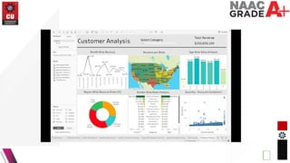
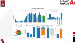
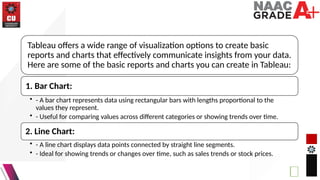
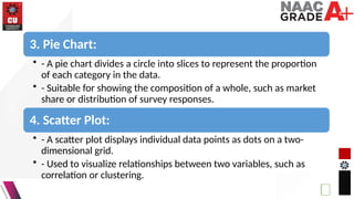
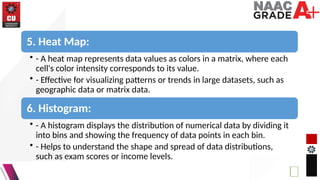
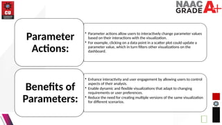
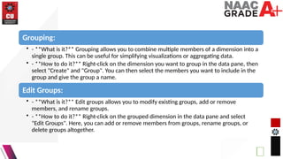
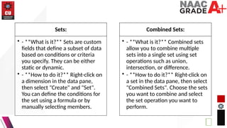
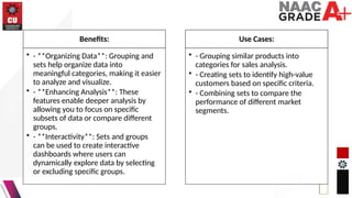
DISCOVER . LEARN . EMPOWER
UNIT-3
UNIVERSITY INSTITUTE OF COMPUTING
MASTER OF COMPUTER APPLICATIONS
DATAANALYTICS
23CAH-725
1
2
Tableau Basic Reports
and Charts
CO Number Title Level
CO4 Evaluate the quality and reliability of
data and the effectiveness of data
analytics solutions
Analyze
Course Outcome
Will be covered in this
lecture
Vision of the Department: To be a Centre of Excellence for nurturing computer
professionals with strong application expertise through experiential learning and
research for matching the requirements of industry and society instilling in them
the spirit of innovation and entrepreneurship.
Mission of the Department: M1 To provide innovative learning centric facilities and
quality-oriented teaching learning process for solving computational problems.
M2 To provide a frame work through Project Based Learning to support society and
industry in promoting a multidisciplinary activity.
M3To develop crystal clear evaluation system and experiential learning mechanism
aligned with futuristic technologies and industry.
M4 To provide doorway for promoting research, innovation and entrepreneurship
skills in collaboration with industry and academia.
M5 To undertake societal activities for upliftment of rural/deprived sections of
society
Tableau offers a wide range of visualization options to create basic
reports and charts that effectively communicate insights from your data.
Here are some of the basic reports and charts you can create in Tableau:
1. Bar Chart:
• - A bar chart represents data using rectangular bars with lengths proportional to the
values they represent.
• - Useful for comparing values across different categories or showing trends over time.
2. Line Chart:
• - A line chart displays data points connected by straight line segments.
• - Ideal for showing trends or changes over time, such as sales trends or stock prices.
3. Pie Chart:
• - A pie chart divides a circle into slices to represent the proportion
of each category in the data.
• - Suitable for showing the composition of a whole, such as market
share or distribution of survey responses.
4. Scatter Plot:
• - A scatter plot displays individual data points as dots on a two-
dimensional grid.
• - Used to visualize relationships between two variables, such as
correlation or clustering.
5. Heat Map:
• - A heat map represents data values as colors in a matrix, where each
cell's color intensity corresponds to its value.
• - Effective for visualizing patterns or trends in large datasets, such as
geographic data or matrix data.
6. Histogram:
• - A histogram displays the distribution of numerical data by dividing it
into bins and showing the frequency of data points in each bin.
• - Helps to understand the shape and spread of data distributions,
such as exam scores or income levels.
7. Tree Map:
• - A tree map visualizes hierarchical data using nested rectangles, with
each rectangle representing a category or subcategory.
• - Useful for exploring hierarchical structures or comparing the relative
sizes of categories.
8. Crosstab (Pivot Table):
• - A crosstab displays data in a tabular format with rows and columns,
similar to a pivot table.
• - Allows for detailed analysis and comparison of data values across
different dimensions.
9. Bullet Graph:
• - A bullet graph is a variation of a bar chart designed to show progress
toward a goal, typically with multiple measures displayed together.
• - Effective for visualizing performance metrics or KPIs with clear
benchmarks.
10. Box Plot:
• - A box plot (box-and-whisker plot) displays the distribution of a dataset
along with its median, quartiles, and outliers.
• - Provides insights into the spread and variability of data, as well as
identifying potential outliers.
What are Parameters?
• Parameters are dynamic values that users can define and modify within Tableau.
• They act as placeholders for values that can be used in calculations, filters, and reference lines in
visualizations.
• Parameters can be used to create interactive dashboards and give users control over their data
analysis.
Creating Parameters:
• Define Parameter: In Tableau, go to the "Parameters" shelf in the data pane and click on "Create
Parameter".
• Specify Name and Data Type: Give the parameter a name and select its data type (e.g., string,
integer, float, date).
• Set Allowable Values: Define the range or list of allowable values for the parameter. This can be a
range of numbers, a list of discrete values, or a range of dates.
• Configure Display Options: Customize the display options for the parameter, such as formatting and
default value.
Using Parameters:
• Once created, parameters can be used in various parts of Tableau, including calculations, filters,
reference lines, and sets.
• Users can interactively change parameter values using parameter controls, such as dropdown lists,
sliders, or input boxes.
Examples of Parameter Use Cases:
• Dynamic Filters: Allow users to dynamically filter data by selecting values from a parameter
dropdown list.
• Thresholds and Goal Lines: Set dynamic thresholds or goal lines in visualizations to highlight
performance against targets.
• Metric Selection: Enable users to switch between different metrics or dimensions in a visualization
using a parameter.
• Custom Calculations: Use parameters to create custom calculations that adjust based on user input.
• Top N Analysis: Allow users to specify the number of top items to display in a visualization.
• Parameter actions allow users to interactively change parameter values
based on their interactions with the visualization.
• For example, clicking on a data point in a scatter plot could update a
parameter value, which in turn filters other visualizations on the
dashboard.
Parameter
Actions:
• Enhance interactivity and user engagement by allowing users to control
aspects of their analysis.
• Enable dynamic and flexible visualizations that adapt to changing
requirements or user preferences.
• Reduce the need for creating multiple versions of the same visualization
for different scenarios.
Benefits of
Parameters:
Grouping:
• - **What is it?** Grouping allows you to combine multiple members of a dimension into a
single group. This can be useful for simplifying visualizations or aggregating data.
• - **How to do it?** Right-click on the dimension you want to group in the data pane, then
select "Create" and "Group". You can then select the members you want to include in the
group and give the group a name.
Edit Groups:
• - **What is it?** Edit groups allows you to modify existing groups, add or remove
members, and rename groups.
• - **How to do it?** Right-click on the grouped dimension in the data pane and select
"Edit Groups". Here, you can add or remove members from groups, rename groups, or
delete groups altogether.
Sets:
• - **What is it?** Sets are custom
fields that define a subset of data
based on conditions or criteria
you specify. They can be either
static or dynamic.
• - **How to do it?** Right-click on
a dimension in the data pane,
then select "Create" and "Set".
You can define the conditions for
the set using a formula or by
manually selecting members.
Combined Sets:
• - **What is it?** Combined sets
allow you to combine multiple
sets into a single set using set
operations such as union,
intersection, or difference.
• - **How to do it?** Right-click on
a set in the data pane, then select
"Combined Sets". Choose the sets
you want to combine and select
the set operation you want to
perform.
Benefits:
• - **Organizing Data**: Grouping and
sets help organize data into
meaningful categories, making it easier
to analyze and visualize.
• - **Enhancing Analysis**: These
features enable deeper analysis by
allowing you to focus on specific
subsets of data or compare different
groups.
• - **Interactivity**: Sets and groups
can be used to create interactive
dashboards where users can
dynamically explore data by selecting
or excluding specific groups.
Use Cases:
• - Grouping similar products into
categories for sales analysis.
• - Creating sets to identify high-value
customers based on specific criteria.
• - Combining sets to compare the
performance of different market
segments.
By leveraging grouping, sets,
and combined sets in Tableau,
you can organize and analyze
your data more effectively,
leading to better insights and
decisions.
18

Lecture 3.2.1.pptx data analytics of ai .

  • 1.
    DISCOVER . LEARN. EMPOWER UNIT-3 UNIVERSITY INSTITUTE OF COMPUTING MASTER OF COMPUTER APPLICATIONS DATAANALYTICS 23CAH-725 1
  • 2.
    2 Tableau Basic Reports andCharts CO Number Title Level CO4 Evaluate the quality and reliability of data and the effectiveness of data analytics solutions Analyze Course Outcome Will be covered in this lecture
  • 3.
    Vision of theDepartment: To be a Centre of Excellence for nurturing computer professionals with strong application expertise through experiential learning and research for matching the requirements of industry and society instilling in them the spirit of innovation and entrepreneurship. Mission of the Department: M1 To provide innovative learning centric facilities and quality-oriented teaching learning process for solving computational problems. M2 To provide a frame work through Project Based Learning to support society and industry in promoting a multidisciplinary activity. M3To develop crystal clear evaluation system and experiential learning mechanism aligned with futuristic technologies and industry. M4 To provide doorway for promoting research, innovation and entrepreneurship skills in collaboration with industry and academia. M5 To undertake societal activities for upliftment of rural/deprived sections of society
  • 6.
    Tableau offers awide range of visualization options to create basic reports and charts that effectively communicate insights from your data. Here are some of the basic reports and charts you can create in Tableau: 1. Bar Chart: • - A bar chart represents data using rectangular bars with lengths proportional to the values they represent. • - Useful for comparing values across different categories or showing trends over time. 2. Line Chart: • - A line chart displays data points connected by straight line segments. • - Ideal for showing trends or changes over time, such as sales trends or stock prices.
  • 7.
    3. Pie Chart: •- A pie chart divides a circle into slices to represent the proportion of each category in the data. • - Suitable for showing the composition of a whole, such as market share or distribution of survey responses. 4. Scatter Plot: • - A scatter plot displays individual data points as dots on a two- dimensional grid. • - Used to visualize relationships between two variables, such as correlation or clustering.
  • 8.
    5. Heat Map: •- A heat map represents data values as colors in a matrix, where each cell's color intensity corresponds to its value. • - Effective for visualizing patterns or trends in large datasets, such as geographic data or matrix data. 6. Histogram: • - A histogram displays the distribution of numerical data by dividing it into bins and showing the frequency of data points in each bin. • - Helps to understand the shape and spread of data distributions, such as exam scores or income levels.
  • 9.
    7. Tree Map: •- A tree map visualizes hierarchical data using nested rectangles, with each rectangle representing a category or subcategory. • - Useful for exploring hierarchical structures or comparing the relative sizes of categories. 8. Crosstab (Pivot Table): • - A crosstab displays data in a tabular format with rows and columns, similar to a pivot table. • - Allows for detailed analysis and comparison of data values across different dimensions.
  • 10.
    9. Bullet Graph: •- A bullet graph is a variation of a bar chart designed to show progress toward a goal, typically with multiple measures displayed together. • - Effective for visualizing performance metrics or KPIs with clear benchmarks. 10. Box Plot: • - A box plot (box-and-whisker plot) displays the distribution of a dataset along with its median, quartiles, and outliers. • - Provides insights into the spread and variability of data, as well as identifying potential outliers.
  • 11.
    What are Parameters? •Parameters are dynamic values that users can define and modify within Tableau. • They act as placeholders for values that can be used in calculations, filters, and reference lines in visualizations. • Parameters can be used to create interactive dashboards and give users control over their data analysis. Creating Parameters: • Define Parameter: In Tableau, go to the "Parameters" shelf in the data pane and click on "Create Parameter". • Specify Name and Data Type: Give the parameter a name and select its data type (e.g., string, integer, float, date). • Set Allowable Values: Define the range or list of allowable values for the parameter. This can be a range of numbers, a list of discrete values, or a range of dates. • Configure Display Options: Customize the display options for the parameter, such as formatting and default value.
  • 12.
    Using Parameters: • Oncecreated, parameters can be used in various parts of Tableau, including calculations, filters, reference lines, and sets. • Users can interactively change parameter values using parameter controls, such as dropdown lists, sliders, or input boxes. Examples of Parameter Use Cases: • Dynamic Filters: Allow users to dynamically filter data by selecting values from a parameter dropdown list. • Thresholds and Goal Lines: Set dynamic thresholds or goal lines in visualizations to highlight performance against targets. • Metric Selection: Enable users to switch between different metrics or dimensions in a visualization using a parameter. • Custom Calculations: Use parameters to create custom calculations that adjust based on user input. • Top N Analysis: Allow users to specify the number of top items to display in a visualization.
  • 13.
    • Parameter actionsallow users to interactively change parameter values based on their interactions with the visualization. • For example, clicking on a data point in a scatter plot could update a parameter value, which in turn filters other visualizations on the dashboard. Parameter Actions: • Enhance interactivity and user engagement by allowing users to control aspects of their analysis. • Enable dynamic and flexible visualizations that adapt to changing requirements or user preferences. • Reduce the need for creating multiple versions of the same visualization for different scenarios. Benefits of Parameters:
  • 14.
    Grouping: • - **Whatis it?** Grouping allows you to combine multiple members of a dimension into a single group. This can be useful for simplifying visualizations or aggregating data. • - **How to do it?** Right-click on the dimension you want to group in the data pane, then select "Create" and "Group". You can then select the members you want to include in the group and give the group a name. Edit Groups: • - **What is it?** Edit groups allows you to modify existing groups, add or remove members, and rename groups. • - **How to do it?** Right-click on the grouped dimension in the data pane and select "Edit Groups". Here, you can add or remove members from groups, rename groups, or delete groups altogether.
  • 15.
    Sets: • - **Whatis it?** Sets are custom fields that define a subset of data based on conditions or criteria you specify. They can be either static or dynamic. • - **How to do it?** Right-click on a dimension in the data pane, then select "Create" and "Set". You can define the conditions for the set using a formula or by manually selecting members. Combined Sets: • - **What is it?** Combined sets allow you to combine multiple sets into a single set using set operations such as union, intersection, or difference. • - **How to do it?** Right-click on a set in the data pane, then select "Combined Sets". Choose the sets you want to combine and select the set operation you want to perform.
  • 16.
    Benefits: • - **OrganizingData**: Grouping and sets help organize data into meaningful categories, making it easier to analyze and visualize. • - **Enhancing Analysis**: These features enable deeper analysis by allowing you to focus on specific subsets of data or compare different groups. • - **Interactivity**: Sets and groups can be used to create interactive dashboards where users can dynamically explore data by selecting or excluding specific groups. Use Cases: • - Grouping similar products into categories for sales analysis. • - Creating sets to identify high-value customers based on specific criteria. • - Combining sets to compare the performance of different market segments.
  • 17.
    By leveraging grouping,sets, and combined sets in Tableau, you can organize and analyze your data more effectively, leading to better insights and decisions.
  • 18.