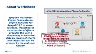
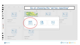
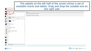
Data Visualization GEri - SpagoBI
Davide Zerbetto, Nunzia Marotta
Engineering
Data Visualization GE Manager, Data Visualization GE Course Creator - FIWARE
davide.zerbetto@eng.it ,nunzia.marotta@eng.it
My First Worksheet
TOPIC OF THE COURSE: the
course gradually explains how
the end-user can build a set of
analysis with charts and
tables which display his own
statistics through an easy-to-
use interface.
About Worksheet
SpagoBI Worksheet
Engine is an external
engine available for
SpagoBI 3.0 or newer
releases. Worksheet is
an extension of Qbe: it
provides the user a
simple way to visualize
data by means of charts
and tables that can be
created by the end-user
himself.
SpagoBI is a Business
intelligence suite for
integrated enterprise
BI solutions, entirely
developed according to
FOSS philosophy
SpagoBI is a Business
intelligence suite for
integrated enterprise
BI solutions, entirely
developed according to
FOSS philosophy
http://demo.spagobi.org/Demo/index.html
Explore “My Analysis” section and click on “Create Analysis” to start with your
first document
Go on choosing the “ad hoc reporting”
Then open the selected dataset by the “show
worksheet” button
The palette on the left half of the screen shows a set of
available charts and tables. Drag and drop the suitable one on
the right side
Drag and drop here!
Explore the “Selected fields” tab in order to get the
corresponding fields
Drag and drop an attribute in the “category”box and
consequently any measure as “series” in the proper one
Drag and drop an attribute in the “category” box and
consequently any measure as “series” in the proper one
Note that “attributes” are indicated with an “A” on the right corner of the
spherical identifier
Drag and drop an attribute in the “category”box and
consequently any measure as “series” in the proper one
Note that “attributes” are indicated with an “A” on the right corner of the
spherical identifier
While measures are indicated with the symbol “#”
Click on the “Preview” tab to see the result of your selection
Enjoy your pie chart!
Insert a new sheet and a new widget
Remember to save your work inside
SpagoBI Server
You can check on your document in “My
Analysis” section
Thanks!Thanks!

My First Worksheet slide support

  • 1.
    Data Visualization GEri- SpagoBI Davide Zerbetto, Nunzia Marotta Engineering Data Visualization GE Manager, Data Visualization GE Course Creator - FIWARE davide.zerbetto@eng.it ,nunzia.marotta@eng.it
  • 2.
    My First Worksheet TOPICOF THE COURSE: the course gradually explains how the end-user can build a set of analysis with charts and tables which display his own statistics through an easy-to- use interface.
  • 3.
    About Worksheet SpagoBI Worksheet Engineis an external engine available for SpagoBI 3.0 or newer releases. Worksheet is an extension of Qbe: it provides the user a simple way to visualize data by means of charts and tables that can be created by the end-user himself. SpagoBI is a Business intelligence suite for integrated enterprise BI solutions, entirely developed according to FOSS philosophy SpagoBI is a Business intelligence suite for integrated enterprise BI solutions, entirely developed according to FOSS philosophy http://demo.spagobi.org/Demo/index.html
  • 4.
    Explore “My Analysis”section and click on “Create Analysis” to start with your first document
  • 5.
    Go on choosingthe “ad hoc reporting”
  • 6.
    Then open theselected dataset by the “show worksheet” button
  • 7.
    The palette onthe left half of the screen shows a set of available charts and tables. Drag and drop the suitable one on the right side
  • 8.
  • 9.
    Explore the “Selectedfields” tab in order to get the corresponding fields
  • 10.
    Drag and dropan attribute in the “category”box and consequently any measure as “series” in the proper one
  • 11.
    Drag and dropan attribute in the “category” box and consequently any measure as “series” in the proper one Note that “attributes” are indicated with an “A” on the right corner of the spherical identifier
  • 12.
    Drag and dropan attribute in the “category”box and consequently any measure as “series” in the proper one Note that “attributes” are indicated with an “A” on the right corner of the spherical identifier While measures are indicated with the symbol “#”
  • 13.
    Click on the“Preview” tab to see the result of your selection
  • 14.
  • 15.
    Insert a newsheet and a new widget
  • 16.
    Remember to saveyour work inside SpagoBI Server
  • 17.
    You can checkon your document in “My Analysis” section
  • 18.