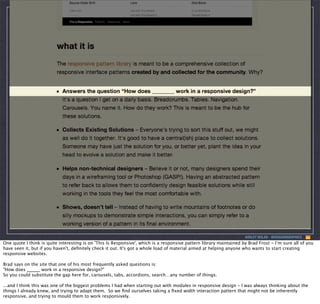
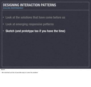
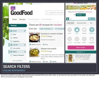
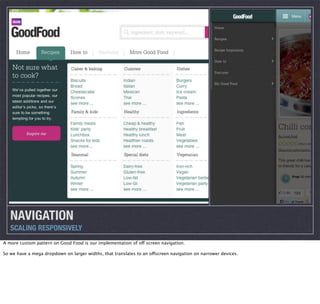
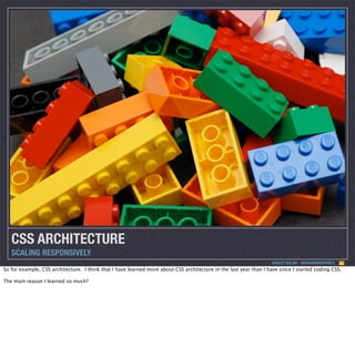
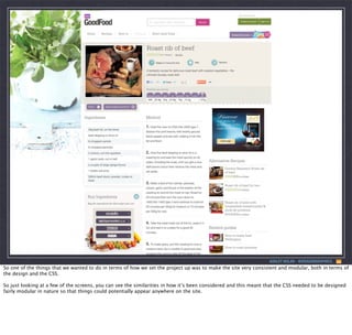
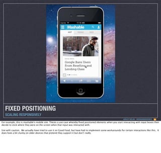
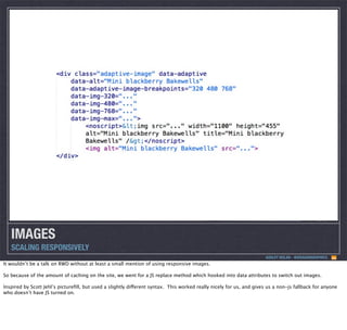
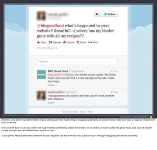
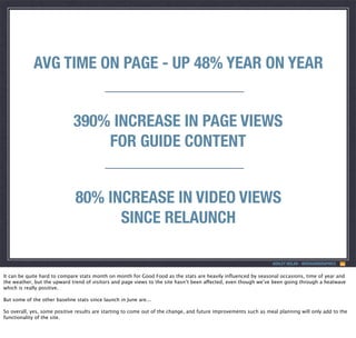
SlideShare a Scribd company logo
1 of 63
Download to read offline
SCALING RESPONSIVELY

ASHLEY NOLAN
@DRAGONGRAPHICS

Hi, I’m Ashley Nolan.
I’m a Creative Technologist working at TMW, a digital agency based in London.
A slightly less catchy, but maybe more descriptive title for this talk would be something like ‘What I learnt as the lead front-end developer on the
BBC Good Food responsive redesign.’
What I want to cover today in my talk will obviously relate pretty directly to the Good Food site, but what I want to really highlight are the main
things I learned from building such a large scale responsive site, what we did well and not so well, and how that can feed into any project of any
size, not just large scale builds such as this one. So hopefully some of what we learned on the project can help you make decisions in the future
on projects you do.
SCALING RESPONSIVELY
(What I learnt as the lead front-end developer
on the BBC Good Food responsive redesign)

ASHLEY NOLAN
@DRAGONGRAPHICS

Hi, I’m Ashley Nolan.
I’m a Creative Technologist working at TMW, a digital agency based in London.
A slightly less catchy, but maybe more descriptive title for this talk would be something like ‘What I learnt as the lead front-end developer on the
BBC Good Food responsive redesign.’
What I want to cover today in my talk will obviously relate pretty directly to the Good Food site, but what I want to really highlight are the main
things I learned from building such a large scale responsive site, what we did well and not so well, and how that can feed into any project of any
size, not just large scale builds such as this one. So hopefully some of what we learned on the project can help you make decisions in the future
on projects you do.
ASHLEY NOLAN - @DRAGONGRAPHICS

The site I have been working on was the redevelopment of the BBC Good Food site, which is a very large cookery website owned by BBC Worldwide.
So, for those who don’t know, BBC Good Food is one of the most trafficked food sites in the UK, with anywhere between 7 to 8 and a half million
unique visits every month depending on the time of year. (30+ million page views)
The first thing that I know I thought when we started pitching for the project was why do BBC need to work with an agency on a responsive
redesign when they have so much great responsive work being done by other BBC properties such as BBC Sport and BBC News.
!==

Well BBC Worldwide, who own BBC Good food, isn’t exactly the same as the BBC itself.
BBC Worldwide is the main commercial arm of the BBC - it actually helps fund the work of the BBC through it’s revenue, and takes care of BBC
brands such as Top Gear, Doctor who and BBC Good Food.
Now because BBC Worldwide is a commercial company, if BBC were to share knowledge and resources with Worldwide, it would be seen as giving it
an unfair competitive advantage, and so would then need to make this information publicly available to other companies such as ITV, Channel 4
and Sky, which it obviously doesn’t want to do.
Therefore this was actually BBC Worldwide’s first responsive rebuild, and is why TMW were involved in helping them make decisions on the best
way forward for the redesign of BBC Good Food, and how I came to be the lead front end developer on the site.
ASHLEY NOLAN - @DRAGONGRAPHICS

I only realised when making the slides for this talk that it was the 3rd of May last year that I started on the Good Food project - and back
then responsive design was still pretty fresh as a concept.
There were a few sites around being held up as great examples, such as the Boston Globe, but most of the sites being made were smaller blog
sized sites, and not many of the big sites on the web had really taken the plunge with responsive. That meant it was a little bit daunting in terms
of what we were going to do, as we were doing what a lot of other companies were going through at the time - making best guesses when it came
to solving the problems responsive design threw at us.
Responsive?
ASHLEY NOLAN - @DRAGONGRAPHICS

The first big call we had to make before anything else was whether or not the site should even be responsive.
The main thing that made us pursue responsive was that we couldn’t see any major negatives pursuing a responsive design approach - but there
were some major positives - one codebase, very flexible in terms of device support, extra time, but we didn’t think as much time as developing
and maintaining 2 different sites.
People who use BBC Good Food want exactly the same information whether they are looking at the site on a mobile device or a desktop, and in
fact, a huge percentage of Good Food’s audience use devices to view the site, and a large amount of those are tablet users (using their tablet while
they cook), so it absolutely made sense to be optimised for any potential device width with one eye on the future.
ASHLEY NOLAN - @DRAGONGRAPHICS

So for anyone who hasn’t seen the site previously, this is what the site used to look like.
A typical recipe page on the old site.
This look and feel was a very slight variation on first incarnation of the Good Food site, launched back in November 2006, so the design as you
would probably expect was starting to age more than a little bit.
ASHLEY NOLAN - @DRAGONGRAPHICS

A large proportion of the sites traffic comes directly through search engines, as the site comes pretty high for cookery related searches.
So the typical user flow would be something like along the lines of this: You’d type in your search term, find your way to BBC Good Food, find the
recipe you want and your journey stops there.
So one of the other goals was to try and hold onto more traffic by offering more linked content.
The site also has a tonne of editorial content that goes into the site on healthy eating and general cookery tips that never really got the attention it
deserved because it wasn’t surfaced very well.
KEY GOALS FOR USERS
BBC GOOD FOOD

Search for recipes
Store/Save recipes to their profile
Cook recipes

The key goals of the site were to be able to provide users a way to search, store and cook recipes.
Some of these areas such as search didn’t really have any amazing examples in responsive design, so one of the things we decided to put our
efforts into early was identifying the key areas and then to sketch and prototype those key aspects.
So to show you the type of stuff we did, I’ll go through how we approached the design.
UNDERSTAND THE PATTERNS
SCALING RESPONSIVELY
ASHLEY NOLAN - @DRAGONGRAPHICS

One of the things we did from the outset on GoodFood was to make sure for important interactions on the site, we researched the area well before
we started designing ourselves.
UNDERSTAND THE PATTERNS
SCALING RESPONSIVELY
ASHLEY NOLAN - @DRAGONGRAPHICS

One thing that I found useful personally was reading about how interaction is defined natively on different devices.
So an example of this is the touch interaction design guidelines that Microsoft have made in relation to their apps.
Although these type of guidelines don’t directly relate to the web but to app’s, it’s a good idea to keep on top of what devices are doing natively as
this can inspire the work we do when designing patterns - and this is definitely true of the early responsive patterns that emerged.
ASHLEY NOLAN - @DRAGONGRAPHICS

One quote I think is quite interesting is on 'This Is Responsive', which is a responsive pattern library maintained by Brad Frost - I’m sure all of you
have seen it, but if you haven't, definitely check it out. It's got a whole load of material aimed at helping anyone who wants to start creating
responsive websites.
Brad says on the site that one of his most frequently asked questions is:
"How does ______ work in a responsive design?"
So you could substitute the gap here for, carousels, tabs, accordions, search…any number of things.
...and I think this was one of the biggest problems I had when starting out with modules in responsive design - I was always thinking about the
things I already knew, and trying to adapt them.  So we find ourselves taking a fixed width interaction pattern that might not be inherently
responsive, and trying to mould them to work responsively.
ASHLEY NOLAN - @DRAGONGRAPHICS

Which is a bit like trying to using flip-flops to make plug sockets float in your swimming pool.
It might work, but it also might end messily.
I need a carousel, how do I make a
carousel work responsively across all
device widths...

ASHLEY NOLAN - @DRAGONGRAPHICS

So on Good Food, rather than thinking 'we need a carousel, how do I make a carousel work responsively across all device widths' , it was really
useful to think about the problem across device widths and apply suitable interaction solutions.
I need a carousel, how do I make a
carousel work responsively across all
device widths...
I need to display a list of images, how
do I make a list of images display
responsively across all device widths...

ASHLEY NOLAN - @DRAGONGRAPHICS

'I need to show a list of images, how do I display a list of images responsively across all device widths'
If that question results in you answering that you need a carousel across all widths to do this, then go ahead and implement it.
But by looking at the problem, you can step back and design the most suitable way of displaying that list of images.
ASHLEY NOLAN - @DRAGONGRAPHICS

So, one area this was especially true was for search filters.
These are still an interaction that not many responsive sites have to deal with, but for us it was one of the most crucial areas as searching for
recipes was really important, irrespective of the device.  The main problem was surfacing the vast number of ways you can filter your search
without it feeling ridiculously cumbersome.
DESIGNING INTERACTION PATTERNS
SCALING RESPONSIVELY

Look at the solutions that have come before us

So we split it up: (and we did this for all of our major interactions on the site, not just search)
And this can be done for any interaction pattern you are looking to implement.
- Look at the solutions that had come before us
- mobile apps, mobile specific websites, or even how successful websites (that are non responsive) were using search filters 
- Mobile app's are pretty ballsy - take inspiration from them (instagram)
DESIGNING INTERACTION PATTERNS
SCALING RESPONSIVELY

Look at the solutions that have come before us
Look at emerging responsive patterns

Look at emerging responsive patterns
- we looked at how people were solving problems in responsive, not necessarily related to search filters, but that could help influence the design
DESIGNING INTERACTION PATTERNS
SCALING RESPONSIVELY

Look at the solutions that have come before us
Look at emerging responsive patterns
Sketch (and prototype too if you have the time)

Sketch
- We sketched out lots of possible ways to solve the problem
SKETCHING
SCALING RESPONSIVELY
The sketching really helped us get away from getting too attached to ideas until we wanted to flesh them out.
Prototyping was also pretty invaluable.
For example, there were a couple of occasions early in the design of the project where we thought we’d come up with a pattern that worked
brilliantly visually, but when we actually put together a simple prototype and started using it, we found that it didn’t feel quite right on different
devices.
SEARCH FILTERS
SCALING RESPONSIVELY
Doing this mobile first actually influenced how we presented filtering at wider views, as we kept the same principles of the quick and advanced
filters and how they were displayed across both.
INTERCHANGING COMPONENTS
SCALING RESPONSIVELY
ASHLEY NOLAN - @DRAGONGRAPHICS

Another technique that we used, and that's become popular in responsive design, is interchanging components at different break points, while
running off the same markup.
The benefit of doing this is that while it may be a bit of overhead when you start to build these patterns, they can be built to be reusable across
projects.
So to give a couple of examples...
CAROUSEL TO SHOW/HIDE TOGGLE
SCALING RESPONSIVELY
A carousel might be the right solution for wider views, but maybe it would be better to simply have a show/hide toggle of the pictures on narrow
views.
...and this is what we implemented on Good Food for this
TABS TO ACCORDION (OR SELECT LIST)
SCALING RESPONSIVELY
ASHLEY NOLAN - @DRAGONGRAPHICS

Tabs are inherently floored at smaller widths - when the screen gets narrow and you have a number of tabs, then you start to have problems.  But
this doesn't mean we can't use them - after all the they are a tried and tested interaction pattern from the days of fixed width sites?
So instead of scrapping them, we can evolve them into a responsive solution.  At small widths the tab headers could be represented in a select list,
or perhaps as an accordion.  This is something we are using on the BBC Good Food website, and we set a data attribute to choose which component
will be used at narrower widths.
NAVIGATION
SCALING RESPONSIVELY
A more custom pattern on Good Food is our implementation of off screen navigation.
So we have a mega dropdown on larger widths, that translates to an offscreen navigation on narrower devices.
LARGE SCALE ARCHITECTURE
SCALING RESPONSIVELY

IMAGE: HTTP://I.TELEGRAPH.CO.UK/MULTIMEDIA/ARCHIVE/02448/PINNACLE_THE_VIEW__2448728K.JPG

ASHLEY NOLAN - @DRAGONGRAPHICS

Aside from the responsive aspect of the project, I want to also talk about a couple of the biggest things I learned working on the project in terms
of it being such a large scale architecture.
For me personally, it was what it was like working on a build of such a massive scale.
So before working on Good Food, I’d been a web developer for around 7 years, and had been lucky enough to work on some great projects, but in
all due respect to the size of those projects, the size was nothing in terms of the traffic and profile that BBC Good Food is. I mean, I mentioned it
to one of my best friends at the time, and I distinctly remember her saying to me ‘whatever you do, don’t mess it up, because I use that site all the
time’.
So, I think for the first few days after I knew I would be working on the project, if I could visualise my thoughts they would probably have looked
something along the lines of this:
ASHLEY NOLAN - @DRAGONGRAPHICS

just how overwhelming it can seem at first working on a build of such a large scale.
It had always been a massive goal of mine to work on a project that is genuinely seen by millions of people on the web, and like anyone who gets
that opportunity, it’s both massively exciting and scary at the same time.
I was leading the front end for the project and at the end of it, the decisions I made would help decide if the project would be classed as a success
or failure.
ASHLEY NOLAN - @DRAGONGRAPHICS

But I think as the project goes on, you realise that as long as you have done your research and can back up your own decisions with good
reasoning of why you have done it a certain way, you have to have faith in our own convictions.
The pace of change is so high in the work that we do, and especially in responsive web builds where we are still finding our way to the rights and
wrongs, that you can’t beat yourself up too much if 6-12 months time the goalposts have moved slightly, and what you did before is no longer the
defacto way of doing things. Make the changes that matter, but improve things that will make a difference, not just change for the sake of change.
ASHLEY NOLAN - @DRAGONGRAPHICS

The other thing that I realised as the project went on is that many of the tiny aspects that you can sometimes take for granted on smaller builds,
really do affect a site as it scales.
So the earlier on you get the right processes in place, the easier things become further down the line. This is especially true when making sure the
structure of your code is properly planned out for reusability in the future.
I think scaling the size of your workflow up in bigger projects, really does highlight any holes in your process and where things do start to fall over.
CSS ARCHITECTURE
SCALING RESPONSIVELY
ASHLEY NOLAN - @DRAGONGRAPHICS

So for example, CSS architecture. I think that I have learned more about CSS architecture in the last year than I have since I started coding CSS.
The main reason I learned so much?
ASHLEY NOLAN - @DRAGONGRAPHICS

It very quickly comes back to bite you - so just like when Ed Balls tweeted his own name, if he didn’t have thousands of people wanting him to fail,
he’d totally have got away with it.
Unfortunately, he’s an MP...
ASHLEY NOLAN - @DRAGONGRAPHICS

...and so now there’s now a day on Twitter celebrating the fact that he cocked up.
And that is what, in a very roundabout way, large scale CSS architecture is like.
Things that you might take for granted, or pass off as a slight hack, on a small to medium sized site, which you’d totally get away with, you really
won’t get away with on large scale builds.
SMACCS
CSS ARCHITECTURE - SCALING RESPONSIVELY
ASHLEY NOLAN - @DRAGONGRAPHICS

SMACCS, by Jonathan Snook, has become pretty highly regarded in terms of CSS architecture, and I would highly recommend that if you haven’t
read it, you go and do so.
I read it earlier this year, and it highlighted so many of the issues I personally came up against when trying to make BBC Good Food as modular as I
could, and I really do wish I’d read it 18 months ago to put more of it into practice.
ASHLEY NOLAN - @DRAGONGRAPHICS

So one of the things that we wanted to do in terms of how we set the project up was to make the site very consistent and modular, both in terms of
the design and the CSS.
So just looking at a few of the screens, you can see the similarities in how it’s been considered and this meant that the CSS needed to be designed
fairly modular in nature so that things could potentially appear anywhere on the site.
MEDIA QUERY STRUCTURE
CSS ARCHITECTURE - SCALING RESPONSIVELY
ASHLEY NOLAN - @DRAGONGRAPHICS

The other issue with CSS architecture on a large scale build is how you structure your media queries.
Media query structure on a large scale build feels a bit like this to me.
It does feel like you are having to battle to get a structure that works and it never really feels all that optimal.
Media queries were one of the worst
things to happen to CSS structure

Harry Roberts
@csswizardry

I do personally agree with Harry Roberts when he said that media queries were one of the worst things to happen to CSS structure.
We used SASS on Good Food to structure our CSS which helped massively with this.
OR

ASHLEY NOLAN - @DRAGONGRAPHICS

The way we approached it on Good Food was to for smaller style changes, we would do these inline using a mixin to add the media queries.
For any larger functionality, such as for navigation breakpoints, it quickly became really hard to keep it readable while doing it inline, and so we
broke these larger chunks of functionality into separately included SASS files and grouped the media queries together within that.
This worked well for us to keep the readability of CSS as we wanted, but I’m not saying this is by any means a definitive way of doing it - whatever
makes it easy to read for your team is the correct way to do it on your project.
HTTP://JAKEARCHIBALD.GITHUB.IO/SASS-IE/

OLD IE SUPPORT
CSS ARCHITECTURE - SCALING RESPONSIVELY
ASHLEY NOLAN - @DRAGONGRAPHICS

Authoring CSS for old IE devices - http://jakearchibald.github.io/sass-ie/
HTTP://JAKEARCHIBALD.GITHUB.IO/SASS-IE/

OLD IE SUPPORT
CSS ARCHITECTURE - SCALING RESPONSIVELY
ASHLEY NOLAN - @DRAGONGRAPHICS
DOCUMENTATION STYLE GUIDES
SCALING RESPONSIVELY
ASHLEY NOLAN - @DRAGONGRAPHICS

One thing I think on a big project that you need to accept is that it is almost impossible to make a file structure that is so obvious that someone
new to the project will instantly know where everything is at a glance.
You can make their lives a lot easier, but the best way to do this is come up with a system and document it well.
Style guides can really help mitigate this, and give those new to the project a great way in in terms of learning and getting to grips with the
workflow.
FUTURE CONSIDERATIONS
SCALING RESPONSIVELY
ASHLEY NOLAN - @DRAGONGRAPHICS

So what did I learn in terms of applying what I did on good food to future projects?
INTERACTION
SCALING RESPONSIVELY
ASHLEY NOLAN - @DRAGONGRAPHICS

Probably one of the biggest things that I've learned going from smaller responsive builds to working on the Good Food website is just how
important it is to really think about the interactions of your site at different widths.
Getting the design to visually adapt across devices is only one of our aims - if the site is hard to use or we aren't considering device specific
functionality to enhance our site, then chances are it won't be as easy to use as it could be.
Before you delve into actually designing patterns, you should know the strengths of the devices you are designing your patterns for and leverage
them if possible.
You should equally be aware of their weaknesses.
TOUCH
SCALING RESPONSIVELY
ASHLEY NOLAN - @DRAGONGRAPHICS

So the first thing to make sure when dealing with touch devices is to make sure that you are handling touch events properly.
So if you add a bunch of buttons to a page on mobile, and try and interact with them, the touch events by default will feel fairly unresponsive. This
is down to browser waiting around 300ms between a tap and the firing of a click event.
Using something like FastClick solves this for you, by firing the click event on touchEnd. If you’d rather you can roll your own event handlers to do
this - it’s up to you.
CSS3
transitions/transforms
>
jQuery.animate()
ANIMATION
SCALING RESPONSIVELY
ASHLEY NOLAN - @DRAGONGRAPHICS

Hopefully this should be pretty widely known, but I wouldn’t recommend using jQuery animations on mobile devices. It makes interactions look
really badCSS3 does directly affect how the interactions feel. This statement should be a given for anyone working on responsive sites.
Bad interaction, and especially glitchy interaction animations, can really kill an otherwise good responsive site.  It can give the sense of the site
being broken when it's not, it's just the interactions don't look right.
position: fixed;
!==
your friend

FIXED POSITIONING
SCALING RESPONSIVELY
ASHLEY NOLAN - @DRAGONGRAPHICS

position:fixed; on devices is not your friend either - I’d say only use it if you have time to debug random issues as it can have some random side
effects on older devices.
FIXED POSITIONING
SCALING RESPONSIVELY
ASHLEY NOLAN - @DRAGONGRAPHICS

For example, this is mashable’s mobile site. Theres a use case whereby fixed positioned elements when you start interacting with input boxes then
decide to stick where they were on the screen when that input was interacted with.
Use with caution. We actually have tried to use it on Good Food, but have had to implement some workarounds for certain interactions like this. It
does look a bit clunky on older devices that pretend they support it but don’t really.
DOM MANIPULATION BETWEEN MEDIA QUERIES
SCALING RESPONSIVELY
ASHLEY NOLAN - @DRAGONGRAPHICS

This is without doubt the thing I’m most ashamed of on the Good Food build.
Basically, don’t do it.
We only implemented with the intention of it only ever happening on resize - we wanted the server to handle any HTML differences. Unfortunately
with the amount of caching and the inability to make holes in the cache to allow for this, the resizing solution became the solution, and it was too
late to go back and change things by that time.
This means on mobile, we have some repainting issues which aren’t ideal, and that the team are still trying to sort out. So in short - use flexbox if
you need to move stuff and change the page flow, not javascript.
ADVERTISING
SCALING RESPONSIVELY
ASHLEY NOLAN - @DRAGONGRAPHICS

Ad’s are a complete pain in the ass basically. Good Food is mainly funded by it’s advertising, and so it is a necessary part of the site, however
when we started the project, we spoke to advertisers, and they were basically pretending responsive design was a fad.
Therefore, all we could do, was server up our best guess when the page loads, and then that ad can never change. This means you don’t get the
right size ads at all devices, which looks bad and also doesn’t make the most of the opportunity to advertise on those devices, which is wasting
potential click through revenue.
IMAGES
SCALING RESPONSIVELY
ASHLEY NOLAN - @DRAGONGRAPHICS

It wouldn’t be a talk on RWD without at least a small mention of using responsive images.
So because of the amount of caching on the site, we went for a JS replace method which hooked into data attributes to switch out images.
Inspired by Scott Jehl’s picturefill, but used a slightly different syntax. This worked really nicely for us, and gives us a non-js fallback for anyone
who doesn’t have JS turned on.
PERFORMANCE
SCALING RESPONSIVELY
ASHLEY NOLAN - @DRAGONGRAPHICS

Performance is an area which I’ve always had to worry about, but like CSS architecture, never in quite as much detail as we had to on Good Food.
I could probably do another talk on it’s own about performace, but the biggest tip I could give would be is that if you do a lot of the simple things
well, that will be 90% of your performance worries taken care of.
So optimising images, compressing and concatenating files, number of requests etc. Then using tools like YSlow and Chrome Page Speed Insights
will really get you to a decent place without having to go absolutely overboard. The trickier parts of performance come down to CSS paints and
really digging into your dev tools.
FEEDBACK AND ANALYTICS
SCALING RESPONSIVELY
ASHLEY NOLAN - @DRAGONGRAPHICS

It’s been great to work on a website where the users are so engaged and passionate, both positively and negatively. I personally think it’s better to
get an opinion one way or the other, as it tends to highlight the areas that are good or bad.
In terms of the feedback the site has received since it went live, it’s been really positive on the whole.
ASHLEY NOLAN - @DRAGONGRAPHICS

Here’s an example of some of the more positive feedback we’ve received so far.
I especially like the Blackberry Z10 comment - I’d love to say we tested specifically for Z10’s but this goes to show that responsive means that
devices that the site wasn’t designed for should get a device agnostic experience.
ASHLEY NOLAN - @DRAGONGRAPHICS

In terms of constructive learnings, the first was just how easy it can be to overestimate user intuition on devices.
When the site went live the editorial team were swamped with feedback from predominantly older tablet users who actually thought we’d deleted
search, when in fact we had put it behind an icon like this.
ASHLEY NOLAN - @DRAGONGRAPHICS

As a reaction, we’ve had to literally spell out where search is by labelling it, so there’s no confusion and adding an additional search box on the
main homepage which isn’t hidden behind an icon.
Which is pretty interesting as I personally thought that mobile and tablet users would be savvy enough to these sort of conventions and
iconography.
ASHLEY NOLAN - @DRAGONGRAPHICS

Another area which has been interesting is seeing just how much impact engaging positively on social media really can have a massive impact with
your audience.
One area we had issues was where we had renamed something called the Binder, to sit under a section called my good food, and a lot of people
simply thought we had deleted their saved recipes.
It was pretty remarkable how someone vocally negative can be reversed into a positive just through engaging with them positively.
POSITIONING
SCALING RESPONSIVELY
ASHLEY NOLAN - @DRAGONGRAPHICS

This is just a simple example where a small change can have such a positive impact on interaction and has been one of the most noticed changes
on the site.
One of the simplest things we changed was the positioning of the ingredients and the method on the recipe page to be next to each other rather
than positioned apart.
This has been really positively received, and it makes a lot of sense, as they directly related when you are cooking and saves users having to scroll
too much when they are in the middle of cooking.
So it’s not always about massive sweeping changes, but also about working out the things that aren’t quite working on a device and trying to solve
it.
Responsive?
Success?
ASHLEY NOLAN - @DRAGONGRAPHICS

Has it been a success?
The reaction has been really good from the community, and the site is still actively under development as there are a number of section we had to
cut before the site went live which are now being worked on.
In terms of headline statistics and analytics though, the site is holding up really well.
AVG TIME ON PAGE - UP 48% YEAR ON YEAR
390% INCREASE IN PAGE VIEWS
FOR GUIDE CONTENT
80% INCREASE IN VIDEO VIEWS
SINCE RELAUNCH
ASHLEY NOLAN - @DRAGONGRAPHICS

It can be quite hard to compare stats month on month for Good Food as the stats are heavily influenced by seasonal occasions, time of year and
the weather, but the upward trend of visitors and page views to the site hasn’t been affected, even though we’ve been going through a heatwave
which is really positive.
But some of the other baseline stats since launch in June are...
So overall, yes, some positive results are starting to come out of the change, and future improvements such as meal planning will only add to the
functionality of the site.
THANKS
ASHLEY NOLAN
@DRAGONGRAPHICS
www.dragongraphics.co.uk

Thanks

More Related Content

What's hot

Social media is here to Stay.
Social media is here to Stay.Social media is here to Stay.
Social media is here to Stay.Jon Olson
 
Task2 brainstorms and mindmaps
Task2  brainstorms and mindmapsTask2  brainstorms and mindmaps
Task2 brainstorms and mindmapspaige moorby
 
Technologies used Evaluation - Question 4
Technologies used   Evaluation - Question 4Technologies used   Evaluation - Question 4
Technologies used Evaluation - Question 4jackfowler16
 
Thoughts on design
Thoughts on designThoughts on design
Thoughts on designshawntelford
 
Design Thinking Action Lab - Prototype & Testing Assignment
Design Thinking Action Lab - Prototype & Testing AssignmentDesign Thinking Action Lab - Prototype & Testing Assignment
Design Thinking Action Lab - Prototype & Testing AssignmentAndy La Fond
 
Evaluation (task 9)
Evaluation (task 9)Evaluation (task 9)
Evaluation (task 9)PJG123
 
Evaluation (task 9)
Evaluation (task 9)Evaluation (task 9)
Evaluation (task 9)PJG123
 
Print production research, experiments, planning
Print production research, experiments, planningPrint production research, experiments, planning
Print production research, experiments, planningJoshEastham2
 
Audience Feedback I've Collected
Audience Feedback I've CollectedAudience Feedback I've Collected
Audience Feedback I've Collectedbobmackenzie98
 
Get 1000 visitors in 24 hours
Get 1000 visitors in 24 hoursGet 1000 visitors in 24 hours
Get 1000 visitors in 24 hoursDjuwarsjah Linnus
 
Fmp evaluation updated
Fmp evaluation updatedFmp evaluation updated
Fmp evaluation updatedBen Harris
 

What's hot (19)

Social media is here to Stay.
Social media is here to Stay.Social media is here to Stay.
Social media is here to Stay.
 
Task2 brainstorms and mindmaps
Task2  brainstorms and mindmapsTask2  brainstorms and mindmaps
Task2 brainstorms and mindmaps
 
Task 5 evaluation
Task 5   evaluation Task 5   evaluation
Task 5 evaluation
 
Media production log
Media production logMedia production log
Media production log
 
Technologies used Evaluation - Question 4
Technologies used   Evaluation - Question 4Technologies used   Evaluation - Question 4
Technologies used Evaluation - Question 4
 
Thoughts on design
Thoughts on designThoughts on design
Thoughts on design
 
Design Thinking Action Lab - Prototype & Testing Assignment
Design Thinking Action Lab - Prototype & Testing AssignmentDesign Thinking Action Lab - Prototype & Testing Assignment
Design Thinking Action Lab - Prototype & Testing Assignment
 
Evaluation (task 9)
Evaluation (task 9)Evaluation (task 9)
Evaluation (task 9)
 
Evaluation (task 9)
Evaluation (task 9)Evaluation (task 9)
Evaluation (task 9)
 
Planning Booklet
Planning BookletPlanning Booklet
Planning Booklet
 
Print production research, experiments, planning
Print production research, experiments, planningPrint production research, experiments, planning
Print production research, experiments, planning
 
Evaluation
EvaluationEvaluation
Evaluation
 
Audience Feedback I've Collected
Audience Feedback I've CollectedAudience Feedback I've Collected
Audience Feedback I've Collected
 
Dev diary fmp
Dev diary fmp Dev diary fmp
Dev diary fmp
 
Print Evaluation Lvl 3
Print Evaluation Lvl 3Print Evaluation Lvl 3
Print Evaluation Lvl 3
 
Ict evaluation
Ict evaluationIct evaluation
Ict evaluation
 
Get 1000 visitors in 24 hours
Get 1000 visitors in 24 hoursGet 1000 visitors in 24 hours
Get 1000 visitors in 24 hours
 
Fmp evaluation updated
Fmp evaluation updatedFmp evaluation updated
Fmp evaluation updated
 
1.2. Proposal
1.2. Proposal1.2. Proposal
1.2. Proposal
 

Viewers also liked

How to Engage Moms Online
How to Engage Moms OnlineHow to Engage Moms Online
How to Engage Moms OnlinePunchTab
 
I Believe We're in a the Midst of a Massive Health Crisis
I Believe We're in a the Midst of a Massive Health CrisisI Believe We're in a the Midst of a Massive Health Crisis
I Believe We're in a the Midst of a Massive Health CrisisLynn G
 
Social for business - Livability talk by TMW
Social for business - Livability talk by TMWSocial for business - Livability talk by TMW
Social for business - Livability talk by TMWBuckersphere
 
Vertic Capabilities
Vertic Capabilities Vertic Capabilities
Vertic Capabilities kferrara212
 
Brief Overview
Brief OverviewBrief Overview
Brief Overviewafrick
 
PunchTab Incentives and Engagement Platform Overview
PunchTab Incentives and Engagement Platform OverviewPunchTab Incentives and Engagement Platform Overview
PunchTab Incentives and Engagement Platform OverviewAngela Sanfilippo
 
Tedx Justin Yoshimura
Tedx Justin YoshimuraTedx Justin Yoshimura
Tedx Justin YoshimuraCharles Hu
 
RLS 2013: Caroline Papadatos, Senior Vice-President, International, LoyaltyOne
RLS 2013: Caroline Papadatos, Senior Vice-President, International, LoyaltyOneRLS 2013: Caroline Papadatos, Senior Vice-President, International, LoyaltyOne
RLS 2013: Caroline Papadatos, Senior Vice-President, International, LoyaltyOneRetailers Association of India
 
Powering Growth Through Customer Engagement
Powering Growth Through Customer Engagement Powering Growth Through Customer Engagement
Powering Growth Through Customer Engagement GS
 
Why You'll Love Working at Kobie Marketing
Why You'll Love Working at Kobie Marketing Why You'll Love Working at Kobie Marketing
Why You'll Love Working at Kobie Marketing Jennifer Lingerfelt
 
Maritz 2014 Loyalty Social Survey for Loyalty Expo
Maritz 2014 Loyalty Social Survey for Loyalty ExpoMaritz 2014 Loyalty Social Survey for Loyalty Expo
Maritz 2014 Loyalty Social Survey for Loyalty ExpoMaritz Motivation Solutions
 
CRM & Multi-Channel Marketing Theatre; Discover how Aimia is using IBM Unica'...
CRM & Multi-Channel Marketing Theatre; Discover how Aimia is using IBM Unica'...CRM & Multi-Channel Marketing Theatre; Discover how Aimia is using IBM Unica'...
CRM & Multi-Channel Marketing Theatre; Discover how Aimia is using IBM Unica'...TFM&A
 
ICLP & Loyalty 360 Webinar
ICLP & Loyalty 360 WebinarICLP & Loyalty 360 Webinar
ICLP & Loyalty 360 WebinarICLP_Loyalty
 
Loyalty one case study -Gamification in employee engagement - Manu Melwin Joy
Loyalty one case study -Gamification in employee engagement - Manu Melwin JoyLoyalty one case study -Gamification in employee engagement - Manu Melwin Joy
Loyalty one case study -Gamification in employee engagement - Manu Melwin Joymanumelwin
 
TMW Unlimited Viewpoint 2017 strategy doc
TMW Unlimited Viewpoint 2017 strategy docTMW Unlimited Viewpoint 2017 strategy doc
TMW Unlimited Viewpoint 2017 strategy docAdam Knight
 
And Sydney - Customer Engagement Agency - Creds & Case Studies
And Sydney - Customer Engagement Agency - Creds & Case StudiesAnd Sydney - Customer Engagement Agency - Creds & Case Studies
And Sydney - Customer Engagement Agency - Creds & Case StudiesAlicia Kearns
 
Rosebud Agency Credentials
Rosebud Agency CredentialsRosebud Agency Credentials
Rosebud Agency CredentialsGUsman013
 
Creative Sponge - Agency Credentials
Creative Sponge - Agency CredentialsCreative Sponge - Agency Credentials
Creative Sponge - Agency Credentialsalextosh
 

Viewers also liked (20)

How to Engage Moms Online
How to Engage Moms OnlineHow to Engage Moms Online
How to Engage Moms Online
 
Punchtab
PunchtabPunchtab
Punchtab
 
I Believe We're in a the Midst of a Massive Health Crisis
I Believe We're in a the Midst of a Massive Health CrisisI Believe We're in a the Midst of a Massive Health Crisis
I Believe We're in a the Midst of a Massive Health Crisis
 
Social for business - Livability talk by TMW
Social for business - Livability talk by TMWSocial for business - Livability talk by TMW
Social for business - Livability talk by TMW
 
Vertic Capabilities
Vertic Capabilities Vertic Capabilities
Vertic Capabilities
 
Brief Overview
Brief OverviewBrief Overview
Brief Overview
 
PunchTab Incentives and Engagement Platform Overview
PunchTab Incentives and Engagement Platform OverviewPunchTab Incentives and Engagement Platform Overview
PunchTab Incentives and Engagement Platform Overview
 
Tedx Justin Yoshimura
Tedx Justin YoshimuraTedx Justin Yoshimura
Tedx Justin Yoshimura
 
RLS 2013: Caroline Papadatos, Senior Vice-President, International, LoyaltyOne
RLS 2013: Caroline Papadatos, Senior Vice-President, International, LoyaltyOneRLS 2013: Caroline Papadatos, Senior Vice-President, International, LoyaltyOne
RLS 2013: Caroline Papadatos, Senior Vice-President, International, LoyaltyOne
 
Powering Growth Through Customer Engagement
Powering Growth Through Customer Engagement Powering Growth Through Customer Engagement
Powering Growth Through Customer Engagement
 
Aimia_Capabilities_abridged
Aimia_Capabilities_abridgedAimia_Capabilities_abridged
Aimia_Capabilities_abridged
 
Why You'll Love Working at Kobie Marketing
Why You'll Love Working at Kobie Marketing Why You'll Love Working at Kobie Marketing
Why You'll Love Working at Kobie Marketing
 
Maritz 2014 Loyalty Social Survey for Loyalty Expo
Maritz 2014 Loyalty Social Survey for Loyalty ExpoMaritz 2014 Loyalty Social Survey for Loyalty Expo
Maritz 2014 Loyalty Social Survey for Loyalty Expo
 
CRM & Multi-Channel Marketing Theatre; Discover how Aimia is using IBM Unica'...
CRM & Multi-Channel Marketing Theatre; Discover how Aimia is using IBM Unica'...CRM & Multi-Channel Marketing Theatre; Discover how Aimia is using IBM Unica'...
CRM & Multi-Channel Marketing Theatre; Discover how Aimia is using IBM Unica'...
 
ICLP & Loyalty 360 Webinar
ICLP & Loyalty 360 WebinarICLP & Loyalty 360 Webinar
ICLP & Loyalty 360 Webinar
 
Loyalty one case study -Gamification in employee engagement - Manu Melwin Joy
Loyalty one case study -Gamification in employee engagement - Manu Melwin JoyLoyalty one case study -Gamification in employee engagement - Manu Melwin Joy
Loyalty one case study -Gamification in employee engagement - Manu Melwin Joy
 
TMW Unlimited Viewpoint 2017 strategy doc
TMW Unlimited Viewpoint 2017 strategy docTMW Unlimited Viewpoint 2017 strategy doc
TMW Unlimited Viewpoint 2017 strategy doc
 
And Sydney - Customer Engagement Agency - Creds & Case Studies
And Sydney - Customer Engagement Agency - Creds & Case StudiesAnd Sydney - Customer Engagement Agency - Creds & Case Studies
And Sydney - Customer Engagement Agency - Creds & Case Studies
 
Rosebud Agency Credentials
Rosebud Agency CredentialsRosebud Agency Credentials
Rosebud Agency Credentials
 
Creative Sponge - Agency Credentials
Creative Sponge - Agency CredentialsCreative Sponge - Agency Credentials
Creative Sponge - Agency Credentials
 

Similar to Scaling Responsively

Developing for the Unknown
Developing for the UnknownDeveloping for the Unknown
Developing for the Unknownnolly00
 
Slide traffic review3
Slide traffic review3Slide traffic review3
Slide traffic review3Jack boby
 
15 Ways to Improve Your Website's Conversion Rate
15 Ways to Improve Your Website's Conversion Rate15 Ways to Improve Your Website's Conversion Rate
15 Ways to Improve Your Website's Conversion RateWSI WebAnalys
 
Know thy interaction – How interaction is changing what we create on the web
Know thy interaction – How interaction is changing what we create on the webKnow thy interaction – How interaction is changing what we create on the web
Know thy interaction – How interaction is changing what we create on the webnolly00
 
5 Top Web Design and Development Tips for an Awesome Web App
5 Top Web Design and Development Tips for an Awesome Web App5 Top Web Design and Development Tips for an Awesome Web App
5 Top Web Design and Development Tips for an Awesome Web AppPixel Crayons
 
5 reasons you need a responsive website
5 reasons you need a responsive website5 reasons you need a responsive website
5 reasons you need a responsive websiteHubbubComs
 
Dans evaluation
Dans evaluationDans evaluation
Dans evaluationDanField97
 
Why Design Matters: How to Make Your Website Worth a Million Visits
Why Design Matters: How to Make Your Website Worth a Million VisitsWhy Design Matters: How to Make Your Website Worth a Million Visits
Why Design Matters: How to Make Your Website Worth a Million VisitsSchoolwires, Inc.
 
David Arkin tips: Managing mobile content
David Arkin tips: Managing mobile contentDavid Arkin tips: Managing mobile content
David Arkin tips: Managing mobile contentDavid Arkin
 
Exploring the Results of the Front-End Tooling Survey 2018
Exploring the Results of the Front-End Tooling Survey 2018 Exploring the Results of the Front-End Tooling Survey 2018
Exploring the Results of the Front-End Tooling Survey 2018 nolly00
 
CLC-Report-Final
CLC-Report-FinalCLC-Report-Final
CLC-Report-FinalDavid Hirst
 
5 compelling reasons your website should be responsive
5 compelling reasons your website should be responsive5 compelling reasons your website should be responsive
5 compelling reasons your website should be responsiveDesignveloper
 
6 figure blogging 1
6 figure blogging 16 figure blogging 1
6 figure blogging 1wanaylainpa
 
Building a User-Focused AmericanActionForum.org
Building a User-Focused AmericanActionForum.orgBuilding a User-Focused AmericanActionForum.org
Building a User-Focused AmericanActionForum.orgericjwilson
 
7 Growth Hacks for Publishers and Content Marketers
7 Growth Hacks for Publishers and Content Marketers7 Growth Hacks for Publishers and Content Marketers
7 Growth Hacks for Publishers and Content MarketersTom Spencer
 
Designing Websites With a Mobile First Approach
Designing Websites With a Mobile First ApproachDesigning Websites With a Mobile First Approach
Designing Websites With a Mobile First ApproachDan Moriarty
 

Similar to Scaling Responsively (20)

Developing for the Unknown
Developing for the UnknownDeveloping for the Unknown
Developing for the Unknown
 
Slide traffic review3
Slide traffic review3Slide traffic review3
Slide traffic review3
 
15 Ways to Improve Your Website's Conversion Rate
15 Ways to Improve Your Website's Conversion Rate15 Ways to Improve Your Website's Conversion Rate
15 Ways to Improve Your Website's Conversion Rate
 
Know thy interaction – How interaction is changing what we create on the web
Know thy interaction – How interaction is changing what we create on the webKnow thy interaction – How interaction is changing what we create on the web
Know thy interaction – How interaction is changing what we create on the web
 
5 Top Web Design and Development Tips for an Awesome Web App
5 Top Web Design and Development Tips for an Awesome Web App5 Top Web Design and Development Tips for an Awesome Web App
5 Top Web Design and Development Tips for an Awesome Web App
 
Responsive
ResponsiveResponsive
Responsive
 
5 reasons you need a responsive website
5 reasons you need a responsive website5 reasons you need a responsive website
5 reasons you need a responsive website
 
Dans evaluation
Dans evaluationDans evaluation
Dans evaluation
 
Mensual de ingles
Mensual de inglesMensual de ingles
Mensual de ingles
 
Why Design Matters: How to Make Your Website Worth a Million Visits
Why Design Matters: How to Make Your Website Worth a Million VisitsWhy Design Matters: How to Make Your Website Worth a Million Visits
Why Design Matters: How to Make Your Website Worth a Million Visits
 
David Arkin tips: Managing mobile content
David Arkin tips: Managing mobile contentDavid Arkin tips: Managing mobile content
David Arkin tips: Managing mobile content
 
Exploring the Results of the Front-End Tooling Survey 2018
Exploring the Results of the Front-End Tooling Survey 2018 Exploring the Results of the Front-End Tooling Survey 2018
Exploring the Results of the Front-End Tooling Survey 2018
 
CLC-Report-Final
CLC-Report-FinalCLC-Report-Final
CLC-Report-Final
 
5 compelling reasons your website should be responsive
5 compelling reasons your website should be responsive5 compelling reasons your website should be responsive
5 compelling reasons your website should be responsive
 
6 figure blogging 1
6 figure blogging 16 figure blogging 1
6 figure blogging 1
 
Building a User-Focused AmericanActionForum.org
Building a User-Focused AmericanActionForum.orgBuilding a User-Focused AmericanActionForum.org
Building a User-Focused AmericanActionForum.org
 
article
articlearticle
article
 
Convey presentation
Convey presentationConvey presentation
Convey presentation
 
7 Growth Hacks for Publishers and Content Marketers
7 Growth Hacks for Publishers and Content Marketers7 Growth Hacks for Publishers and Content Marketers
7 Growth Hacks for Publishers and Content Marketers
 
Designing Websites With a Mobile First Approach
Designing Websites With a Mobile First ApproachDesigning Websites With a Mobile First Approach
Designing Websites With a Mobile First Approach
 

More from nolly00

Design and CSS
Design and CSSDesign and CSS
Design and CSSnolly00
 
Exploring Our Front-End Workflows
Exploring Our Front-End WorkflowsExploring Our Front-End Workflows
Exploring Our Front-End Workflowsnolly00
 
CSS Best Practices
CSS Best PracticesCSS Best Practices
CSS Best Practicesnolly00
 
Reworking our-workflows
Reworking our-workflowsReworking our-workflows
Reworking our-workflowsnolly00
 
TMW Code Club – Session 2 - CSS Basics
TMW Code Club – Session 2 - CSS BasicsTMW Code Club – Session 2 - CSS Basics
TMW Code Club – Session 2 - CSS Basicsnolly00
 
TMW Code Club Session 1
TMW Code Club Session 1TMW Code Club Session 1
TMW Code Club Session 1nolly00
 

More from nolly00 (6)

Design and CSS
Design and CSSDesign and CSS
Design and CSS
 
Exploring Our Front-End Workflows
Exploring Our Front-End WorkflowsExploring Our Front-End Workflows
Exploring Our Front-End Workflows
 
CSS Best Practices
CSS Best PracticesCSS Best Practices
CSS Best Practices
 
Reworking our-workflows
Reworking our-workflowsReworking our-workflows
Reworking our-workflows
 
TMW Code Club – Session 2 - CSS Basics
TMW Code Club – Session 2 - CSS BasicsTMW Code Club – Session 2 - CSS Basics
TMW Code Club – Session 2 - CSS Basics
 
TMW Code Club Session 1
TMW Code Club Session 1TMW Code Club Session 1
TMW Code Club Session 1
 

Recently uploaded

08448380779 Call Girls In Civil Lines Women Seeking Men
08448380779 Call Girls In Civil Lines Women Seeking Men08448380779 Call Girls In Civil Lines Women Seeking Men
08448380779 Call Girls In Civil Lines Women Seeking MenDelhi Call girls
 
Neo4j - How KGs are shaping the future of Generative AI at AWS Summit London ...
Neo4j - How KGs are shaping the future of Generative AI at AWS Summit London ...Neo4j - How KGs are shaping the future of Generative AI at AWS Summit London ...
Neo4j - How KGs are shaping the future of Generative AI at AWS Summit London ...Neo4j
 
Human Factors of XR: Using Human Factors to Design XR Systems
Human Factors of XR: Using Human Factors to Design XR SystemsHuman Factors of XR: Using Human Factors to Design XR Systems
Human Factors of XR: Using Human Factors to Design XR SystemsMark Billinghurst
 
WhatsApp 9892124323 ✓Call Girls In Kalyan ( Mumbai ) secure service
WhatsApp 9892124323 ✓Call Girls In Kalyan ( Mumbai ) secure serviceWhatsApp 9892124323 ✓Call Girls In Kalyan ( Mumbai ) secure service
WhatsApp 9892124323 ✓Call Girls In Kalyan ( Mumbai ) secure servicePooja Nehwal
 
Swan(sea) Song – personal research during my six years at Swansea ... and bey...
Swan(sea) Song – personal research during my six years at Swansea ... and bey...Swan(sea) Song – personal research during my six years at Swansea ... and bey...
Swan(sea) Song – personal research during my six years at Swansea ... and bey...Alan Dix
 
GenCyber Cyber Security Day Presentation
GenCyber Cyber Security Day PresentationGenCyber Cyber Security Day Presentation
GenCyber Cyber Security Day PresentationMichael W. Hawkins
 
Transcript: #StandardsGoals for 2024: What’s new for BISAC - Tech Forum 2024
Transcript: #StandardsGoals for 2024: What’s new for BISAC - Tech Forum 2024Transcript: #StandardsGoals for 2024: What’s new for BISAC - Tech Forum 2024
Transcript: #StandardsGoals for 2024: What’s new for BISAC - Tech Forum 2024BookNet Canada
 
Install Stable Diffusion in windows machine
Install Stable Diffusion in windows machineInstall Stable Diffusion in windows machine
Install Stable Diffusion in windows machinePadma Pradeep
 
Transforming Data Streams with Kafka Connect: An Introduction to Single Messa...
Transforming Data Streams with Kafka Connect: An Introduction to Single Messa...Transforming Data Streams with Kafka Connect: An Introduction to Single Messa...
Transforming Data Streams with Kafka Connect: An Introduction to Single Messa...HostedbyConfluent
 
Azure Monitor & Application Insight to monitor Infrastructure & Application
Azure Monitor & Application Insight to monitor Infrastructure & ApplicationAzure Monitor & Application Insight to monitor Infrastructure & Application
Azure Monitor & Application Insight to monitor Infrastructure & ApplicationAndikSusilo4
 
Injustice - Developers Among Us (SciFiDevCon 2024)
Injustice - Developers Among Us (SciFiDevCon 2024)Injustice - Developers Among Us (SciFiDevCon 2024)
Injustice - Developers Among Us (SciFiDevCon 2024)Allon Mureinik
 
#StandardsGoals for 2024: What’s new for BISAC - Tech Forum 2024
#StandardsGoals for 2024: What’s new for BISAC - Tech Forum 2024#StandardsGoals for 2024: What’s new for BISAC - Tech Forum 2024
#StandardsGoals for 2024: What’s new for BISAC - Tech Forum 2024BookNet Canada
 
Maximizing Board Effectiveness 2024 Webinar.pptx
Maximizing Board Effectiveness 2024 Webinar.pptxMaximizing Board Effectiveness 2024 Webinar.pptx
Maximizing Board Effectiveness 2024 Webinar.pptxOnBoard
 
08448380779 Call Girls In Friends Colony Women Seeking Men
08448380779 Call Girls In Friends Colony Women Seeking Men08448380779 Call Girls In Friends Colony Women Seeking Men
08448380779 Call Girls In Friends Colony Women Seeking MenDelhi Call girls
 
Benefits Of Flutter Compared To Other Frameworks
Benefits Of Flutter Compared To Other FrameworksBenefits Of Flutter Compared To Other Frameworks
Benefits Of Flutter Compared To Other FrameworksSoftradix Technologies
 
How to Remove Document Management Hurdles with X-Docs?
How to Remove Document Management Hurdles with X-Docs?How to Remove Document Management Hurdles with X-Docs?
How to Remove Document Management Hurdles with X-Docs?XfilesPro
 
AI as an Interface for Commercial Buildings
AI as an Interface for Commercial BuildingsAI as an Interface for Commercial Buildings
AI as an Interface for Commercial BuildingsMemoori
 
Presentation on how to chat with PDF using ChatGPT code interpreter
Presentation on how to chat with PDF using ChatGPT code interpreterPresentation on how to chat with PDF using ChatGPT code interpreter
Presentation on how to chat with PDF using ChatGPT code interpreternaman860154
 
Automating Business Process via MuleSoft Composer | Bangalore MuleSoft Meetup...
Automating Business Process via MuleSoft Composer | Bangalore MuleSoft Meetup...Automating Business Process via MuleSoft Composer | Bangalore MuleSoft Meetup...
Automating Business Process via MuleSoft Composer | Bangalore MuleSoft Meetup...shyamraj55
 
Key Features Of Token Development (1).pptx
Key  Features Of Token  Development (1).pptxKey  Features Of Token  Development (1).pptx
Key Features Of Token Development (1).pptxLBM Solutions
 

Recently uploaded (20)

08448380779 Call Girls In Civil Lines Women Seeking Men
08448380779 Call Girls In Civil Lines Women Seeking Men08448380779 Call Girls In Civil Lines Women Seeking Men
08448380779 Call Girls In Civil Lines Women Seeking Men
 
Neo4j - How KGs are shaping the future of Generative AI at AWS Summit London ...
Neo4j - How KGs are shaping the future of Generative AI at AWS Summit London ...Neo4j - How KGs are shaping the future of Generative AI at AWS Summit London ...
Neo4j - How KGs are shaping the future of Generative AI at AWS Summit London ...
 
Human Factors of XR: Using Human Factors to Design XR Systems
Human Factors of XR: Using Human Factors to Design XR SystemsHuman Factors of XR: Using Human Factors to Design XR Systems
Human Factors of XR: Using Human Factors to Design XR Systems
 
WhatsApp 9892124323 ✓Call Girls In Kalyan ( Mumbai ) secure service
WhatsApp 9892124323 ✓Call Girls In Kalyan ( Mumbai ) secure serviceWhatsApp 9892124323 ✓Call Girls In Kalyan ( Mumbai ) secure service
WhatsApp 9892124323 ✓Call Girls In Kalyan ( Mumbai ) secure service
 
Swan(sea) Song – personal research during my six years at Swansea ... and bey...
Swan(sea) Song – personal research during my six years at Swansea ... and bey...Swan(sea) Song – personal research during my six years at Swansea ... and bey...
Swan(sea) Song – personal research during my six years at Swansea ... and bey...
 
GenCyber Cyber Security Day Presentation
GenCyber Cyber Security Day PresentationGenCyber Cyber Security Day Presentation
GenCyber Cyber Security Day Presentation
 
Transcript: #StandardsGoals for 2024: What’s new for BISAC - Tech Forum 2024
Transcript: #StandardsGoals for 2024: What’s new for BISAC - Tech Forum 2024Transcript: #StandardsGoals for 2024: What’s new for BISAC - Tech Forum 2024
Transcript: #StandardsGoals for 2024: What’s new for BISAC - Tech Forum 2024
 
Install Stable Diffusion in windows machine
Install Stable Diffusion in windows machineInstall Stable Diffusion in windows machine
Install Stable Diffusion in windows machine
 
Transforming Data Streams with Kafka Connect: An Introduction to Single Messa...
Transforming Data Streams with Kafka Connect: An Introduction to Single Messa...Transforming Data Streams with Kafka Connect: An Introduction to Single Messa...
Transforming Data Streams with Kafka Connect: An Introduction to Single Messa...
 
Azure Monitor & Application Insight to monitor Infrastructure & Application
Azure Monitor & Application Insight to monitor Infrastructure & ApplicationAzure Monitor & Application Insight to monitor Infrastructure & Application
Azure Monitor & Application Insight to monitor Infrastructure & Application
 
Injustice - Developers Among Us (SciFiDevCon 2024)
Injustice - Developers Among Us (SciFiDevCon 2024)Injustice - Developers Among Us (SciFiDevCon 2024)
Injustice - Developers Among Us (SciFiDevCon 2024)
 
#StandardsGoals for 2024: What’s new for BISAC - Tech Forum 2024
#StandardsGoals for 2024: What’s new for BISAC - Tech Forum 2024#StandardsGoals for 2024: What’s new for BISAC - Tech Forum 2024
#StandardsGoals for 2024: What’s new for BISAC - Tech Forum 2024
 
Maximizing Board Effectiveness 2024 Webinar.pptx
Maximizing Board Effectiveness 2024 Webinar.pptxMaximizing Board Effectiveness 2024 Webinar.pptx
Maximizing Board Effectiveness 2024 Webinar.pptx
 
08448380779 Call Girls In Friends Colony Women Seeking Men
08448380779 Call Girls In Friends Colony Women Seeking Men08448380779 Call Girls In Friends Colony Women Seeking Men
08448380779 Call Girls In Friends Colony Women Seeking Men
 
Benefits Of Flutter Compared To Other Frameworks
Benefits Of Flutter Compared To Other FrameworksBenefits Of Flutter Compared To Other Frameworks
Benefits Of Flutter Compared To Other Frameworks
 
How to Remove Document Management Hurdles with X-Docs?
How to Remove Document Management Hurdles with X-Docs?How to Remove Document Management Hurdles with X-Docs?
How to Remove Document Management Hurdles with X-Docs?
 
AI as an Interface for Commercial Buildings
AI as an Interface for Commercial BuildingsAI as an Interface for Commercial Buildings
AI as an Interface for Commercial Buildings
 
Presentation on how to chat with PDF using ChatGPT code interpreter
Presentation on how to chat with PDF using ChatGPT code interpreterPresentation on how to chat with PDF using ChatGPT code interpreter
Presentation on how to chat with PDF using ChatGPT code interpreter
 
Automating Business Process via MuleSoft Composer | Bangalore MuleSoft Meetup...
Automating Business Process via MuleSoft Composer | Bangalore MuleSoft Meetup...Automating Business Process via MuleSoft Composer | Bangalore MuleSoft Meetup...
Automating Business Process via MuleSoft Composer | Bangalore MuleSoft Meetup...
 
Key Features Of Token Development (1).pptx
Key  Features Of Token  Development (1).pptxKey  Features Of Token  Development (1).pptx
Key Features Of Token Development (1).pptx
 

Scaling Responsively

  • 1. SCALING RESPONSIVELY ASHLEY NOLAN @DRAGONGRAPHICS Hi, I’m Ashley Nolan. I’m a Creative Technologist working at TMW, a digital agency based in London. A slightly less catchy, but maybe more descriptive title for this talk would be something like ‘What I learnt as the lead front-end developer on the BBC Good Food responsive redesign.’ What I want to cover today in my talk will obviously relate pretty directly to the Good Food site, but what I want to really highlight are the main things I learned from building such a large scale responsive site, what we did well and not so well, and how that can feed into any project of any size, not just large scale builds such as this one. So hopefully some of what we learned on the project can help you make decisions in the future on projects you do.
  • 2. SCALING RESPONSIVELY (What I learnt as the lead front-end developer on the BBC Good Food responsive redesign) ASHLEY NOLAN @DRAGONGRAPHICS Hi, I’m Ashley Nolan. I’m a Creative Technologist working at TMW, a digital agency based in London. A slightly less catchy, but maybe more descriptive title for this talk would be something like ‘What I learnt as the lead front-end developer on the BBC Good Food responsive redesign.’ What I want to cover today in my talk will obviously relate pretty directly to the Good Food site, but what I want to really highlight are the main things I learned from building such a large scale responsive site, what we did well and not so well, and how that can feed into any project of any size, not just large scale builds such as this one. So hopefully some of what we learned on the project can help you make decisions in the future on projects you do.
  • 3. ASHLEY NOLAN - @DRAGONGRAPHICS The site I have been working on was the redevelopment of the BBC Good Food site, which is a very large cookery website owned by BBC Worldwide. So, for those who don’t know, BBC Good Food is one of the most trafficked food sites in the UK, with anywhere between 7 to 8 and a half million unique visits every month depending on the time of year. (30+ million page views) The first thing that I know I thought when we started pitching for the project was why do BBC need to work with an agency on a responsive redesign when they have so much great responsive work being done by other BBC properties such as BBC Sport and BBC News.
  • 4. !== Well BBC Worldwide, who own BBC Good food, isn’t exactly the same as the BBC itself. BBC Worldwide is the main commercial arm of the BBC - it actually helps fund the work of the BBC through it’s revenue, and takes care of BBC brands such as Top Gear, Doctor who and BBC Good Food. Now because BBC Worldwide is a commercial company, if BBC were to share knowledge and resources with Worldwide, it would be seen as giving it an unfair competitive advantage, and so would then need to make this information publicly available to other companies such as ITV, Channel 4 and Sky, which it obviously doesn’t want to do. Therefore this was actually BBC Worldwide’s first responsive rebuild, and is why TMW were involved in helping them make decisions on the best way forward for the redesign of BBC Good Food, and how I came to be the lead front end developer on the site.
  • 5. ASHLEY NOLAN - @DRAGONGRAPHICS I only realised when making the slides for this talk that it was the 3rd of May last year that I started on the Good Food project - and back then responsive design was still pretty fresh as a concept. There were a few sites around being held up as great examples, such as the Boston Globe, but most of the sites being made were smaller blog sized sites, and not many of the big sites on the web had really taken the plunge with responsive. That meant it was a little bit daunting in terms of what we were going to do, as we were doing what a lot of other companies were going through at the time - making best guesses when it came to solving the problems responsive design threw at us.
  • 6. Responsive? ASHLEY NOLAN - @DRAGONGRAPHICS The first big call we had to make before anything else was whether or not the site should even be responsive. The main thing that made us pursue responsive was that we couldn’t see any major negatives pursuing a responsive design approach - but there were some major positives - one codebase, very flexible in terms of device support, extra time, but we didn’t think as much time as developing and maintaining 2 different sites. People who use BBC Good Food want exactly the same information whether they are looking at the site on a mobile device or a desktop, and in fact, a huge percentage of Good Food’s audience use devices to view the site, and a large amount of those are tablet users (using their tablet while they cook), so it absolutely made sense to be optimised for any potential device width with one eye on the future.
  • 7. ASHLEY NOLAN - @DRAGONGRAPHICS So for anyone who hasn’t seen the site previously, this is what the site used to look like. A typical recipe page on the old site. This look and feel was a very slight variation on first incarnation of the Good Food site, launched back in November 2006, so the design as you would probably expect was starting to age more than a little bit.
  • 8. ASHLEY NOLAN - @DRAGONGRAPHICS A large proportion of the sites traffic comes directly through search engines, as the site comes pretty high for cookery related searches. So the typical user flow would be something like along the lines of this: You’d type in your search term, find your way to BBC Good Food, find the recipe you want and your journey stops there. So one of the other goals was to try and hold onto more traffic by offering more linked content. The site also has a tonne of editorial content that goes into the site on healthy eating and general cookery tips that never really got the attention it deserved because it wasn’t surfaced very well.
  • 9. ASHLEY NOLAN - @DRAGONGRAPHICS A large proportion of the sites traffic comes directly through search engines, as the site comes pretty high for cookery related searches. So the typical user flow would be something like along the lines of this: You’d type in your search term, find your way to BBC Good Food, find the recipe you want and your journey stops there. So one of the other goals was to try and hold onto more traffic by offering more linked content. The site also has a tonne of editorial content that goes into the site on healthy eating and general cookery tips that never really got the attention it deserved because it wasn’t surfaced very well.
  • 10. KEY GOALS FOR USERS BBC GOOD FOOD Search for recipes Store/Save recipes to their profile Cook recipes The key goals of the site were to be able to provide users a way to search, store and cook recipes. Some of these areas such as search didn’t really have any amazing examples in responsive design, so one of the things we decided to put our efforts into early was identifying the key areas and then to sketch and prototype those key aspects. So to show you the type of stuff we did, I’ll go through how we approached the design.
  • 11. UNDERSTAND THE PATTERNS SCALING RESPONSIVELY ASHLEY NOLAN - @DRAGONGRAPHICS One of the things we did from the outset on GoodFood was to make sure for important interactions on the site, we researched the area well before we started designing ourselves.
  • 12. UNDERSTAND THE PATTERNS SCALING RESPONSIVELY ASHLEY NOLAN - @DRAGONGRAPHICS One thing that I found useful personally was reading about how interaction is defined natively on different devices. So an example of this is the touch interaction design guidelines that Microsoft have made in relation to their apps. Although these type of guidelines don’t directly relate to the web but to app’s, it’s a good idea to keep on top of what devices are doing natively as this can inspire the work we do when designing patterns - and this is definitely true of the early responsive patterns that emerged.
  • 13. ASHLEY NOLAN - @DRAGONGRAPHICS One quote I think is quite interesting is on 'This Is Responsive', which is a responsive pattern library maintained by Brad Frost - I’m sure all of you have seen it, but if you haven't, definitely check it out. It's got a whole load of material aimed at helping anyone who wants to start creating responsive websites. Brad says on the site that one of his most frequently asked questions is: "How does ______ work in a responsive design?" So you could substitute the gap here for, carousels, tabs, accordions, search…any number of things. ...and I think this was one of the biggest problems I had when starting out with modules in responsive design - I was always thinking about the things I already knew, and trying to adapt them.  So we find ourselves taking a fixed width interaction pattern that might not be inherently responsive, and trying to mould them to work responsively.
  • 14. ASHLEY NOLAN - @DRAGONGRAPHICS One quote I think is quite interesting is on 'This Is Responsive', which is a responsive pattern library maintained by Brad Frost - I’m sure all of you have seen it, but if you haven't, definitely check it out. It's got a whole load of material aimed at helping anyone who wants to start creating responsive websites. Brad says on the site that one of his most frequently asked questions is: "How does ______ work in a responsive design?" So you could substitute the gap here for, carousels, tabs, accordions, search…any number of things. ...and I think this was one of the biggest problems I had when starting out with modules in responsive design - I was always thinking about the things I already knew, and trying to adapt them.  So we find ourselves taking a fixed width interaction pattern that might not be inherently responsive, and trying to mould them to work responsively.
  • 15. ASHLEY NOLAN - @DRAGONGRAPHICS Which is a bit like trying to using flip-flops to make plug sockets float in your swimming pool. It might work, but it also might end messily.
  • 16. I need a carousel, how do I make a carousel work responsively across all device widths... ASHLEY NOLAN - @DRAGONGRAPHICS So on Good Food, rather than thinking 'we need a carousel, how do I make a carousel work responsively across all device widths' , it was really useful to think about the problem across device widths and apply suitable interaction solutions.
  • 17. I need a carousel, how do I make a carousel work responsively across all device widths... I need to display a list of images, how do I make a list of images display responsively across all device widths... ASHLEY NOLAN - @DRAGONGRAPHICS 'I need to show a list of images, how do I display a list of images responsively across all device widths' If that question results in you answering that you need a carousel across all widths to do this, then go ahead and implement it. But by looking at the problem, you can step back and design the most suitable way of displaying that list of images.
  • 18. ASHLEY NOLAN - @DRAGONGRAPHICS So, one area this was especially true was for search filters. These are still an interaction that not many responsive sites have to deal with, but for us it was one of the most crucial areas as searching for recipes was really important, irrespective of the device.  The main problem was surfacing the vast number of ways you can filter your search without it feeling ridiculously cumbersome.
  • 19. DESIGNING INTERACTION PATTERNS SCALING RESPONSIVELY Look at the solutions that have come before us So we split it up: (and we did this for all of our major interactions on the site, not just search) And this can be done for any interaction pattern you are looking to implement. - Look at the solutions that had come before us - mobile apps, mobile specific websites, or even how successful websites (that are non responsive) were using search filters  - Mobile app's are pretty ballsy - take inspiration from them (instagram)
  • 20. DESIGNING INTERACTION PATTERNS SCALING RESPONSIVELY Look at the solutions that have come before us Look at emerging responsive patterns Look at emerging responsive patterns - we looked at how people were solving problems in responsive, not necessarily related to search filters, but that could help influence the design
  • 21. DESIGNING INTERACTION PATTERNS SCALING RESPONSIVELY Look at the solutions that have come before us Look at emerging responsive patterns Sketch (and prototype too if you have the time) Sketch - We sketched out lots of possible ways to solve the problem
  • 22. SKETCHING SCALING RESPONSIVELY The sketching really helped us get away from getting too attached to ideas until we wanted to flesh them out. Prototyping was also pretty invaluable. For example, there were a couple of occasions early in the design of the project where we thought we’d come up with a pattern that worked brilliantly visually, but when we actually put together a simple prototype and started using it, we found that it didn’t feel quite right on different devices.
  • 23. SEARCH FILTERS SCALING RESPONSIVELY Doing this mobile first actually influenced how we presented filtering at wider views, as we kept the same principles of the quick and advanced filters and how they were displayed across both.
  • 24. INTERCHANGING COMPONENTS SCALING RESPONSIVELY ASHLEY NOLAN - @DRAGONGRAPHICS Another technique that we used, and that's become popular in responsive design, is interchanging components at different break points, while running off the same markup. The benefit of doing this is that while it may be a bit of overhead when you start to build these patterns, they can be built to be reusable across projects. So to give a couple of examples...
  • 25. CAROUSEL TO SHOW/HIDE TOGGLE SCALING RESPONSIVELY A carousel might be the right solution for wider views, but maybe it would be better to simply have a show/hide toggle of the pictures on narrow views. ...and this is what we implemented on Good Food for this
  • 26. TABS TO ACCORDION (OR SELECT LIST) SCALING RESPONSIVELY ASHLEY NOLAN - @DRAGONGRAPHICS Tabs are inherently floored at smaller widths - when the screen gets narrow and you have a number of tabs, then you start to have problems.  But this doesn't mean we can't use them - after all the they are a tried and tested interaction pattern from the days of fixed width sites? So instead of scrapping them, we can evolve them into a responsive solution.  At small widths the tab headers could be represented in a select list, or perhaps as an accordion.  This is something we are using on the BBC Good Food website, and we set a data attribute to choose which component will be used at narrower widths.
  • 27. NAVIGATION SCALING RESPONSIVELY A more custom pattern on Good Food is our implementation of off screen navigation. So we have a mega dropdown on larger widths, that translates to an offscreen navigation on narrower devices.
  • 28. LARGE SCALE ARCHITECTURE SCALING RESPONSIVELY IMAGE: HTTP://I.TELEGRAPH.CO.UK/MULTIMEDIA/ARCHIVE/02448/PINNACLE_THE_VIEW__2448728K.JPG ASHLEY NOLAN - @DRAGONGRAPHICS Aside from the responsive aspect of the project, I want to also talk about a couple of the biggest things I learned working on the project in terms of it being such a large scale architecture. For me personally, it was what it was like working on a build of such a massive scale. So before working on Good Food, I’d been a web developer for around 7 years, and had been lucky enough to work on some great projects, but in all due respect to the size of those projects, the size was nothing in terms of the traffic and profile that BBC Good Food is. I mean, I mentioned it to one of my best friends at the time, and I distinctly remember her saying to me ‘whatever you do, don’t mess it up, because I use that site all the time’. So, I think for the first few days after I knew I would be working on the project, if I could visualise my thoughts they would probably have looked something along the lines of this:
  • 29. ASHLEY NOLAN - @DRAGONGRAPHICS just how overwhelming it can seem at first working on a build of such a large scale. It had always been a massive goal of mine to work on a project that is genuinely seen by millions of people on the web, and like anyone who gets that opportunity, it’s both massively exciting and scary at the same time. I was leading the front end for the project and at the end of it, the decisions I made would help decide if the project would be classed as a success or failure.
  • 30. ASHLEY NOLAN - @DRAGONGRAPHICS But I think as the project goes on, you realise that as long as you have done your research and can back up your own decisions with good reasoning of why you have done it a certain way, you have to have faith in our own convictions. The pace of change is so high in the work that we do, and especially in responsive web builds where we are still finding our way to the rights and wrongs, that you can’t beat yourself up too much if 6-12 months time the goalposts have moved slightly, and what you did before is no longer the defacto way of doing things. Make the changes that matter, but improve things that will make a difference, not just change for the sake of change.
  • 31. ASHLEY NOLAN - @DRAGONGRAPHICS The other thing that I realised as the project went on is that many of the tiny aspects that you can sometimes take for granted on smaller builds, really do affect a site as it scales. So the earlier on you get the right processes in place, the easier things become further down the line. This is especially true when making sure the structure of your code is properly planned out for reusability in the future. I think scaling the size of your workflow up in bigger projects, really does highlight any holes in your process and where things do start to fall over.
  • 32. CSS ARCHITECTURE SCALING RESPONSIVELY ASHLEY NOLAN - @DRAGONGRAPHICS So for example, CSS architecture. I think that I have learned more about CSS architecture in the last year than I have since I started coding CSS. The main reason I learned so much?
  • 33. ASHLEY NOLAN - @DRAGONGRAPHICS It very quickly comes back to bite you - so just like when Ed Balls tweeted his own name, if he didn’t have thousands of people wanting him to fail, he’d totally have got away with it. Unfortunately, he’s an MP...
  • 34. ASHLEY NOLAN - @DRAGONGRAPHICS ...and so now there’s now a day on Twitter celebrating the fact that he cocked up. And that is what, in a very roundabout way, large scale CSS architecture is like. Things that you might take for granted, or pass off as a slight hack, on a small to medium sized site, which you’d totally get away with, you really won’t get away with on large scale builds.
  • 35. SMACCS CSS ARCHITECTURE - SCALING RESPONSIVELY ASHLEY NOLAN - @DRAGONGRAPHICS SMACCS, by Jonathan Snook, has become pretty highly regarded in terms of CSS architecture, and I would highly recommend that if you haven’t read it, you go and do so. I read it earlier this year, and it highlighted so many of the issues I personally came up against when trying to make BBC Good Food as modular as I could, and I really do wish I’d read it 18 months ago to put more of it into practice.
  • 36. ASHLEY NOLAN - @DRAGONGRAPHICS So one of the things that we wanted to do in terms of how we set the project up was to make the site very consistent and modular, both in terms of the design and the CSS. So just looking at a few of the screens, you can see the similarities in how it’s been considered and this meant that the CSS needed to be designed fairly modular in nature so that things could potentially appear anywhere on the site.
  • 37. ASHLEY NOLAN - @DRAGONGRAPHICS So one of the things that we wanted to do in terms of how we set the project up was to make the site very consistent and modular, both in terms of the design and the CSS. So just looking at a few of the screens, you can see the similarities in how it’s been considered and this meant that the CSS needed to be designed fairly modular in nature so that things could potentially appear anywhere on the site.
  • 38. MEDIA QUERY STRUCTURE CSS ARCHITECTURE - SCALING RESPONSIVELY ASHLEY NOLAN - @DRAGONGRAPHICS The other issue with CSS architecture on a large scale build is how you structure your media queries. Media query structure on a large scale build feels a bit like this to me. It does feel like you are having to battle to get a structure that works and it never really feels all that optimal.
  • 39. Media queries were one of the worst things to happen to CSS structure Harry Roberts @csswizardry I do personally agree with Harry Roberts when he said that media queries were one of the worst things to happen to CSS structure. We used SASS on Good Food to structure our CSS which helped massively with this.
  • 40. OR ASHLEY NOLAN - @DRAGONGRAPHICS The way we approached it on Good Food was to for smaller style changes, we would do these inline using a mixin to add the media queries. For any larger functionality, such as for navigation breakpoints, it quickly became really hard to keep it readable while doing it inline, and so we broke these larger chunks of functionality into separately included SASS files and grouped the media queries together within that. This worked well for us to keep the readability of CSS as we wanted, but I’m not saying this is by any means a definitive way of doing it - whatever makes it easy to read for your team is the correct way to do it on your project.
  • 41. HTTP://JAKEARCHIBALD.GITHUB.IO/SASS-IE/ OLD IE SUPPORT CSS ARCHITECTURE - SCALING RESPONSIVELY ASHLEY NOLAN - @DRAGONGRAPHICS Authoring CSS for old IE devices - http://jakearchibald.github.io/sass-ie/
  • 42. HTTP://JAKEARCHIBALD.GITHUB.IO/SASS-IE/ OLD IE SUPPORT CSS ARCHITECTURE - SCALING RESPONSIVELY ASHLEY NOLAN - @DRAGONGRAPHICS
  • 43. DOCUMENTATION STYLE GUIDES SCALING RESPONSIVELY ASHLEY NOLAN - @DRAGONGRAPHICS One thing I think on a big project that you need to accept is that it is almost impossible to make a file structure that is so obvious that someone new to the project will instantly know where everything is at a glance. You can make their lives a lot easier, but the best way to do this is come up with a system and document it well. Style guides can really help mitigate this, and give those new to the project a great way in in terms of learning and getting to grips with the workflow.
  • 44. FUTURE CONSIDERATIONS SCALING RESPONSIVELY ASHLEY NOLAN - @DRAGONGRAPHICS So what did I learn in terms of applying what I did on good food to future projects?
  • 45. INTERACTION SCALING RESPONSIVELY ASHLEY NOLAN - @DRAGONGRAPHICS Probably one of the biggest things that I've learned going from smaller responsive builds to working on the Good Food website is just how important it is to really think about the interactions of your site at different widths. Getting the design to visually adapt across devices is only one of our aims - if the site is hard to use or we aren't considering device specific functionality to enhance our site, then chances are it won't be as easy to use as it could be. Before you delve into actually designing patterns, you should know the strengths of the devices you are designing your patterns for and leverage them if possible. You should equally be aware of their weaknesses.
  • 46. TOUCH SCALING RESPONSIVELY ASHLEY NOLAN - @DRAGONGRAPHICS So the first thing to make sure when dealing with touch devices is to make sure that you are handling touch events properly. So if you add a bunch of buttons to a page on mobile, and try and interact with them, the touch events by default will feel fairly unresponsive. This is down to browser waiting around 300ms between a tap and the firing of a click event. Using something like FastClick solves this for you, by firing the click event on touchEnd. If you’d rather you can roll your own event handlers to do this - it’s up to you.
  • 47. CSS3 transitions/transforms > jQuery.animate() ANIMATION SCALING RESPONSIVELY ASHLEY NOLAN - @DRAGONGRAPHICS Hopefully this should be pretty widely known, but I wouldn’t recommend using jQuery animations on mobile devices. It makes interactions look really badCSS3 does directly affect how the interactions feel. This statement should be a given for anyone working on responsive sites. Bad interaction, and especially glitchy interaction animations, can really kill an otherwise good responsive site.  It can give the sense of the site being broken when it's not, it's just the interactions don't look right.
  • 48. position: fixed; !== your friend FIXED POSITIONING SCALING RESPONSIVELY ASHLEY NOLAN - @DRAGONGRAPHICS position:fixed; on devices is not your friend either - I’d say only use it if you have time to debug random issues as it can have some random side effects on older devices.
  • 49. FIXED POSITIONING SCALING RESPONSIVELY ASHLEY NOLAN - @DRAGONGRAPHICS For example, this is mashable’s mobile site. Theres a use case whereby fixed positioned elements when you start interacting with input boxes then decide to stick where they were on the screen when that input was interacted with. Use with caution. We actually have tried to use it on Good Food, but have had to implement some workarounds for certain interactions like this. It does look a bit clunky on older devices that pretend they support it but don’t really.
  • 50. FIXED POSITIONING SCALING RESPONSIVELY ASHLEY NOLAN - @DRAGONGRAPHICS For example, this is mashable’s mobile site. Theres a use case whereby fixed positioned elements when you start interacting with input boxes then decide to stick where they were on the screen when that input was interacted with. Use with caution. We actually have tried to use it on Good Food, but have had to implement some workarounds for certain interactions like this. It does look a bit clunky on older devices that pretend they support it but don’t really.
  • 51. DOM MANIPULATION BETWEEN MEDIA QUERIES SCALING RESPONSIVELY ASHLEY NOLAN - @DRAGONGRAPHICS This is without doubt the thing I’m most ashamed of on the Good Food build. Basically, don’t do it. We only implemented with the intention of it only ever happening on resize - we wanted the server to handle any HTML differences. Unfortunately with the amount of caching and the inability to make holes in the cache to allow for this, the resizing solution became the solution, and it was too late to go back and change things by that time. This means on mobile, we have some repainting issues which aren’t ideal, and that the team are still trying to sort out. So in short - use flexbox if you need to move stuff and change the page flow, not javascript.
  • 52. ADVERTISING SCALING RESPONSIVELY ASHLEY NOLAN - @DRAGONGRAPHICS Ad’s are a complete pain in the ass basically. Good Food is mainly funded by it’s advertising, and so it is a necessary part of the site, however when we started the project, we spoke to advertisers, and they were basically pretending responsive design was a fad. Therefore, all we could do, was server up our best guess when the page loads, and then that ad can never change. This means you don’t get the right size ads at all devices, which looks bad and also doesn’t make the most of the opportunity to advertise on those devices, which is wasting potential click through revenue.
  • 53. IMAGES SCALING RESPONSIVELY ASHLEY NOLAN - @DRAGONGRAPHICS It wouldn’t be a talk on RWD without at least a small mention of using responsive images. So because of the amount of caching on the site, we went for a JS replace method which hooked into data attributes to switch out images. Inspired by Scott Jehl’s picturefill, but used a slightly different syntax. This worked really nicely for us, and gives us a non-js fallback for anyone who doesn’t have JS turned on.
  • 54. PERFORMANCE SCALING RESPONSIVELY ASHLEY NOLAN - @DRAGONGRAPHICS Performance is an area which I’ve always had to worry about, but like CSS architecture, never in quite as much detail as we had to on Good Food. I could probably do another talk on it’s own about performace, but the biggest tip I could give would be is that if you do a lot of the simple things well, that will be 90% of your performance worries taken care of. So optimising images, compressing and concatenating files, number of requests etc. Then using tools like YSlow and Chrome Page Speed Insights will really get you to a decent place without having to go absolutely overboard. The trickier parts of performance come down to CSS paints and really digging into your dev tools.
  • 55. FEEDBACK AND ANALYTICS SCALING RESPONSIVELY ASHLEY NOLAN - @DRAGONGRAPHICS It’s been great to work on a website where the users are so engaged and passionate, both positively and negatively. I personally think it’s better to get an opinion one way or the other, as it tends to highlight the areas that are good or bad. In terms of the feedback the site has received since it went live, it’s been really positive on the whole.
  • 56. ASHLEY NOLAN - @DRAGONGRAPHICS Here’s an example of some of the more positive feedback we’ve received so far. I especially like the Blackberry Z10 comment - I’d love to say we tested specifically for Z10’s but this goes to show that responsive means that devices that the site wasn’t designed for should get a device agnostic experience.
  • 57. ASHLEY NOLAN - @DRAGONGRAPHICS In terms of constructive learnings, the first was just how easy it can be to overestimate user intuition on devices. When the site went live the editorial team were swamped with feedback from predominantly older tablet users who actually thought we’d deleted search, when in fact we had put it behind an icon like this.
  • 58. ASHLEY NOLAN - @DRAGONGRAPHICS As a reaction, we’ve had to literally spell out where search is by labelling it, so there’s no confusion and adding an additional search box on the main homepage which isn’t hidden behind an icon. Which is pretty interesting as I personally thought that mobile and tablet users would be savvy enough to these sort of conventions and iconography.
  • 59. ASHLEY NOLAN - @DRAGONGRAPHICS Another area which has been interesting is seeing just how much impact engaging positively on social media really can have a massive impact with your audience. One area we had issues was where we had renamed something called the Binder, to sit under a section called my good food, and a lot of people simply thought we had deleted their saved recipes. It was pretty remarkable how someone vocally negative can be reversed into a positive just through engaging with them positively.
  • 60. POSITIONING SCALING RESPONSIVELY ASHLEY NOLAN - @DRAGONGRAPHICS This is just a simple example where a small change can have such a positive impact on interaction and has been one of the most noticed changes on the site. One of the simplest things we changed was the positioning of the ingredients and the method on the recipe page to be next to each other rather than positioned apart. This has been really positively received, and it makes a lot of sense, as they directly related when you are cooking and saves users having to scroll too much when they are in the middle of cooking. So it’s not always about massive sweeping changes, but also about working out the things that aren’t quite working on a device and trying to solve it.
  • 61. Responsive? Success? ASHLEY NOLAN - @DRAGONGRAPHICS Has it been a success? The reaction has been really good from the community, and the site is still actively under development as there are a number of section we had to cut before the site went live which are now being worked on. In terms of headline statistics and analytics though, the site is holding up really well.
  • 62. AVG TIME ON PAGE - UP 48% YEAR ON YEAR 390% INCREASE IN PAGE VIEWS FOR GUIDE CONTENT 80% INCREASE IN VIDEO VIEWS SINCE RELAUNCH ASHLEY NOLAN - @DRAGONGRAPHICS It can be quite hard to compare stats month on month for Good Food as the stats are heavily influenced by seasonal occasions, time of year and the weather, but the upward trend of visitors and page views to the site hasn’t been affected, even though we’ve been going through a heatwave which is really positive. But some of the other baseline stats since launch in June are... So overall, yes, some positive results are starting to come out of the change, and future improvements such as meal planning will only add to the functionality of the site.